Wingnut 16ga wrote:Impressive generalhead....I like the thought of having two win conditions. Maybe I missed it but did you decide not to have the auto deploy?....it's not shown in the latest maps that you posted
It's at the top-right.
Re: Alamo map [22/10] Pg3
Posted: Tue Oct 23, 2012 9:21 pm
by generalhead
Ty wing, I still have a lot of adjustment. I probably won't post a new map for a couple of days
Re: Alamo map [27/10] Pg3
Posted: Sat Oct 27, 2012 8:23 pm
by generalhead
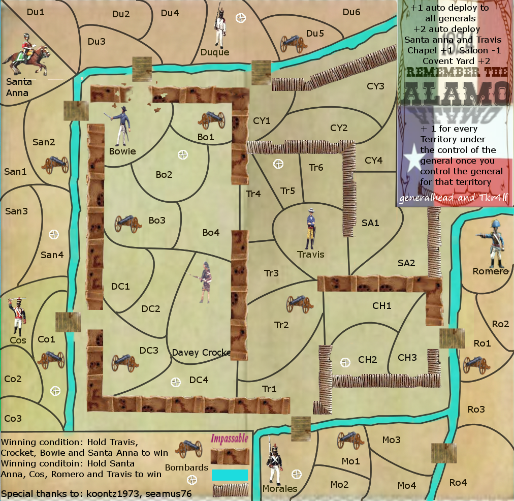
Here is my newest update, It is better but I am sure it still needs a lot of work. If you could help point those out as most of you have a finer eye for map details due to I am new at this. Thank you in advance.
Click image to enlarge.
I will go back and see if I have covered all of the details already given
I have a bridge that needs to be adjusted
the water borders need work
Some of my palisades need blending
Davey Crocketts name needs moved up
Remove white mark below Santa Anna
turn Mo1 cannon to the right
see about a back drop for the bottom key
blue bleeding into bottom key
questions Do the bridge connections look o.k.? Is everything to scale? Do the Alamo walls look o.k.? Is my bonus layout even for game play? Are the keys Legible and understandable?
Re: Alamo map [27/10] Pg4
Posted: Sat Oct 27, 2012 10:45 pm
by Seamus76
You're moving in the right direction, and your skills are getting better, but like you said there is still a lot to be done.
The "men" look better, but there is some inconsistency with them, from a uniform perspective. Morales, Duque, Romero all look different. It might be better to use the same guy, but flip and rotate, etc. to make the differences.
I think the legend flags/backgrounds need to be a little lighter and more in the background, possibly lighten the opacity. I also think you can find a good old-time font that fits a little better, and compliments the "Remember the Alamo" text.
Possibly think about lightening the territory borders. It's a little chaotic to my eyes with all of the lines. Good use of the Path Tool it looks like, but keep all of places they touch nice and tight. ex. where DC3, DC4, and Crocket meet.
It took me a little while to figure out where the Chapel, Saloon, and Covent Yard were. You need to explain that better, poss. change the legend to include something like Chapel (CH) +1, Saloon (SA) +1, etc. Along those lines it's not really obvious who the generals are, so you'll need to work on that.
For me, as for your questions, just keep working on them all. There is a lot you can do with this map. Keep up the hard work.
Re: Alamo map [27/10] Pg4
Posted: Sat Oct 27, 2012 11:28 pm
by generalhead
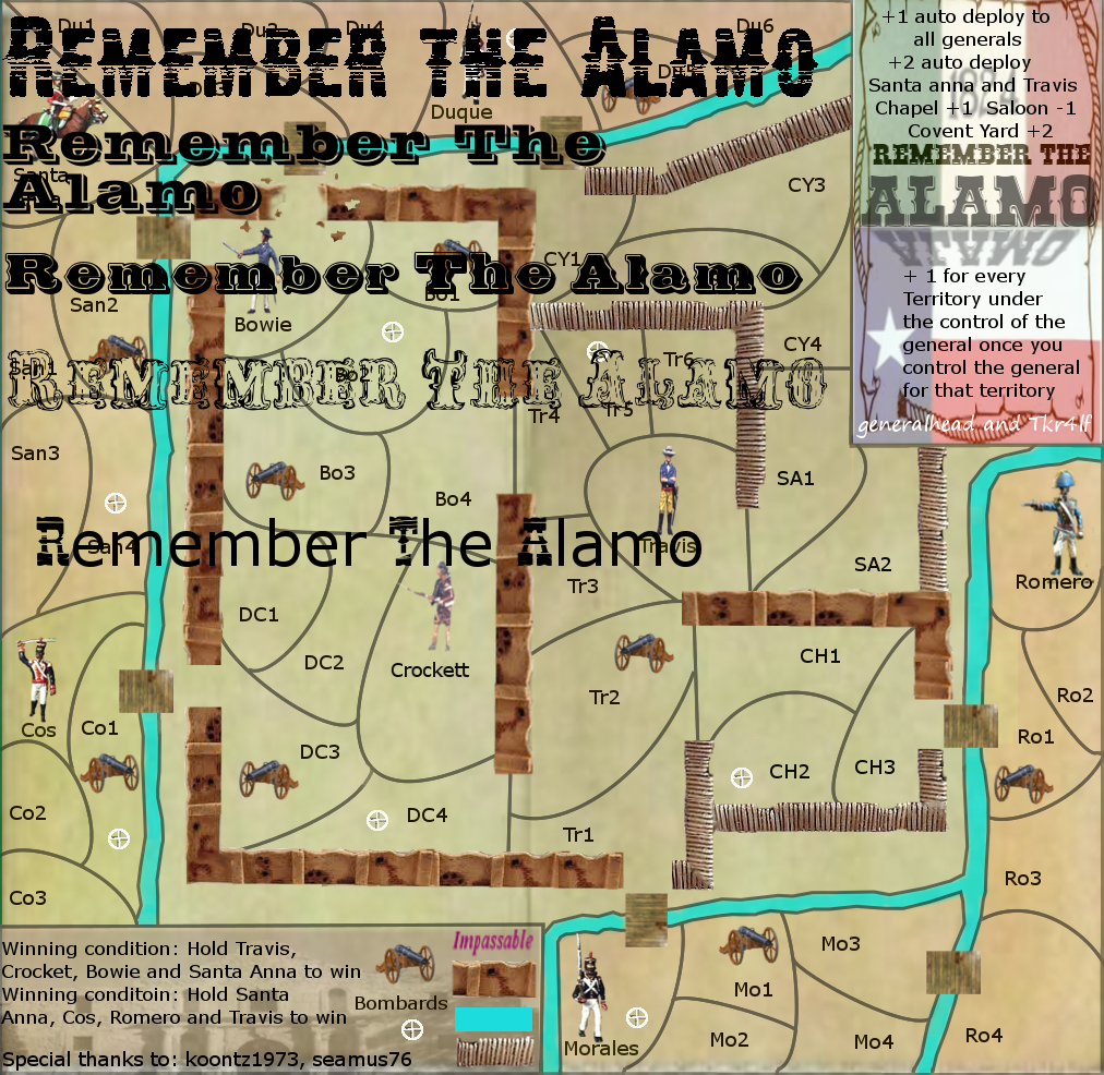
I went through all of the western fonts at dafont and these are the best ones in the western section, I will keep looking though.
Click image to enlarge.
Re: Alamo map [27/10] Pg4
Posted: Sun Oct 28, 2012 1:23 am
by koontz1973
Top font is best but it may not look good small. Which cannon hit which target? Or do they all hit everything? Figures, shrink them to half the size. The jpegs for the walls are not good. Go here (http://www.cgtextures.com/) and find wood planks, use them instead by shrinking to the right size. The same can be done for an underlying texture.
Like seamus said, you are coming along and I am happy that you are trying new things. That is the only way to learn.
Re: Alamo map [27/10] Pg4
Posted: Sun Oct 28, 2012 9:13 am
by generalhead
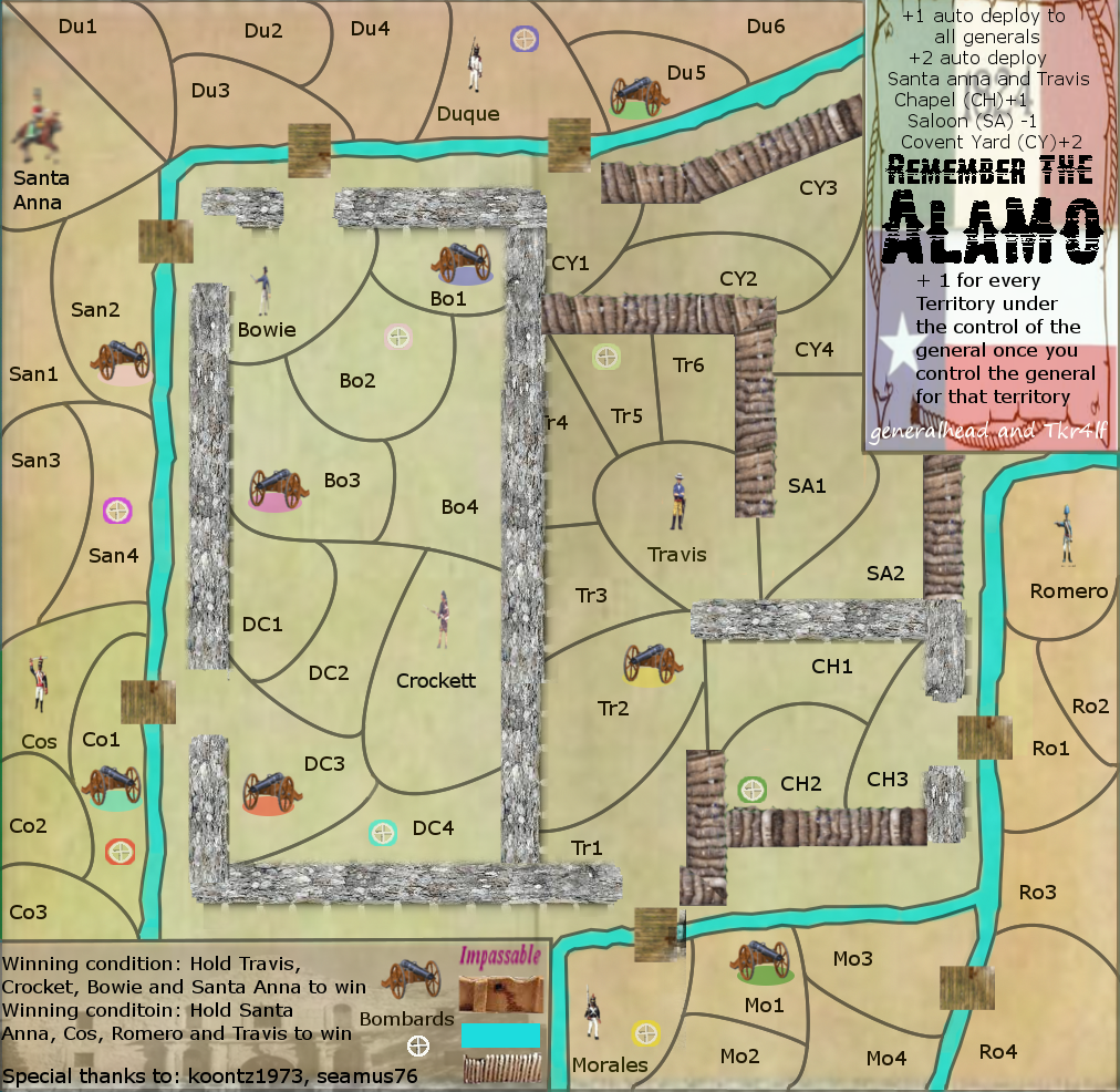
Do these walls look good or do I need a more of an overview look on the wood. The only problem with that is you lose the fee of the palisades.
Click image to enlarge.
Santa Anna is fuzzy, All the people still need re-sized better The impassable legend needs to be changed if the walls are good.
Re: Alamo map [27/10] Pg4
Posted: Sun Oct 28, 2012 9:41 am
by tkr4lf
Coming along nicely.
Walls still need work though. I'm not a big fan of the regular walls you have now. I like previous versions of those better. Also, I like the version before this last one's palisade walls better than these you have now. But you still need some better ones than even those.
I don't know if this is just me, but I feel like the walls should all be touching. It's kind of weird having all the breaks in the walls. I understand what you're going for, having the gaps be entrances to the forts, but possibly you could make some gates instead? And have ladders on the outside of the walls in select areas that the Mexicans could use to gain access to the fort? The only place where there should be a gap is the small breach in the northern wall, basically in the middle of Bowie and B01.
Also, I still think Romero needs a cannon, too. That would have the added benefit of giving the Mexicans at least one more cannon than the Texians, to reflect there superior force.
Oh, and as for the fonts, I personally like the second and the third ones better.
I'll post some more feedback later on. Keep up the good work.
Re: Alamo map [27/10] Pg4
Posted: Sun Oct 28, 2012 9:59 am
by koontz1973
Walls still need a lot of work doing to them but do not worry. tk is right, the walls need to be touching but this leads to the problem of how to get through them so you have to have the breaks in them. Cannons need to be sorted out some more. Again shrink them down and sort out the targets better. They looked rushed. Do not rush anything, I will just go back and get you to do it again.
Yes "Boss Man", Ty tk. Good stuff Good stuff. I agree with every thing. In my original version I did have the walls enclosed and it looked a lot better, but when I expanded it posed a problem. I like the ladder Idea, I will have to see what I can do with that. I did have a cannon in Romero but deleted it. I agree putting it back would show the Mexican army superiority. The walls I will keep working on. Study, Study, Study. Thanks again gentlemen.
Re: Alamo map [27/10] Pg4
Posted: Sun Oct 28, 2012 1:45 pm
by koontz1973
GH, just done the dispatch and noticed you map is too large. You will need to scale it down to 840 wide and 800 high. Better to do this now before anything else.
Re: Alamo map [27/10] Pg4
Posted: Thu Nov 01, 2012 5:38 pm
by Unstoppable!
WOW awesome buddie real good !!!
Re: Alamo map [27/10] Pg4
Posted: Sat Nov 03, 2012 9:43 am
by generalhead
Sorry it took so long, due to the sizing and me wanting to change a bunch of things I though it would be better to start from scratch
changed all the walls
the size of Anna's territory.
the colors
I had to redo some of the people due to resizing them too many times distorted them
moved some of the canons
added ladders
Click image to enlarge.
Sorry "Boss Man" I didn't see that you had posted the wall information until I posted this version of the map. Do you like these walls, I know they still need work, or should I change them all together? With the walls I was trying to go for a top-front view since the people and cannons are a top-front view. I didn't know if it would mesh if I went with a top view for the walls and everything else was a top-front view. With my lack of experience I will let you make that call "Boss Man".
My yellow target is suppose to be on Tr4, I don't know how it got into the saloon.
every needs another e
saloon is spelled wrong
check lines
Re: Alamo map [3/11] Pg4
Posted: Sat Nov 03, 2012 1:19 pm
by koontz1973
GH, changed all the walls - Here is the thing about your walls, you have the perspective down really well, but the jpegs you have used are just atrocious. The walls themselves have white bits on them from the jpeg itself and the wooded posts have the black all around them. This is going to be the biggest thing you do on this map as the rest is coming along nicely. When I did Rorke's Drift, I had natty dread and Dim on my back constantly about my impassables, trees, river, walls and rocks. So I know what you feel when I write this. But do not get discouraged, as they are getting better. the size of Anna's territory. the colors I had to redo some of the people due to resizing them too many times distorted them moved some of the canons added ladders The rest is good. Some of the graphics will need to be worked on like the men, cannons and targets. Men can be worked on but I suggest you look and Flapcakes Trench map in beta now, or cairnswk', Stalingrad map for a good way to show how to do targets.
Water. could be made smoother. Bridges, select each one (one at a time) and in the selection drop down menu, distort, invert and erase. (Copy the layer incase you hate the effect.) Play with the settings but you can get the horizontal or vertical to be smooth. So the short is smooth, long becomes jagged. Ladders are great but may get lost with colour blind players. Use the colour menu to make them darker.
Sent you a PM.
Re: Alamo map [3/11] Pg4
Posted: Sat Nov 03, 2012 2:14 pm
by generalhead
Thank you for all of your work "Boss Man". I would rather you critique me all day and me do the map over 500 times than me put out a crappy map. I will keep working as long as you keep telling me it's wrong. (Study, Study, Study)
Re: Alamo map [3/11] Pg4
Posted: Sun Nov 04, 2012 12:14 am
by koontz1973
generalhead wrote:Thank you for all of your work "Boss Man". I would rather you critique me all day and me do the map over 500 times than me put out a crappy map. I will keep working as long as you keep telling me it's wrong. (Study, Study, Study)
Do not worry, we will not let you produce a crappy map. In fact, this is far from where you started and far from crappy.
Re: Alamo map [3/11] Pg4
Posted: Sun Nov 04, 2012 7:26 am
by trinicardinal
overall nice clean graphics on the map itself. the legend on the right is definitely better now and the slight cut off of the win conditions seems to have been fixed as well.. Good luck with this one.
Re: Alamo map [3/11] Pg4
Posted: Sun Nov 04, 2012 11:56 am
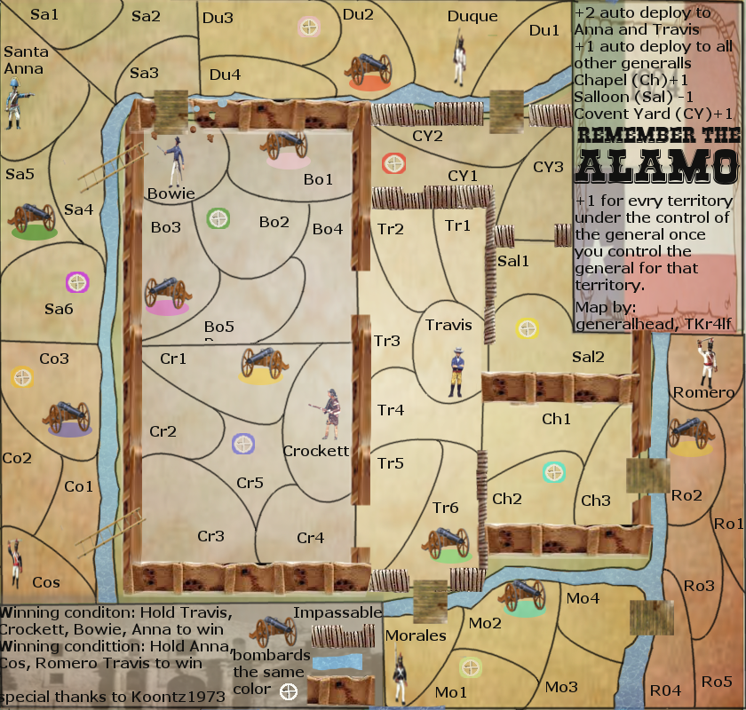
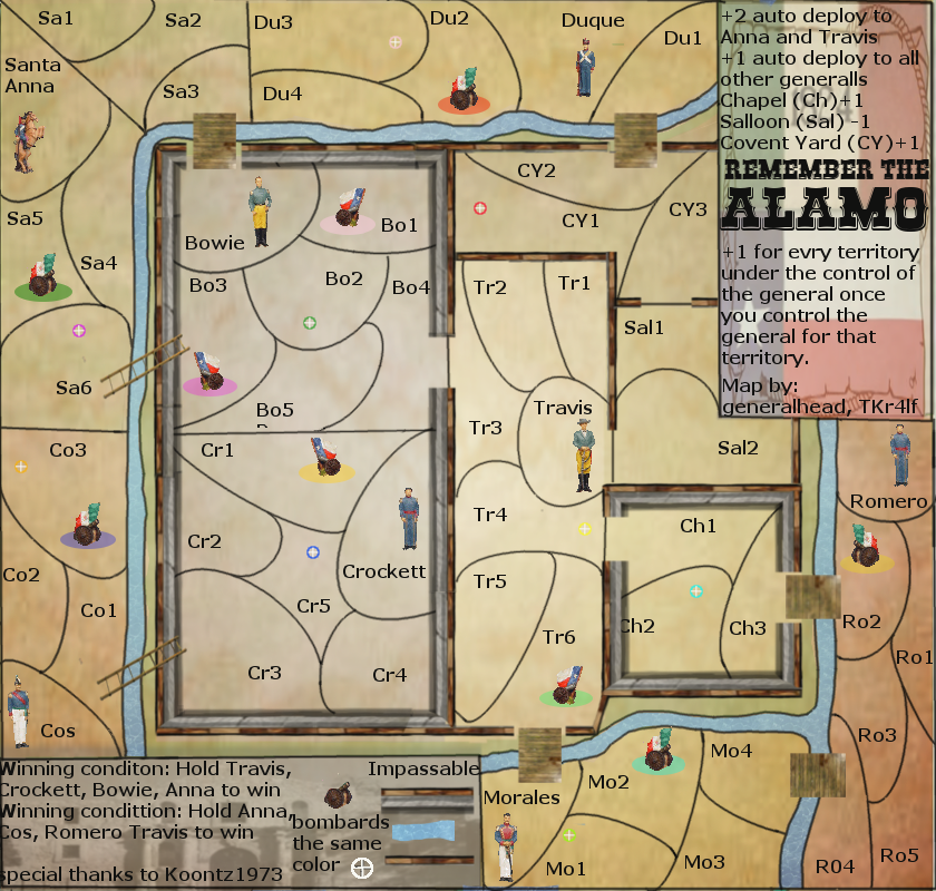
by generalhead
Wow! "Boss Man" yet again you are right. this does look a lot cleaner. tell me what you think and what should change next. If I should go with a different walls? do the rivers look better? Do you like the targets better?
Click image to enlarge.
I need to work on the word spacing in the legends. Would it look back if I made the letters a little smaller?
Re: Alamo map [4/11] Pg5
Posted: Sun Nov 04, 2012 12:15 pm
by koontz1973
Walls are much better. Bung a shadow on them to see how that looks and you are 50% their.
Re: Alamo map [4/11] Pg5
Posted: Sun Nov 04, 2012 12:56 pm
by Seamus76
Looking good, the coloring has come together nicely, as well as the walls. I think a shadow will help as well. I am really disliking the cannons. The old ones were much better, and the coloring under them was better as well, but could use a little "g" blur. I'm not a fan of the legends. It's not just the font, or the spacing, which needs work, but it just all seems too thrown together with little organization. With a little work you should have it.
Re: Alamo map [4/11] Pg5
Posted: Sun Nov 04, 2012 1:08 pm
by generalhead
The legends look too boxy correct. Do you think a nice border edge would look good. I am looking into how to do the shadow now. Koontz wrote me how to do it, i just need to go back through and figure it out. I like these cannons because they have the Mexico and Texas flags on them which separates the two sides of the map more. I will see what every one else thinks about the cannons and make a decision then. They are smaller too which makes the map look cleaner. I need to redo the colored shadows for the cannons by making them smaller. I used the old ones to see how they looked. Again thanks for your input Seamus, you are great.
Re: Alamo map [4/11] Pg5
Posted: Sun Nov 04, 2012 1:27 pm
by Seamus76
Fair enough, but the map would look better with the old cannons, and find better flags to incorporate. The legend could use a border but that's only part of it. Make the special thanks part smaller and reduce the opacity to be more in the background, or move it all together. I think you can also lose the "winning condition" part since you say "to win" at the end. Just say "hold...OR..." this would give more room.
Re: Alamo map [4/11] Pg5
Posted: Sun Nov 04, 2012 1:58 pm
by generalhead
cool thanks buddy!
Re: Alamo map [4/11] Pg5
Posted: Sun Nov 04, 2012 2:01 pm
by koontz1973
Remove the thanks part, move yours and tks names to the bottom right at half the size. Lost the backgrounds for the legends at the moment and just use a plain white backing for now. This will improve legibility and allow you to concentrate on other aspects of the map. Yes, the cannons did not work, use the old ones. Make the winning condition to hold all men, this will reduce the text. Impassable, reduce the images for this by 50%. New text: Hold all officers to win Cannons bombard same coloured targets Reduce the text size by a third. All officers +1 auto deploy. Officers and every 2 territories under his command +1 Using this text will stop you repeating yourself for both sides and reduces it.
River between Romero and the chapel is good. Do the rest like this.
Take your time. Have fun and let me know if any of this is not clear. Here to help get your map made.
Re: Alamo map [4/11] Pg5
Posted: Sun Nov 04, 2012 6:51 pm
by MagnusGreeol
Seamus76 wrote:Looking good, the coloring has come together nicely, as well as the walls. I think a shadow will help as well. I am really disliking the cannons. The old ones were much better, and the coloring under them was better as well, but could use a little "g" blur. I'm not a fan of the legends. It's not just the font, or the spacing, which needs work, but it just all seems too thrown together with little organization. With a little work you should have it.
Salut---ALL-------) I have to agree with Seamus,, The cannons look a little stuby,,or the flag over-powers the barrel ?, Couple Questions,,I counted 54 territs on this map,,Is that enough for 8 man play,, Same as I thought for Austrum map, that the territs looked to big to be just one territ,, and can they be split up and made into more ? I'm fighting My-self to divulge these questions ,,because My lack of knowledge on the know-how,,But lose not, what You find tomorrow. You Guys are great,,keep up the good work,,Maybe some-day I'll be able to legitimately run the knowledge race,,but for now I'll watch and root from the stands '')
Lol2-All--In Life & War----Salute-------) Sincerely, >>>----MAG-OUT----->