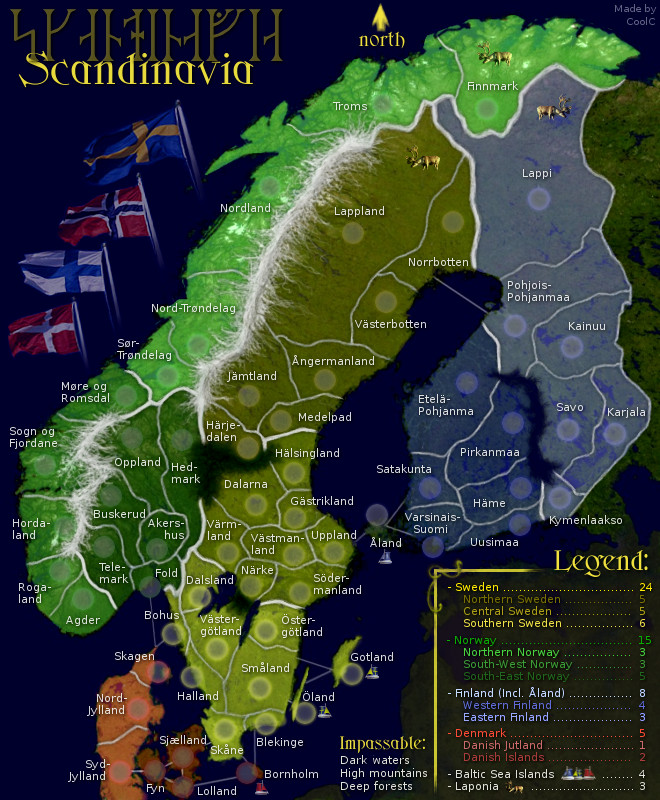
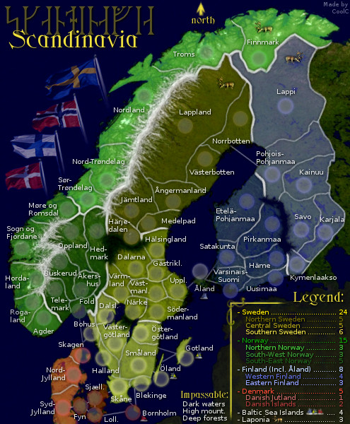
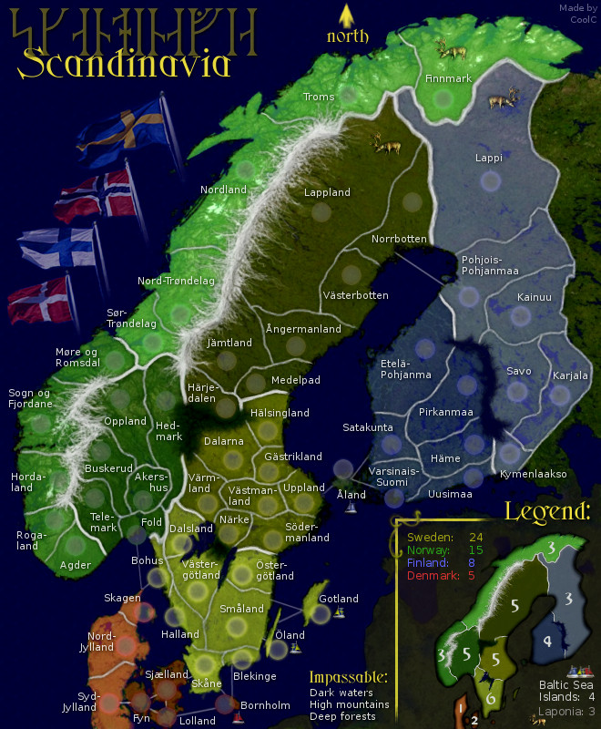
LARGE map
- Click image to enlarge.
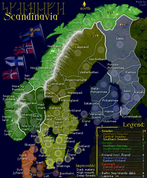
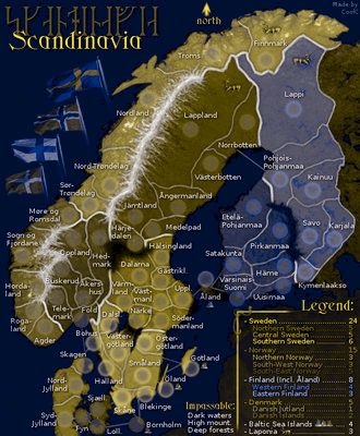
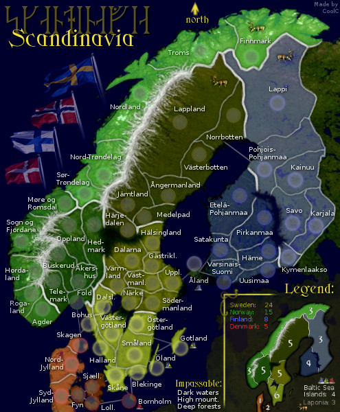
SMALL map
- Click image to enlarge.
Moderator: Cartographers
![]() by CoolC on Sat Jul 10, 2010 7:31 pm
by CoolC on Sat Jul 10, 2010 7:31 pm


![]() by natty dread on Sat Jul 10, 2010 9:43 pm
by natty dread on Sat Jul 10, 2010 9:43 pm


![]() by mviola on Wed Jul 21, 2010 10:42 pm
by mviola on Wed Jul 21, 2010 10:42 pm


![]() by RedBaron0 on Thu Jul 22, 2010 5:47 am
by RedBaron0 on Thu Jul 22, 2010 5:47 am


![]() by CoolC on Thu Jul 22, 2010 6:06 pm
by CoolC on Thu Jul 22, 2010 6:06 pm
![]() by natty dread on Fri Jul 30, 2010 3:13 am
by natty dread on Fri Jul 30, 2010 3:13 am
mviola wrote:i'm sorry to say this, but with natty's Nordic Countries map now, is there a point to working on this? They're pretty much identical maps. I know you've put in like 3 years on this but, I'm just wondering.
![]() by CoolC on Fri Aug 06, 2010 11:14 am
by CoolC on Fri Aug 06, 2010 11:14 am
![]() by natty dread on Fri Aug 06, 2010 11:43 am
by natty dread on Fri Aug 06, 2010 11:43 am
![]() by ender516 on Sat Aug 07, 2010 3:05 pm
by ender516 on Sat Aug 07, 2010 3:05 pm


![]() by natty dread on Sat Aug 07, 2010 3:09 pm
by natty dread on Sat Aug 07, 2010 3:09 pm
![]() by RedBaron0 on Wed Aug 11, 2010 5:27 am
by RedBaron0 on Wed Aug 11, 2010 5:27 am
![]() by CoolC on Fri Aug 13, 2010 5:30 am
by CoolC on Fri Aug 13, 2010 5:30 am
RedBaron0 wrote:The land where the island of Aland is isn't colored to be part of the Finland bonuses.
natty_dread wrote:Also if you abbreviate names on the small map you'll need a legend decoding the abbreviations...
![]() by CoolC on Fri Aug 13, 2010 7:38 pm
by CoolC on Fri Aug 13, 2010 7:38 pm
![]() by CoolC on Mon Sep 20, 2010 4:04 pm
by CoolC on Mon Sep 20, 2010 4:04 pm

![]() by Victor Sullivan on Mon Sep 20, 2010 8:11 pm
by Victor Sullivan on Mon Sep 20, 2010 8:11 pm


![]() by natty dread on Mon Sep 20, 2010 8:14 pm
by natty dread on Mon Sep 20, 2010 8:14 pm
![]() by Victor Sullivan on Mon Sep 20, 2010 8:18 pm
by Victor Sullivan on Mon Sep 20, 2010 8:18 pm
![]() by the.killing.44 on Mon Sep 20, 2010 8:19 pm
by the.killing.44 on Mon Sep 20, 2010 8:19 pm


![]() by Victor Sullivan on Mon Sep 20, 2010 8:34 pm
by Victor Sullivan on Mon Sep 20, 2010 8:34 pm
the.killing.44 wrote:Exact same bonuses…
![]() by natty dread on Tue Sep 21, 2010 5:39 am
by natty dread on Tue Sep 21, 2010 5:39 am
the.killing.44 wrote:Exact same bonuses…
![]() by iancanton on Wed Sep 29, 2010 2:00 am
by iancanton on Wed Sep 29, 2010 2:00 am
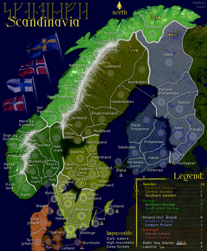
CoolC wrote:Made Åland once again in similar color as Finland, this time choosing a slightly brighter blue then east finland - that should make it clear enough that it doesn't belong to west finland.


![]() by natty dread on Wed Sep 29, 2010 6:32 am
by natty dread on Wed Sep 29, 2010 6:32 am
![]() by ender516 on Wed Sep 29, 2010 12:07 pm
by ender516 on Wed Sep 29, 2010 12:07 pm
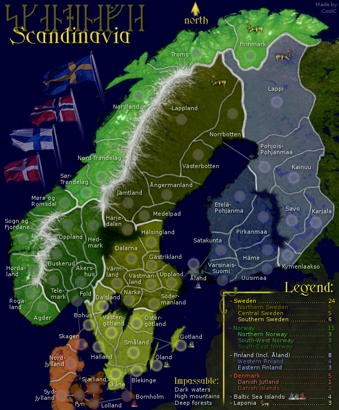
natty_dread wrote:Small suggestion: swap Norway & Sweden in the legend so the countries go in the same order they go on the map (From left to right)
![]() by Victor Sullivan on Wed Sep 29, 2010 3:00 pm
by Victor Sullivan on Wed Sep 29, 2010 3:00 pm
![]() by CoolC on Wed Sep 29, 2010 4:09 pm
by CoolC on Wed Sep 29, 2010 4:09 pm
Victor Sullivan wrote:Also, bonus area names would be nice (besides the over-arching country bonuses).
natty_dread wrote:Small suggestion: swap Norway & Sweden in the legend so the countries go in the same order they go on the map (From left to right)
iancanton wrote:this is a definite improvement. åland is now clearly part of neither west finland nor central sweden. the previous colour looked far too green.
Users browsing this forum: No registered users
|
|||||||
| Conquer Club is not associated with RISK online in any way. Copyright © 2006-2024 by Big Wham LLC | |||||||