Page 11 of 12

Re: Zodiac Map(v6.4.5 on First post and page 16)

PostPosted: Sun Apr 10, 2011 12:32 am
by natty dread
The first one is marked "free for personal use" so you can't use it here...

Re: Zodiac Map(v6.4.5 on First post and page 16)

PostPosted: Tue Apr 19, 2011 2:01 am
by rsacheli
i changed the font and now need to adjust the glows on them to make them more readable... update coming very soon!

Re: Zodiac Map(v7 on First post and page 18)

PostPosted: Thu Apr 21, 2011 11:35 pm
by rsacheli
Click image to enlarge.
image

Re: Zodiac Map(v7 on First post and page 18)

PostPosted: Fri Apr 22, 2011 12:24 am
by Victor Sullivan
Well, this map got a whole lot sexier. Maybe use a secondary font for the smaller text, it's a tad hard to read. And the Spring/Summer/Winter/Fall thing at the top-right is really squished, see if you can make it less. And maybe explore new background images, this one doesn't have really anything distinguishable. Also, change your signature font.

Re: Zodiac Map(v7 on First post and page 18)

PostPosted: Fri Apr 22, 2011 10:42 am
by ender516
If you are no longer doing the elements and the seasons, then maybe the colours need to be unified. I mean, if Capricorn, Aquarius and Pisces are all winter blue in the legend, shouldn't they be the same on the map?

Re: Zodiac Map(v7 on First post and page 18)

PostPosted: Fri Apr 22, 2011 3:10 pm
by Victor Sullivan
ender516 wrote:If you are no longer doing the elements and the seasons, then maybe the colours need to be unified. I mean, if Capricorn, Aquarius and Pisces are all winter blue in the legend, shouldn't they be the same on the map?

Well, the issue there is they're all adjacent bonus areas, so it'd be hard to distinguish between them.

Re: Zodiac Map(v7 on First post and page 18)

PostPosted: Fri Apr 22, 2011 11:13 pm
by ender516
Then change the legend to use the proper colours. The seasons are denoted by the symbols on the troop circles. Of course, those will be hidden by the numbers, which is why I originally suggested (I think) that the symbols surround the circles, so that they would be more visible.

Re: Zodiac Map(v7 on First post and page 18)

PostPosted: Sat Apr 23, 2011 7:54 am
by isaiah40
ender516 wrote:Then change the legend to use the proper colours. The seasons are denoted by the symbols on the troop circles. Of course, those will be hidden by the numbers, which is why I originally suggested (I think) that the symbols surround the circles, so that they would be more visible.


Which is another reason we are allowing this to go supersize a tad bit to make it clearer.

rsacheli, are you working on a slightly larger version to help with the clarity issues? If so can we please see the larger sizes?

Re: Zodiac Map(v7 on First post and page 18)

PostPosted: Sat Apr 23, 2011 7:27 pm
by rsacheli
I havent started making a larger version... yet... I want to try to keep this size if I can...
I will change the glows to make it more readable...
Ill also play with expanding the season markings beyond the circles...

As for my signature font, whats wrong with that? It should be different from the main font so that its not confused with the rest of the map text?

Re: Zodiac Map(v7 on First post and page 18)

PostPosted: Sat Apr 23, 2011 8:34 pm
by rsacheli
Click image to enlarge.
image

Re: Zodiac Map(v7.1 on First post and page 18)

PostPosted: Sat Apr 23, 2011 8:58 pm
by isaiah40
Well those few changes look better. But you are going to have to make this small bigger so that the 888's don't overlap each other in a few spots. Upsize this to 700x670 for the small and put the 888's on it so we can see them please. I don't think you will have to go any larger than this for the small, as for the large you probably won't have to go any bigger, but I'll let my other carto's give their opinion as well.

Re: Zodiac Map(v7.1 on First post and page 18)

PostPosted: Thu Apr 28, 2011 4:34 pm
by rsacheli
when did it switch to 888? it used to be just 88 and if it went triple digits then it remained centered on the circle and that was that...

Re: Zodiac Map(v7.1 on First post and page 18)

PostPosted: Thu Apr 28, 2011 6:53 pm
by isaiah40
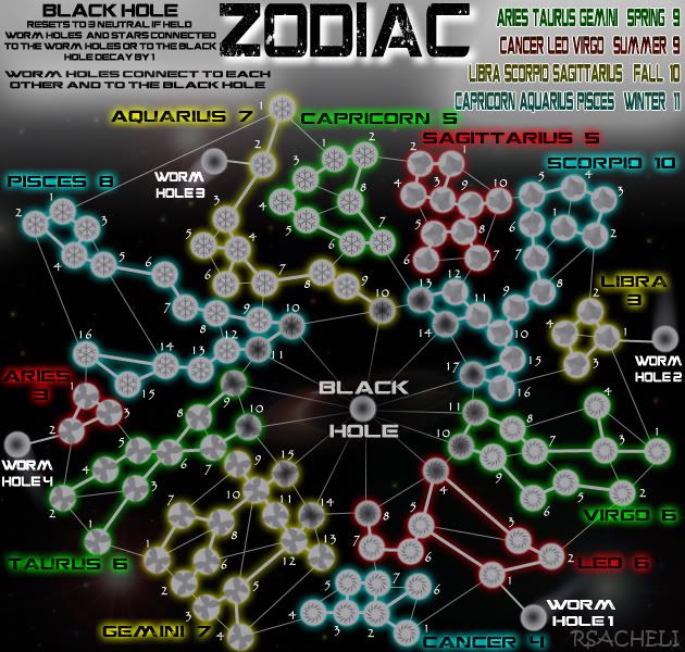
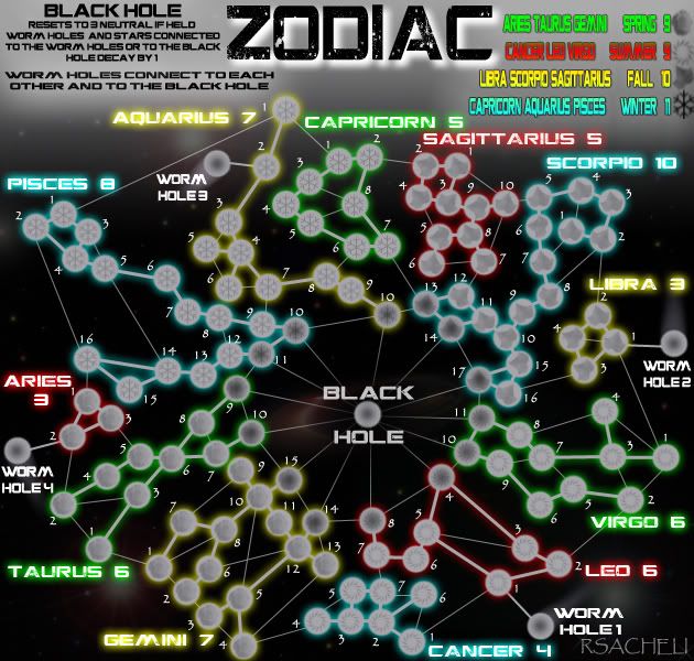
rsacheli wrote:when did it switch to 888? it used to be just 88 and if it went triple digits then it remained centered on the circle and that was that...


Actually, just the fist 2 8's are centered.

Re: Zodiac Map(v7.1 on First post and page 18)

PostPosted: Sat May 07, 2011 6:14 pm
by rsacheli
on vacation next two weeks, no updates will be posted, but i might get a chance to work on it a bit...

Re: Zodiac Map(v7.1 on First post and page 18)

PostPosted: Wed May 11, 2011 6:59 pm
by OliverFA
Hello! Don't know if that's been asked before. So forgive me if I am repeating the question. But I wonder why the sign shapes are not present in the map. Having such a clear and definite theme, it seems natural that the signs can be seen in the map. At least the outlines of the constellations. Also, shouldn't the stars in the map mirror the real stars in the sky?

Re: Zodiac Map(v7.1 on First post and page 18)

PostPosted: Fri May 13, 2011 12:31 am
by lostatlimbo
Hey you dropped Papyrus! Good decision.

Re: Zodiac Map(v7.1 on First post and page 18)

PostPosted: Fri May 13, 2011 10:09 am
by isaiah40
To start with, the few changes you have done have improved this map in some respects. This map has lots of potential, though as it stands right now, this map just does not say Zodiac. I would go back to page 17 and read what some others have suggested, which you have turned down for no good reason. Use the larger size for the small map and incorporate those suggestions. For example, do the outline of the constellations - this will add to the theme of the map - and then you can space out the constellations a bit more for CLARITY reasons. It's fine that you want to try and keep the size you have for the small map, but it just isn't going to work. It will be way too crowded.

Take off the season names in the legend, and then you can add a little more space between the letters to make them easier to read. The Black Hole - use the sun or earth instead, again these go with the theme. I would personally go with the sun, because for all intensive purposes, the sun is a star. You mentioned this:
I will not use someone elses drawings.

You don't have to use someone elses drawings, you can trace them and then they will be your own. The point is, you really need to incorporate these ideas into this map because THEY FIT THE THEME!

On another note, you will need to make the large map before we can send you to the forge.

So to recap here are the list of things needing to be done (with a couple extra things to do):

1 - Incorporate those ideas from page 17 into the map
2 - Make the small map 700x670 so that everything will be clearer and easy to read
3 - Change the Black Hole to either the Sun or the Earth
4 - Trace the outlines of the constellation pictures if need be and place them on the map
5 - Remove the season names from the legend and increase the spacing between the letters
6 - Make the large map
7 - Do a color blind test by going to Vischeck, and post the results here
8 - Post both large and your new supersize small map with the 888's on them

Re: Zodiac Map(v7.1 on First post and page 18)

PostPosted: Mon May 30, 2011 2:16 pm
by isaiah40
okay rsacheli, are you getting an update ready? I will be back in a couple of weeks for a review of what you have posted.

Re: Zodiac Map(v7.1 on First post and page 18)

PostPosted: Sat Jun 04, 2011 1:07 am
by rsacheli
isaiah40 wrote:
So to recap here are the list of things needing to be done (with a couple extra things to do):

1 - Incorporate those ideas from page 17 into the map
2 - Make the small map 700x670 so that everything will be clearer and easy to read
3 - Change the Black Hole to either the Sun or the Earth
4 - Trace the outlines of the constellation pictures if need be and place them on the map
5 - Remove the season names from the legend and increase the spacing between the letters
6 - Make the large map
7 - Do a color blind test by going to Vischeck, and post the results here
8 - Post both large and your new supersize small map with the 888's on them


the sun or earth dont make any more sense than the black hole... nor would any explination as to why the earth would reset and decay those around it... the sun I can see but not for the worm-holes...
constellation pictures would clutter this map too much even in a larger more spread out version... and I am not that great an artist to create the images myself...

Re: Zodiac Map(v7.1 on First post and page 18)

PostPosted: Sun Jun 05, 2011 1:06 pm
by isaiah40
rsacheli wrote:the sun or earth dont make any more sense than the black hole... nor would any explination as to why the earth would reset and decay those around it... the sun I can see but not for the worm-holes...
constellation pictures would clutter this map too much even in a larger more spread out version... and I am not that great an artist to create the images myself...


So put the sun in place of the Black Hole.

Have you made the supersize small map with the constellation outlines? If not how do you know that it would still be cluttered?

If you can't do the outlines yourself, ask around for help. I'm sure there is someone that would be willing to help you with them.

This map does have potential, it just needs the tweaks I have mentioned (not to mention others have as well) to raise it up a couple of notches. So that being said, go back and reread page 17, and my remarks about what needs to be done to get this map moved on into the Final Forge.

You do these things, and we'll get it moved up for you.

Isaiah40

Re: Zodiac Map(v7.1 on First post and page 18)

PostPosted: Thu Jun 16, 2011 1:22 pm
by RedBaron0
I said a lot of these same things a very long time ago. It's just so difficult to see a map of the Zodiac without seeing the zodiac! Lets pump this puppy up, you've got a great concept lets get the graphics to match!

Re: Zodiac Map(v7.1 on First post and page 18)

PostPosted: Tue Jun 21, 2011 2:56 am
by rsacheli
working on it... but its slow going... life is very busy right now

Re: Zodiac Map(v7.1 on First post and page 18)

PostPosted: Tue Jun 21, 2011 5:44 pm
by cairnswk
rsacheli, hi.
I have long been a student of the zodiac.
2 things i feel would enhance the map...
1. if you're going to have the seasons on the map, then you need to rename the map "Zodiac - Northern Hemisphere". We in the south celebrate Taurus in Autum - i am an autumn birth.
2. I would prefer to see the zodiac symbols somehow on the map, for traditional assocation. You can take basic images from the internet and re-draw over them. it would give the map that extra finish.
Perhaps something like this
Image

Re: Zodiac Map(v7.1 on First post and page 18)

PostPosted: Tue Jun 21, 2011 5:53 pm
by gimil
cairnswk wrote:rsacheli, hi.
I have long been a student of the zodiac.
2 things i feel would enhance the map...
1. if you're going to have the seasons on the map, then you need to rename the map "Zodiac - Northern Hemisphere". We in the south celebrate Taurus in Autum - i am an autumn birth.
2. I would prefer to see the zodiac symbols somehow on the map, for traditional assocation. You can take basic images from the internet and re-draw over them. it would give the map that extra finish.
Perhaps something like this
Image


I definitely agree with this. It would add a little more umpth to the theme. I also feel that the background a far to washed out and doesn't add to the the overall theme of the map. I think something more fitting would be a picture of the milky way with the the black whole in the picture aligned with the black hole on the map.

Click image to enlarge.
image

Re: Zodiac Map(v7.1 on First post and page 18)

PostPosted: Wed Jun 22, 2011 2:33 am
by RedBaron0
That'd work pretty well too since the Milky Way is a barred spiral...