Conquer Club

[Abandoned] - Welcome to mars!

Abandoned and Vacationed maps. The final resting place, unless you recycle.

Moderator: Cartographers

Forum rules
Please read the Community Guidelines before posting.

Re: Welcome to mars! Update p.5

Postby lt_oddball on Tue Jun 16, 2009 8:01 am

Is there a magnetic north on mars ? :-s


Hi there,

Nice colour scheme.

1) I suppose you'll mark which bonusname belongs to which bonuscolour ?
(in Sun May 17, 2009 2:44 am map it was all there ?)

2) why is there no link between Tartarus and Nepenthes ?

3) It is a "simple" map (that's meant as refreshing :D )..but can't you think of some extra bonus gimmick ?
A landing station ? a crashed rocket site ? A vault with alien eyes peeking ? O:)

http://www.empireonline.com/images/feat ... m-mars.jpg

http://blog.boriss.org/img/Mission-To-Mars-495.jpg


Cheers
Last edited by lt_oddball on Wed Jun 17, 2009 6:39 am, edited 1 time in total.
Barbarus hic ego sum, quia non intellegor ulli.
User avatar
Major lt_oddball
 
Posts: 364
Joined: Mon Mar 05, 2007 11:17 am
Location: Fortress Europe

Re: Welcome to mars! Update p.5

Postby RedBaron0 on Tue Jun 16, 2009 1:29 pm

lt_oddball wrote:Is there a magnetic north on mars ? :-s


There is a magnetic North on Mars, but Mars' magnetic field is extremely weak, at least 10,000x weaker than Earth's Magnetic field. In the past it appears the field was stronger due to magnetism in the rocks on Mars, but it has weakened significantly over time, there are a few theories out there as to why the field weakened so much. The reasons why aren't a big deal here; the big thing would be without a strong magnetic field a couple things are true:
  • Solar wind blows away Martian atmosphere.
  • The Martian surface is bathed in solar radiation.
ImageImage
User avatar
Sergeant 1st Class RedBaron0
 
Posts: 2657
Joined: Sun Aug 19, 2007 12:59 pm
Location: Pennsylvania

Re: Welcome to mars! Update p.5

Postby Industrial Helix on Wed Jun 17, 2009 6:09 am

Well, the map has certainly brightened up and look great for it, a lot of the changes made have gone a long way.

Graphically, I think its pretty solid, you've nailed the compass and the ships. the title is great as well.

I feel like this map is stuck between having a full interesting story and being some lines over some red stuff and calling it Mars. It doesn't look like the red planet we know and love because you've taken some imagination with it, which causes me as a player to not fill in the gaps as I would with a map of a region I'm familiar with. But I think the little script is a nice intro, but the rest of the story should be told through the game.

While i understand the need to not overcomplicated things, I think throwing in some cities or other signs of a story would go a long way for this map.
Sketchblog [Update 07/25/11]: http://indyhelixsketch.blogspot.com/
Living in Japan [Update 07/17/11]: http://mirrorcountryih.blogspot.com/
Russian Revolution map for ConquerClub [07/20/11]: viewtopic.php?f=241&t=116575
User avatar
Cook Industrial Helix
 
Posts: 3462
Joined: Mon Jul 14, 2008 6:49 pm
Location: Ohio

Re: Welcome to mars! Update p.5

Postby pimphawks70 on Wed Jun 17, 2009 4:39 pm

First I would like to say I love the map. That probably doesn't count for much, but I thought I should let you know.

Secondly, I have a question? On the far right are those supposed to be space ships or what? I think they need to be cleared up a little bit.

Lastly, I agree with Industrial Helix: The map needs more to it- I don't really get the feeling like it's a Martian map. I feel like it could be colored differently and easily be changed to something. Maybe something more to go along with the little intro story would be nice...


Pimp
Image
User avatar
Brigadier pimphawks70
 
Posts: 1102
Joined: Fri Aug 31, 2007 10:21 am

Re: Welcome to mars! Update p.5

Postby captainwalrus on Wed Jun 17, 2009 4:47 pm

It this supposed to be all of mars? If so, why is the south pole ice but the top just sort of ends? Shouldn't there be ice or something at the top?
User avatar
Private 1st Class captainwalrus
 
Posts: 1018
Joined: Sun Nov 11, 2007 3:19 pm
Location: Finnmark

Re: Welcome to mars! Update p.5

Postby gimil on Thu Jun 18, 2009 3:04 pm

Industrial Helix wrote:While i understand the need to not overcomplicated things, I think throwing in some cities or other signs of a story would go a long way for this map.


DO you mean add things for a graphical or gameplay perspective?
What do you know about map making, bitch?

natty_dread wrote:I was wrong


Top Score:2403
User avatar
Corporal 1st Class gimil
 
Posts: 8599
Joined: Sat Mar 03, 2007 12:42 pm
Location: United Kingdom (Scotland)

Re: Welcome to mars! Update p.5

Postby lt_oddball on Thu Jun 18, 2009 5:22 pm

gimil wrote:
Industrial Helix wrote:While i understand the need to not overcomplicated things, I think throwing in some cities or other signs of a story would go a long way for this map.


DO you mean add things for a graphical or gameplay perspective?


Both:

3) It is a "simple" map now (that's meant as refreshing :D )..but can't you think of some extra bonus gimmick ?
A landing station ? a crashed rocket site ? A vault with alien eyes peeking ?
Barbarus hic ego sum, quia non intellegor ulli.
User avatar
Major lt_oddball
 
Posts: 364
Joined: Mon Mar 05, 2007 11:17 am
Location: Fortress Europe

Re: Welcome to mars! Update p.5

Postby gimil on Thu Jun 18, 2009 5:29 pm

lt_oddball wrote:
gimil wrote:
Industrial Helix wrote:While i understand the need to not overcomplicated things, I think throwing in some cities or other signs of a story would go a long way for this map.


DO you mean add things for a graphical or gameplay perspective?


Both:

3) It is a "simple" map now (that's meant as refreshing :D )..but can't you think of some extra bonus gimmick ?
A landing station ? a crashed rocket site ? A vault with alien eyes peeking ?


I can add super cities and stuff for graphical fun but I don't really want to add gimmicks for the sake of adding gimmicks. Sometimes straightforward classic play is the way to go.
What do you know about map making, bitch?

natty_dread wrote:I was wrong


Top Score:2403
User avatar
Corporal 1st Class gimil
 
Posts: 8599
Joined: Sat Mar 03, 2007 12:42 pm
Location: United Kingdom (Scotland)

Re: Welcome to mars! Update p.5

Postby oaktown on Thu Jun 18, 2009 6:30 pm

gimil wrote:Sometimes straightforward classic play is the way to go.

agreed. A gameplay change I'd consider is adding a connection to make this map play more like a certain board game rather than just being a clone of the CC classic. As CC players may or may not know, the CC classic appears to have Kamchatka envy. 8-[
Image
User avatar
Captain oaktown
 
Posts: 4451
Joined: Sun Dec 03, 2006 9:24 pm
Location: majorcommand

Re: Welcome to mars! Update p.5

Postby Sharpsh00ter on Thu Jun 18, 2009 8:19 pm

Just an idea but what about a floating city ala Atlantis (from Stargate Atlantis) It could be a cool addition.


C
User avatar
Private Sharpsh00ter
 
Posts: 24
Joined: Wed May 13, 2009 4:59 pm
Location: Canada

Re: Welcome to mars! Update p.5

Postby whitestazn88 on Mon Jun 22, 2009 8:17 pm

oaktown wrote:
gimil wrote:Sometimes straightforward classic play is the way to go.

agreed. A gameplay change I'd consider is adding a connection to make this map play more like a certain board game rather than just being a clone of the CC classic. As CC players may or may not know, the CC classic appears to have Kamchatka envy. 8-[


what? i thought there was an extra connection in cc classic and the one that was missing from the board game was from east africa to middle east?

and i don't understand what you mean about kamchatka envy..
Lieutenant whitestazn88
 
Posts: 3128
Joined: Mon Feb 05, 2007 2:59 pm
Location: behind you

Re: Welcome to mars! Update p.5

Postby el-presidente on Wed Jun 24, 2009 8:14 am

Some versions of classic have the connection between East africa and Middle east, some don't. Mine doesn't, but I was at a friends house and he beat me because his board did.
Image
Private el-presidente
 
Posts: 158
Joined: Fri Sep 19, 2008 2:14 pm

Re: Welcome to mars! Update p.5

Postby oaktown on Wed Jun 24, 2009 8:56 am

I'm unaware of the East Africa - Middle East variance, but check out the Kamchatka - China connection.

http://upload.wikimedia.org/wikipedia/c ... me_map.png
Image
User avatar
Captain oaktown
 
Posts: 4451
Joined: Sun Dec 03, 2006 9:24 pm
Location: majorcommand

Re: Welcome to mars! Update p.5

Postby pikkio on Thu Jun 25, 2009 9:47 am

hello! i didn't read the discussion, so excuse me if i say something that you have jet decided about.

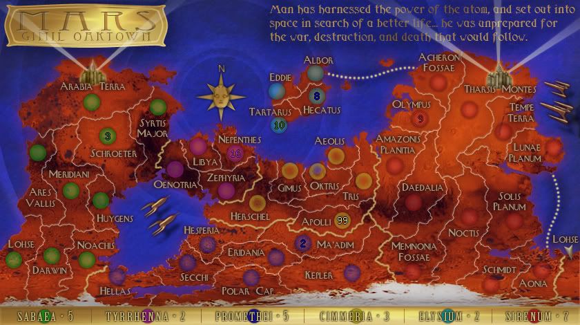
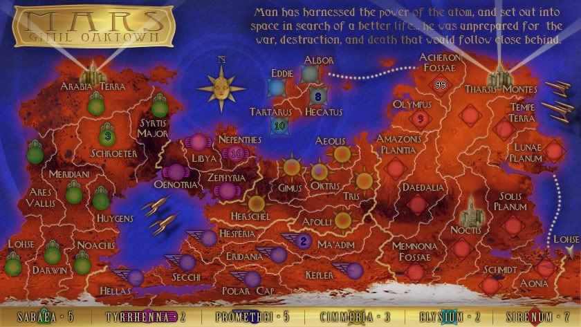
i like the feeling of the map. i like the texture of the territories and the background effect. i really like the outer borders effect (how you made it?) that seems a bit pixellated and give to the map an original futuristic feeling.
the only thing that i don't like is the names of the territories.. i think it's not much readable, and it's very difficult to identify wich territories are in wich country and wich is the right bonus. i don't now if it will be better to change the font, or maybe work on colours and make the glows more fitted and thin. in particular, i think that there are some glow colours that are invisible and don't pop from the background, maybe start changing thoose. ;) or you can try something like we did in oceania and find a glow colour that pop well for all the territories and then make the names with the same colour for the same country.
then try something to associate the countries with the names on the legend, maybe a colour association, or put an icon in the territories of the same country, or something else like that.

for the gameplay (that's not my speciality..) i think that it will better if there isn't only one access point to the island. ;)

keep on the good work! ^_^
Image
User avatar
Sergeant 1st Class pikkio
 
Posts: 188
Joined: Mon Mar 05, 2007 8:58 am
Location: UK

Re: Welcome to mars! Update p.5

Postby oaktown on Fri Jun 26, 2009 6:12 pm

Click image to enlarge.
image

The gimil/oaktown Mars tennis match continues... this update is my turn!

What's new:
  • New font on the territory titles... still an art deco style, but sans serif.
  • Regions are now distinguished by the color of the army circle. The colors can change, but we like this basic idea... since we have to have the dumb things we may as well put them to good use.
  • Cities and spotlights!
  • I've been redrawing borders to make room for the army counts - it works right now for the large map (shown) but more work will be required to make the small map work.

What I'd like to do next:
  • Come up with a shape for the army "circles" that fits the era/look of the map. The circles don't work for me.
  • More fun crap like cities. Gimil has expressed concern that folks will look at the cities that are there and think that they have a bonus/game element attached. If there's more such fun across the map the cities will blend in the with the overall look more.
Image
User avatar
Captain oaktown
 
Posts: 4451
Joined: Sun Dec 03, 2006 9:24 pm
Location: majorcommand

Re: Welcome to mars! Update p.6

Postby Danyael on Fri Jun 26, 2009 7:04 pm

looks good
are you going with different shapes for army circle or different all around army marker :?:

if it is the same all around could you switch elysiums colour with tyrrhennas
just so the dark blues are separated by the light blue on the map
then i will see the difference better if not a problem
User avatar
Corporal 1st Class Danyael
 
Posts: 352
Joined: Fri Jul 04, 2008 4:26 pm
Location: Winnipeg, Manitoba

Re: Welcome to mars! Update p.6

Postby oaktown on Fri Jun 26, 2009 7:08 pm

I hear ya Danyael, the colors are a work in progress... I'm colorblind and have trouble with them myself. Plenty of time to work that out though.
Image
User avatar
Captain oaktown
 
Posts: 4451
Joined: Sun Dec 03, 2006 9:24 pm
Location: majorcommand

Welcome to mars! Update p.6

Postby Nzen on Fri Jun 26, 2009 8:39 pm

The colored circles solve many problems. I like this direction.

The sirenum circles match a bit with the background mars, but I am not sure how to improve it.

As far as icons go, perhaps you could have a 'science hero' standing dramatically between Memnonia Fossai and Noctius. You can find images everywhere, but I recommend ProjectRho for your 50s space inspiration.
User avatar
Sergeant 1st Class Nzen
 
Posts: 25
Joined: Tue Jan 13, 2009 12:50 am

Re: Welcome to mars! Update p.6

Postby pikkio on Sat Jun 27, 2009 6:40 am

you get it!! ^_^ really good idea. ;)

i'm agree with the idea to make different shapes for each country instead of the circles, it will help a lot to distinguish them. the only problem at now is that (expecially in a small map..) some numbers will be not much clear in the same coloured army circle.. yes, i'm agree that it's readable, but i think that it isn't enough for the foundry standards.. try to fade the inner glow of the army circles to the white instead of the same colour but lighter. by the way, with the different shapes, probably it's enough a coloured border to distinguish them, and then the numbers will be clearly readable. ;)

good the new font and good idea to put some cities and icons. good work guys! ^_^
Image
User avatar
Sergeant 1st Class pikkio
 
Posts: 188
Joined: Mon Mar 05, 2007 8:58 am
Location: UK

Re: Welcome to mars! Update p.6

Postby gimil on Sat Jun 27, 2009 12:10 pm

Oaktown I think we are going to need to put a darkish outer glow on thise continent names in the legends. They are a little difficult to read with gold on gold.
What do you know about map making, bitch?

natty_dread wrote:I was wrong


Top Score:2403
User avatar
Corporal 1st Class gimil
 
Posts: 8599
Joined: Sat Mar 03, 2007 12:42 pm
Location: United Kingdom (Scotland)

Re: Welcome to mars! Update p.6

Postby captainwalrus on Sat Jun 27, 2009 4:33 pm

Do the 2 big city things attack each other? I seems like they might, but I couldn't find if it said that anywhere.
~ CaptainWalrus
User avatar
Private 1st Class captainwalrus
 
Posts: 1018
Joined: Sun Nov 11, 2007 3:19 pm
Location: Finnmark

Re: Welcome to mars! Update p.6

Postby oaktown on Sat Jun 27, 2009 5:11 pm

Click image to enlarge.
image


pikkio wrote:i'm agree with the idea to make different shapes for each country instead of the circles, it will help a lot to distinguish them. the only problem at now is that (expecially in a small map..) some numbers will be not much clear in the same coloured army circle..

Check! In keeping with art deco theme I gave each circle a deco flourish. My concern is that maybe it's too much - don't want the map itself to get lost among all of the little graphics. Readability issues will be dealt with as we roll along.

Another thought is that if folks like the idea of different shapes, we could lose the colors altogether and just choose one color that is easy to read. It would make the map look more artsy and less like somebody spilled a bags of Skittles.

gimil wrote:Oaktown I think we are going to need to put a darkish outer glow on thise continent names in the legends.

Hope this looks better.

captainwalrus wrote:Do the 2 big city things attack each other? I seems like they might, but I couldn't find if it said that anywhere.

Answer is no; they're just eye candy. As noted earlier the trouble with having some fun with the graphics is that folks expect cities to attack each other.
Image
User avatar
Captain oaktown
 
Posts: 4451
Joined: Sun Dec 03, 2006 9:24 pm
Location: majorcommand

Re: Welcome to mars! Update p.6

Postby cairnswk on Sat Jun 27, 2009 5:25 pm

oaktown wrote:.....
Check! In keeping with art deco theme I gave each circle a deco flourish. My concern is that maybe it's too much - don't want the map itself to get lost among all of the little graphics. Readability issues will be dealt with as we roll along.


Mmm. oaktown. i'm kinda thinking it is too much, but only in the manner that the colours in the legend are not matching the colours on the map for whatever reasons. I like the idea of the art deco theme icons but some are getting lost in amongst all that red.
My other concern is that the army numbers are going to get lost on those army circle colours.

Is there going to be a link from Tartarus to perhaps Nepethes? That island is a bottleneck.
I like the overall design. :)
Image
* Pearl Harbour * Waterloo * Forbidden City * Jamaica * Pot Mosbi
User avatar
Private cairnswk
 
Posts: 11510
Joined: Sat Feb 03, 2007 8:32 pm
Location: Australia

Re: Welcome to mars! Update p.6

Postby oaktown on Sat Jun 27, 2009 5:32 pm

cairnswk wrote:Mmm. oaktown. i'm kinda thinking it is too much, but only in the manner that the colours in the legend are not matching the colours on the map for whatever reasons. I like the idea of the art deco theme icons but some are getting lost in amongst all that red.
My other concern is that the army numbers are going to get lost on those army circle colours.

I concur... gim and I were just discussing the possibility of softening the colors as we. I like the reds copper tones of the map, so working the army circles in to that color scheme will be on our minds as we proceed.

The Gimster is up next for updates... let's see what he's got up his sleeve for us! 8-)
Image
User avatar
Captain oaktown
 
Posts: 4451
Joined: Sun Dec 03, 2006 9:24 pm
Location: majorcommand

Re: Welcome to mars! Update p.7

Postby AndyDufresne on Sat Jun 27, 2009 7:28 pm

You know, I actually like the plethora of shapes. It's something that isn't done very often, and I think you can pull it off thematically on a map such as this one (on many maps it would certainly detract, but I think it enhances the theme in this one). I also like the individualistic colors as well, thouh a mock up with a neutral tone for everything and only shapes would be interesting and worth pursuing I think as well.


--Andy
User avatar
Corporal 1st Class AndyDufresne
 
Posts: 24919
Joined: Fri Mar 03, 2006 8:22 pm
Location: A Banana Palm in Zihuatanejo

PreviousNext

Return to Recycling Box

Who is online

Users browsing this forum: No registered users