Page 3 of 5
Re: Welcome to mars! Update p. 3

Posted:
Sun May 10, 2009 8:25 pmby oaktown
- Click image to enlarge.
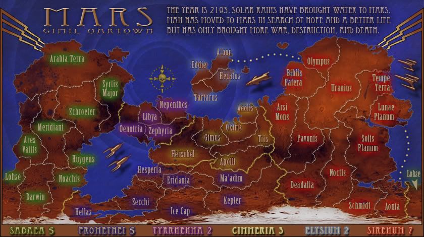
Hey all, gimil and I are playing alternating versions right now, as there are somethings I like to do and things he likes to do. Sorry for not noticing the recent comments as my focus has been on what gimil and I last talked about. In this version I've...
• added a border, which also incorporates the region bonuses. I think moving the bonuses down there makes the top of the map cleaner, and I like separating the gameplay info from the fictional backstory.
• overall I tried to improve some of the muddier elements of the map. Folks have been complaining that the map is "dark" when really I think the problem is that there is a lack of contrast. Dark is fine as long as you keep everything visible. For instance, the text was in my opinion the hardest thing to read, and while it really isn't any lighter now it does have greater contrast against the background.
• brought in a uniquely "classic" element that gimil and I had spoken of... hope you like.

There's still plenty to do... I think we'll need to somehow provide a better key to the regions (region names on the map itself might be necessary) and there's the question of what to do with army counts/contrast circles. I'll mull that one over and see if I can't find a solution in keeping with the 1930s/Flash Gordon/Metropolis style.
And I'm cool with losing the date, and/or any other parts of the text that isn't crucial to the backstory. If we work on it I'm sure we can say more with fewer words.
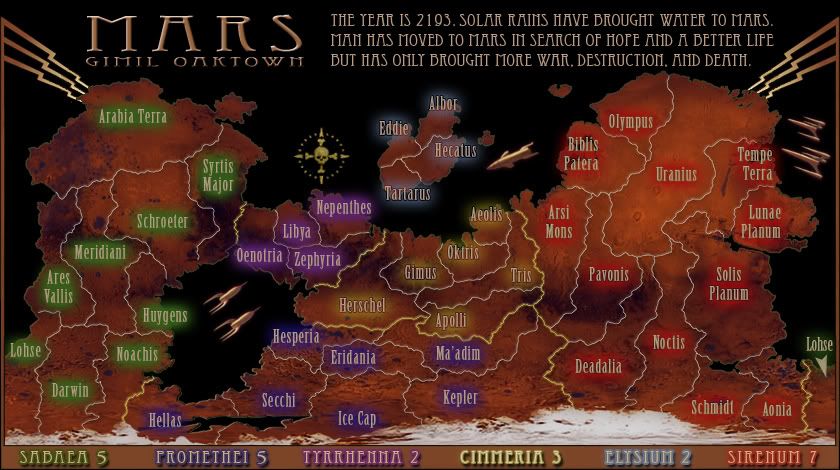
Just for fun: as an example of how the map really isn't too "dark" check out how friggin' cool gimil'dland looks with a black background... I think the land isn't the problem, we just need to get everything else right.
- Click image to enlarge.
Re: Welcome to mars! Update p. 3
Posted:
Mon May 11, 2009 1:36 pmby thenobodies80
My best concerns now are on the text/colors:
tyrrhenna and promethei have very similar colors on the map
Lohse lose the green color on the right part of the map (on the water)
Elysium names aren't clear on the blue background if compared with the legend
Cyan, violet and yellow hurt a bit my eyes...(on territories)
Commas on the "story text" are very similar to full stops.
Trying to have coloured names instead of neon glows? Or something
similar this RJ's dots idea
http://www.rjbeals.com/shadowlands/shadowlands-rjbeals-beta-7a.jpg I like the legend on the lower part of map, it's a good choice, but the cimmeria name isn't so easy to read

TNBDS
Re: Welcome to mars! Update p. 3
Posted:
Mon May 11, 2009 8:27 pmby RedBaron0
I'm glad someone is doing this map again, I've tried it myself and I still need to refine my imaging skill before doing a serious attempt at a map.
Anyways... I like the image, a clean map with classic gameplay. The image is definately too dark as it stands.
Whatever fiction you want to put together for the story is gravy just decide what you want to do, be firm on it. The story can be pure fiction with little basis in reality, or be based on real science. (terraforming - I'd suggest looking at the book series by Kim Stanley Robinson titled Red, Green, and Blue Mars for inspiration if this is your intention) Or you can kinda be ambiguous with the story line.(i.e. many years in the future or past)
My biggest beef... {twitch} is that the names of geographical areas on your map are in the wrong places. Specifically the areas around the massive shield volcanoes are off.
Areas marked incorrectly: (take the names I give you and alter them as you will, but PLEASE hold true to the region's name in reality!)
Biblis Patera - Olympus Mons, I'd go with Acheron Fossae
Uranius - Is there to the northeast of the 3 other major volcanoes in the territory, Ascraeus Mons, Pavonis Mons, and Arsai Mons. (listed in order from northeast to southwest) Best name I'd think would be Tharsis Montes.
Arsi Mons - I'd probably mark in Amazonis Planitia
From there I'd shift names north, Daedalia north to Pavonis and rename Deadalia, Memnonia Fossae
These are my suggestions, take them and run with them. I'm protective of the names of the surface features of Mars, they are unique in all of the Solar System, I have a strong passion to have them marked correctly.
Re: Welcome to mars! Update p. 3
Posted:
Mon May 11, 2009 8:40 pmby LED ZEPPELINER
Just a question, I'm not sure if this has been answered... Is this going to replace one of the classic maps?
Re: Welcome to mars! Update p. 3
Posted:
Mon May 11, 2009 8:42 pmby the.killing.44
LED ZEPPELINER wrote:Just a question, I'm not sure if this has been answered... Is this going to replace one of the classic maps?
I'm pretty sure no … but something regarding classic will come up in the coming weeks

The map is sweet, I agree with n00bodies right now as there's not much more. That dotted route could use some accentuating.
.44
Re: Welcome to mars! Update p. 3
Posted:
Tue May 12, 2009 1:10 amby oaktown
LED ZEPPELINER wrote:Just a question, I'm not sure if this has been answered... Is this going to replace one of the classic maps?
Nope, it's just another map. It has absolutely nothing whatsoever to do with any map that may be the copyrighted property of a major board game company. Nothing in common at all.
Re: Welcome to mars! Update p. 3
Posted:
Tue May 12, 2009 4:08 pmby reggie_mac
RedBaron0 wrote:Areas marked incorrectly: (take the names I give you and alter them as you will, but PLEASE hold true to the region's name in reality!)
Biblis Patera - Olympus Mons, I'd go with Acheron Fossae
Uranius - Is there to the northeast of the 3 other major volcanoes in the territory, Ascraeus Mons, Pavonis Mons, and Arsai Mons. (listed in order from northeast to southwest) Best name I'd think would be Tharsis Montes.
Arsi Mons - I'd probably mark in Amazonis Planitia
From there I'd shift names north, Daedalia north to Pavonis and rename Deadalia, Memnonia Fossae
These are my suggestions, take them and run with them. I'm protective of the names of the surface features of Mars, they are unique in all of the Solar System, I have a strong passion to have them marked correctly.
Dammit, i was going to post the same thing...
But yes, Mars is already a well named planet, it would be great to stick with the correct names for the areas.
Also, when you start to terraform a planet you'll end up with growth, if you get the time, adding some green/brown/lichen/growth type coloring around the edges of the ocean areas would definitely give this map that little something extra.
RedBaron0 wrote:I'd suggest looking at the book series by Kim Stanley Robinson titled Red, Green, and Blue Mars for inspiration if this is your intention
Or just read it because its a good series, but it is well worth reading.
Re: Welcome to mars! Update p. 3
Posted:
Tue May 12, 2009 4:15 pmby Merciless Wong
Well for some reason, I sense that the bonuses and general structure of the map has been play tested extensively. So no objections. Just clarity. The continents are hard to tell apat just by color on the names.
Re: Welcome to mars! Update p. 3
Posted:
Thu May 14, 2009 8:13 pmby gho
I dont know if i like the story line. Couldn't you make it a bit more closer to today and have different nations trying to colonise it (US, Russia, China, EU, India and Japan) and name the continents after them. Alternatively you could do a straight geographic map with no storyline.
Re: Welcome to mars! Update p. 3
Posted:
Thu May 14, 2009 9:10 pmby hecter
The lighter text is much better and really brings out the map. I'm still not a fan of the water rings, and the compass could use some work as well. The border would look nicer, methinks, if it had a bit of a copper or bronze feel to it, like your text and other stuff has got. The two purple (or the blue and purple) countries look too similar. It'd be nice if you could fix that somehow.
I also really like the simplistic, classic-"like" gameplay. It's nice.
Re: Welcome to mars! Update p. 3
Posted:
Sat May 16, 2009 9:44 pmby oaktown
- Click image to enlarge.
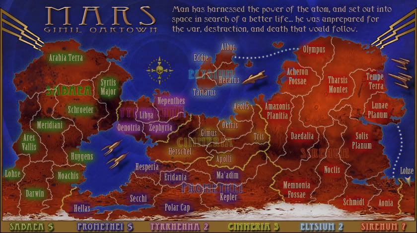
Since gimil hasn't been around to make the next round of changes (or update the first post) I've done some tinkering. I hope I've incorporated the territory names as suggested. Water is darker, radar circles less pronounced, and I rewrote the back story to make it less specific and more 1930s sci-fi.
For those of you who aren't familiar with the old classic, the compass is borrowed from that map... I'm thinking I might replace the skull with a retro sci-fi robot head.
Re: Welcome to mars! Update p. 3
Posted:
Sun May 17, 2009 3:46 pmby RedBaron0
Looks good, you need to reverse Olympus and Acheron, other than that the names are good to go.
The continent names overlaying the territories are difficult to see and might not be needed; the bottom key is all you should need. And yeah, I'd go with the robot head for sure.
Re: Welcome to mars! Update p. 3
Posted:
Sun May 24, 2009 2:35 pmby el-presidente
I like it, at first it was a little hard to read, but after giving it a better look it isn't that bad. The land and the background seem a little oddly septerated, as if the land is standing up verticly and the background is the sky, but that might just be me. I have no gameplay concerns, and I don't forsee there being many. It is a good concept, I hope you are still working on it, even though the first page isn't updated or anything.

Re: Welcome to mars! Update p.5
Posted:
Tue Jun 02, 2009 2:29 amby gimil
Ok sorry for the delay in getting this update to date. I am now around to make the next update.
Some concerns I have upfront:
-I don't think the colouring of the compass really fits with the rest of the theme. I think it needs to be more golden (although we risk over using gold at this point).
-The middle ship isn't to hot in my opinion. I think having the two pairs of ships will be enought anyway. Removing the middle one reduce clutter.
-I don't really like having the continent names inside the continents, again adds to the cluttered look I am feeling. An alternative idea for recognising continents would be a coloured border around the continent, like british isles REVAMP for example.
-The legends golden table thingymajig needs to be more textured/metallic looking. Right now it is very flat on top of a very textured map.
Those are the issues I see and hope to address with oaktown for the next update. Which I will work on once I get the latest PSD from oaktown.
Re: Welcome to mars! Update p.5
Posted:
Tue Jun 02, 2009 8:44 amby thenobodies80
gimil wrote:-The middle ship isn't to hot in my opinion. I think having the two pairs of ships will be enought anyway. Removing the middle one reduce clutter.
-I don't really like having the continent names inside the continents, again adds to the cluttered look I am feeling. An alternative idea for recognising continents would be a coloured border around the continent, like british isles REVAMP for example.
-The legends golden table thingymajig needs to be more textured/metallic looking. Right now it is very flat on top of a very textured map.
Agree.
My concern is about elysium-syrenum. It remind me the classic oceania-asia. Elysium is an easy target and it has only one way of expansion. You're doing a map with the "classic Asia" problem. In other words, if a lucky player will control syrenum, he will win easily. If not the syrenum bonus will not assigned in games. Vertical territories prevent the classic "one big territory border" and make this zone very hard to hold, but probably the player that will control elysium can gain 2 troops per turn without any problem with the same advantage that oceania gave on the classic map. When spoils will come ,someone will try to break the bonus,etc,etc. What do you think about adding another link to elysium? From Arabian Terra? In the same time i think it will balance the bonus, actually Sabaea seems a bit easier to hold compared with promethei.
Re: Welcome to mars! Update p. 3
Posted:
Tue Jun 02, 2009 10:24 amby RjBeals
el-presidente wrote: The land and the background seem a little oddly septerated, as if the land is standing up verticly and the background is the sky, but that might just be me.
I also notice this. It looks like you just have a straight layer mask applied to a mars landscape image. I think you just need to work on the land edges a bit, add some shading, maybe blur your mask a bit so it's not such a hard edge.
I love the borders (both on the map, and the gold legend border).
Everything still looks too dark to me. Have you considered changing the water to non-playable sand? or desert? Water just doesn't feel right for mars. Maybe make the water black (grayish black)?
Re: Welcome to mars! Update p.5
Posted:
Mon Jun 08, 2009 6:55 amby gimil
This is only half the updated I planned but I didn't want to leave this thread doing nothing any longer:
- Click image to enlarge.
UPDATED:
-Nice gold textured title badge with a gold textured compass and legends to match.
-New compass was a mixture between the old hand made compass by oaktown and the sci-fi robot head oaktown picked out. Which I added the golden effects to.
-Added an overlay that made the map overall lighter.
-Removed the ship that was in the middle of the map that I personally didn't like

PLANS FOR NEXT UPDATE:
-Colour code the legends
-Possibly colour code the borders within a continent
-Refine the terr names some more to fit with the whole colour code crusdate I will be going on for the next update.
-Refine land edges to blend into the water better.
-Refine the effects on the paragraph text at the top to make it more readable.
-Any other ideas that are thrown at me.
Re: Welcome to mars! Update p.5
Posted:
Mon Jun 08, 2009 12:57 pmby AndyDufresne
I like the general theme of this map. The aesthetic accoutrements, like the compass, the rockets, and the title are all superb. I'm a little less sold on the water and the look of the land---they are Mars-esque but do not totally say "Mars" to me. Hm, for some reason, I feel like there is a strange disconnect between the land/water visuals, and the other iconic visuals (compass, rockets, etc). It might be land/water color, it might be those areas feel a little flat when compared to the icons, I'm not sure. I think you are on the right track, but something seems missing.
Your plans for the next update look like you've got a good route ahead of you.
--Andy
Re: Welcome to mars! Update p.5
Posted:
Wed Jun 10, 2009 11:11 pmby oaktown
you nailed the compass rose, and I like the new title box. We'll need some way to better indicate the regions, since my slapping the regions names on the map didn't work.
At first folks complained that the map was too dark, but now I fear we've made it too bright!

Re: Welcome to mars! Update p.5
Posted:
Thu Jun 11, 2009 2:37 amby RedBaron0
The brightness I personally don't see as a problem, it's either spot on, or maybe a smidgen on the bright size, especially in the Tharsis region.
The bot head is great!
Why not take the basic yellow line dividing bonuses; double the pixel thickness and color each half of the line the bonus' color cue and color code the key text, maybe?
Re: Welcome to mars! Update p.5
Posted:
Mon Jun 15, 2009 11:43 amby dolomite13
I have to say that I am loving this map. I am a pulp sci-fi novel nut and I can feel that coming through in this map.
I changes to make the map lighter look great =)
Only concern I would have would be unit placement on a small version of this map, some territories are quite small.
I am looking forward to playing this.
--D
Re: Welcome to mars! Update p.5
Posted:
Mon Jun 15, 2009 2:43 pmby whitestazn88
hey, i'm here for the preliminary review.
so far this map looks pretty good. i've never really been a huge stickler on gameplay, but overall it looks like it works, nice bonus regions, they feel eerily similar to something i've played before...lol
graphically, i like that you've brightened it up. something has to be done about the legend on the bottom though. at this point i don't know which bonus is which. and maybe put the coloring behind the territory names a little more pronounce to tell the difference between regions
Re: Welcome to mars! Update p.5
Posted:
Mon Jun 15, 2009 2:47 pmby gimil
whitestazn88 wrote:hey, i'm here for the preliminary review.
so far this map looks pretty good. i've never really been a huge stickler on gameplay, but overall it looks like it works, nice bonus regions, they feel eerily similar to something i've played before...lol
graphically, i like that you've brightened it up. something has to be done about the legend on the bottom though. at this point i don't know which bonus is which. and maybe put the coloring behind the territory names a little more pronounce to tell the difference between regions
Expect more on your issues in the next update

Re: Welcome to mars! Update p.5
Posted:
Mon Jun 15, 2009 9:35 pmby lostatlimbo
I really like the "Buck Rogers" look you've developed here.
Random thoughts:
- In addition to color coding the legend, I think you should change the font or create more contrast. The two continent names on the left are hard to read with the darker shade of gold background.
- It took me several looks to figure out that Lohse was a wrap-around territory. This is partly because you haven't colored it the same green as the left-side of Lohse and because the Sirenum color coding is so close to the background it blends in, so the right-side of Lohse looks like part of the Sirenum bonus instead of Sabaea. The pointer on Lohse is not enough indication as it suggests a distant attack route or bombardment, not a wrap around connection. I would put two arrows facing each other on either side to indicate the link.
- I agree with nobodies comment about Elysium. Nepenthes to Tarturus seems like an ideal connection.
- The water doesn't really look like water to me - more like a sonar map on a Navy sub or something. I'd like to see more texture. I envision a Mars ocean to be volatile and as striking as the land masses are currently.
- On that note - why does Mars have water? I think this should be mentioned in the header. Did the ice caps melt or did man create the oceans?
- I would think Mars should have at least some non-water impassable areas, given its harsh landscape - especially given the darker spots in the land texture. Those spots look like mountains (or maybe deep craters) to me. Could you add a "Badlands" or "Dead Zone" area which you cannot cross? Somewhere in the ballpark of Daedalia would be a good start. Maybe between Herschel and Ma'adim as well?
Other than that, I think you have a fine map here. Looking forward to playing this one.
Re: Welcome to mars! Update p.5
Posted:
Tue Jun 16, 2009 3:10 amby RedBaron0
lost is right on a lot of these things about the physical structures of Mars. The dark areas are craters and in general, lowland type areas. These areas would be ideal to add rivers as impassible.
Mars just doesn't have a lot of relief. Mountains on Mars have been created in conjunction with crater formation primarily. Other than that mountains have been created as a part of hot spot vulcanism. (ie Olympus Mons) Plate tectonics did not develop on Mars as it did on Earth. Mars is half the size of Earth and cooled much quicker making the crust of Mars much thicker, thus heavier. There are no plates floating above a plastic mantle on Mars, so there is no mountain ranges being created by colliding plate boundaries.
Basically, Mars has a highlands region - southern hemisphere; a lowlands region - northern hemisphere; areas of former geologic activity - Tharsis, Elysium, and Valles Marineris; and major impact basins - Hellas and Argyre.
Water is water, as long as it is liquid, a big difference would be, at first, the ocean on Mars would be fresh water, and any rivers would be salty. Eventually that would switch as the mineral content gets leached out of ground and deposited into the ocean Weather could be an option for impassible boundaries, dust storms on Mars are legendary. Dust storms have been known to envelop the ENTIRE planet.