All I have time to say is that the bonus names seem really blurry. Ill have to make time to take another look at this sometime though
[Abandoned] - Alaska
Moderator: Cartographers
88 posts
• Page 3 of 4 • 1, 2, 3, 4
Re: Alaska V3.1 - pg3
![]() by bryguy on Mon Apr 20, 2009 4:58 pm
by bryguy on Mon Apr 20, 2009 4:58 pm
Im liking this map right now 
All I have time to say is that the bonus names seem really blurry. Ill have to make time to take another look at this sometime though
All I have time to say is that the bonus names seem really blurry. Ill have to make time to take another look at this sometime though
-
 bryguy
- Posts: 4381
- Joined: Tue Aug 07, 2007 8:50 am
- Location: Lost in a Jigsaw


Re: Alaska v4 - new colors and layout
![]() by tlane on Mon Apr 20, 2009 5:43 pm
by tlane on Mon Apr 20, 2009 5:43 pm
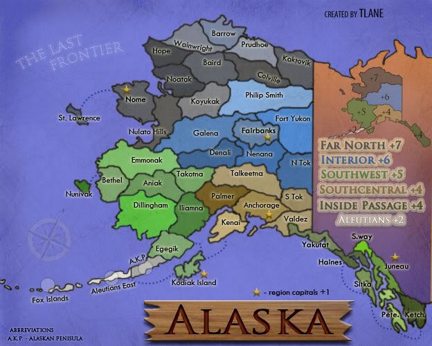
here is v4
changed:
-layout
-attack routes
-colors(tell me if you dont like)
-new continent name text
-added: abbreviations
-changed minimap a little
and some more little changes
working on:
-mountains and rivers
-gameplay (need suggestions)
-other suggestions
hope people like
tlane
color ideas thanks to .44
- Click image to enlarge.
changed:
-layout
-attack routes
-colors(tell me if you dont like)
-new continent name text
-added: abbreviations
-changed minimap a little
and some more little changes
working on:
-mountains and rivers
-gameplay (need suggestions)
-other suggestions
hope people like
tlane
color ideas thanks to .44
Last edited by tlane on Mon Apr 20, 2009 6:45 pm, edited 1 time in total.
-
tlane
- Posts: 309
- Joined: Wed Oct 22, 2008 7:11 pm
- Location: NYC - sint maarten(sometimes)


Re: Alaska v4 - new colors and layout
![]() by sailorseal on Mon Apr 20, 2009 5:46 pm
by sailorseal on Mon Apr 20, 2009 5:46 pm
I for see problems with the inside passage and coordinates
-
sailorseal
- Posts: 2735
- Joined: Sun May 25, 2008 1:49 pm
- Location: conquerclub.com


Re: Alaska v4 - new colors and layout
![]() by the.killing.44 on Mon Apr 20, 2009 6:36 pm
by the.killing.44 on Mon Apr 20, 2009 6:36 pm
Nice colors! Oh wait … (damn I'm modest  ).
).
Yes, the colors are better for separation. But here's an idea: make it so the borders between territories have glows on the respective sides with their respective colors.
Other small things about graphics, because this isn't the gameplay you'll be going for I see (re: your impassables comment):
Let's get some impassable borders for GP!
.44
Yes, the colors are better for separation. But here's an idea: make it so the borders between territories have glows on the respective sides with their respective colors.
Other small things about graphics, because this isn't the gameplay you'll be going for I see (re: your impassables comment):
- The stroke in the legend is way too heavy and wide.
- I suggest you add a glow or light stroke around the numbers on the minimap (I just noticed Aleutians +2), and maybe a glow around the minimap itself.
- Speaking of separation, drop shadow would look nice on the map as a whole.
- Aleutians East connects to Fox Islands?
- to clear up the connection between Kodiak I. and Aleutians E., I suggest you move A.E. above the tert name and have the connection extend further down.
- Will you do my connection drop shadow idea?
- "region capitals +1" seems to be in the middle of nowhere…
- the compass doesn't suit the map at all.
- You can shave off ~8px from the top

Let's get some impassable borders for GP!
.44
-

the.killing.44
- Posts: 4724
- Joined: Thu Oct 23, 2008 7:43 pm
- Location: now tell me what got two gums and knows how to spit rhymes


Re: Alaska v4 - new colors and layout
![]() by thenobodies80 on Mon Apr 20, 2009 7:14 pm
by thenobodies80 on Mon Apr 20, 2009 7:14 pm
Colors are better, i don't think because you wanna use two green.... 
The two greens cause some problems:
1.similar on the main map
2.colors are different in the zone names but very similar on small map.
I'm with .44 about "region capitals +1" placement. And you mean +1 for any or for all capitals?
But i want to focus on current bonuses.
inside passage +4 6 terr + 1 bord + 1 cont. Seems very simple to hold, and you have to add the capital bonus for a +5 total, very high
  i think +2 (+3 with the capital)
Aleutians are easy +1/+2 3 terr + 1 bord + 1 cont. i'm agree with +2
South Central is good +4 (+1 with the capital)
Southwest is +4 (+1 with the capital ) , this zone has the aleutians exclusive
Far North is big to hold but if i use all my armies to take philip smith i can defend this zone with only three active borders, and emmona, galena and philip smith are a good defensive line ( i think). With 7+1=8 armies the expansion could be too easy....so i suggest you to set this zone to +5 (+1 for the capital)
Interior for me is a +5 (+1 for capital), this zone is sorrounded by many other different zones.
Obviously if the capitall bonus is given if you hold all the capitals the value could be different.
And the capital bonus is an autodeploy or not?
This map is growing!
TNBD
The two greens cause some problems:
1.similar on the main map
2.colors are different in the zone names but very similar on small map.
I'm with .44 about "region capitals +1" placement. And you mean +1 for any or for all capitals?
But i want to focus on current bonuses.
inside passage +4
Aleutians are easy +1/+2 3 terr + 1 bord + 1 cont. i'm agree with +2
South Central is good +4 (+1 with the capital)
Southwest is +4 (+1 with the capital ) , this zone has the aleutians exclusive
Far North is big to hold but if i use all my armies to take philip smith i can defend this zone with only three active borders, and emmona, galena and philip smith are a good defensive line ( i think). With 7+1=8 armies the expansion could be too easy....so i suggest you to set this zone to +5 (+1 for the capital)
Interior for me is a +5 (+1 for capital), this zone is sorrounded by many other different zones.
Obviously if the capitall bonus is given if you hold all the capitals the value could be different.
And the capital bonus is an autodeploy or not?
This map is growing!
TNBD
-

thenobodies80
- Posts: 5400
- Joined: Wed Sep 05, 2007 4:30 am
- Location: Milan


Re: Alaska v4 - new colors and layout
![]() by wcaclimbing on Mon Apr 20, 2009 7:36 pm
by wcaclimbing on Mon Apr 20, 2009 7:36 pm
Nice map! I really like what you've done with it so far.
One thing, though. I'm not a big fan of the orange on the orange-purple gradient you've got there. The orange doesn't really seem to fit in with the rest of the map.
Have you tried changing the orange out for a dark blue? So it would be a blue-purple gradient. I think that may look better.
Other than that, I don't have any graphics complaints. Its looking good to me.

-

wcaclimbing
- Posts: 5598
- Joined: Fri May 12, 2006 10:09 pm
- Location: In your quantum box....Maybe.


Re: Alaska v4 - new colors and layout
![]() by Danyael on Mon Apr 20, 2009 10:27 pm
by Danyael on Mon Apr 20, 2009 10:27 pm
thenobodies80 wrote:Colors are better, i don't think because you wanna use two green....
The two greens cause some problems:
1.similar on the main map
2.colors are different in the zone names but very similar on small map.
yes those are very had to distinguish
both souths and inside passage hold what looks to me as the same colours if you don't want to change them at least define different border like the.killing.44 said
the main colours you need to worry about being to close is reds and greens and browns(for majority of colour blind people)
and blues purples and pinks for the few others
looking good otherwise
-

Danyael
- Posts: 352
- Joined: Fri Jul 04, 2008 4:26 pm
- Location: Winnipeg, Manitoba
Re: Alaska v4.1
![]() by tlane on Fri Apr 24, 2009 5:06 pm
by tlane on Fri Apr 24, 2009 5:06 pm
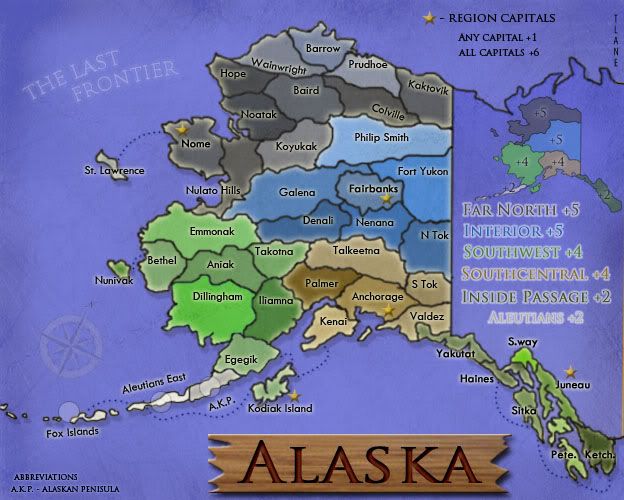
Here is v4.1
Changes:
Added glow
moved region capitals/changed
outline on bonuses
gradient
bonus amounts
more little changes
Working on:
impossibles, gameplay
green colors, ideas?
I put this new version up to see if people like the new glow and other graphics changes, I am not sure of them myself.
I have made almost all the changes except the greens, I wasn't sure if I should still change it because of the new glow, which may make it clearer.
I am currently working hard on the impossibles, which will be up on the next version.
Thanks for the comments from the new Foundry Assistants, congratulations again!
tlane
- Click image to enlarge.
Changes:
Added glow
moved region capitals/changed
outline on bonuses
gradient
bonus amounts
more little changes
Working on:
impossibles, gameplay
green colors, ideas?
I put this new version up to see if people like the new glow and other graphics changes, I am not sure of them myself.
I have made almost all the changes except the greens, I wasn't sure if I should still change it because of the new glow, which may make it clearer.
I am currently working hard on the impossibles, which will be up on the next version.
Thanks for the comments from the new Foundry Assistants, congratulations again!
tlane
-
tlane
- Posts: 309
- Joined: Wed Oct 22, 2008 7:11 pm
- Location: NYC - sint maarten(sometimes)
Re: Alaska v4.1
![]() by ustus on Mon Apr 27, 2009 12:52 am
by ustus on Mon Apr 27, 2009 12:52 am
I don't know if it's just me, but the brightness on the region names (esp. Aleutians) makes them quite difficult to read. Perhaps reduce the outer glow you have on them? (pardon if i guessed the wrong effect..)
For some reason i want to suggest swapping the position of the title and "the last frontier" but I'm not sure how that would look - If i were making it I'd try it out, just to see if it works, for some reason i want the title at the top... again, I'm not sure why I'm thinking that. Maybe it's because I'm postponing a philosophy paper that i should be writing and that's fogging my mind........
For some reason i want to suggest swapping the position of the title and "the last frontier" but I'm not sure how that would look - If i were making it I'd try it out, just to see if it works, for some reason i want the title at the top... again, I'm not sure why I'm thinking that. Maybe it's because I'm postponing a philosophy paper that i should be writing and that's fogging my mind........
-

ustus
- Posts: 291
- Joined: Thu Nov 20, 2008 3:49 pm

Re: Alaska v4.1
![]() by tlane on Mon Apr 27, 2009 6:27 am
by tlane on Mon Apr 27, 2009 6:27 am
ustus wrote:I don't know if it's just me, but the brightness on the region names (esp. Aleutians) makes them quite difficult to read. Perhaps reduce the outer glow you have on them? (pardon if i guessed the wrong effect..)
no, you guessed the right effect, i will work on it
For some reason i want to suggest swapping the position of the title and "the last frontier" but I'm not sure how that would look - If i were making it I'd try it out, just to see if it works, for some reason i want the title at the top...
i will experiment with it, and see what happens, but currently i have it on the bottom so it could be bigger
again, I'm not sure why I'm thinking that. Maybe it's because I'm postponing a philosophy paper that i should be writing and that's fogging my mind........
good luck on the paper
tlane
-
tlane
- Posts: 309
- Joined: Wed Oct 22, 2008 7:11 pm
- Location: NYC - sint maarten(sometimes)
Re: Alaska v4.1
![]() by Samuraipizzaguy on Mon Apr 27, 2009 10:21 pm
by Samuraipizzaguy on Mon Apr 27, 2009 10:21 pm
do you think you could add oil territories in there or is this a different era?
-
Samuraipizzaguy
- Posts: 32
- Joined: Wed Apr 22, 2009 10:35 pm
Re: Alaska v4.1
![]() by tlane on Tue Apr 28, 2009 4:10 pm
by tlane on Tue Apr 28, 2009 4:10 pm
Samuraipizzaguy wrote:do you think you could add oil territories in there or is this a different era?
I haven't thought much about what era the map is in, but I have thought about the oil idea and played around with it. I will think about it more, but currently I don't think I am going to do it.
Any more comments on this?
NEW UPDATE COMING IN A LITTLE BIT.
tlane
-
tlane
- Posts: 309
- Joined: Wed Oct 22, 2008 7:11 pm
- Location: NYC - sint maarten(sometimes)
Re: Alaska v5
![]() by tlane on Tue Apr 28, 2009 6:07 pm
by tlane on Tue Apr 28, 2009 6:07 pm
Changed:
-glow around bonus names
-added mountains and river
-took out compass
and some more little changes
Working on:
-mountains and rivers, graphically
-glow around bonus names
i tried to give the mountains a snowy feel, but it didn't really work like i thought, so I am working on it
tlane
-glow around bonus names
-added mountains and river
-took out compass
and some more little changes
Working on:
-mountains and rivers, graphically
-glow around bonus names
i tried to give the mountains a snowy feel, but it didn't really work like i thought, so I am working on it
tlane
-
tlane
- Posts: 309
- Joined: Wed Oct 22, 2008 7:11 pm
- Location: NYC - sint maarten(sometimes)
Re: Alaska v5
![]() by the.killing.44 on Tue Apr 28, 2009 7:54 pm
by the.killing.44 on Tue Apr 28, 2009 7:54 pm
Both mountains and river don't look very good. For mountains, I think you should take a look at pep's Germany REVAMP, which could give you some snowy mountain-top ideas.
.44
.44
-
the.killing.44
- Posts: 4724
- Joined: Thu Oct 23, 2008 7:43 pm
- Location: now tell me what got two gums and knows how to spit rhymes
Re: Alaska v5
![]() by thenobodies80 on Wed Apr 29, 2009 3:22 pm
by thenobodies80 on Wed Apr 29, 2009 3:22 pm
I'm agree with .44 about rivers and mountains. Actually the mountains are very off-hand and the river seems sticked on the map.
Anyway, i like the idea to add some impassable borders...
I used this map to compare your alaska.
http://img117.imageshack.us/img117/7593/mappacartinaalaska.jpg
About mountains, i suppose that you've drawn the alaska range with the Mount McKinley, good choice
Why not add the brooks range in the northern part?
I like to see the Yukon river, it'll give to you some good impassable to use.
Now the colors of the bonus names are good.
On the whole, actually your map seems to be very blue...too blue! you changed the gradient, but i cant' see the purple-dark blue as wcaclimbing suggested to you.Try it!
Finally try to use a yellow to change the double green, similar to the one you used in an old version on the aleutians zone. If this one doesn't fit very well, try another... Come on! try!try!and try again....there are so many colors, you'll find the right one
Good work!
TNBDS
-
thenobodies80
- Posts: 5400
- Joined: Wed Sep 05, 2007 4:30 am
- Location: Milan
Re: Alaska v5
![]() by LED ZEPPELINER on Thu Apr 30, 2009 6:58 pm
by LED ZEPPELINER on Thu Apr 30, 2009 6:58 pm
i would either choose to have all territories have army circles, or none of them. In my opinion, it is good to keep things consistent. I undertand why you put them there, but maybe on those skinny territories you can just put the 88 on the water (if possible).
sailorseal wrote:My big boy banana was out the whole time
AndyDufresne wrote:Forever linked at the hip's-banana! (That sounds strange, don't quote me.)AndyDufresne wrote:Many Happy Bananas to everyone, lets party...with Bananas.
--Andy
-
LED ZEPPELINER
- Posts: 1088
- Joined: Tue Nov 25, 2008 10:09 pm
Re: Alaska v5
![]() by tlane on Fri May 01, 2009 5:52 pm
by tlane on Fri May 01, 2009 5:52 pm
thenobodies80 wrote:I'm agree with .44 about rivers and mountains. Actually the mountains are very off-hand and the river seems sticked on the map.working on this, but not sure exactly how much they will look like the Germany revamp map
Anyway, i like the idea to add some impassable borders...
I used this map to compare your alaska.
http://img117.imageshack.us/img117/7593/mappacartinaalaska.jpg
About mountains, i suppose that you've drawn the alaska range with the Mount McKinley, good choice
Why not add the brooks range in the northern part?
I like to see the Yukon river, it'll give to you some good impassable to use.
will do both Yukon river and Brooks range,
Now the colors of the bonus names are good.
On the whole, actually your map seems to be very blue...too blue! you changed the gradient, but i cant' see the purple-dark blue as wcaclimbing suggested to you.Try it! done
Finally try to use a yellow to change the double green, similar to the one you used in an old version on the aleutians zone. If this one doesn't fit very well, try another... Come on! try!try!and try again....there are so many colors, you'll find the right one
Good work!
thanks!
TNBDS
LED ZEPPELINER wrote:i would either choose to have all territories have army circles, or none of them. In my opinion, it is good to keep things consistent. I undertand why you put them there, but maybe on those skinny territories you can just put the 88 on the water (if possible).i will try it and see if it works/if it is legible
the next update may take a few more days, because i am going to be redoing some of the borders to allow the mountains to fit in.
thanks for the comments, keep 'em coming!
tlane
Last edited by tlane on Sat May 02, 2009 6:54 am, edited 1 time in total.
-
tlane
- Posts: 309
- Joined: Wed Oct 22, 2008 7:11 pm
- Location: NYC - sint maarten(sometimes)
Re: Alaska v5
![]() by oaktown on Fri May 01, 2009 7:22 pm
by oaktown on Fri May 01, 2009 7:22 pm
You've got a nice little map coming along here tlane... it's not knocking my socks off yet, but it's nice. I'd like to see you commit to either presenting the text of the territories horizontally or angled - right now it looks like you meant to make all of the text straight but you just overlooked some, because "Colville" has space to fit, for example.
A concern of mine is the size of the map. I get that you're working with the small version, and that's good - there will be no nasty surprises later. But there are going to be some pretty messy areas, especially along the inside passage. Army counts are going to be crossing borders, and possibly tripping over each over. To me this is a map that would greatly benefit from a little use of perspective. The top-down view means you have some very large regions up north, and some very small regions in the south; giving us some longitude and latitude lines and bringing the southern part of the map toward us a bit would allow you to better represent the inside passage territories without sacrificing geographical accuracy.
The image below is a start..

But I would take that look and give some arch to the latitude lines, putting the southern part of the map in the foreground.
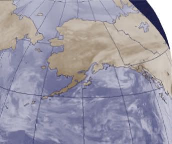
yeah, that was a terrible example, but I hope you get the idea from it. Wid's Great Lakes map is a much better example of what I mean.
Anyway, it's just a thought that might give the map a "top of the world" look to it, and solve a potential pacing problem.
A concern of mine is the size of the map. I get that you're working with the small version, and that's good - there will be no nasty surprises later. But there are going to be some pretty messy areas, especially along the inside passage. Army counts are going to be crossing borders, and possibly tripping over each over. To me this is a map that would greatly benefit from a little use of perspective. The top-down view means you have some very large regions up north, and some very small regions in the south; giving us some longitude and latitude lines and bringing the southern part of the map toward us a bit would allow you to better represent the inside passage territories without sacrificing geographical accuracy.
The image below is a start..
But I would take that look and give some arch to the latitude lines, putting the southern part of the map in the foreground.
yeah, that was a terrible example, but I hope you get the idea from it. Wid's Great Lakes map is a much better example of what I mean.
Anyway, it's just a thought that might give the map a "top of the world" look to it, and solve a potential pacing problem.
-

oaktown
- Posts: 4451
- Joined: Sun Dec 03, 2006 9:24 pm
- Location: majorcommand


Re: Alaska v5
![]() by mibi on Sun May 03, 2009 11:01 pm
by mibi on Sun May 03, 2009 11:01 pm
This map is pretty cool and I like the idea of an alaskan map. But this image has a 'small tone' to it, which is not something I get from Alaska's vastness and largeness. I'll just leave it at that.
-

mibi
- Posts: 3350
- Joined: Thu Mar 01, 2007 8:19 pm
- Location: The Great State of Vermont

Re: Alaska v5
![]() by tlane on Mon May 04, 2009 3:33 pm
by tlane on Mon May 04, 2009 3:33 pm
Thanks for the comment oak, i am going to experiment and see how it works.
I think this might be fixed when with oak's comment, maybe you had something else in mind.
tlane
mibi wrote:This map is pretty cool and I like the idea of an alaskan map. But this image has a 'small tone' to it, which is not something I get from Alaska's vastness and largeness. I'll just leave it at that.
I think this might be fixed when with oak's comment, maybe you had something else in mind.
tlane
-
tlane
- Posts: 309
- Joined: Wed Oct 22, 2008 7:11 pm
- Location: NYC - sint maarten(sometimes)
Re: Alaska v5
![]() by rjz115dude on Wed May 06, 2009 7:00 am
by rjz115dude on Wed May 06, 2009 7:00 am
This map is really nice to look at, but the mountains at the bottom center of the map look bad compared to the rest of the map. Please change it
- 115
- 115
-
rjz115dude
- Posts: 52
- Joined: Sun Dec 07, 2008 7:10 pm
Re: Alaska v5
![]() by whitestazn88 on Wed May 06, 2009 3:52 pm
by whitestazn88 on Wed May 06, 2009 3:52 pm
for some reason, i am very bothered by the fact that the various territories in any given "continent" bonus group are not uniform in color...
-
whitestazn88
- Posts: 3128
- Joined: Mon Feb 05, 2007 2:59 pm
- Location: behind you


Re: Alaska v5
![]() by LED ZEPPELINER on Wed May 06, 2009 4:14 pm
by LED ZEPPELINER on Wed May 06, 2009 4:14 pm
whitestazn88 wrote:for some reason, i am very bothered by the fact that the various territories in any given "continent" bonus group are not uniform in color...
i have been telling him he should make them all the same, but he doesn't. i agree with you whitestazn
sailorseal wrote:My big boy banana was out the whole time
AndyDufresne wrote:Forever linked at the hip's-banana! (That sounds strange, don't quote me.)AndyDufresne wrote:Many Happy Bananas to everyone, lets party...with Bananas.
--Andy
-
LED ZEPPELINER
- Posts: 1088
- Joined: Tue Nov 25, 2008 10:09 pm
Re: Alaska v5
![]() by tlane on Wed May 06, 2009 6:39 pm
by tlane on Wed May 06, 2009 6:39 pm
LED ZEPPELINER wrote:whitestazn88 wrote:for some reason, i am very bothered by the fact that the various territories in any given "continent" bonus group are not uniform in color...
i have been telling him he should make them all the same, but he doesn't. i agree with you whitestazn
i will put it to a vote
tlane
-
tlane
- Posts: 309
- Joined: Wed Oct 22, 2008 7:11 pm
- Location: NYC - sint maarten(sometimes)
88 posts
• Page 3 of 4 • 1, 2, 3, 4
Who is online
Users browsing this forum: No registered users
|
|||||||
| Conquer Club is not associated with RISK online in any way. Copyright © 2006-2024 by Big Wham LLC | |||||||