Page 5 of 9
Re: War of the Triple Alliance; updates pg. 7

Posted:
Mon Aug 04, 2008 2:36 pmby oaktown
ZeakCytho wrote:I like the suns/stars, but they look bigger than necessary. I think you could fit 88s in smaller versions of them?
probably... I'll play with it. trouble is keeping the basic inner circle the same size - the rays are just decorative, and don't help army count readability any.
Re: War of the Triple Alliance; updates pg. 7

Posted:
Mon Aug 04, 2008 6:55 pmby whitestazn88
i think the suns and stars look cool, but a little large
Re: War of the Triple Alliance; update pg. 6

Posted:
Mon Aug 04, 2008 7:41 pmby iancanton
oaktown wrote:Mato Grosso does make better sense now, and i hope is a more appropriate +5.
u have +6 on the map itself, so did u want it to be +5 or +6? the spreadsheet i used continues to give +5 but, now that the territories have been reorganised, there's not a lot wrong with +6 either, although mato grosso is smaller than argentina. either way, it's time for this.

ian.

Re: War of the Triple Alliance; updates pg. 7

Posted:
Mon Aug 04, 2008 9:49 pmby oaktown
weird seeing somebody else stamp a map for gameplay.

Thanks for the time you've put into this, ian. I'll revisit the mato grosso bonus - I honestly don't remember what I thought it should be.
Re: War of the Triple Alliance; updates pg. 7 [D, Gp]

Posted:
Mon Aug 04, 2008 10:07 pmby whitestazn88
is ian one of those stamp lickers?
Re: War of the Triple Alliance; updates pg. 7 [D, Gp]

Posted:
Mon Aug 04, 2008 11:13 pmby oaktown
whitestazn88 wrote:is ian one of those stamp lickers?
yep - somebody has to stamp my maps!
Re: War of the Triple Alliance; updates pg. 7 [D, Gp]

Posted:
Tue Aug 05, 2008 11:02 amby whitestazn88
it would take less red tape if you could just stamp your own though...
Re: War of the Triple Alliance; updates pg. 7 [D, Gp]

Posted:
Tue Aug 05, 2008 7:55 pmby oaktown
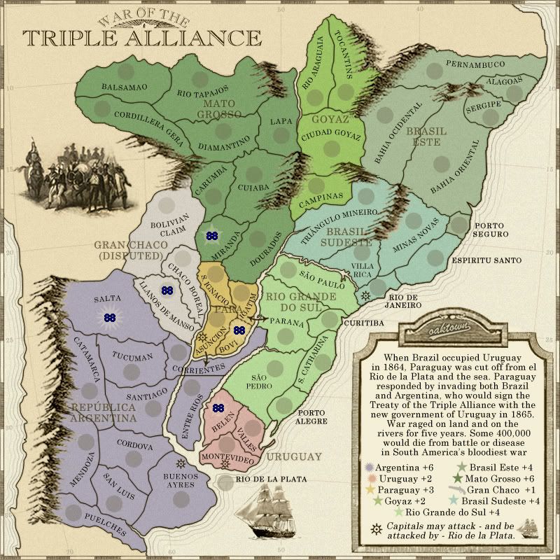
- Click image to enlarge.

I would like feedback on two aspects of this map:
1. the colors. I've gone back to shades of green, and while these greens look nice to my eyes (and seem more or less distinct from each other) I'd like more feedback from those of you who see colors in a more conventional way.
2. the army suns/stars. There are a two examples, with army 88s, each of army suns and army stars. Gran Chaco would remain circles, since that territory does not fall under a flag.
Re: War of the Triple Alliance; updates pg. 7 [D, Gp]

Posted:
Tue Aug 05, 2008 8:06 pmby ZeakCytho
The color of Brazil Este looks a bit weird to me - make it a bit darker? It seems paler than the other colors on the map.
The army star is great. The army sun...not so much. It still feels too large, even though center is just about as small as it will get. Maybe decrease the length of each of the arms? But they're already pretty short...
Re: War of the Triple Alliance; updates pg. 7 [D, Gp]

Posted:
Tue Aug 05, 2008 9:20 pmby whitestazn88
you have 4 shades of green on this map, which isn't too bad because they are easy to differentiate, and they are very brazil-y with the whole forest thing going on
plus the whole map is kinda parchamenty... so it's not bad to me. in fact, if there was a color i'd change, it would be the purple to something else
Re: War of the Triple Alliance; updates pg. 7 [D, Gp]

Posted:
Wed Aug 06, 2008 2:44 amby pamoa
Colors:
From begining I thought shade of green for Brazil were the best option.
I do not really agree with ZeakCytho about Brasil Este, it's fine for me.
But in Brasil Sudeste their is a bit of blue in it which is disturbing because it's a color between Brasil green shades and Argentina blue shades.
You have 3 options, you can change Argentina main color from blue to an other one but it would be a pitty as Argentina color is pale blue.
You can switch Brasil Sudeste and Brasil Este colors so the "problematic" color would be at the opposite of the map.
Or simply try to remove the blue in this color but it could be tricky with the other greens.
I also agree with whitestazn88 about Uruguay color, it could be a bit more bright as Paraguay is.
Army sun and stars:
I totally agree with ZeakCytho.
You kept the circle under the star so you get longer branches without having a too big symbol, try the same way for the sun.
However, pay attention, try to put them all over the map.
You could have a saturation of decorative effect, it could be too much.
Suggestion:
think about reusing the old book effect you put in Brazil revamp  in this one as it seems you are not going to win it.
Re: War of the Triple Alliance; updates pg. 7 [D, Gp]

Posted:
Wed Aug 06, 2008 9:37 pmby AndyDufresne
Hm, I actually like the sun army shadow, but I can see it would be problematic in some of smaller areas. The star army shadow is dandy though too!
I give the colors a thumbs up. I'd only consider altering Argentina's color slightly, but I'm not even sure really what I'd do with it. Most of the colors feel like they fit for the map, which is key.
The legend still looks a little oddly "realistic" compared to say how the mountains and the iconography look.
Lastly, have you noticed the overlapping "War OF..." and the "60"? Would you consider nudging the title down a half step, and maybe even ever so slightly decreasing the size of the Longitude degrees.
--Andy
Re: War of the Triple Alliance; updates pg. 7 [D, Gp]

Posted:
Wed Aug 06, 2008 9:41 pmby edbeard
the star looks weird because it's a mix of a circle and a star. I'd say it should just be a star.
It's hard to say which is good because the whole map looks weird with suns, stars, and circles all about. painful to put all of them on but I can tell which looks better if it's everywhere. sometimes it just doesn't look right in one place or it only looks decent in one place but great everywhere else.
I think the lighter colour is better than the darker circles, though.
Re: War of the Triple Alliance; updates pg. 7 [D, Gp]

Posted:
Thu Aug 07, 2008 11:07 amby gimil
The general graphics you have oaky are nice, clean, crisp, consistant etc. (the usual jargan compliments) but I really dont like the continent colours you have used they don't work so well together in my opinion. Would you be happy to play around wtih them for a bit and find something a little more fitting? Maybe its just me that has this view, I dont know.
On another note the ship image, could you move in south and east a little? make it feel a little more centered in that little patch of water.
Re: War of the Triple Alliance; updates pg. 7 [D, Gp]

Posted:
Thu Aug 07, 2008 12:18 pmby oaktown
ZeakCytho wrote:The color of Brazil Este looks a bit weird to me - make it a bit darker? It seems paler than the other colors on the map.
Pamoa wrote:I do not really agree with ZeakCytho about Brasil Este, it's fine for me.
But in Brasil Sudeste their is a bit of blue in it which is disturbing because it's a color between Brasil green shades and Argentina blue shades.
whitestazn88 wrote:you have 4 shades of green on this map, which isn't too bad because they are easy to differentiate
gimil wrote:I really dont like the continent colours you have used they don't work so well together in my opinion. Would you be happy to play around wtih them for a bit and find something a little more fitting? Maybe its just me that has this view, I dont know.
andy wrote:I give the colors a thumbs up. I'd only consider altering Argentina's color slightly, but I'm not even sure really what I'd do with it. Most of the colors feel like they fit for the map, which is key.
does... not... compute............. hippo... about... to explode...
overload...
overload...
Re: War of the Triple Alliance; updates pg. 7 [D, Gp]

Posted:
Thu Aug 07, 2008 11:39 pmby AndyDufresne
Hey you wanted feedback, be happy with what you've got.

--Andy
Re: War of the Triple Alliance; updates pg. 7 [D, Gp]

Posted:
Sat Aug 16, 2008 11:37 amby Lynx Cat
Hello there, great job on the map! I'll grace it with my first post ever in Conquer Club. I don't know if there are any other Portuguese-speakers in this thread, so I'll go ahead and chime in about place names.
-"Balsamao" looks wrong, but I don't know what it is so I'll have to look it up
-"Cordilheira Geral", not "Cordillera Gera" (we don't speak Spanish!)
-"Corumbá" not "Carumbá"
-"Cuiabá" (accent)
-"Cidade de Goyaz" not "Ciudad" (again, no Spanish!)
-"Espirito Santo" not "Espiritu" (idem)
-"Paraná" (accent)
Also, it seems like you're going for old-style names. That's all good, though it could entail some changes. I'm pretty sure "Triangulo" (as in Triângulo Mineiro) loses its accent in old-timey spelling. And "Porto Allegre" might actually be a valid old-style spelling, would have to check on that though. Otherwise, if you're using modern spelling, there are a few accents missing (like in Tapajós) and some names are slightly different (Goiás and S. Catarina). Also, I'm not sure about the word "Este"... it's certainly not modern Portuguese, but it sounds like it could actually be correct 1800's Portuguese. I'd have to check that too. As a final naming suggestion, "Rio Grande do Sul" is (even historically) only about the lower third of the continent you've given that name to... "Brasil Sul" sounds much more natural, since the continent is almost identical to the real region of the same name.
Other than that, I'm almost afraid of losing my way among all the shades of green - to me, using different shades of the same color for continents in the same country doesn't sound so good when there are so many continents involved. But there's plenty of discussion about that already, and anyway, it doesn't look game-killing to me. In all other aspects, I like this map very much, can't wait to play it...
Re: War of the Triple Alliance; updates pg. 7 [D, Gp]

Posted:
Sat Aug 16, 2008 11:43 pmby Blitzaholic
looks good to me
Re: War of the Triple Alliance; updates pg. 7 [D, Gp]

Posted:
Wed Aug 20, 2008 10:25 pmby oaktown
Lynx Cat wrote:Hello there, great job on the map! I'll grace it with my first post ever in Conquer Club. I don't know if there are any other Portuguese-speakers in this thread, so I'll go ahead and chime in about place names.
-"Balsamao" looks wrong, but I don't know what it is so I'll have to look it up
-"Cordilheira Geral", not "Cordillera Gera" (we don't speak Spanish!)
-"Corumbá" not "Carumbá"
-"Cuiabá" (accent)
-"Cidade de Goyaz" not "Ciudad" (again, no Spanish!)
-"Espirito Santo" not "Espiritu" (idem)
-"Paraná" (accent)
Hi Lynx Cat,thanks for stopping by and checking out the map. I've been pulling all of the names from 1850s-1860s maps of the region, as made by English-speaking cartographers. I am NOT trying to use Portuguese or Spanish names for locales, but rather 19th century English derivations of those names. Names rarely translate correctly due to language differences and historical usages - Deutschland becomes Germany in English and Alemania in Spanish and Alemanha in Portuguese.
That said, I'll go back and check my sources - since I have used multiple old maps at different stages of production, I may have mixed and matched a bit.
Re: War of the Triple Alliance; updates pg. 7 [D, Gp]

Posted:
Fri Aug 22, 2008 4:56 amby Lynx Cat
Oh, OK. If that's what you meant to do, that's another thing. And you know what, it might even make the map more "legitimate", as some people say Britain was actually the "manipulator" that made this war happen behind the scenes... so, good work!
Re: War of the Triple Alliance; updates pg. 7 [D, Gp]

Posted:
Sun Aug 24, 2008 5:53 pmby oaktown
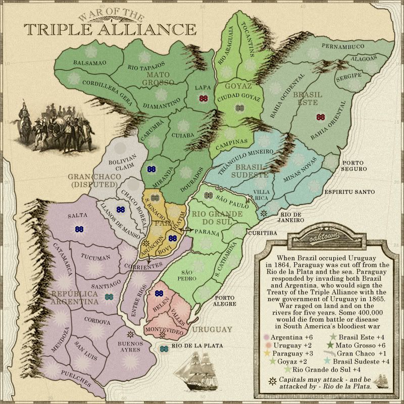
- Click image to enlarge.

minor update... since there's no consensus on what to do with the colors, I've left it more or less as it was. Argentina is a bit more purple, hopefully to help distinguish it from the blue-green of sudeste. And I meant to make the grunge overlay is a bit darker, but it seems to fade when converted to jpeg.
I wasn't liking the suns and stars, but after walking away from this for two weeks I think I'm OK with them so long as they are subtle. The stars may get lost a bit behind the army counts but that's fine - I just don't want them to be distracting. The suns are a bit large, but I think they'll do. The small map will be a challenge - maybe just plain circles in the small version.
Re: War of the Triple Alliance; update pg. 9 [D, Gp]

Posted:
Sun Aug 24, 2008 6:01 pmby ZeakCytho
The ship at the bottom looks almost too realistic. Could you make it a bit grungier, like the soldiers in the top left?
Re: War of the Triple Alliance; update pg. 9 [D, Gp]

Posted:
Mon Aug 25, 2008 6:58 amby gimil
I think I would be happy to see the stars all round for the army circles. There are simply prettier in my humble opinion.
The continent colours arn't as bad as I thought so I could probably live with them. Since there seems to be a 50/50 split with opinion on the continent colours I suppose that leaves you with the final say oaky boy!
Im not to happy with the layout of para its a little cramped and confusing. Im sure its nothing a rearrangement can't fix.
Last but not least Corrientes doesn't have an army circle.
Re: War of the Triple Alliance; update pg. 9 [D, Gp]

Posted:
Mon Aug 25, 2008 12:47 pmby ZeakCytho
gimil wrote:Last but not least Corrientes doesn't have an army circle.
Yes it does; it's on the left half of the territory, right above the C in Corrientes.
Re: War of the Triple Alliance; updates pg. 7 [D, Gp]

Posted:
Tue Aug 26, 2008 5:48 amby yeti_c
oaktown wrote:I wasn't liking the suns and stars, but after walking away from this for two weeks I think I'm OK with them so long as they are subtle. The stars may get lost a bit behind the army counts but that's fine - I just don't want them to be distracting. The suns are a bit large, but I think they'll do. The small map will be a challenge - maybe just plain circles in the small version.
Oak - I can't see the correlation between what the suns and stars represent?!
At first I thought it was
Stars = Brazil
Suns = Argentina
But then Uruaguay has suns - and paraguay has stars.
Confused!
C.


