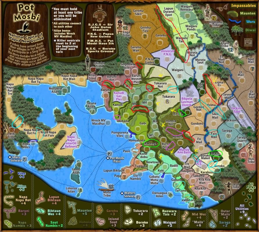
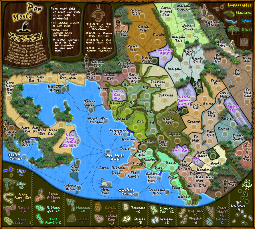
RedBaron0 wrote:Alright cairns, lets hash out these graphics,..
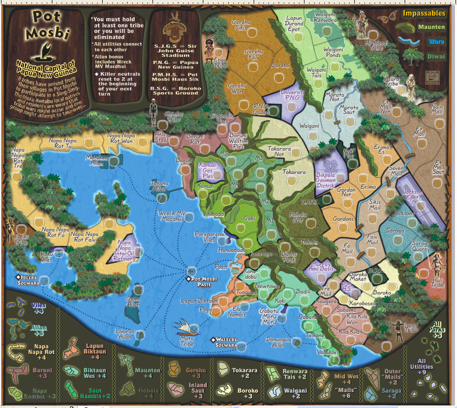
Good
you're really gonna need to put some more work into this. There is a ton of awful looking stuff here.
i realise this needs more work, but i didn't think it was that awful

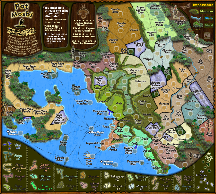
I had already started on changing colours since i am not happy with the colour scheme yet.
The mountains aren't constant with their light source you got lighter sides where it should be dark and dark sides where it should be light.
Oh! the light source is from the ESE.
So with that knowledge please advise where you think the changes should be made.
There is a line on some of the tops that should be some sort of ridge?
Please advise on this also, and how do you know that that area you're looking at should be some sort of ridge?
Before i comment on these below, the map is exported to .jpg not .png so there is going to be some issues with a bit of bluriness.
Also, the minimum line thickness in this maps' software is 1 px. There are no decimals.
The tribe markers are a mix of decent to just terrible...
Some are reasonable .pngs, some others i have to re-draw.
Motu is just blurry
Yes, i plaved this in a bitmap rather than as a vector group...here is the original size...and it is reduced down to map size...fixed next version

... and the Asaro one looks like a stormtrooper from Star Wars. Maybe its the glow, too bright/too wide/too yellow
OK, here is the Asaro natives (your version of storm troopers - perhaps that's where Lucas got the idea from

)
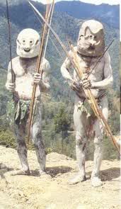
and this is my take on it...(40x120px) and reduced down to fit on the map

..yes there is a yellow glow which i will look at reducing

all tribes glow has been reduced from 5px to 2 px.
You should add more different jungle trees to break up the monotony of the rest, its just the same background tree copied over and over in nice neat straight lines.
That is an easy fix, time consuming but easy
The thinner territories borders are too thin, they are pixely and jagged especially noticeable on lighter regions such as Napa Napa.
You've mentioned Napa Napa, but what the others do you think need fixing?
- the inner borders are 1px #333333 soft line 100% edge
- between regions borders are 3 px #333333 soft rounded 50% edge
Why is the river water darker than the ocean?
Is there are rule that says rivers can't be darked than the ocean? I am simply curious
Some territory names are getting lost, especially on the dark green of the parks.
Please clarfiy so i know which ones to correct
I don't know if the shadow around the border of the map is necessary, it at least needs to be toned down
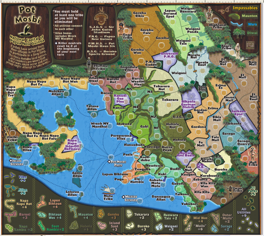
i'd like to retain it and yes maybe it needs toning down
...it really seems bothersome when in contact with the playing surface.
oh! is that a personal preference? Et Mail and Nain Mail can be moved west to avoid this border.
Thanks for the input, and i look forward to hearing those other areas you think need fixing