Page 2 of 27

PostPosted: Fri Nov 02, 2007 8:54 am
by cairnswk
yeti_c wrote:
asl80 wrote:hey cairns - version 3's looking better than the first, but why the explorer helmet inlay(thingy), maybe keep it as an open playing field?


I concur...

C.


OK guys...i'll keep it in mind...somewhere :wink:

The helmut thingy is an outline of Napoleon's Hat, and i wanted to use the outside area for bonuses and game play instructions....see what happens eh?!

PostPosted: Fri Nov 02, 2007 8:56 am
by yeti_c
Ah I see... hmmm -> perhaps blur it a bit or make it less stark then or something?!

FYI

Image

C.

PostPosted: Fri Nov 02, 2007 9:24 am
by asl80
asl80 wrote:hey cairns - version 3's looking better than the first, but why the explorer helmet inlay(thingy), maybe keep it as an open playing field?

your probably already on the way to this - but giving the map a clear wellington-napoleon oppositional gameplay would be best?

hopefully will have a feel similar to pearl harbour, which is a beautiful map.
(i.e. even if it's within territories, you could have figures with army circles beside - not too sure about the army no.s within the figures like the attempt above)


[EDIT]: P.S. - i voted for B thinking of something different - consider it changed to C, which i left alone picturing something like Gazala which i'm still a little unsure of (lines all over the place) ... pearl harbour has a greater focus on imagery and setting, as opposed to just schemata, though recreates the attack routes, and positions held, likely to have taken place. (Don't take the Gazala points to seriously though - have t go back and have a look at it {and still like it})

The point been, that it is getting the overall setting right that is most important, i.e. out on a field - assuming it was indeed so (or did they fight virtual wars back then too?), as well as making the player feel like they are holding a position, i.e. napolean, and advancing in his shoes with his army - assuming that the gameplay is organised so it is best to try and take sides so this can be recreated.

Would a possible way for making the taking of sides more likely be to have a few small bonuses at each end of the map (prob. northwestish and southeastish in this context), then some larger ones in the middle, followed by some medium ones that either side would ultimately contest for in the end to gain the upper hand in the balancing of power?

PostPosted: Fri Nov 02, 2007 3:39 pm
by cairnswk
asl80 wrote:Would a possible way for making the taking of sides more likely be to have a few small bonuses at each end of the map (prob. northwestish and southeastish in this context), then some larger ones in the middle, followed by some medium ones that either side would ultimately contest for in the end to gain the upper hand in the balancing of power?


That might be possible with the artilllery grouping used in this map.

PostPosted: Sat Nov 03, 2007 8:03 am
by cairnswk
Still Version 3

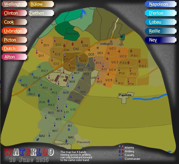
Below is still Version....just an idea of where this is heading.

Image

PostPosted: Sat Nov 03, 2007 8:12 am
by militant
i have no knowledge of waterloo, but i looked at the poll and noticed the option for different shapes for infantry and artillary. anyway is it possible to add a certain amount of armies to them territories every turn.
For example Add 3 armies to artillary
Add 1 armies to infanty

PostPosted: Sat Nov 03, 2007 1:31 pm
by cairnswk
militant wrote:i have no knowledge of waterloo, but i looked at the poll and noticed the option for different shapes for infantry and artillary. anyway is it possible to add a certain amount of armies to them territories every turn.
For example Add 3 armies to artillary
Add 1 armies to infanty


Yes i was thinking along those lines. :)

Image

PostPosted: Sat Nov 03, 2007 1:40 pm
by onbekende
EDIT: nvm, I demand my browser auto-updates a page

PostPosted: Sat Nov 03, 2007 1:46 pm
by onbekende
1 question for now: Artillary like Clinton (CA1 - CA3) can attack all of there color band or all of the next color band? And what about territories who fell in 1 sections? RC2 for example (far left).

PostPosted: Sat Nov 03, 2007 2:13 pm
by cairnswk
onbekende wrote:1 question for now: Artillary like Clinton (CA1 - CA3) can attack all of there color band or all of the next color band? And what about territories who fell in 1 sections? RC2 for example (far left).


Probably badly worded for now and needs changing...
but the idea is that artillary like CA1 can only bombard terts two sections ahead....not in their own section nor the section immediately in front, but the one after the one in front.

RC2 is Cavalry so they can't bombard....but i am thinking they might be able to attack two terts ahead as was suggested in this thread.

PostPosted: Sat Nov 03, 2007 5:39 pm
by onbekende
cairnswk wrote:
onbekende wrote:1 question for now: Artillary like Clinton (CA1 - CA3) can attack all of there color band or all of the next color band? And what about territories who fell in 1 sections? RC2 for example (far left).


Probably badly worded for now and needs changing...
but the idea is that artillary like CA1 can only bombard terts two sections ahead....not in their own section nor the section immediately in front, but the one after the one in front.

RC2 is Cavalry so they can't bombard....but i am thinking they might be able to attack two terts ahead as was suggested in this thread.
aaaaah, indeed is good idea but better wording required

and that RC2 was just an example

Version 4 Update.

PostPosted: Mon Nov 05, 2007 4:41 am
by cairnswk
Version 4 update

OK....this is pretty well the layout for this map.

Busy...yes...what else can you expect from me :shock:

But i think that this is another like Pearl Harbor - one of those important historical battles that deserves historical correctness.

Anyway...let me know what you think.

Large Version 4
Image

PostPosted: Mon Nov 05, 2007 5:32 am
by yeti_c
Cavalry stuff isn't programmable...

You can either attack or not -> you can't have the ability to attack determined by the holding of another territory!!

C.

PostPosted: Mon Nov 05, 2007 5:56 am
by cairnswk
yeti_c wrote:Cavalry stuff isn't programmable...

You can either attack or not -> you can't have the ability to attack determined by the holding of another territory!!

C.


Thanks yeti_c...i'll have to rethink that one then.

Perhaps...."Cavalry can attack two territories ahead"

PostPosted: Thu Nov 08, 2007 5:53 pm
by cairnswk
OK....i want to move ahead with this one....any suggestions/complaints/ideas for graphics or gameplay.

PostPosted: Thu Nov 08, 2007 6:07 pm
by Herakilla
i personally dont like the shape of the outline of the whole map but im sure i could grow to love it, just seems distracting to me

PostPosted: Thu Nov 08, 2007 6:11 pm
by unriggable
I agree, I don't like the whole anthill setup. Not to mention that some territories are hard to differentiate from toehrs (green on the left).

PostPosted: Thu Nov 08, 2007 7:51 pm
by cairnswk
unriggable wrote:I agree, I don't like the whole anthill setup. Not to mention that some territories are hard to differentiate from others (green on the left).


Its actually not an ant hill (although that would be an idea since it has been posted as an idea in here before LOL)

It's the outline of Napoleon's Hat. Got It! Pertinent, isn't it?...if you guys start thinking outside of your normal boxes. Start asking...what is this guy designing here. You know I don't just make a map, some of my ideas are also designs - whether people like them or not.
And ask yourselves....why would he put an ant hill in the map of a war involving Napoleon? Is it meant to be something else? Then you might just not post some semi ridi idea that it being ant hill. Common guy...surely you can do better than that...use that thing you've supposedly got in your heads called a brain.

Next one...the colours are not set yet, and yes there has to be more differentiation given to them, but thanks for the input, as this is valid toward changing the colours and of course perhaps reducing the number of terits, which is in my plans.

PostPosted: Thu Nov 08, 2007 11:21 pm
by Aerial Attack
Wow. This map is BUSY BUSY BUSY !!!

I like the idea. I love the usage of the hat for the layout.

1) didn't the French military hats of that time have a brim?

2) You transposed the e and c in directly [explanation of artillery]

3) Speaking of that explanation - I looked and Looked and LOOKED. Alas, I could only find 2 or 3 things that seemed like the MIGHT be the bands. These need to be fairly prominent and consistent in their shaping and shading.

4) Pretty much everything touches everything else - a big old free for all [Battle of Actium anyone?]. That's fine by me, just makes it harder to actually HOLD a bonus.

5) I love the flags - I think those should be used for commanders. Your artillery just seems too similar to your infantry symbol [which I like]. Maybe a stack of canon balls? As for calvary try crossed swords?

Of course, makings things bigger will only make the map seem even busier.

6) It looks like you tried or accidentally came close to matching the British terr background colors with those in the legend. Not so much for the French terr background colors.

Sorry to have such a long post.

PostPosted: Thu Nov 08, 2007 11:54 pm
by cairnswk
Aerial Attack wrote:Wow. This map is BUSY BUSY BUSY !!!

I like the idea. I love the usage of the hat for the layout.

1) didn't the French military hats of that time have a brim?

2) You transposed the e and c in directly [explanation of artillery]

3) Speaking of that explanation - I looked and Looked and LOOKED. Alas, I could only find 2 or 3 things that seemed like the MIGHT be the bands. These need to be fairly prominent and consistent in their shaping and shading.

4) Pretty much everything touches everything else - a big old free for all [Battle of Actium anyone?]. That's fine by me, just makes it harder to actually HOLD a bonus.

5) I love the flags - I think those should be used for commanders. Your artillery just seems too similar to your infantry symbol [which I like]. Maybe a stack of canon balls? As for calvary try crossed swords?

Of course, makings things bigger will only make the map seem even busier.

6) It looks like you tried or accidentally came close to matching the British terr background colors with those in the legend. Not so much for the French terr background colors.

Sorry to have such a long post.


aerial attack....it's not a long post, but very productive feedback...just what i was looking for...thank you. :)

I'll see what i can do now with all this information. sometimes the artist gets so involved they can't see the light on the hill STS.

below is his hat this was taken from....of course stretched in height ot fit the map.

Image

PostPosted: Fri Nov 09, 2007 8:18 am
by asl80
Cairns - the shape of napolean's hat in the picture above is nice, but i must say the stretched transformation seems more like a safari hat. The concept is good, but keep the shape of the original, maybe rotate it 35-40o (degres) so that the point is down on the left a little and going across the page (if some of the corners get chopped off i wouldn't say that's a problem - so long as the shape, i.e. what the image is, can be discerned - the present transformation truly is a little misleading) - ultimately, at the same time as providing the space for the field of battle, it would be really nice if it could be only so slightly discernable as a transparency {if you could get it to not interfere with the practical bits of the map}, this would also help the case for not needing to see the whole hat.

P.S. - the battle took place on a hill didn't it? - If it's at all within your sights, i'd love to see a bit of a foreground/background setting, i.e a little more three dimensional (though not necc. 3D), i think the setting of this battle certainly urges it.
My thought is, that, Wellington's troops, placed a little to the north west of the map (i.e. within the hat that run's the opposite direction as mentioned above) would be presented as the highest point in your graphical representation, moving down to Napolean's army to the south east. (it seems the diagonal/slant would be a good way of representing slope)
Ahh, if this is the case, then the landscape, of the hill, could take up your whole map, though the playing area could still reamain within the hat, which now, is more of an outline - though still inclusionary(of the playing field)/exclusionary(of the bonus info and left over land etc). Here, the landscape outside of the hat could be shadded/dimmed/whatever's appropriate. This would also give you the chance of keeping some of the original hat's graphics around the unused verges.

PostPosted: Fri Nov 09, 2007 9:27 am
by yeti_c
Cairns,

Your cav, inf & art - need to look like these pieces...

Image

What do you reckon?

C.

PostPosted: Fri Nov 09, 2007 11:07 am
by cairnswk
yeti_c....too much...i've already tried all those figurines etc...and they simply just don't fit the curent size restrictions of the small map. Sorry. :)

PostPosted: Fri Nov 09, 2007 11:11 am
by Coleman
Mind if I try to build symbols closer to those that fit? I could give you a set later of a few attempts. I just don't like that the calvary is flags. :)

The infantry and artillery are actually probably as good as possible. Couldn't you try something like a knight chess piece instead of a flag?

PostPosted: Fri Nov 09, 2007 11:25 am
by cairnswk
asl80 wrote:Cairns - the shape of napolean's hat in the picture above is nice, but i must say the stretched transformation seems more like a safari hat. The concept is good, but keep the shape of the original, maybe rotate it 35-40o (degres) so that the point is down on the left a little and going across the page (if some of the corners get chopped off i wouldn't say that's a problem - so long as the shape, i.e. what the image is, can be discerned - the present transformation truly is a little misleading) - ultimately, at the same time as providing the space for the field of battle, it would be really nice if it could be only so slightly discernable as a transparency {if you could get it to not interfere with the practical bits of the map}, this would also help the case for not needing to see the whole hat.

P.S. - the battle took place on a hill didn't it? - If it's at all within your sights, i'd love to see a bit of a foreground/background setting, i.e a little more three dimensional (though not necc. 3D), i think the setting of this battle certainly urges it.
My thought is, that, Wellington's troops, placed a little to the north west of the map (i.e. within the hat that run's the opposite direction as mentioned above) would be presented as the highest point in your graphical representation, moving down to Napolean's army to the south east. (it seems the diagonal/slant would be a good way of representing slope)
Ahh, if this is the case, then the landscape, of the hill, could take up your whole map, though the playing area could still reamain within the hat, which now, is more of an outline - though still inclusionary(of the playing field)/exclusionary(of the bonus info and left over land etc). Here, the landscape outside of the hat could be shadded/dimmed/whatever's appropriate. This would also give you the chance of keeping some of the original hat's graphics around the unused verges.


asl80...this is now the 10th time i have tried to get this map into some form of a map for CC....and it is for all intense purposes working to a degree. I also probably don't have the skill you speak of to present the things you need.

I appreciate the length you proposed above, but at this time i don't want to change it from where it is at present, its is simply too much work.
As it is now the next stage is to put it into continents that are spearated somewwhat bny fences and hedge rows.

Yes the battle did take place on a hill, but that is vey hard to convey on a 2 dimensional map, especially if you want to have all the abilities of artillery and cavalry.

The shape of Napoleon's hat is also goping to remain unchanged as this allows the map with plenty of room for the bonus information around the outside. Sorry :)