Page 3 of 11

Re: Eurasia Mini [19.2.12] p4

PostPosted: Sat Feb 25, 2012 2:25 pm
by natty dread
thenobodies80 wrote:So, to start the gameplay balancement/discussion.....what's your plan with the gameplay natty?


Hmm... plan...

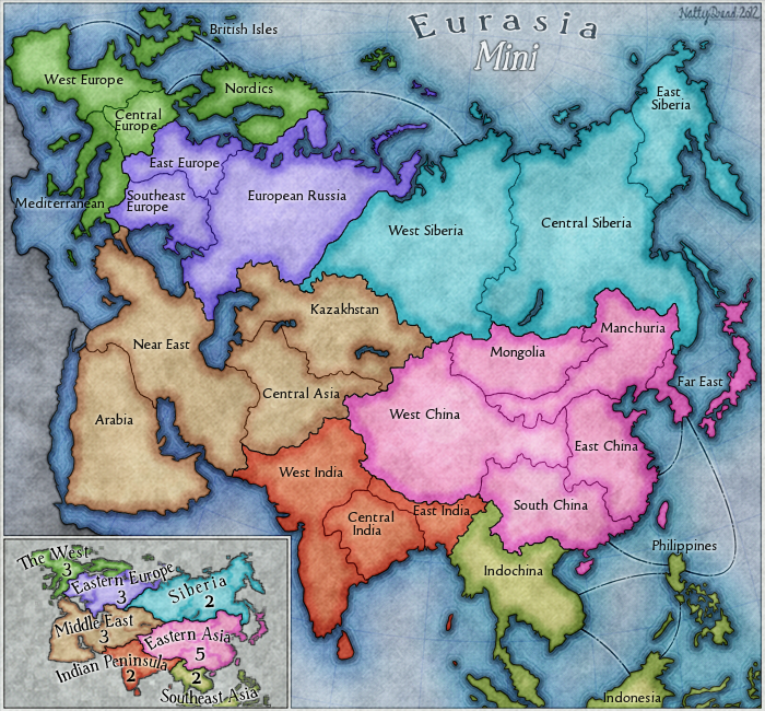
Well, firstly the gameplay would follow the gameplay of Eurasia in that each territory is a bonus area from Eurasia. So it's kind of like a reverse World 2.1 thing. I had to add territories to India & S.E. Asia since they would only be 2 territories otherwise, but other than that the gameplay scheme is accurate.

Then, I thought about adding impassables, but I kind of feel they'd be unnecessary on a map this size - although, I'm not totally married to that idea, so if it becomes necessary to add them, I'm 0k with that.

Other than that, I don't really know what else there is to do - I figure it's pretty well balanced, there are feasible bonuses to hold in all parts of the map, and it seems to work pretty well as it is to me. But then, if anyone can see any concerns about the current gameplay I'm of course willing to address them.

So, that's pretty much it, I don't really have anything more specific in mind at this point.

Re: Eurasia Mini [19.2.12] p4

PostPosted: Sat Feb 25, 2012 3:55 pm
by thenobodies80
more than about the impassable i was thinking about the 3 regions territories. I mean I love doodle earth but i really hate when someone start with africa from the start (and it's not me ;))
With a such small map, start with a bonus makes a big difference.

what about 3 starting positions with 4 components?

1-west india, indochina,european russia, central siberia
2-east india, philippines, west siberia, southeast europe
3-east europe, central india, indonesia, east siberia

Re: Eurasia Mini [19.2.12] p4

PostPosted: Sat Feb 25, 2012 5:46 pm
by natty dread
Sure, those can be coded in. I'll add them to the first post.

Re: Eurasia Mini [19.2.12] p4

PostPosted: Fri Mar 02, 2012 8:13 pm
by chapcrap
I am in favor of this map still. :)

Re: Eurasia Mini [19.2.12] p4

PostPosted: Tue Mar 06, 2012 12:53 am
by Victor Sullivan
Gameplay-ly speaking, thumbs up.

Graphically speaking, I rather preferred version 1: http://img6.imageshack.us/img6/4523/eurasiamini.png I wonder if some middle ground could be made by blending the thick inner outlines into the main land color gradient-style. Hopefully I am making sense here, ha.

-Sully

Re: Eurasia Mini [19.2.12] p4

PostPosted: Tue Mar 06, 2012 6:55 pm
by natty dread
Click image to enlarge.
image

Re: Eurasia Mini [7.3.12] p4

PostPosted: Tue Mar 06, 2012 7:42 pm
by Jdsizzleslice
I'm pressing the like button on this one. :D

Re: Eurasia Mini [7.3.12] p4

PostPosted: Wed Mar 07, 2012 6:56 am
by thenobodies80
Image

Gameplay looks good, well done. :)

Nobodies

Re: Eurasia Mini [7.3.12] p4

PostPosted: Wed Mar 07, 2012 7:14 am
by natty dread
Thanks!

So, any graphical issues I should address?

Re: Eurasia Mini [7.3.12] p4

PostPosted: Wed Mar 07, 2012 7:15 am
by crazymilkshake5
No Impassibles?

Re: Eurasia Mini [7.3.12] p4

PostPosted: Wed Mar 07, 2012 7:17 am
by natty dread
Nope.

Re: Eurasia Mini [7.3.12] p4

PostPosted: Wed Mar 07, 2012 7:20 am
by Victor Sullivan
I still think a little more blending could be done with those thick color borders. I just think it doesn't quite look right. I feel like it cheapens the look just a tad.

-Sully

Re: Eurasia Mini [7.3.12] p4

PostPosted: Wed Mar 07, 2012 7:29 am
by natty dread
Ok.

Click image to enlarge.
image

Re: Eurasia Mini [7.3.12] p5

PostPosted: Wed Mar 07, 2012 7:40 am
by Victor Sullivan
:D That's better.

-Sully

Re: Eurasia Mini [7.3.12] p5

PostPosted: Fri Mar 09, 2012 3:12 pm
by natty dread
Here's both sizes!

Click image to enlarge.
image


Click image to enlarge.
image

Re: Eurasia Mini [9.3.12] p5

PostPosted: Fri Mar 09, 2012 3:40 pm
by AndyDufresne
The mini is so---mini! It's cute like Mongol Empire small.


--Andy

Re: Eurasia Mini [9.3.12] p5

PostPosted: Fri Mar 09, 2012 8:22 pm
by RedBaron0
The word "Mini" in the title is kinda pixely, could it be the font or just the anti-aliasing? It's worse on the small map. Different font or color should fix that up.

Re: Eurasia Mini [9.3.12] p5

PostPosted: Fri Mar 09, 2012 8:45 pm
by cairnswk
natty, i don't know if it's the font or the tracking/kerning, but there are some anomolies that i think could be examined to improve...
Large...
1. b e in East Siberia
2. same in Central Siberia
3. same in West Siberia
4. ..n ch... Manchuria
5. Ea st in East chine
6. Ea st in Far East
7. Ea st in Near East
8. Europ ean Ru ssia
9. Southea st Europe
10. Brit ish Isles

Small map
1. Mon golia
2. the pe in east Europe sit on top of each other, same in European Russia
3. Kazakh stan
4. in the legend...Eastern Europe kind of gets lost amongst the background

Also on the large and small...the a in Eurasia looks like it doesn't follow the curve, it looks slanted differently

I can see the assault lines on the large map are kinda looking like long dash dot long dash etc...
but that gets completely lost of the small to the point of bluriness.

Hope this helps :)

Re: Eurasia Mini [9.3.12] p5

PostPosted: Fri Mar 09, 2012 9:19 pm
by natty dread
AndyDufresne wrote:The mini is so---mini! It's cute like Mongol Empire small.


That's kind of the point of this map. ;)

RedBaron0 wrote:The word "Mini" in the title is kinda pixely, could it be the font or just the anti-aliasing? It's worse on the small map. Different font or color should fix that up.


Nah, it's the stroke on the text, should be an easy fix...

cairnswk wrote:natty, i don't know if it's the font or the tracking/kerning, but there are some anomolies that i think could be examined to improve...


Yeah, I can try to improve the kerning at some places. It's hard to find fonts that both look good and are properly kerned...

cairnswk wrote:Also on the large and small...the a in Eurasia looks like it doesn't follow the curve, it looks slanted differently


Nope, that's just the font, or maybe an optical illusion. The text is set to follow a bezier path so the slant is consistent there.

cairnswk wrote:I can see the assault lines on the large map are kinda looking like long dash dot long dash etc...
but that gets completely lost of the small to the point of bluriness.


I could try making the lines thicker on the small.

Re: Eurasia Mini [9.3.12] p5

PostPosted: Fri Mar 09, 2012 9:30 pm
by cairnswk
Can i ask what font the Eurasia title is? :)

Re: Eurasia Mini [9.3.12] p5

PostPosted: Fri Mar 09, 2012 9:40 pm
by natty dread
Click image to enlarge.
image


Click image to enlarge.
image

Re: Eurasia Mini [9.3.12] p5

PostPosted: Fri Mar 09, 2012 9:49 pm
by cairnswk
natty, nice improvements, the assault lines on the small are still pixely to me but i can see an improvement and clearer definition...
Kazakstan on both small and large still need work....and Manchuria on the large :)
and this...
Can i ask what font the Eurasia title is? :)

Re: Eurasia Mini [9.3.12] p5

PostPosted: Fri Mar 09, 2012 9:57 pm
by natty dread
The font is handserif medium...

Re: Eurasia Mini [9.3.12] p5

PostPosted: Sat Mar 10, 2012 1:11 am
by RedBaron0
Probably wanna alter the path of your borders on the small map for Central Europe and East India, so the whole name fits within the bounds of the territory, or have it so the words aren't overlapping the border.

Re: Eurasia Mini [9.3.12] p5

PostPosted: Sat Mar 10, 2012 1:53 am
by natty dread
Done

Click image to enlarge.
image


Click image to enlarge.
image