mibi wrote:...I would be right annoyed if I were a Portland resident and some jackass just turned my city into a child's place mat gone horribly wrong.
Misplace anger much?
I know I've gone astray when the guy who created Supermax: Colored Button Riot! tells me I have too many icons.
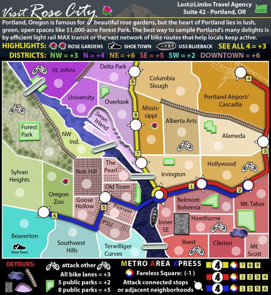
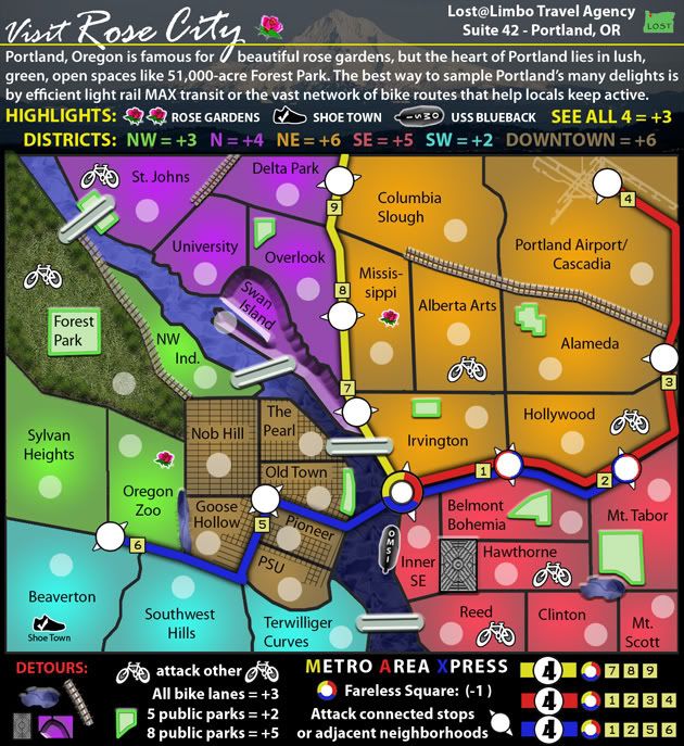
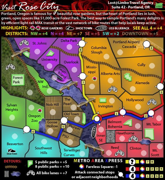
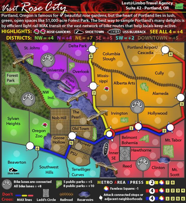
The 'demented' parks are reasonably close to their actual shapes, though I can't say the same for scale and location - details sacrificed for clarity and balance.
Ditto for the two reservoirs, which seem quite clear as bodies of water. I'd hoped the grey dimensional door would be mistaken for a maddening maze of residential roads - which any Portland resident would instantly recognize as the "no-drive" zone Ladd's Circle.
I don't expect that labeling it as such in the legend will help explain this, but it is
clearly an obstruction. Do forgive me for being a little creative and adding detours that stray from the typical
mountain-river-fence trifecta that marks most of the 130 maps in play. I'm equally as sorry for using bikes and parks, instead of the typical cannons and battleships. Are you angry that I have too many icons or just that they aren't violent enough for your tastes?
Since Portland isn't actually a war zone, I thought I'd try something new and highlight the things that make Portland unique. The fact that you can easily get anywhere in town by bike (without being run over) isn't something you can say about most US cities. Ditto to an overabundance of park space. If you had bothered to read the legend, you'd know that the "highways" are a light rail transit system (with the highest ridership in the US). These aren't frivolous icons - they are
the whole purpose of having a Portland map. I suppose I could have made the 67th war map or drawn artificial borders over yet another random country, but I elected to try something new instead.
And yes, I opted for a kitschy look. From the very beginning, it was meant to look more like a tourist-y brochure extolling all these Portland-y characteristics. I think clean, clear lines and bold colors work well for this map and, again I'll reference NYC map as my initial inspiration in this regard.
Despite your vitriol, your overlying point was not lost on me. The map
was getting a bit cluttered visually, so I've made some changes to minimize this by toning down the boldest icons. I've also converted the bike lanes into their own territories - which I believe improves the look & gameplay and gives the bike lanes more purpose.
As for your ex-girlfriend issues - I can't help you, but there are more fish in the sea. When you've gotten your angst under control, come back and let me know if my next update soothes the pain.