Re: Cuban Missile Crisis [17 Aug 2011] (v36 page 5)
lighter tones of red would be pink. no.
maybe a stroke around the title letters in black.
maybe a stroke around the title letters in black.
Conquer Club, a free online multiplayer variation of a popular world domination board game.
https://www.conquerclub.com/forum/
https://www.conquerclub.com/forum/viewtopic.php?f=358&t=145088
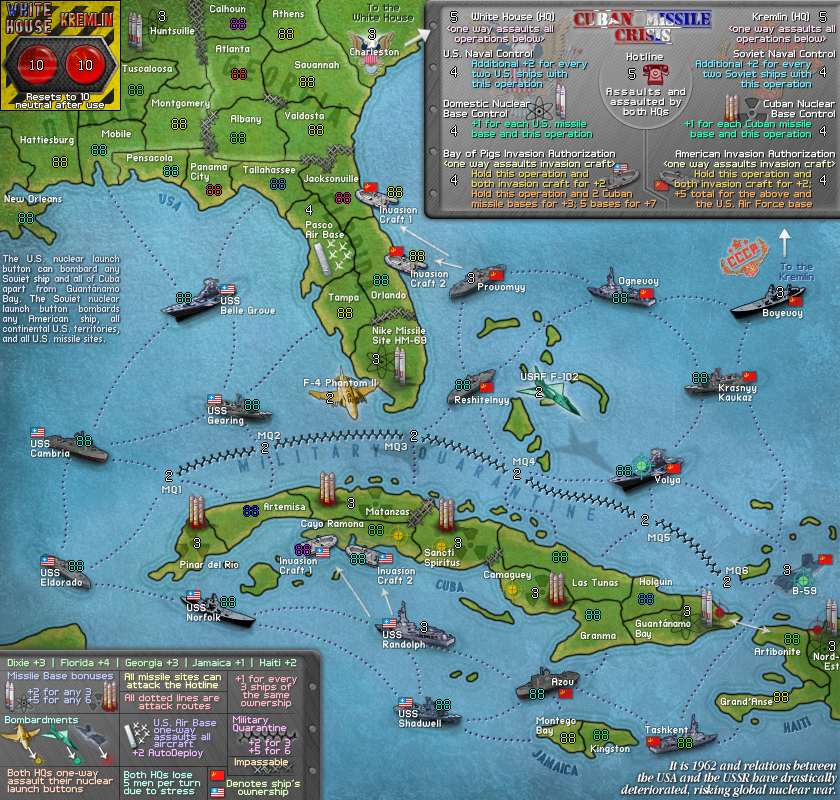
natty_dread wrote:The impassables that look like lots of small X:s... maybe you could change them to something more resembling barbed wire?

DiM wrote:natty_dread wrote:The impassables that look like lots of small X:s... maybe you could change them to something more resembling barbed wire?
why should it look like barbed wire when it's not barbed wire?
those are hedgehogs. or at least i think that's what they're called.
here's an image:
natty_dread wrote:Yeah, but they look like small X:s.

Ace Rimmer wrote:It wouldn't make sense to do the same kind of graphics touch to the White House/Kremlin as those are not titles, but part of the map itself. The title is different to stand out. The logo may look a little different/better in the supersized version.
No comments for a week, so it's time to use this as the baseline and start working on supersizing this. More updates to come eventually.
Gillipig wrote:This is in my mind one of the best maps in the foundry. Great map ace!!
DiM wrote:Gillipig wrote:This is in my mind one of the best maps in the foundry. Great map ace!!
i concur.
ace should hurry up making both small and large images so this can get the graphics stamp and be moved to final forge.
Nola_Lifer wrote:DiM wrote:Gillipig wrote:This is in my mind one of the best maps in the foundry. Great map ace!!
i concur.
ace should hurry up making both small and large images so this can get the graphics stamp and be moved to final forge.
Let us make that three. :D Hope ace rimjob can find time for it. :)


Elmo9199 wrote:sorry if i missed something, but what the heck does the 2 big red buttons on the upper-left corner do???
i dont see what it does in the legend.
RedBaron0 wrote:Agreed on the color for the ships, but since they look exactly the same, how about changing the orientation of the Soviet ships, just to help distinguish them from the American ships?
Elmo9199 wrote:RedBaron0 wrote:Agreed on the color for the ships, but since they look exactly the same, how about changing the orientation of the Soviet ships, just to help distinguish them from the American ships?
Honestly, i think the flags are enough to distinguish the US and Soviet ships apart