Didn't realize you were talking about the legend. Yeah, that is kind of hard to read. Like it might say Southfast Coast. Which might be a cooler name, though. It's like everybody in Mozambique owns Ferraris.
Conquer Club
Conquer Club, a free online multiplayer variation of a popular world domination board game.
https://www.conquerclub.com/forum/
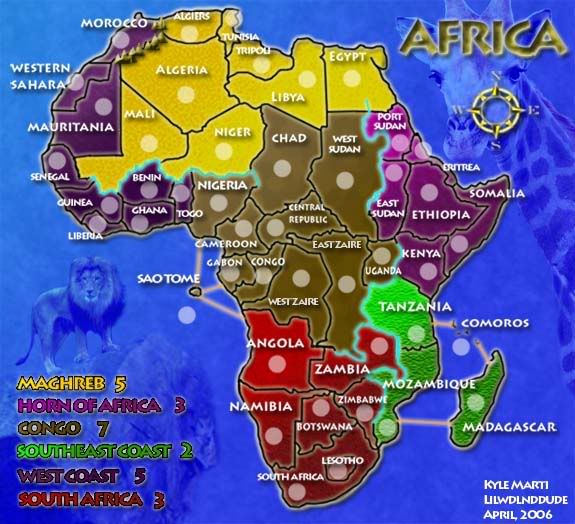
Africa Map [Done]
Page 4 of 7
ahh!!
on photobucket.com my picture uploaded to the correct picture but here on conquerclub the picture hasnt changed yet!!!! this is so frustrating. I guess i just have to wait till it changes.....
i had that problem too. Try saving your picture with a different name. Then upload the new file to photobucket. and then post the new pick here in the forums. it should work then.
Very nice!! 
Ah, the pictures have bee updated now and the Legend is much clearer. It doesn't seem to fit as much, but I'm just being picky. Look forward to giving this map a play or two.
--Andy
--Andy
what do you think
What do you think of the lion??
I love the lion!
Whoa, sweet! 
I dislike the lion. It doesn't seem to fit well with the visual quality of the map. It's like putting photo-realstic images in a comic strip made for cartoons. Perhaps something less 'realistic' looking.
--Andy
--Andy
I wonder how it would look if the lion were run through a filter to make it look less realistic. Perhaps converting it to brushstrokes or something similar.
That's way too much work. He should just get an image from the Lion King. 
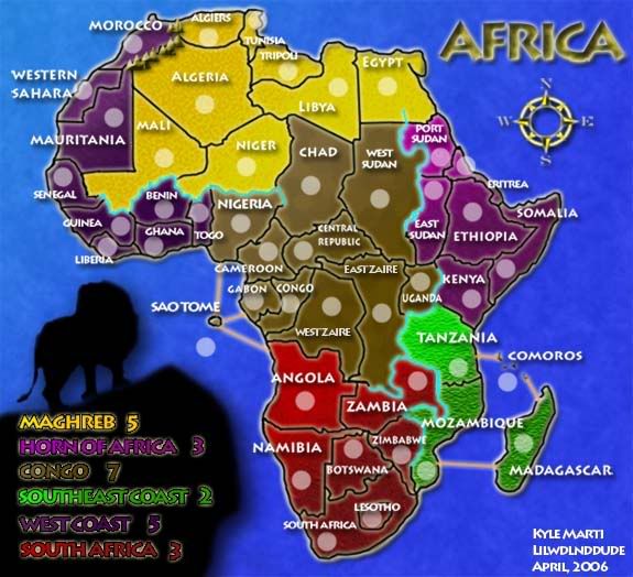
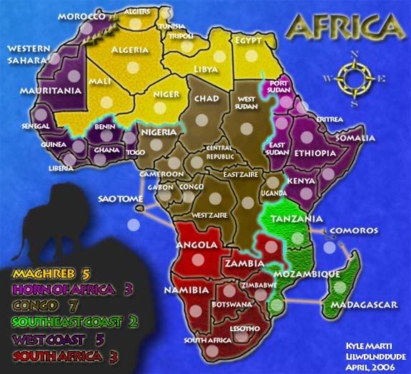
Maybe would be better if its not used as image, but as a shadow, like the liberty statue in USA map.
I want to say the names of both Zaire are different of the others: they seem more recent (are lighter), but the "T" is fogged in both names.
I want to say the names of both Zaire are different of the others: they seem more recent (are lighter), but the "T" is fogged in both names.
I like Marv's suggestion about the shadow, I think that would look rather nice and still give it a great visual appeal, rather than how the legend currently is. I also noticed the Zaires, they seem to be on different layers or something of the sort.
--Andy
--Andy
I'll cast a late vote for the old lion.
Yeah, I'm with Rocksolid. The new one just looks kinda unfinished...
Perhaps a lighter shade to make it more gray. But definitely not the old lion, it didn't fit well with the map. But it might have been better than the shadow as it stands now. But I think there must be some other images what would look amazing, rather than the old lion.
Perhaps something similar (but not the exact image since the photo-realism doesn't mesh well with the map)
http://www.krugerpark.co.za/images/lion ... 0grass.jpg
http://www.cottoneauctions.com/images/A ... erdptg.jpg
But how about something different than a lion. There are many creatures synonymous with Africa...Giraffes and Elephants...I'd look around for many images before just sticking with one. But you are definitely on the right track to add something to the legend to add a finished quality to it.
--Andy
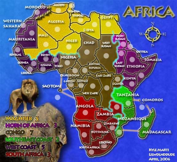
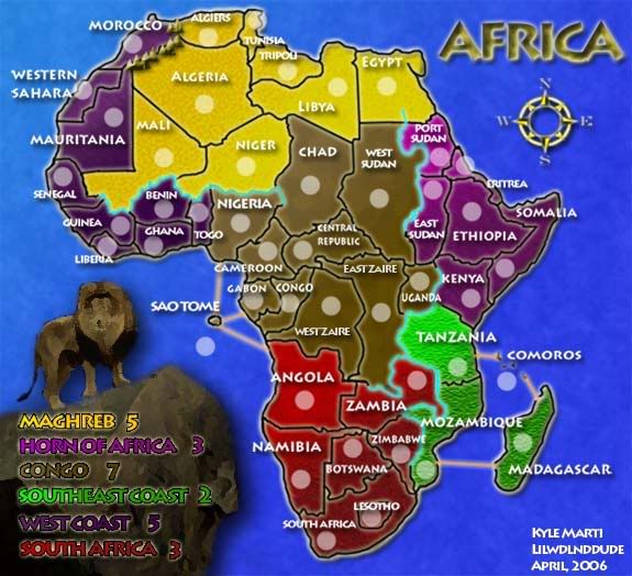
Here are all the options. Remember, this is only a lion. I can put other animals there but I would like to stick with the lion.
Im suprised Pedronicus hasnt come here yet and said.. "I wanna see some mud huts!!" 
Out of the current revisions, lol sorry to say I really don't like anyone of them (I'm probably too picky, hehe). I think you were getting close to somewhere on the second one...perhaps some sort of stained glass effect might accentuate the lion.
I still think some experimentation should be done with other animals, simply for experimenting's sake. The lion is well suited and strong, and works quite visualls for this map. But try some other animals, and perhaps a few different versions of the lion (perhaps of just head and mane, to other things).
--Andy
I didnt mean THAT shadow, but a transparency effect, mixed with the background... see the USA map!
So I think this looks really good. what about all you out there? Let me know so I can send it to lack!
YEAH!
lol... love the giraffe, but I think a Mud Hut would be far more appropriate.
Also, it looks like you didn't turn it grey-scale before you made it transparent, and I bet it'd look much better if you did that.
Also, it looks like you didn't turn it grey-scale before you made it transparent, and I bet it'd look much better if you did that.
Yeah, this looks quite nice. I think it's fine in color (although I imagine grayscale would probably be fine too).