Re: Nordic Countries [Graphics Revamp] [11.8.11]
I think I'll just take the original design and make it darker and edgier
- Click image to enlarge.

Conquer Club, a free online multiplayer variation of a popular world domination board game.
https://www.conquerclub.com/forum/
https://www.conquerclub.com/forum/viewtopic.php?f=358&t=101345

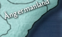
natty_dread wrote:Something like this...
- Click image to enlarge.
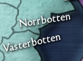
natty_dread wrote:Or maybe something like this
- Click image to enlarge.

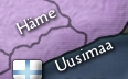
isaiah40 wrote:These can go horizontal as you have the room. I'm one that if the name fits in the territory horizontally then, it should go that way.
natty_dread wrote:isaiah40 wrote:These can go horizontal as you have the room. I'm one that if the name fits in the territory horizontally then, it should go that way.
With all due respect, your honour, that's debatable. Some might argue that having only a few territory labels non-horizontally makes those labels stick out.


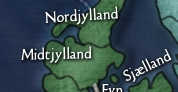
natty_dread wrote:
- Click image to enlarge.

natty_dread wrote:If anyone says "blobs" one more time, he's banned from this thread.
koontz1973 wrote:A huge improvement, looks like a forest now from afar. =D>


lostatlimbo wrote:You and I clearly have different perspectives when it comes to graphics.


natty_dread wrote:Anything else?