Page 13 of 24
Re: Salem's Switch [1.10.11] V21-P18 GFX

Posted:
Tue Nov 22, 2011 6:30 pmby cairnswk
cairnswk wrote:I should be back to this one in about a fortnight after RL issues get moved along

Work has started on this one again, finishing land plots, adding large black trees atop buggy stops etc. New version should be finished in a couple of days.
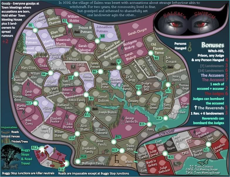
Re: Salem's Switch [24.11.11] V22-P21 GFX
Posted:
Wed Nov 23, 2011 6:03 pmby cairnswk
Version 22.
Ground contouring complete, addition of house styles
Because i have changed computers a new font has appeared
- Click image to enlarge.
Re: Salem's Switch [24.11.11] V22-P21 GFX
Posted:
Wed Nov 23, 2011 9:07 pmby ender516
That's a nice font, and the grounds look fine. So, are you not adding texture to the Accusers, Accused, Judges, or Reverends, just the Landowners?
Re: Salem's Switch [24.11.11] V22-P21 GFX
Posted:
Wed Nov 23, 2011 9:55 pmby cairnswk
ender516 wrote:That's a nice font, and the grounds look fine. So, are you not adding texture to the Accusers, Accused, Judges, or Reverends, just the Landowners?
Yes i think just the Landowners ender516, although i'm sure about the colours yet.
Re: Salem's Switch [24.11.11] V22-P21 GFX
Posted:
Mon Nov 28, 2011 11:02 amby AndyDufresne
I've always thought that the text on the legend, or mapboard areas, would look much better with some sort of outline stroke.
--Andy
Re: Salem's Switch [24.11.11] V22-P21 GFX
Posted:
Wed Nov 30, 2011 4:28 pmby cairnswk
AndyDufresne wrote:I've always thought that the text on the legend, or mapboard areas, would look much better with some sort of outline stroke.
--Andy
I'll see about this Andy, thanks
Re: Salem's Switch [24.11.11] V22-P21 GFX
Posted:
Thu Dec 01, 2011 6:51 pmby gimil
The eyes man..you still haven't work on the eyes, old man!

Re: Salem's Switch [24.11.11] V22-P21 GFX
Posted:
Thu Dec 01, 2011 7:12 pmby cairnswk
gimil wrote:The eyes man..you still haven't work on the eyes, old man!
Oh yes i have young man, and taking shots of my eyes to put in there were appaulling.
But i will get to them soon, so be patient.
Re: Salem's Switch [24.11.11] V22-P21 GFX
Posted:
Thu Dec 01, 2011 9:53 pmby Victor Sullivan
gimil wrote:The eyes man..you still haven't work on the eyes, old man!
*Gasp!* This is libel! Where's the Old Man's Union?!
-Sully
Re: Salem's Switch [24.11.11] V22-P21 GFX
Posted:
Sat Dec 03, 2011 3:37 pmby gimil
cairnswk wrote:gimil wrote:The eyes man..you still haven't work on the eyes, old man!
Oh yes i have young man, and taking shots of my eyes to put in there were appaulling.
But i will get to them soon, so be patient.
Yes...I am being patient. But do you remember you reminded me to remind you to remember to do them if you didn't remember to do them?
Re: Salem's Switch [24.11.11] V22-P21 GFX
Posted:
Sat Dec 03, 2011 4:10 pmby cairnswk
gimil wrote:cairnswk wrote:gimil wrote:The eyes man..you still haven't work on the eyes, old man!
Oh yes i have young man, and taking shots of my eyes to put in there were appaulling.
But i will get to them soon, so be patient.
Yes...I am being patient. But do you remember you reminded me to remind you to remember to do them if you didn't remember to do them?
Yes i remember, but i simply haven't made or had the time to to do them, but i am remembering i have to do them.
Thank-you however, for keeping your part.
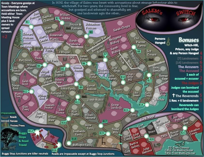
Re: Salem's Switch [16.12.11] V23-P21 GFX Eyes/Fonts
Posted:
Fri Dec 16, 2011 4:14 amby cairnswk
Version 23
1. Eyes have been fixed, not mine - I didn't have the skill to use my photos and adapt the same as the originals, so these will have to suffice.
2. The map fonts have been highlighted with black backing.
- Click image to enlarge.
Re: Salem's Switch [16.12.11] V23-P21 GFX Eyes/Fonts
Posted:
Fri Dec 16, 2011 7:10 amby natty dread
Eyes look good now.
Re: Salem's Switch [16.12.11] V23-P21 GFX Eyes/Fonts
Posted:
Fri Dec 16, 2011 9:23 amby ender516
I find the black backing on the fonts too strong, especially under the names of the Accusers. I much prefer any of the looks on Version 22, where the backing was lighter (see Ann Putnam Jr) or where there was no backing at all (Ezekial Cheever, William Hobbs). Granted, with white text, it may be better with a backing than without (compare Ann Putnam Jr with Edward Putnam), but really, the text without the backing works well enough, and you could use a dark text for the Accusers (Johnathon Putnam).
Re: Salem's Switch [16.12.11] V23-P21 GFX Eyes/Fonts
Posted:
Fri Dec 16, 2011 9:01 pmby cairnswk
natty_dread wrote:Eyes look good now.
Good!
ender516 wrote:I find the black backing on the fonts too strong, especially under the names of the Accusers. I much prefer any of the looks on Version 22, where the backing was lighter (see Ann Putnam Jr) or where there was no backing at all (Ezekial Cheever, William Hobbs). Granted, with white text, it may be better with a backing than without (compare Ann Putnam Jr with Edward Putnam), but really, the text without the backing works well enough, and you could use a dark text for the Accusers (Johnathon Putnam).
AndyDufresne wrote:I've always thought that the text on the legend, or mapboard areas, would look much better with some sort of outline stroke.
--Andy
ender516, i did the whole lot in response to above from Andy, I have not done the legend areas.
Perhaps those accusers only need the backing text lightened as you say, i'll see.
I'd prefer to have some consistency with the front text being all white, so the background will have to be manipulated.
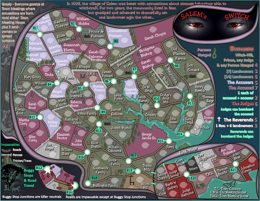
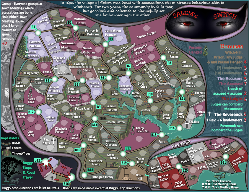
Re: Salem's Switch [30.12.11] V24-P21 GFX
Posted:
Thu Dec 29, 2011 11:51 pmby cairnswk
here is V24...
1. I have added highighting to the legend as per Andy's request.
2. I've removed the black background to those accessued and accussers texts
3. added some small representation of an image from the trials that does not interfere with the overall map to give it some historical flavour
4. i wanted to do something with the legend also but thought it would be better to leave that area alone.
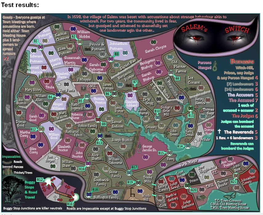
Re: Salem's Switch [30.12.11] V24-P22 GFX<->XML
Posted:
Fri Dec 30, 2011 1:19 amby cairnswk
Preview of XML - uncentered
Re: Salem's Switch [30.12.11] V24-P22 GFX<->XML
Posted:
Fri Dec 30, 2011 9:41 amby ndrs
The texts have serious legibility issues. It was more clear in V22.
Some ideas:
- Dark red on dark blue is dangerous.
- Side stats / legends would do better with a black / dark blue drop shadow.
- the shadow could be less sharp, on both region names and legend.
- Keep it consistent.
- Perhaps add a little letter-spacing to all texts.
Re: Salem's Switch [30.12.11] V24-P22 GFX<->XML
Posted:
Fri Dec 30, 2011 11:26 amby isaiah40
I have to agree with ndrs on the text. V22 was easier to read.
Re: Salem's Switch [30.12.11] V24-P22 GFX<->XML
Posted:
Fri Dec 30, 2011 8:58 pmby ender516
I think I have to put my vote again for the style in V22, with a light grey backing for all territory texts being my favourite. It definitely does not look right with the landowners having a backing and the accused and accusers having none. The emphasis seems reversed.
Re: Salem's Switch [3.1.12] V25-P22 GFX<->Texts
Posted:
Mon Jan 02, 2012 8:37 pmby cairnswk
ndrs wrote:The texts have serious legibility issues. It was more clear in V22.
Some ideas:
- Dark red on dark blue is dangerous.
- Side stats / legends would do better with a black / dark blue drop shadow.
- the shadow could be less sharp, on both region names and legend.
- Keep it consistent.
- Perhaps add a little letter-spacing to all texts.
isaiah40 wrote:I have to agree with ndrs on the text. V22 was easier to read.
ender516 wrote:I think I have to put my vote again for the style in V22, with a light grey backing for all territory texts being my favourite. It definitely does not look right with the landowners having a backing and the accused and accusers having none. The emphasis seems reversed.
Thanks guys for your comments..
This is V25...i've done all the map text the same, and fixed up the external bits.
Re: Salem's Switch [3.1.12] V25-P22 GFX text
Posted:
Mon Jan 02, 2012 9:26 pmby Nola_Lifer
Nice! It's legible now.
Re: Salem's Switch [3.1.12] V25-P22 GFX text
Posted:
Tue Jan 03, 2012 10:03 pmby ender516
Yes, this text is looking good. It does seem, however, that the shadows under some of the rotated texts, most notably C. Blake, J. Raymont, and J. Trask, are not as prominent, making them appear to be flatter on the map as compared to other texts which float nicely above it, casting shadows.
Re: Salem's Switch [5.1.12] V26-P22 GFX text
Posted:
Wed Jan 04, 2012 3:23 pmby cairnswk
ender516 wrote:Yes, this text is looking good. It does seem, however, that the shadows under some of the rotated texts, most notably C. Blake, J. Raymont, and J. Trask, are not as prominent, making them appear to be flatter on the map as compared to other texts which float nicely above it, casting shadows.
ender516, i've fixed those offending territories by reverting the angle to 0, adjusting the drop shadow to the same as the straight texts, and then instating the angle to the text.
Version 26. - i've made both sides opacity the same under the legend.
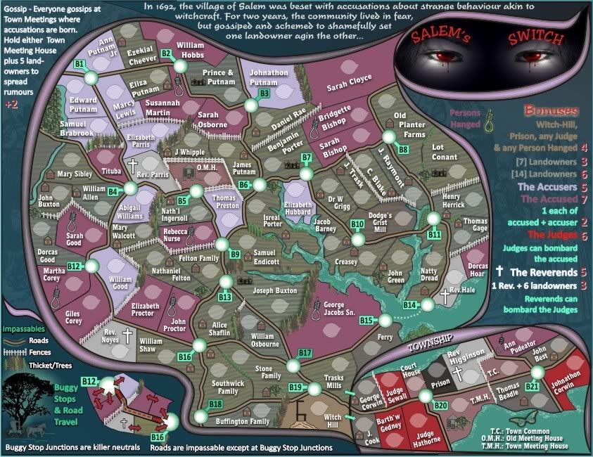
Re: Salem's Switch [5.1.12] V26-P22 GFX text
Posted:
Thu Jan 05, 2012 1:23 amby ender516
That has improved the text. Now, don't let anyone tell you that the shadows are wrong, because they come from a different light source.
Sadly, I just noticed that the red bonus values at the far right are hard to make out: 5s and 6s are particularly difficult to distinguish, and 3s could be 8s. The word Bonuses, above, is pretty clear. Perhaps that style of text would work for the numbers? (The +2 on the far side of the map deserves the same fix.)