Conquer Club
Conquer Club, a free online multiplayer variation of a popular world domination board game.
https://www.conquerclub.com/forum/
Salem's Switch V36 [Quenched]
https://www.conquerclub.com/forum/viewtopic.php?f=358&t=102092
Page 14 of 24
Re: Salem's Switch [9.1.12] V27-P22 LGE/SML
Looks great! Though I am having difficulty seeing the textures on the grey areas of the Township.
-Sully
-Sully
Re: Salem's Switch [9.1.12] V27-P22 LGE/SML
Victor Sullivan wrote:Looks great! Though I am having difficulty seeing the textures on the grey areas of the Township.
-Sully
It is there but as with Dodge's Gris Mill and Ferry, it is slightly different to the others "in the field"
Re: Salem's Switch [9.1.12] V27-P22 LGE/SML
cairnswk wrote:Victor Sullivan wrote:Looks great! Though I am having difficulty seeing the textures on the grey areas of the Township.
-Sully
It is there but as with Dodge's Gris Mill and Ferry, it is slightly different to the others "in the field"
Could you make the texture more apparent?
-Sully
Re: Salem's Switch [9.1.12] V27-P22 LGE/SML
Victor Sullivan wrote:cairnswk wrote:Victor Sullivan wrote:Looks great! Though I am having difficulty seeing the textures on the grey areas of the Township.
-Sully
It is there but as with Dodge's Gris Mill and Ferry, it is slightly different to the others "in the field"
Could you make the texture more apparent?
-Sully
Ah, Sully, isn't there already enough going on ggfx wise in that area without trying to "flesh out" some texture?
Re: Salem's Switch [9.1.12] V27-P22 LGE/SML
cairnswk wrote:Victor Sullivan wrote:cairnswk wrote:Victor Sullivan wrote:Looks great! Though I am having difficulty seeing the textures on the grey areas of the Township.
-Sully
It is there but as with Dodge's Gris Mill and Ferry, it is slightly different to the others "in the field"
Could you make the texture more apparent?
-Sully
Ah, Sully, isn't there already enough going on ggfx wise in that area without trying to "flesh out" some texture?
I'm a terrible person to ask
-Sully
Re: Salem's Switch [9.1.12] V27-P22 LGE/SML
[Stickied]
The only issue I see now cairns is that the legends text on the right needs t stand out a little more. It looks to flat on that watermark underneath and some colours are swallowed up. I think a glow on those legends that match the terr names should solve this problem.
The only issue I see now cairns is that the legends text on the right needs t stand out a little more. It looks to flat on that watermark underneath and some colours are swallowed up. I think a glow on those legends that match the terr names should solve this problem.
Re: Salem's Switch [5.1.12] V27-P22 GFX text
Just bumping this to next page.
Large - 1021W x 787H
Small - 844W x 650H
Large - 1021W x 787H
- Click image to enlarge.
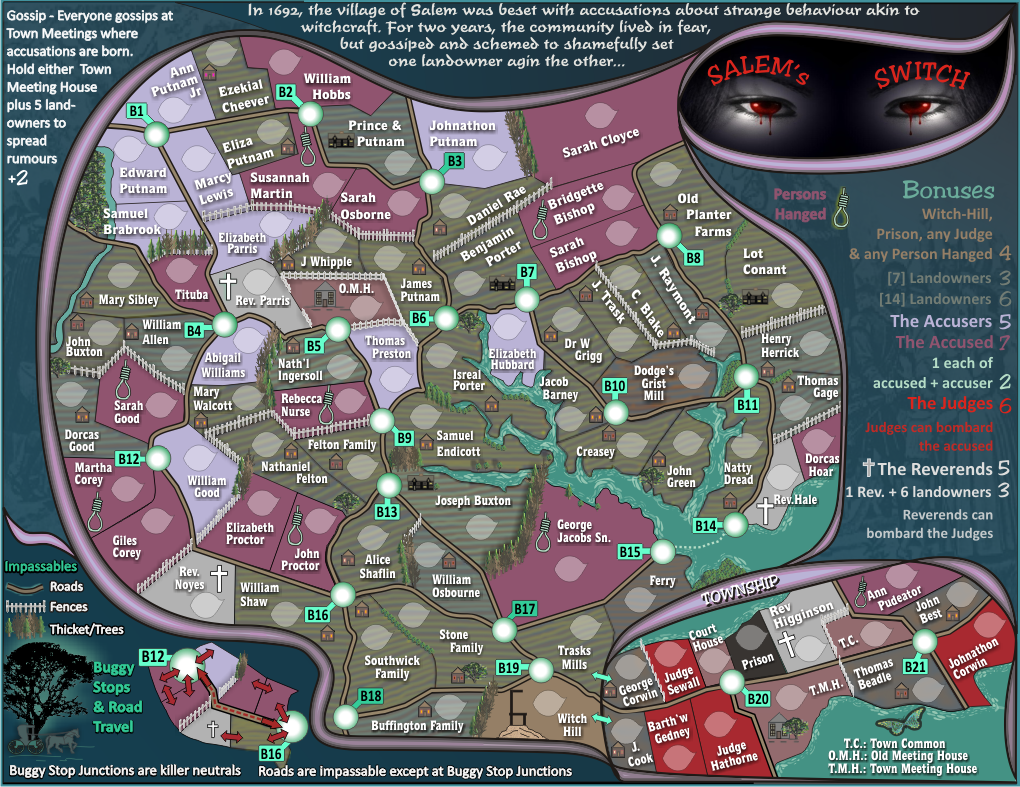
Small - 844W x 650H
- Click image to enlarge.
Re: Salem's Switch [9.1.12] V27-P22 LGE/SML
gimil wrote:[Stickied]
The only issue I see now cairns is that the legends text on the right needs t stand out a little more. It looks to flat on that watermark underneath and some colours are swallowed up. I think a glow on those legends that match the terr names should solve this problem.
Gimil, firstly let me remind you that "to flat" should be "too flat"...which has now been done to death but i see it still appears.
I've already been through this one and tried to make it stand out more, and i have tried to put a glow around the text unsuccessfully, because what happens is that you lose the watermark image in the background and i don't want that. Besides a white glow that matches the terr names look hideous.
To boot, it is an odd combination of colours but that is the design of the map.
I think 90% of it stands out reasonably well, more so particularly on the big map.
Overall, i'm pretty happy with it.
Re: Salem's Switch [9.1.12] V27-P22 LGE/SML
Have to agree with cairnswk on this one. The text looks nice and even. No need to try and get it to stand out more. Nothing really important to GP there.
Saying that though, some of the text is shiny while others are flat. Can it be all of one or the other?
Saying that though, some of the text is shiny while others are flat. Can it be all of one or the other?
Re: Salem's Switch [9.1.12] V27-P22 LGE/SML
I think that the only text that is hard to read is the "Judges can bombard ...". Everything else looks fine to me.
Re: Salem's Switch [9.1.12] V27-P22 LGE/SML
Maybe try a black shadow or a black stroke around the right side legend text. Then blur it into the background so that it only accentuates the text but isn't prominent by itself.
Re: Salem's Switch [9.1.12] V27-P22 LGE/SML
koontz1973 wrote:Have to agree with cairnswk on this one. The text looks nice and even. No need to try and get it to stand out more. Nothing really important to GP there.
Saying that though, some of the text is shiny while others are flat. Can it be all of one or the other?
I think that is a colour perception...perhaps.
isaiah40 wrote:I think that the only text that is hard to read is the "Judges can bombard ...". Everything else looks fine to me.
Good.
natty_dread wrote:Maybe try a black shadow or a black stroke around the right side legend text. Then blur it into the background so that it only accentuates the text but isn't prominent by itself.
Having said i'm pretty happy with...i am trying an extrude function which i think everyone will be happy with...results shortly.
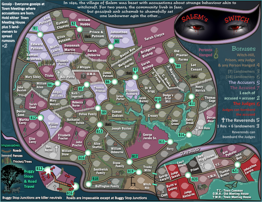
Re: Salem's Switch [16.1.12] V28-P22 LGE/SML
Version 28 - lge and small .pngs
I've applied an extrude function in the same direction as the map text shadow to the legend, I think this works better than anything else i've tried previously...and yes, lifts the legend
I've applied an extrude function in the same direction as the map text shadow to the legend, I think this works better than anything else i've tried previously...and yes, lifts the legend
- Click image to enlarge.

Re: Salem's Switch [16.1.12] V28-P22 LGE/SML
Looks pretty nice, except for the B in bonuses...
Re: Salem's Switch [16.1.12] V28-P22 LGE/SML
why are the bonuses written like that?
all the text on the map is clean and crisp but that one has a weird 3dish effect that not only makes it stand apart but also very hard to read.
i assume you have 1 text layer and then multiplied it several times and shifted it down-right 1px each time to get that 3d effect.
you should keep just the top most layer and add a simple drop shadow to it. it will make it much easier to read and numbers won't clash into each other (3 on top of 6) and you won't have weird letters either (the B or L or Y)
Re: Salem's Switch [16.1.12] V28-P22 LGE/SML
natty_dread wrote:Looks pretty nice, except for the B in bonuses...
Fixed next version, i didn't even notice that so thanks natty.
It was a colour gradient causing that,
Re: Salem's Switch [16.1.12] V28-P22 LGE/SML
DiM wrote:why are the bonuses written like that?
all the text on the map is clean and crisp but that one has a weird 3dish effect that not only makes it stand apart but also very hard to read.
i assume you have 1 text layer and then multiplied it several times and shifted it down-right 1px each time to get that 3d effect.
you should keep just the top most layer and add a simple drop shadow to it. it will make it much easier to read and numbers won't clash into each other (3 on top of 6) and you won't have weird letters either (the B or L or Y)
1. because this was a solution that was arrived at after trying several others (previous pages and experience)
2. i don't find it hard to read
3. your assumption is incorrect - it is an extrude function down-right 1 px to get the 3D effect. A drop shadow does not work on that blue background..it needed something harsher but less blurry to the background watermark.
4. you've been awol while this was being discussed
Re: Salem's Switch [16.1.12] V28-P22 LGE/SML
it doesn't really matter how the text was made, point is it's 3d.
3d text especially when it is small is very hard to read. also that text is the only 3d element on this map. everything else is flat.
in my opinion it's completely out of place (just like the +2 on the left side)
also i'm not sure where the 3d effect has been discussed since this is the first time you've done it. frankly the previous version wasn't perfect but was much better than this one. i'm talking about this: http://i155.photobucket.com/albums/s282 ... 7Scd-1.png
Re: Salem's Switch [16.1.12] V28-P22 LGE/SML
DiM wrote:it doesn't really matter how the text was made, point is it's 3d.
3d text especially when it is small is very hard to read. also that text is the only 3d element on this map. everything else is flat.
in my opinion it's completely out of place (just like the +2 on the left side)
also i'm not sure where the 3d effect has been discussed since this is the first time you've done it. frankly the previous version wasn't perfect but was much better than this one. i'm talking about this: http://i155.photobucket.com/albums/s282 ... 7Scd-1.png
As always, you're entitled to your opinion, but it's not my opinion.
Re: Salem's Switch [16.1.12] V28-P22 LGE/SML
meh 
Re: Salem's Switch [16.1.12] V28-P22 LGE/SML
I think the previous version was legible enough, and the extruded text does look a little out of place. Granted, the "Judges can bombard..." was a little hard to read at a glance, but you could read it if you gave your eyes a few seconds. It's not a highway sign that you have to see at a glance, where black on yellow contrast is the sort of thing you need. Said text is also not something you need to look at again and again, like the territory names, so I think it could go back to what you had.
Re: Salem's Switch [16.1.12] V28-P22 LGE/SML
Couple of small points.
The new text, although nice does look a little weird. But I can live with it.
Small map only - bottom right you have T.C. Town Common. The second m is an n.
Rev Higginson cross on both is pixelated. You have the other icons in the township at a north - south orientation. Why not the cross. This will also solve the pixel problem.
Rev Hale cross in the large has a small black dot in it. Is it there for a reason?
Love the map and cannot wait to play.
Re: Salem's Switch [16.1.12] V28-P22 LGE/SML
ender516 wrote:I think the previous version was legible enough, and the extruded text does look a little out of place. Granted, the "Judges can bombard..." was a little hard to read at a glance, but you could read it if you gave your eyes a few seconds. It's not a highway sign that you have to see at a glance, where black on yellow contrast is the sort of thing you need. Said text is also not something you need to look at again and again, like the territory names, so I think it could go back to what you had.
Thanks ender516, i'm going to reduce the black perspective so that it is almost un-noticeable.
koontz1973 wrote:Couple of small points.
The new text, although nice does look a little weird. But I can live with it.
Small map only - bottom right you have T.C. Town Common. The second m is an n.
Rev Higginson cross on both is pixelated. You have the other icons in the township at a north - south orientation. Why not the cross. This will also solve the pixel problem.
Rev Hale cross in the large has a small black dot in it. Is it there for a reason?
Love the map and cannot wait to play.
Thanks koontz1973...sorry, but i think you need glasses
Town Common is spelt correctly and the second m is an m, not an n
Rev. Higginson cross has altered orientation so that it fits within the territory. The others don't need this, but Higginson's does.
You didn't pick up that Rev Higginson is missing a punkt (fullstop) behind Rev.
i don't know which map you're looking at but there is no large black dot near Rev. Hale. ... prehaps something on your screen eh?
Corrections coming soon.
Re: Salem's Switch [16.1.12] V28-P22 LGE/SML
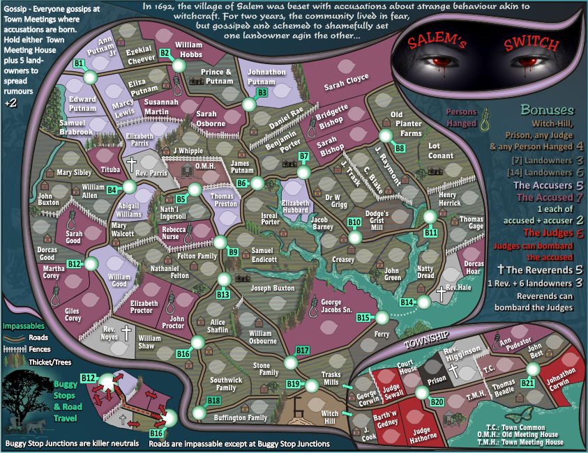
Version 28 - lge and small .pngs
pls refresh your browser f5 for the changes to version 28. the legned text now has less of distance and angle to the black extrusion making it seem less of perspective and more like solid drop shadow.
Rev Higginson has a punkt, and his cross remains slanted.
Judges can bombard and Reverends can bombard text size has been increased from 3 to 3.2 hopefully making that more legible on the small.
- Click image to enlarge.