I see what you're getting at. Still, rather convoluted.
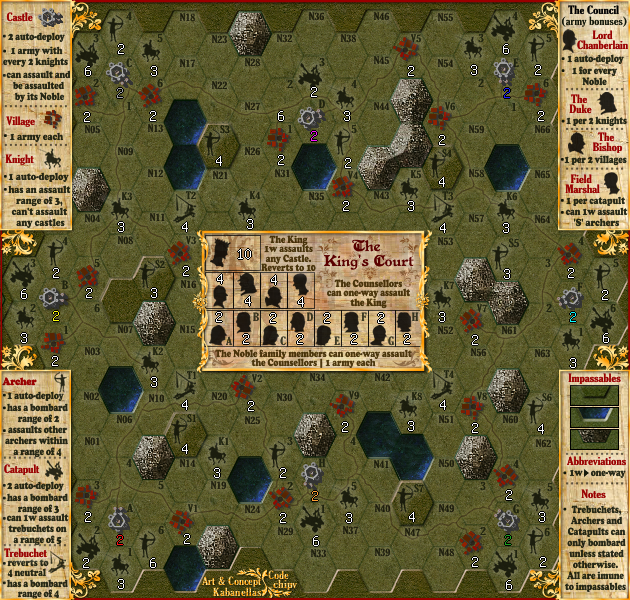
Here's one: The castles in the corner can be assaulted from one trebuchet each (and their catapults can in turn assault one trebuchet each). The castles in the middle can be assaulted by two trebuchets each. So Castle H has to deal with whoever's in A, B, F, and G, while castle A only has to deal with B and H. How do you address this iniquity?
The King's Court [Quenched]
Moderator: Cartographers
Re: The King's Court (version 16) Gameplay issues on discuss
![]() by Evil DIMwit on Sun Sep 05, 2010 12:01 pm
by Evil DIMwit on Sun Sep 05, 2010 12:01 pm


-

 Evil DIMwit
- Posts: 1616
- Joined: Thu Mar 22, 2007 1:47 pm
- Location: Philadelphia, NJ


Re: The King's Court (version 16) Gameplay issues on discuss
![]() by Kabanellas on Mon Sep 06, 2010 11:45 am
by Kabanellas on Mon Sep 06, 2010 11:45 am
Evil DIMwit wrote:I see what you're getting at. Still, rather convoluted.
Here's one: The castles in the corner can be assaulted from one trebuchet each (and their catapults can in turn assault one trebuchet each). The castles in the middle can be assaulted by two trebuchets each. So Castle H has to deal with whoever's in A, B, F, and G, while castle A only has to deal with B and H. How do you address this iniquity?
That could either be seen as a disadvantage or an advantage. Castle H catapult site will be able to reach more castles than castle A catapult site.
The price for more dominance comes with more exposure.


-
Kabanellas
- Posts: 1482
- Joined: Fri Feb 27, 2009 12:21 pm
- Location: Porto, Portugal


Re: The King's Court (version 16) Gameplay issues on discuss
![]() by MarshalNey on Sun Sep 12, 2010 10:18 am
by MarshalNey on Sun Sep 12, 2010 10:18 am
The gameplay seems okay, I think.
One thing I've been waiting to say until the big kinks were worked out, is that I think a judicious use of color could greatly help with the clarity of the gameplay.
For instance, by color-coding each Noble with its corresponding castle, you might clear up some confusion that's been brought up once already about the Noble-Castle connection. Plus it would make it easier to get a quick read of the map for people like me
Also, it might help to match the Councillors with their corresponding places in the legend with color (borders, silohuette outline, background, whatever) or with a small distinctive colored symbol perhaps... just something to enhance the current distinctions, which take a moment or two to distinguish.
I think that the gameplay might benefit also from boosting the value of the Councillors. If you made the Duke and the Bishop give +1 for every relevant thing held, rather than +1 for 2, and likewise increased the Field Marshal's bonus to +2 per catapult, it would even things out and also make them more worthwhile to pursue in their own right. By 'even things out', I mean that the Duke and Bishop could now potentially give +3 without having to crash into another players' home turf, while the Field Marshal would only give a +2, but also provides access to the S Archers thus having a relatively balanced value.
The Lord Chamberlain still provides +2 right off the bat, so I think he might still be okay as is, but you could always increase the Noble bonus to +2 per without seriously overpowering him, since taking Nobles is going to be very, very difficult.
This isn't necessary, especially for 4 player-games or smaller, but it might help make 5 to 8-player games more enjoyable by putting more viable bonuses out there.
I'll ask my fellow CAs if there's any other objections to stickying this one; I think Evil D was satisfied.
Marshal Ney
-

MarshalNey
- Posts: 781
- Joined: Mon Sep 28, 2009 9:02 pm
- Location: St. Louis, MO


Re: The King's Court (version 16) Gameplay issues on discuss
![]() by Kabanellas on Mon Sep 13, 2010 2:40 pm
by Kabanellas on Mon Sep 13, 2010 2:40 pm
Thanks a lot Marshall 
I could try to use some coloring in the letters to see how it works.
As for the counselors , I’m not really keen on boosting those bonuses, giving that much preponderance to the court itself – we would end up in the same situation we debated a few months ago – the game would be played mainly in the court rather than on the ground.
Also, for conceptual /gameplay reasons I want to reduce the free bonuses (as opposed to the auto-deployable ones) as much as possible. Keeping the large part of the income in this map attached to the production lines.
But again, I believe that only in BETA phase will we be able to slightly adjust all those bonus and neutral starters in a balanced and coherent way. There are some fairly new particularities and features concerning the gameplay here that I’m not really comfortable yet to adjust without testing it as much as possible.
Thanks again guys, for keeping interest in this project. I do believe that this will be a very fun map to play.
-
Kabanellas
- Posts: 1482
- Joined: Fri Feb 27, 2009 12:21 pm
- Location: Porto, Portugal
Re: The King's Court (version 16) Gameplay issues on discuss
![]() by Evil DIMwit on Thu Sep 23, 2010 1:35 pm
by Evil DIMwit on Thu Sep 23, 2010 1:35 pm
Oh, wow. This has been sitting here for a while. Well, looks like there aren't any further complaints so I'll go ahead and move this along. Sorry about the delay.


-
Evil DIMwit
- Posts: 1616
- Joined: Thu Mar 22, 2007 1:47 pm
- Location: Philadelphia, NJ
Re: The King's Court (version 16) Gameplay issues on discuss
![]() by chipv on Thu Sep 23, 2010 1:36 pm
by chipv on Thu Sep 23, 2010 1:36 pm
MarshalNey wrote:The gameplay seems okay, I think.
One thing I've been waiting to say until the big kinks were worked out, is that I think a judicious use of color could greatly help with the clarity of the gameplay.
For instance, by color-coding each Noble with its corresponding castle, you might clear up some confusion that's been brought up once already about the Noble-Castle connection. Plus it would make it easier to get a quick read of the map for people like me
Also, it might help to match the Councillors with their corresponding places in the legend with color (borders, silohuette outline, background, whatever) or with a small distinctive colored symbol perhaps... just something to enhance the current distinctions, which take a moment or two to distinguish.
Points taken - best dealt with in Graphics, let me just stick with gameplay at the moment.
MarshalNey wrote:I think that the gameplay might benefit also from boosting the value of the Councillors. If you made the Duke and the Bishop give +1 for every relevant thing held, rather than +1 for 2, and likewise increased the Field Marshal's bonus to +2 per catapult, it would even things out and also make them more worthwhile to pursue in their own right. By 'even things out', I mean that the Duke and Bishop could now potentially give +3 without having to crash into another players' home turf, while the Field Marshal would only give a +2, but also provides access to the S Archers thus having a relatively balanced value.
The Lord Chamberlain still provides +2 right off the bat, so I think he might still be okay as is, but you could always increase the Noble bonus to +2 per without seriously overpowering him, since taking Nobles is going to be very, very difficult.
This isn't necessary, especially for 4 player-games or smaller, but it might help make 5 to 8-player games more enjoyable by putting more viable bonuses out there.
I'll ask my fellow CAs if there's any other objections to stickying this one; I think Evil D was satisfied.
Marshal Ney
This discussion is in serious danger of becoming circular. We solved the problem about making sure the game won't be solely played in the court.
What I don't see the point of is making most of the map useless - we would like to encourage multiple strategies and providing a big play area is one method but we need to give incentive to use the whole map too. The Noble bonus we did discuss already and I thought we agreed +2 is too much (we did have it at +2 at some point I think).
A quick trial of the gameplay on the XML Wizard shows that giving +1 for each special unit would remove the need for exploring the whole map - this has to work for all gametypes, I am expecting multiple kill routes for terminator and standard multi-player for example. Team games I want to last for more than a few rounds also as well as 1v1. It would be easier to secure a lot of territories without resistance so there is less reason to up the bonus I think.
-
chipv
- Posts: 2750
- Joined: Mon Apr 28, 2008 5:30 pm


Re: The King's Court (version 16) Gameplay issues on discuss
![]() by chipv on Thu Sep 23, 2010 1:38 pm
by chipv on Thu Sep 23, 2010 1:38 pm
Evil DIMwit wrote:Oh, wow. This has been sitting here for a while. Well, looks like there aren't any further complaints so I'll go ahead and move this along. Sorry about the delay.
Thanks very much, I was wondering!
-
chipv
- Posts: 2750
- Joined: Mon Apr 28, 2008 5:30 pm
Re: The King's Court (version 16) Gameplay issues on discuss
![]() by Kabanellas on Sun Sep 26, 2010 6:22 pm
by Kabanellas on Sun Sep 26, 2010 6:22 pm
Great!!!!!!!!!!!!!!!!! one step closer now
-
Kabanellas
- Posts: 1482
- Joined: Fri Feb 27, 2009 12:21 pm
- Location: Porto, Portugal
Re: The King's Court (version 16) Gameplay issues on discuss
![]() by Kabanellas on Sun Sep 26, 2010 6:25 pm
by Kabanellas on Sun Sep 26, 2010 6:25 pm
MarshalNey wrote:One thing I've been waiting to say until the big kinks were worked out, is that I think a judicious use of color could greatly help with the clarity of the gameplay.
For instance, by color-coding each Noble with its corresponding castle, you might clear up some confusion that's been brought up once already about the Noble-Castle connection. Plus it would make it easier to get a quick read of the map for people like me
Also, it might help to match the Councillors with their corresponding places in the legend with color (borders, silohuette outline, background, whatever) or with a small distinctive colored symbol perhaps... just something to enhance the current distinctions, which take a moment or two to distinguish.
I'll try it
-
Kabanellas
- Posts: 1482
- Joined: Fri Feb 27, 2009 12:21 pm
- Location: Porto, Portugal
Re: The King's Court (version 16) Gameplay issues on discuss
![]() by Kabanellas on Tue Sep 28, 2010 8:23 pm
by Kabanellas on Tue Sep 28, 2010 8:23 pm
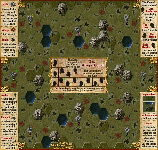
I've tried it, and I really don't like the use of colour here. It will look even more messed up with all the armies and they're different colours. 
(you can see the test in Castles/Nobles A, B, and C )
(you can see the test in Castles/Nobles A, B, and C )
- Click image to enlarge.
-
Kabanellas
- Posts: 1482
- Joined: Fri Feb 27, 2009 12:21 pm
- Location: Porto, Portugal
Re: The King's Court (version 16) [GP]
![]() by Industrial Helix on Wed Sep 29, 2010 12:00 pm
by Industrial Helix on Wed Sep 29, 2010 12:00 pm
I kind of don't think that color coding is necessary. I can find a castle relatively easy and checking the letter isnt too hard. Plus BOB will be nice.
Graphically, I think this map has been close to ready since it started. General gripes I have that the background is awfully dark. Brighten it up a tad?
Here's hoping it has a short stint in the graphics workshop and on a side note... if this was a table top game it would be awesome if you could move your archers, knights, ect, around the board.
Sketchblog [Update 07/25/11]: http://indyhelixsketch.blogspot.com/
Living in Japan [Update 07/17/11]: http://mirrorcountryih.blogspot.com/
Russian Revolution map for ConquerClub [07/20/11]: viewtopic.php?f=241&t=116575
Living in Japan [Update 07/17/11]: http://mirrorcountryih.blogspot.com/
Russian Revolution map for ConquerClub [07/20/11]: viewtopic.php?f=241&t=116575
-

Industrial Helix
- Posts: 3462
- Joined: Mon Jul 14, 2008 6:49 pm
- Location: Ohio


Re: The King's Court (version 16) [GP]
![]() by RjBeals on Wed Sep 29, 2010 9:06 pm
by RjBeals on Wed Sep 29, 2010 9:06 pm
Kabanellas - curious if you're developing this map at double size, then reducing by half before you post?

-

RjBeals
- Posts: 2506
- Joined: Mon Nov 20, 2006 5:17 pm
- Location: South Carolina, USA


Re: The King's Court (version 16) [GP]
![]() by porkenbeans on Wed Sep 29, 2010 10:07 pm
by porkenbeans on Wed Sep 29, 2010 10:07 pm
Yeah, it seems that the text is awfully blurry. Could it be from resizing rasterized text ?RjBeals wrote:Kabanellas - curious if you're developing this map at double size, then reducing by half before you post?

-

porkenbeans
- Posts: 2546
- Joined: Mon Sep 10, 2007 4:06 pm


Re: The King's Court (version 16) [GP]
![]() by Victor Sullivan on Wed Sep 29, 2010 10:29 pm
by Victor Sullivan on Wed Sep 29, 2010 10:29 pm
porkenbeans wrote:Yeah, it seems that the text is awfully blurry. Could it be from resizing rasterized text ?RjBeals wrote:Kabanellas - curious if you're developing this map at double size, then reducing by half before you post?
Oh yeah, that's killed me in a couple Photoshop works of mine
Beckytheblondie: "Don't give us the dispatch, give us a mustache ride."
Scaling back on my CC involvement...
Scaling back on my CC involvement...
-

Victor Sullivan
- Posts: 6010
- Joined: Mon Feb 08, 2010 8:17 pm
- Location: Columbus, OH


Re: The King's Court (version 16) [GP]
![]() by Kabanellas on Thu Sep 30, 2010 4:45 pm
by Kabanellas on Thu Sep 30, 2010 4:45 pm
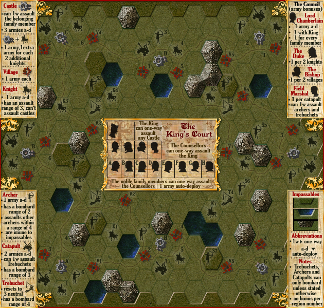
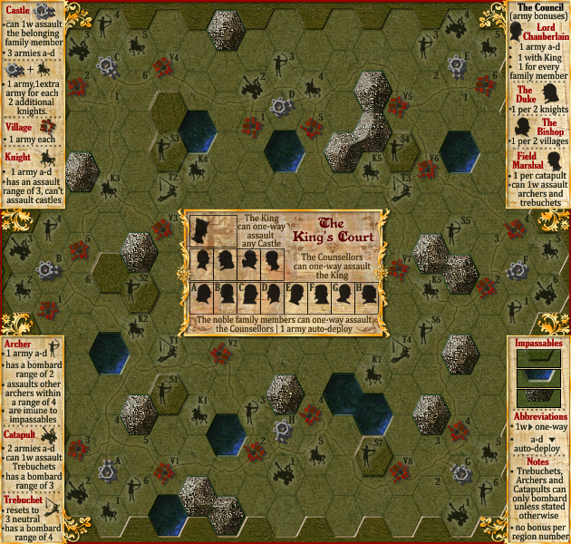
I can honestly say that the font looks good to me as it is, but nevertheless I've tried a different one in the 3rd page of this thread. You can take a look at it:
(don't mind the map version, is an old one)
- Click image to enlarge.
- Click image to enlarge.
-
Kabanellas
- Posts: 1482
- Joined: Fri Feb 27, 2009 12:21 pm
- Location: Porto, Portugal
Re: The King's Court (version 16) [GP]
![]() by ender516 on Thu Sep 30, 2010 10:34 pm
by ender516 on Thu Sep 30, 2010 10:34 pm
I prefer the text in the second of the two images just above. The text in the first one takes a little longer to come into focus for me, or should I say, for me to realize that it is not going to focus any better. Side note: under the Archer note, "immune" is misspelled "imune".
-

ender516
- Posts: 4455
- Joined: Wed Dec 17, 2008 6:07 pm
- Location: Waterloo, Ontario

Re: The King's Court (version 16) [GP]
![]() by porkenbeans on Fri Oct 01, 2010 9:40 pm
by porkenbeans on Fri Oct 01, 2010 9:40 pm
Both are blurry Kab.
But on the 2nd example, the text is NOT that blurry on the two legends bordering the right side of the map.
But on the 2nd example, the text is NOT that blurry on the two legends bordering the right side of the map.
-
porkenbeans
- Posts: 2546
- Joined: Mon Sep 10, 2007 4:06 pm
Re: The King's Court (version 16) [GP]
![]() by Kabanellas on Sat Oct 02, 2010 1:40 am
by Kabanellas on Sat Oct 02, 2010 1:40 am
if one of you guys has a font similar to the 1st example that you think could work better, I'm open to suggestions
-
Kabanellas
- Posts: 1482
- Joined: Fri Feb 27, 2009 12:21 pm
- Location: Porto, Portugal
Re: The King's Court (version 16) [GP]
![]() by Kabanellas on Thu Oct 07, 2010 12:35 pm
by Kabanellas on Thu Oct 07, 2010 12:35 pm
What about this one:
- Click image to enlarge.
-
Kabanellas
- Posts: 1482
- Joined: Fri Feb 27, 2009 12:21 pm
- Location: Porto, Portugal
Re: The King's Court (version 16) [GP]
![]() by ender516 on Thu Oct 07, 2010 12:44 pm
by ender516 on Thu Oct 07, 2010 12:44 pm
I still prefer the same font I preferred before. And pork may have a point, the right-hand legends tend to be clearer than the left. It may be a matter of contrast, as the right-hand legends seem to have a lighter background.
-
ender516
- Posts: 4455
- Joined: Wed Dec 17, 2008 6:07 pm
- Location: Waterloo, Ontario
Re: The King's Court (version 16) [GP]
![]() by CoolC on Fri Oct 08, 2010 7:18 am
by CoolC on Fri Oct 08, 2010 7:18 am
I suggest you make the half-hexes around the info boxes raised / impassable. Looks like you've started doing this on the sides but not at all on the center box (above and below).
I don't need a 500px image in my signature because I don't have anything to compensate for.
-

CoolC
- Posts: 104
- Joined: Tue May 01, 2007 10:10 am


Re: The King's Court (version 16) [GP]
![]() by Kabanellas on Mon Oct 11, 2010 6:37 am
by Kabanellas on Mon Oct 11, 2010 6:37 am
CoolC wrote:I suggest you make the half-hexes around the info boxes raised / impassable. Looks like you've started doing this on the sides but not at all on the center box (above and below).
Are you talking about the hexes above B4 or F4 that don't have the 'inner bevel'? That was done on purpose, like if the legend boards have been placed there covering a couple of the in-game hexes.
-
Kabanellas
- Posts: 1482
- Joined: Fri Feb 27, 2009 12:21 pm
- Location: Porto, Portugal
Re: The King's Court (version 16) [GP]
![]() by CoolC on Thu Oct 14, 2010 12:55 pm
by CoolC on Thu Oct 14, 2010 12:55 pm
Kabanellas wrote:CoolC wrote:I suggest you make the half-hexes around the info boxes raised / impassable. Looks like you've started doing this on the sides but not at all on the center box (above and below).
Are you talking about the hexes above B4 or F4 that don't have the 'inner bevel'? That was done on purpose, like if the legend boards have been placed there covering a couple of the in-game hexes.
Yes, but mostly about the central box, below K5, V4 etc. I just think it would look better if it was raised like other impassables.
I don't need a 500px image in my signature because I don't have anything to compensate for.
-
CoolC
- Posts: 104
- Joined: Tue May 01, 2007 10:10 am
Re: The King's Court (version 16) [GP]
![]() by thenobodies80 on Fri Oct 29, 2010 4:39 pm
by thenobodies80 on Fri Oct 29, 2010 4:39 pm
On the whole the map looks very nice and it seems there's no so much work to do imo
I think that you should try to make cell borders more visible, for example the one between V3 and N16, or V2 N25 (there are some others).
The text looks a bit blurry, but i can read it, however a possible improvement of the readibility will be really appreciated.
Bottom right legend....All are im(m)une to impassables.
Looking forward your next update
Nobodies
-

thenobodies80
- Posts: 5400
- Joined: Wed Sep 05, 2007 4:30 am
- Location: Milan


Re: The King's Court (version 16) [GP]
![]() by Kabanellas on Sat Oct 30, 2010 2:35 pm
by Kabanellas on Sat Oct 30, 2010 2:35 pm
Thanks a lot NB
I'll post the update during the following week
I'll post the update during the following week
-
Kabanellas
- Posts: 1482
- Joined: Fri Feb 27, 2009 12:21 pm
- Location: Porto, Portugal
Who is online
Users browsing this forum: No registered users
|
|||||||
| Conquer Club is not associated with RISK online in any way. Copyright © 2006-2024 by Big Wham LLC | |||||||