Yeah, the toll sign doesn't fit the map at all.
Other than that, looks really cool!
Philadelphia [Quenched]
Moderator: Cartographers
Re: Philadelphia - updated 5/10 pg 15
![]() by thenobodies80 on Tue May 10, 2011 5:59 am
by thenobodies80 on Tue May 10, 2011 5:59 am
[Moved] back into the Graphics Workshop.
-

 thenobodies80
- Posts: 5400
- Joined: Wed Sep 05, 2007 4:30 am
- Location: Milan


Re: Philadelphia - updated 5/10 pg 15
![]() by DoomYoshi on Tue May 10, 2011 7:57 am
by DoomYoshi on Tue May 10, 2011 7:57 am
Great idea for graphical theme. Is it possible to downplay the bricks a bit? I feel they will be a major distraction to gameplay and make it is actually a really simple map more complicated.
░▒▒▓▓▓▒▒░
-

DoomYoshi
- Posts: 10715
- Joined: Tue Nov 16, 2010 9:30 pm
- Location: Niu York, Ukraine


Re: Philadelphia - updated 5/10 pg 15
![]() by carlpgoodrich on Tue May 10, 2011 8:13 am
by carlpgoodrich on Tue May 10, 2011 8:13 am
Maybe make the "paint" a bit darker so the bricks don't show through so much. And by darker I mean less transparent.
-
carlpgoodrich
- Posts: 408
- Joined: Tue Aug 04, 2009 2:12 pm


Re: Philadelphia - updated 5/10 pg 15
![]() by RedBaron0 on Fri May 13, 2011 3:01 am
by RedBaron0 on Fri May 13, 2011 3:01 am
Should be pretty easy to do. I think I might have something interesting for the "toll." I'm gonna put up a graffiti tag from the city across the river in New Jersey, Camden. It'll fit the theme, and probably work much better.
I still just can't figure out what I should put for the bridges, I'm figuring some sort of icon, but getting it to fit into the theme is proving to be difficult... most graffiti ends up ON bridges, not of them. lol The minor connections I can just erase part of the river to show the connection. it's just the 4 Delaware River bridges that are really killing me right now....
I still just can't figure out what I should put for the bridges, I'm figuring some sort of icon, but getting it to fit into the theme is proving to be difficult... most graffiti ends up ON bridges, not of them. lol The minor connections I can just erase part of the river to show the connection. it's just the 4 Delaware River bridges that are really killing me right now....


-

RedBaron0
- Posts: 2657
- Joined: Sun Aug 19, 2007 12:59 pm
- Location: Pennsylvania


Re: Philadelphia - updated 5/10 pg 15
![]() by Victor Sullivan on Fri May 13, 2011 2:57 pm
by Victor Sullivan on Fri May 13, 2011 2:57 pm
What if you kept the STOP sign for the toll, but put "New Jersey" and "Pay toll" in graffiti? Much like the STOP signs that have "WAR" spray-painted below "STOP" in the C-bus. Just a thought.
-Sully
-Sully
Beckytheblondie: "Don't give us the dispatch, give us a mustache ride."
Scaling back on my CC involvement...
Scaling back on my CC involvement...
-

Victor Sullivan
- Posts: 6010
- Joined: Mon Feb 08, 2010 8:17 pm
- Location: Columbus, OH


Re: Philadelphia - updated 5/10 pg 15
![]() by RedBaron0 on Sat May 14, 2011 1:17 am
by RedBaron0 on Sat May 14, 2011 1:17 am
Not a bad idea, but the more I think of it, why would there be a stop sign on a brick wall? Lemme see if this idea I got now works, then I can maybe tinker a bit with that idea.
-
RedBaron0
- Posts: 2657
- Joined: Sun Aug 19, 2007 12:59 pm
- Location: Pennsylvania
Re: Philadelphia - updated 5/14 pg 16
![]() by RedBaron0 on Sat May 14, 2011 2:14 pm
by RedBaron0 on Sat May 14, 2011 2:14 pm
- Click image to enlarge.
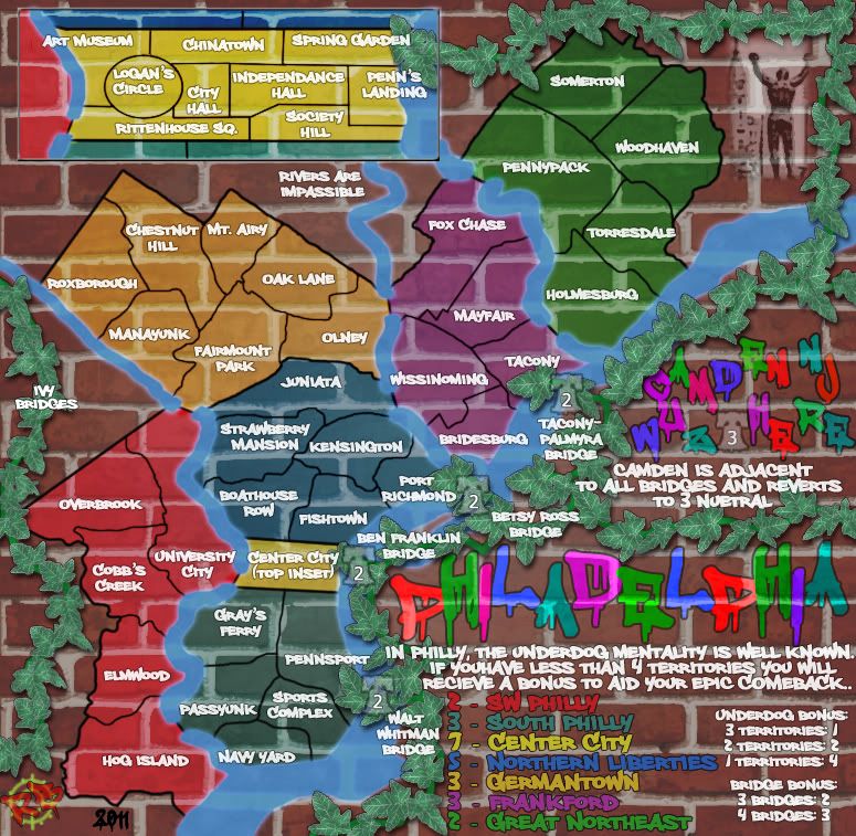
Alright here's the fullest update. I kept racking my brain to try and figure out an in-theme method of placing bridges on the map that's on a brick wall.... first I thought, fire escapes, and while interesting, wouldn't really work since they'd be really small, and wouldn't eatly do what they are supposed to do... (lead to the ground and safety) So with the brick, I as lost again, but then watching a Phillies game, they have a brick wall out in center field... with ivy growing on it, kinda a rip off of Wrigley, I know, but it fits into the theme. So here you have ivy growing up the wall and being the 4 main bridges on the map, and also kinda/sorta connecting it to the 'toll' which is now just marked as Camden NJ in graffito-tag form.
Other little changes:
font is different also in the previous update, called "Philly Sans"
The map inset is larger and shows the connections to the rest of the map better.
army 'circles' are liberty bells for the bridges and in Camden
Things to do:
perhaps clean up the ivy in spots, and may be lead it up to the bell in Camden?
Rocky at the top of the map is on top of the ivy
check army numbers and colors
vischeck
what else?!
-
RedBaron0
- Posts: 2657
- Joined: Sun Aug 19, 2007 12:59 pm
- Location: Pennsylvania
Re: Philadelphia - updated 5/14 pg 16
![]() by natty dread on Sat May 14, 2011 2:25 pm
by natty dread on Sat May 14, 2011 2:25 pm
Ok... too much. Sorry, Rb0... but that's just... too much.
The harlequinesque colours for the title etc. just looks gaudy. It doesn't really remind me of a graffiti style, and doesn't really look good.
The leaves... a neat idea, but I think they clutter the map up too much.
Another thing - the frame around the inset map doesn't really fit the graffiti style. You could replace it with a black outline, with a little paint running, to stay true with the style.

-

natty dread
- Posts: 12877
- Joined: Fri Feb 08, 2008 8:58 pm
- Location: just plain fucked


Re: Philadelphia - updated 5/14 pg 16
![]() by natty dread on Sat May 14, 2011 2:26 pm
by natty dread on Sat May 14, 2011 2:26 pm
Btw, if you're still looking for fonts, you might want to check this out...
http://www.addictivefonts.com/script/gr ... -artworks/
http://www.addictivefonts.com/script/gr ... -artworks/
-
natty dread
- Posts: 12877
- Joined: Fri Feb 08, 2008 8:58 pm
- Location: just plain fucked
Re: Philadelphia - updated 5/14 pg 16
![]() by Evil DIMwit on Sat May 14, 2011 4:21 pm
by Evil DIMwit on Sat May 14, 2011 4:21 pm
Dig the ivy. The wall looked kind of naked without it. If you want to declutter it a bit, as Natty suggests, you can get rid of the strip above the 'Philadelphia' label, and remove the bit in the northeast corner so that the ivy goes offscreen along the New Jersey border and then just peeks out from the top of the map to connect to Center City.
Some of the labels are unnecessary -- like 'ivy bridges' or 'wuz here'
And I do recommend you play around with the title. Take a walk around the city and study some graffiti for inspiration. If you could put together a title without a pre-made font, that'd be sick.
Haven't checked on this map for a couple of months and I really like what I'm seeing.


-

Evil DIMwit
- Posts: 1616
- Joined: Thu Mar 22, 2007 1:47 pm
- Location: Philadelphia, NJ

Re: Philadelphia - updated 5/14 pg 16
![]() by danfrank on Sat May 14, 2011 9:15 pm
by danfrank on Sat May 14, 2011 9:15 pm
why is the map seethrough and the legend not.. have you tried making the map part not transparent ... that may reduce the clutter look seeing all the grout lines through map .. i like the ivy and the bells is original and fits philly perfectly...
-
danfrank
- Posts: 611
- Joined: Mon Dec 24, 2007 1:19 am


Re: Philadelphia - updated 5/14 pg 16
![]() by carlpgoodrich on Sat May 14, 2011 9:51 pm
by carlpgoodrich on Sat May 14, 2011 9:51 pm
I'm glad this map is back in business and I think its moving in the right direction. But to be honest, there is something about the ivy that bugs me. For one, the color isn't quite right (just did a google image search for ivy, I think yours has too much blue...). Also, the combination of the ivy and the bright letters make this look very Christmas-y. Maybe use the more subtle colors from the territories to make the title.
I think I could get behind the ivy. Can I suggest getting rid of the square border look in the top right. Maybe have the ivy go off the map and then back on, or something.
I think I could get behind the ivy. Can I suggest getting rid of the square border look in the top right. Maybe have the ivy go off the map and then back on, or something.
-
carlpgoodrich
- Posts: 408
- Joined: Tue Aug 04, 2009 2:12 pm
Re: Philadelphia - updated 5/14 pg 16
![]() by Evil DIMwit on Sun May 15, 2011 2:46 am
by Evil DIMwit on Sun May 15, 2011 2:46 am
Speaking of square borders, the border on the Center City inset doesn't look very graffiti. Perhaps you should fix that. Or maybe you can make it like a poster posted on the wall or something like that.
-
Evil DIMwit
- Posts: 1616
- Joined: Thu Mar 22, 2007 1:47 pm
- Location: Philadelphia, NJ
Re: Philadelphia - updated 5/14 pg 16
![]() by RedBaron0 on Wed May 18, 2011 1:19 am
by RedBaron0 on Wed May 18, 2011 1:19 am
- Click image to enlarge.

I'll fiddle with the border of the inset, see what I can come up with.
I'm starting to think the whole drips things for graffiti isn't necessary, you paint something good, graffiti or not, you shouldn't be sloppy! I may try some of those other fonts, as well as just hand drawing the titles.
-
RedBaron0
- Posts: 2657
- Joined: Sun Aug 19, 2007 12:59 pm
- Location: Pennsylvania
Re: Philadelphia - updated 5/14 pg 16
![]() by AndyDufresne on Wed May 18, 2011 10:14 am
by AndyDufresne on Wed May 18, 2011 10:14 am
Instead of more Ivy, why not add poster detritus?

--Andy
--Andy
-

AndyDufresne
- Posts: 24919
- Joined: Fri Mar 03, 2006 8:22 pm
- Location: A Banana Palm in Zihuatanejo


Re: Philadelphia - updated 5/14 pg 16
![]() by RedBaron0 on Wed May 18, 2011 2:43 pm
by RedBaron0 on Wed May 18, 2011 2:43 pm
ooooh, not a bad idear, I'll look to add some Phillyish stuff
-
RedBaron0
- Posts: 2657
- Joined: Sun Aug 19, 2007 12:59 pm
- Location: Pennsylvania
Re: Philadelphia - updated 5/14 pg 16
![]() by natty dread on Wed May 18, 2011 6:00 pm
by natty dread on Wed May 18, 2011 6:00 pm
"Poster detritus" could work if it's made as a part of the background, otherwise it'll just be more clutter... also, I'm still in favor of removing the ivy alltogether.
-
natty dread
- Posts: 12877
- Joined: Fri Feb 08, 2008 8:58 pm
- Location: just plain fucked
Re: Philadelphia - updated 5/14 pg 16
![]() by RedBaron0 on Sun May 22, 2011 2:46 am
by RedBaron0 on Sun May 22, 2011 2:46 am
I am really liking the ivy, hopefully the next update may convince you natty, still I will consider something else if others agree that the ivy isn't adding to the image.
-
RedBaron0
- Posts: 2657
- Joined: Sun Aug 19, 2007 12:59 pm
- Location: Pennsylvania
Re: Philadelphia - updated 5/14 pg 16
![]() by Victor Sullivan on Sun May 22, 2011 2:55 am
by Victor Sullivan on Sun May 22, 2011 2:55 am
RedBaron0 wrote:I am really liking the ivy, hopefully the next update may convince you natty, still I will consider something else if others agree that the ivy isn't adding to the image.
-Sully
Beckytheblondie: "Don't give us the dispatch, give us a mustache ride."
Scaling back on my CC involvement...
Scaling back on my CC involvement...
-
Victor Sullivan
- Posts: 6010
- Joined: Mon Feb 08, 2010 8:17 pm
- Location: Columbus, OH
Re: Philadelphia - updated 5/14 pg 16
![]() by natty dread on Sun May 22, 2011 3:57 am
by natty dread on Sun May 22, 2011 3:57 am
I could like the ivy more if you made it look more realistic, less "pixel-art" like...
-
natty dread
- Posts: 12877
- Joined: Fri Feb 08, 2008 8:58 pm
- Location: just plain fucked
Re: Philadelphia - updated 5/14 pg 16
![]() by Victor Sullivan on Sun May 22, 2011 2:39 pm
by Victor Sullivan on Sun May 22, 2011 2:39 pm
natty_dread wrote:I could like the ivy more if you made it look more realistic, less "pixel-art" like...
This
-Sully
Beckytheblondie: "Don't give us the dispatch, give us a mustache ride."
Scaling back on my CC involvement...
Scaling back on my CC involvement...
-
Victor Sullivan
- Posts: 6010
- Joined: Mon Feb 08, 2010 8:17 pm
- Location: Columbus, OH
Re: Philadelphia - updated 5/30 pg 17
![]() by RedBaron0 on Mon May 30, 2011 2:39 am
by RedBaron0 on Mon May 30, 2011 2:39 am
- Click image to enlarge.
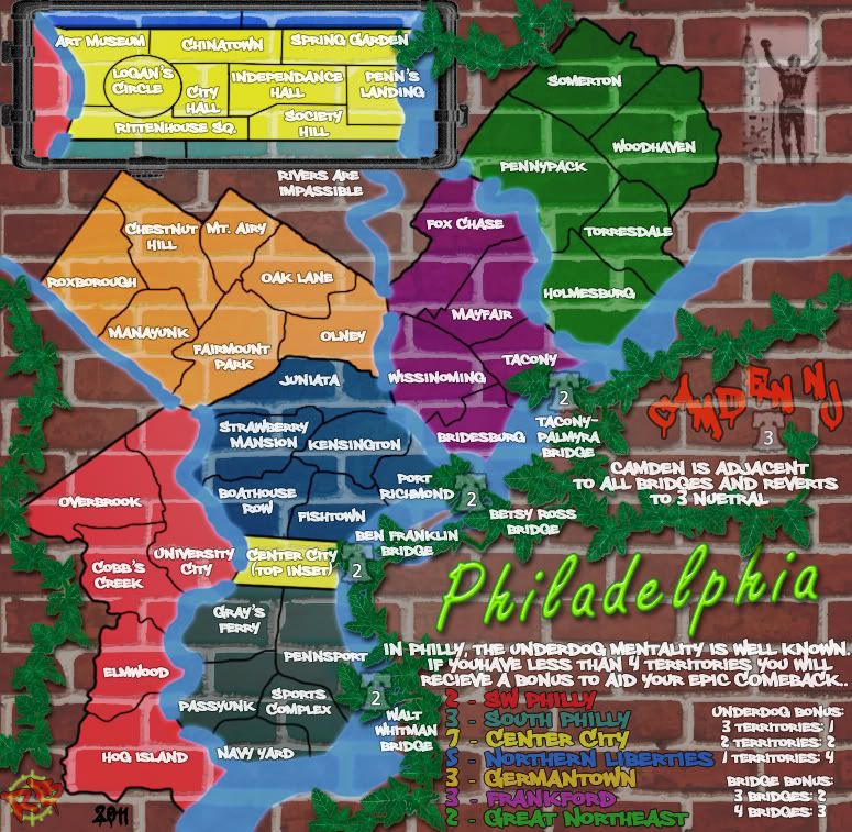
Lets call this 3/4 of an update. I think the ivy will likely stay, but I think I can go completely photographic instead of drawings, as previously stated, same with the pipe I've added as a frame for the inset, as well as extending the pipe down the side of the map instead of the ivy there. Still haven't added poster detritus, but starting to feel it isn't necessary, maybe, we shall see.
I've also gone to a neon sign look for the title, which I likely will have to flesh out a tiny bit more. Add it gray connectors or a bit of a frame maybe, for a more realistic look.
Kinda wondering about the bells too, just use them on the bridges, or perhaps add them to all the territories? (might be kinda tight in a few spots)
-
RedBaron0
- Posts: 2657
- Joined: Sun Aug 19, 2007 12:59 pm
- Location: Pennsylvania
Re: Philadelphia - updated 5/30 pg 17
![]() by sannemanrobinson on Mon May 30, 2011 3:07 am
by sannemanrobinson on Mon May 30, 2011 3:07 am
I like the pipes and the idea to connect it to the inset. It reminded me more of a billboard though. In that case you shouldn't see the bricks behind the inset.
I'm not too fond of the bells. In combination with the ivy it's Chrismas. Making circles or 88's might help to check the available space.
I'm not too fond of the bells. In combination with the ivy it's Chrismas. Making circles or 88's might help to check the available space.
-
sannemanrobinson
- Posts: 255
- Joined: Mon Dec 20, 2010 6:35 am


Re: Philadelphia - updated 5/30 pg 17
![]() by AndyDufresne on Mon May 30, 2011 10:18 am
by AndyDufresne on Mon May 30, 2011 10:18 am
Yeah, the combinations of bells and ivy strangely has a holiday-esque feel to it, haha.
--Andy
--Andy
-
AndyDufresne
- Posts: 24919
- Joined: Fri Mar 03, 2006 8:22 pm
- Location: A Banana Palm in Zihuatanejo
Who is online
Users browsing this forum: overlander
|
|||||||
| Conquer Club is not associated with RISK online in any way. Copyright © 2006-2024 by Big Wham LLC | |||||||