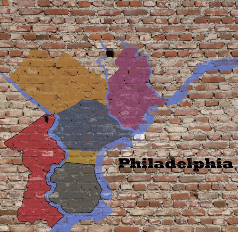
the brick idea's kinda cool, but the brick itself kinda sucks. have you tried a brick background, and slipping it behind?
http://upload.wikimedia.org/wikipedia/c ... wall02.jpg
http://www.scottbolster.com/potn/brick_wall.jpg
I don't feel like the compass reallly goes. or the font on the territories.
the font, would be nice to see something a little more graffiti like also.
http://www.dafont.com/mouse-graffity.fo ... Art+Museum
or even if it's just something a little more handwritten
Philadelphia [Quenched]
Moderator: Cartographers
Re: Philadelphia - updated 2/25 pg 12
![]() by Tisha on Fri Feb 25, 2011 12:07 pm
by Tisha on Fri Feb 25, 2011 12:07 pm
-

 Tisha
Tisha
- Posts: 1065
- Joined: Sat Dec 23, 2006 12:41 am


Re: Philadelphia - updated 2/25 pg 12
![]() by ghirrindin on Fri Feb 25, 2011 12:09 pm
by ghirrindin on Fri Feb 25, 2011 12:09 pm
natty_dread wrote:ghirrindin wrote:Cool map. Perhaps make the territorial colors a tad more vibrant? They're a little drab... at least to me.
I disagree. Something painted on a brick wall is supposed to look a bit "drab".
Yeah OK, sure, I guess. But I'm not arguing for neon colors here. The fact is that I'm not colorblind, and I still have a hard time finding difference in both Center City/Germantown and South Philly/Northern Liberties.

-

ghirrindin
- Posts: 129
- Joined: Sat Jan 12, 2008 9:34 pm
- Location: Urbana, IL


Re: Philadelphia - updated 2/25 pg 12
![]() by natty dread on Fri Feb 25, 2011 2:07 pm
by natty dread on Fri Feb 25, 2011 2:07 pm
ghirrindin wrote:Yeah OK, sure, I guess. But I'm not arguing for neon colors here. The fact is that I'm not colorblind, and I still have a hard time finding difference in both Center City/Germantown and South Philly/Northern Liberties.
Well ok, then those colours need to be changed, but it doesn't mean that all of them should be brighter.

-

natty dread
- Posts: 12877
- Joined: Fri Feb 08, 2008 8:58 pm
- Location: just plain fucked


Re: Philadelphia - updated 2/25 pg 12
![]() by Victor Sullivan on Fri Feb 25, 2011 3:20 pm
by Victor Sullivan on Fri Feb 25, 2011 3:20 pm
I'd post something more of substance, but IH and natty beat me to the punch... I agree with all concerns expressed by them thus far.
Beckytheblondie: "Don't give us the dispatch, give us a mustache ride."
Scaling back on my CC involvement...
Scaling back on my CC involvement...
-

Victor Sullivan
- Posts: 6010
- Joined: Mon Feb 08, 2010 8:17 pm
- Location: Columbus, OH


Re: Philadelphia - updated 2/25 pg 12
![]() by Tisha on Sat Feb 26, 2011 12:21 pm
by Tisha on Sat Feb 26, 2011 12:21 pm
let me know if you want help making it look like real brick
-
Tisha
- Posts: 1065
- Joined: Sat Dec 23, 2006 12:41 am
Re: Philadelphia - updated 2/25 pg 12
![]() by Z-Rambo on Sat Feb 26, 2011 1:36 pm
by Z-Rambo on Sat Feb 26, 2011 1:36 pm
Yeah, that looks crappy....sorry jmo,
-

Z-Rambo
- Posts: 181
- Joined: Fri Jan 01, 2010 3:16 am
- Location: Maryville, TN

Re: Philadelphia - updated 2/25 pg 12
![]() by Riskismy on Sat Feb 26, 2011 1:42 pm
by Riskismy on Sat Feb 26, 2011 1:42 pm
hehe. I know this is graphics phase and all, but I like the underdog bonus enough to not care. Great idea! 
-
Riskismy
- Posts: 391
- Joined: Thu Jun 01, 2006 8:21 pm
- Location: Copenhagen

Re: Philadelphia - updated 2/25 pg 12
![]() by carlpgoodrich on Sat Feb 26, 2011 5:10 pm
by carlpgoodrich on Sat Feb 26, 2011 5:10 pm
Ya, I'm not feeling the "real brick." Maybe there's a way to make it work... Not sure.
-
carlpgoodrich
- Posts: 408
- Joined: Tue Aug 04, 2009 2:12 pm

Re: Philadelphia - updated 2/25 pg 12
![]() by Tisha on Sat Feb 26, 2011 5:48 pm
by Tisha on Sat Feb 26, 2011 5:48 pm
just an idea was tossing out there.. I just really don't like the current, but I guess I'm the only one.
-
Tisha
- Posts: 1065
- Joined: Sat Dec 23, 2006 12:41 am
Re: Philadelphia - updated 2/25 pg 12
![]() by Industrial Helix on Sat Feb 26, 2011 10:58 pm
by Industrial Helix on Sat Feb 26, 2011 10:58 pm
I think the first example could work if you could make it seem more like the paint was actually one it. Tough task though...
Sketchblog [Update 07/25/11]: http://indyhelixsketch.blogspot.com/
Living in Japan [Update 07/17/11]: http://mirrorcountryih.blogspot.com/
Russian Revolution map for ConquerClub [07/20/11]: viewtopic.php?f=241&t=116575
Living in Japan [Update 07/17/11]: http://mirrorcountryih.blogspot.com/
Russian Revolution map for ConquerClub [07/20/11]: viewtopic.php?f=241&t=116575
-

Industrial Helix
- Posts: 3462
- Joined: Mon Jul 14, 2008 6:49 pm
- Location: Ohio


Re: Philadelphia - updated 2/25 pg 12
![]() by natty dread on Sun Feb 27, 2011 1:16 am
by natty dread on Sun Feb 27, 2011 1:16 am
The problem with textures that are really "bumpy" (like the 2nd one Tisha posted) is that you have to make the image follow the "bumps" or it will not look like it's painted on...
It's easier to take a texture that is relatively flat but good looking.
It's easier to take a texture that is relatively flat but good looking.
-
natty dread
- Posts: 12877
- Joined: Fri Feb 08, 2008 8:58 pm
- Location: just plain fucked
Re: Philadelphia - updated 2/25 pg 12
![]() by RedBaron0 on Sun Feb 27, 2011 3:48 am
by RedBaron0 on Sun Feb 27, 2011 3:48 am
I do like what you've got there Tisha, I'd be interested in seeing how you've done it.
I'm not completely sold on the background as it is sortof photographic. It fits in the theme, and I like it, however, it just doesn't have a true feel for me, maybe I just haven't found the right wall, or the right blending of the 2, yet.
I'm not completely sold on the background as it is sortof photographic. It fits in the theme, and I like it, however, it just doesn't have a true feel for me, maybe I just haven't found the right wall, or the right blending of the 2, yet.


-

RedBaron0
- Posts: 2657
- Joined: Sun Aug 19, 2007 12:59 pm
- Location: Pennsylvania


Re: Philadelphia - updated 2/25 pg 12
![]() by Industrial Helix on Sun Feb 27, 2011 2:21 pm
by Industrial Helix on Sun Feb 27, 2011 2:21 pm
Well, I think a gray mortar would work better than white.
Sketchblog [Update 07/25/11]: http://indyhelixsketch.blogspot.com/
Living in Japan [Update 07/17/11]: http://mirrorcountryih.blogspot.com/
Russian Revolution map for ConquerClub [07/20/11]: viewtopic.php?f=241&t=116575
Living in Japan [Update 07/17/11]: http://mirrorcountryih.blogspot.com/
Russian Revolution map for ConquerClub [07/20/11]: viewtopic.php?f=241&t=116575
-
Industrial Helix
- Posts: 3462
- Joined: Mon Jul 14, 2008 6:49 pm
- Location: Ohio
Re: Philadelphia - updated 2/25 pg 12
![]() by natty dread on Sun Feb 27, 2011 2:52 pm
by natty dread on Sun Feb 27, 2011 2:52 pm
Yeah the current version kind of looks like there's a red base paint on the wall...
-
natty dread
- Posts: 12877
- Joined: Fri Feb 08, 2008 8:58 pm
- Location: just plain fucked
Re: Philadelphia - updated 3/7 pg 13
![]() by RedBaron0 on Mon Mar 07, 2011 1:16 am
by RedBaron0 on Mon Mar 07, 2011 1:16 am
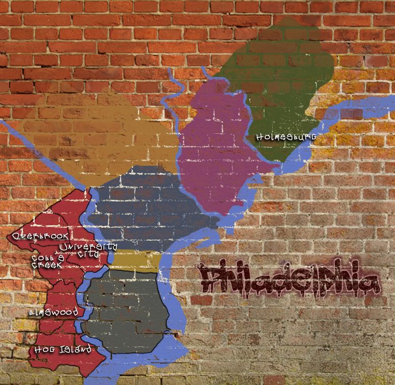
- Click image to enlarge.
I'm still work'n on this, still transitioning on a lot of things, and this is probably gonna need a couple things for sure. I wanna make the smaller bridges larger to the connections are clearer, and I'm thinking I'll need some sort of icon/marker for the bridges into Jersey, instead of the little lines and the army circles.
But I've got a new font, might have to find a better "3"
a few little things here and there for a hopefully more pleasing landscape.
-
RedBaron0
- Posts: 2657
- Joined: Sun Aug 19, 2007 12:59 pm
- Location: Pennsylvania
Re: Philadelphia - updated 3/7 pg 13
![]() by Victor Sullivan on Mon Mar 07, 2011 1:27 am
by Victor Sullivan on Mon Mar 07, 2011 1:27 am
I like the brick background a lot better, but I do have some graphical concerns with this draft:
-Sully
- The land areas adjacent to the river have really pixelated edges.
- I think it might be good to test out another font, I find it rather daunting and hard to read at a glance.
- The color of the river and Northern Liberties is awfully similar, I suggest contrasting them a bit more.
- I'm just not feeling the mini state of New Jersey for the toll... It might be worth investigating other images, and with the new theme, I think you could find something more suitable.
-Sully
Beckytheblondie: "Don't give us the dispatch, give us a mustache ride."
Scaling back on my CC involvement...
Scaling back on my CC involvement...
-
Victor Sullivan
- Posts: 6010
- Joined: Mon Feb 08, 2010 8:17 pm
- Location: Columbus, OH
Re: Philadelphia - updated 3/7 pg 13
![]() by natty dread on Mon Mar 07, 2011 2:26 am
by natty dread on Mon Mar 07, 2011 2:26 am
There's some weird pixelation to the land areas... How did that happen?
The font looks good, apart from the 3.
The font looks good, apart from the 3.
-
natty dread
- Posts: 12877
- Joined: Fri Feb 08, 2008 8:58 pm
- Location: just plain fucked
Re: Philadelphia - updated 3/7 pg 13
![]() by isaiah40 on Mon Mar 07, 2011 7:17 am
by isaiah40 on Mon Mar 07, 2011 7:17 am
I think the pixilation is from the beveled edges. So remove them and they should be fine as that is the only places I see the pixilation.
-
isaiah40
- Posts: 3990
- Joined: Mon Aug 27, 2007 7:14 pm


Re: Philadelphia - updated 3/7 pg 13
![]() by natty dread on Mon Mar 07, 2011 7:21 am
by natty dread on Mon Mar 07, 2011 7:21 am
Yeah, the bevel doesn't really go with the painted look anyway...
-
natty dread
- Posts: 12877
- Joined: Fri Feb 08, 2008 8:58 pm
- Location: just plain fucked
Re: Philadelphia - updated 3/7 pg 13
![]() by Z-Rambo on Mon Mar 07, 2011 6:55 pm
by Z-Rambo on Mon Mar 07, 2011 6:55 pm
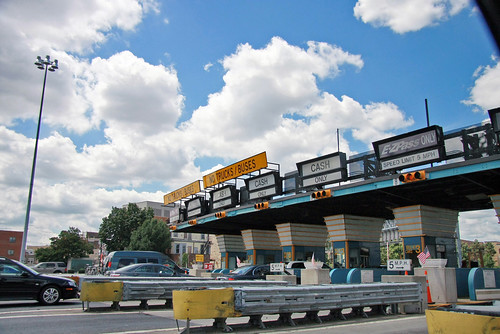
how about using a picture of a toll instead of NJ?

or
or
-
Z-Rambo
- Posts: 181
- Joined: Fri Jan 01, 2010 3:16 am
- Location: Maryville, TN
Re: Philadelphia - updated 3/7 pg 13
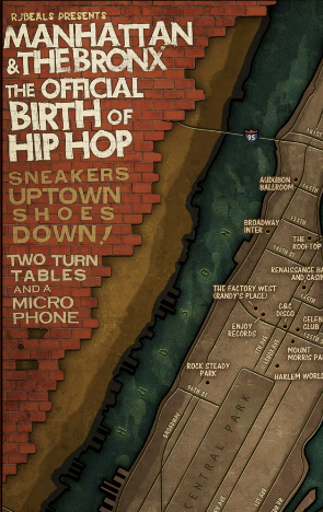
![]() by RjBeals on Tue Mar 08, 2011 8:27 pm
by RjBeals on Tue Mar 08, 2011 8:27 pm
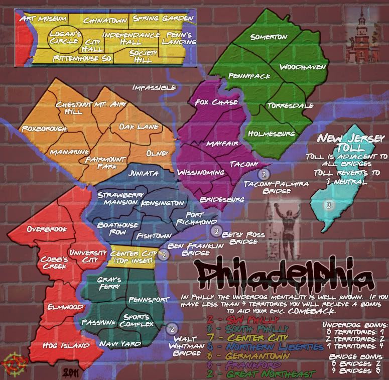
- Click image to enlarge.
the brick looks really bad. If that's your hook, then you really need to make this look like it's painted (or spraypainted) on a wall. Now it looks like a quick pattern overlay. Make it stronger with more contrast. Add some inconsistencies to it. Here's my brick work for a map I did.

-

RjBeals
- Posts: 2506
- Joined: Mon Nov 20, 2006 5:17 pm
- Location: South Carolina, USA


Re: Philadelphia - updated 3/7 pg 13
![]() by Riskismy on Thu Mar 10, 2011 2:57 pm
by Riskismy on Thu Mar 10, 2011 2:57 pm
Damn. We'd have some kick-ass gameplay if people gave as much attention to that, as they do the graphics. Much too easy to just go 'that looks bad'.
The bricks are just fine.
The bricks are just fine.

-
Riskismy
- Posts: 391
- Joined: Thu Jun 01, 2006 8:21 pm
- Location: Copenhagen
Re: Philadelphia - updated 3/7 pg 13
![]() by natty dread on Thu Mar 10, 2011 3:07 pm
by natty dread on Thu Mar 10, 2011 3:07 pm
Riskismy wrote: if people gave as much attention
People do.
It's just easier for the layperson to comment on graphics than gameplay. That doesn't mean that gameplay development isn't taking place. You should pop your head to the gameplay forum and see how the process works.
Riskismy wrote:Much too easy to just go 'that looks bad. The bricks are just fine.
Having people offering constructive criticism is a vital part of the process. "Just fine" is not good enough, we strive to make the maps of CC as good as they can be.
Riskismy, please don't make other people's map threads your personal platform. If you have commentary about the foundry process you want to share, post it on the foundry discussions forum. Map threads should be reserved for comments pertaining to the map.
Last edited by natty dread on Thu Mar 10, 2011 4:52 pm, edited 1 time in total.
-
natty dread
- Posts: 12877
- Joined: Fri Feb 08, 2008 8:58 pm
- Location: just plain fucked
Re: Philadelphia - updated 3/7 pg 13
![]() by Riskismy on Thu Mar 10, 2011 4:50 pm
by Riskismy on Thu Mar 10, 2011 4:50 pm
This is the second time you're telling me not to make a given thread my 'personal platform'. As I haven't done it even once yet (you'd sure as hell know the difference), I think it's is turning out to be you making them into your 'personal platform',
I made 2 comments pertaining to the topic at hand:
1) There's too many opinions being voiced here to accommodate them all. "It's just easier for the layperson to comment on graphics than gameplay" was my point exactly.
2) The bricks are pretty enough in my opinion.
I made 2 comments pertaining to the topic at hand:
1) There's too many opinions being voiced here to accommodate them all. "It's just easier for the layperson to comment on graphics than gameplay" was my point exactly.
2) The bricks are pretty enough in my opinion.
-
Riskismy
- Posts: 391
- Joined: Thu Jun 01, 2006 8:21 pm
- Location: Copenhagen
Re: Philadelphia - updated 3/7 pg 13
![]() by RjBeals on Thu Mar 10, 2011 5:53 pm
by RjBeals on Thu Mar 10, 2011 5:53 pm
my opinion is the bricks look shitty. and I didn't just say it looks bad. I gave a visual example of something better to reference. I'm not about to offer step by step methods to do create this map better.
-
RjBeals
- Posts: 2506
- Joined: Mon Nov 20, 2006 5:17 pm
- Location: South Carolina, USA
Who is online
Users browsing this forum: No registered users
|
|||||||
| Conquer Club is not associated with RISK online in any way. Copyright © 2006-2024 by Big Wham LLC | |||||||