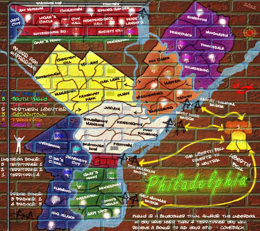
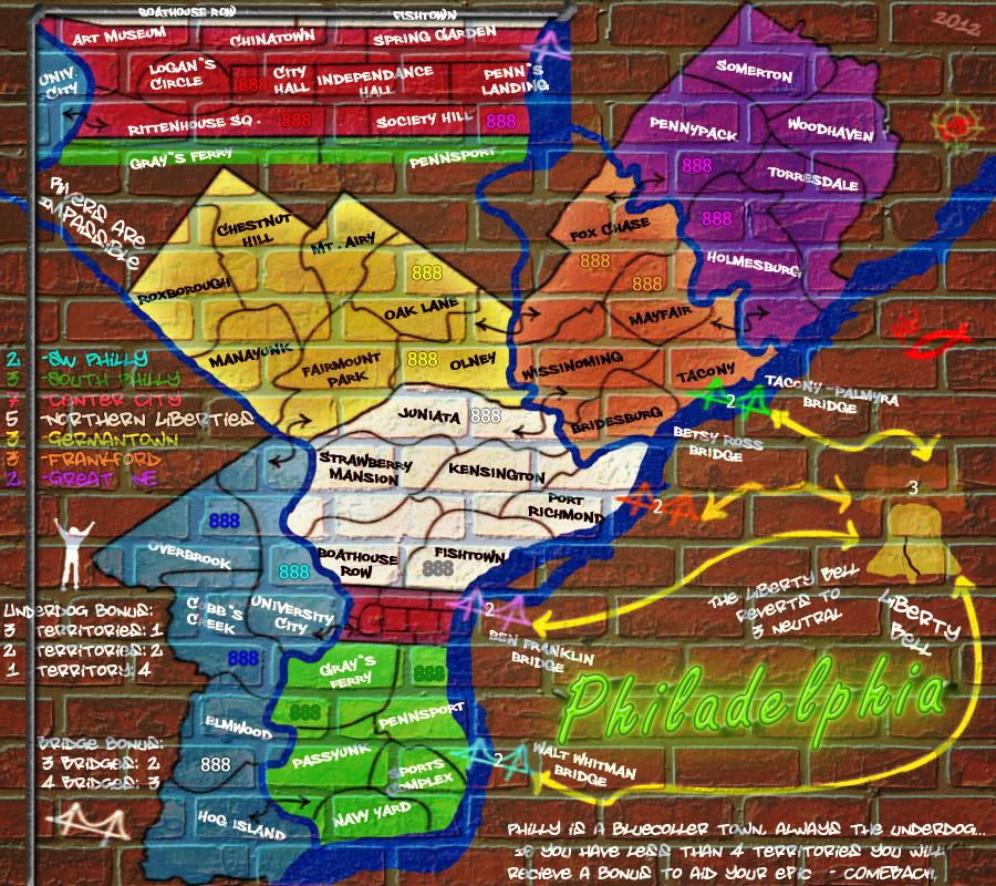
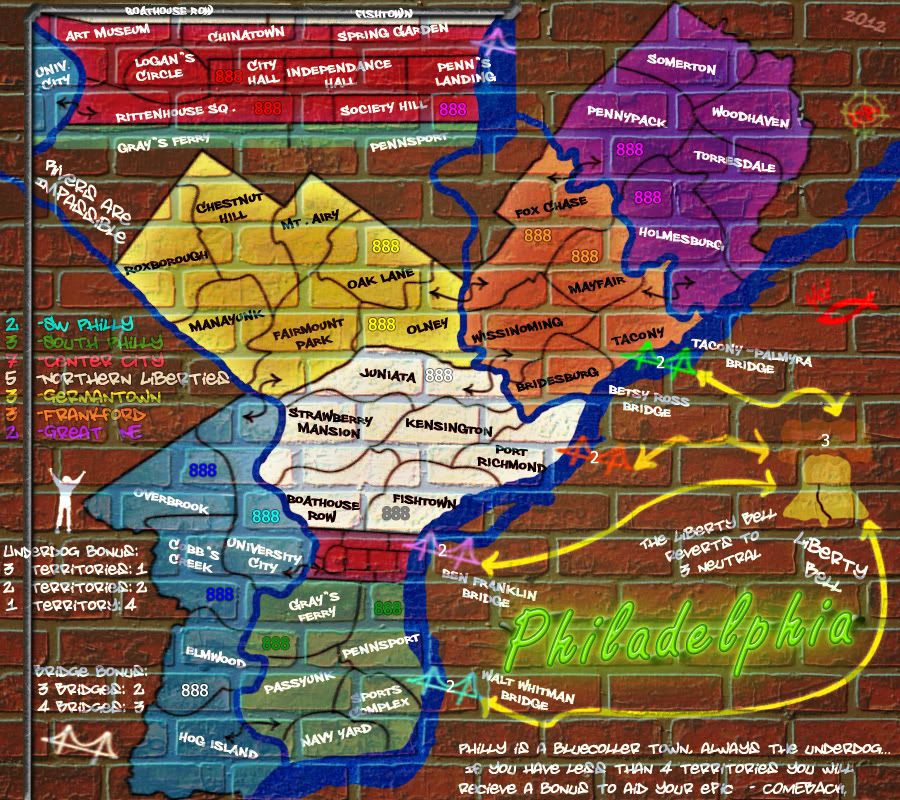
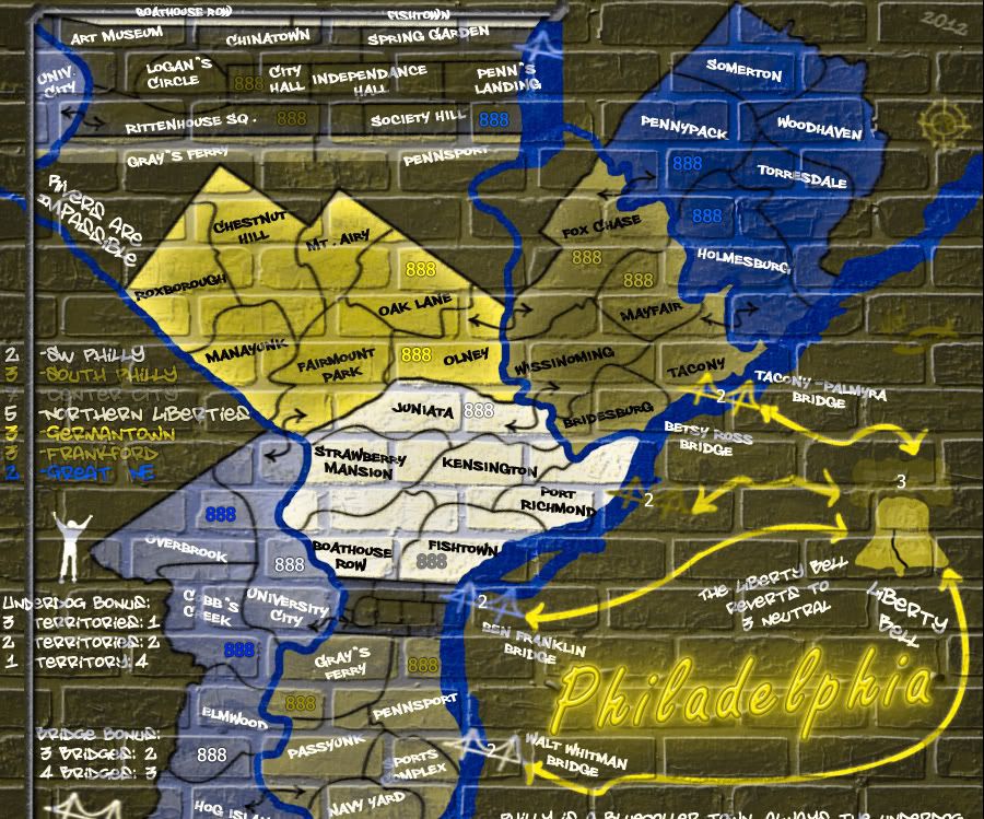
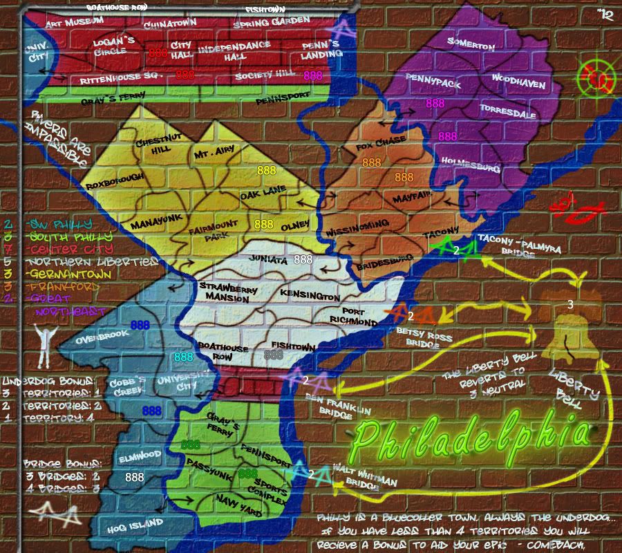
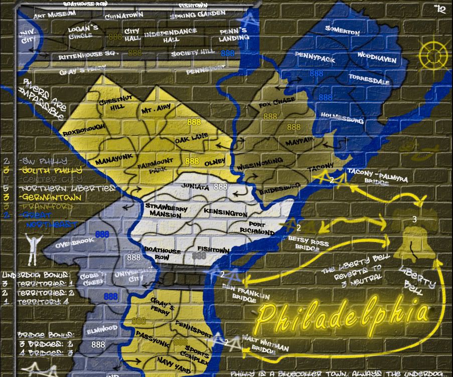
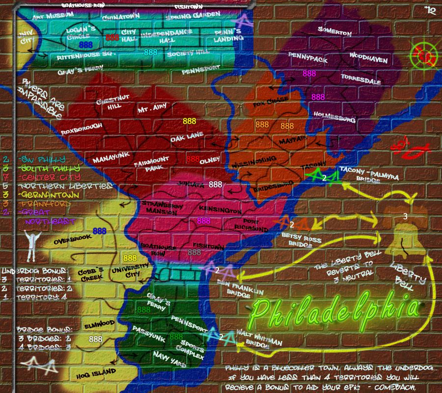
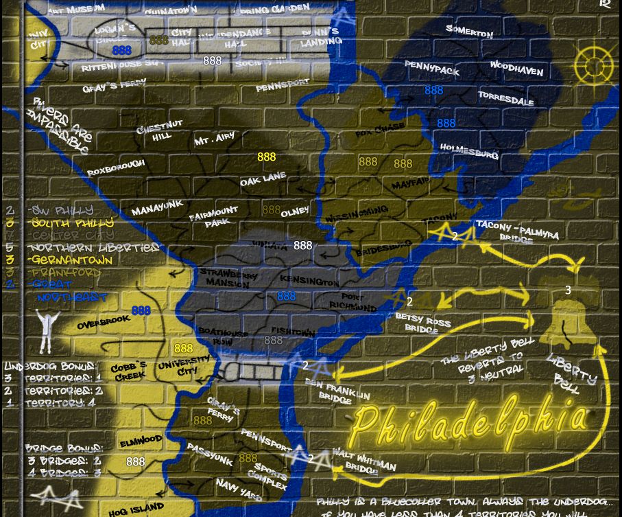
Re: Philadelphia - [29 March 2012] pg 30 -army circles
RedBaron0 wrote:Black is the most common spray paint graffiti color, and honestly I like the look. Sigh... I will try all white.
I can add more drips, I figured out how to make them look good with the army circles and I can apply it to everything else. Still a work in progress afterall. I may end up redrawing all the borders, bridges, and connectors using this technique.
But before you said that you didn't want to add drips because good graffiti artists don't make paint drips... and I agree with it. I think you can make the circles look like a part of the painting by just making them a bit irregular in shape, and with the airbrush edges...