Re: California 1.6
I mean the text below the images -- there are now 52 territories, not 51.
Conquer Club, a free online multiplayer variation of a popular world domination board game.
https://www.conquerclub.com/forum/
https://www.conquerclub.com/forum/viewtopic.php?f=358&t=126233
Evil DIMwit wrote:I mean the text below the images -- there are now 52 territories, not 51.

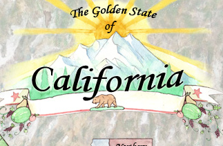
Victor Sullivan wrote:You should do something "flashy" to reflect California properly. This would also be good to set it apart from the "just a state map" mentality.
The Bison King wrote:Much better, but what is "flashy" to you?

One possible solution is to desaturate the colors outside of LA in the inset, same for the Bay area.
Then something ought to be done about all that white around the minimap... something to make the vibrancy of the minimap colors not compete so hard with the main map.
Lastly, the lines when you zoomed in to make the inset are all overly blurry. Either rescan it at a higher resolution or re do the back lines in photoshop.
As for the cities, doing it like the italy map is quite lame and I think you can do better. What about little city symbols, perhaps somewhat unique to the cities they represent.
Looking at this map I feel like I'm being assaulted by a rainbow
RedBaron0 wrote:The look is nice.... but I think is getting a little tired. I'd like to see you go in a different direction, broaden your horizons a little. I really hate to think this style is all you got.
Besides California is a modern, real place, unlike Celtic 7 or Thyseneal. I really think you'll need more graphically than the water color to pass this one though. It's early still, I'm looking forward to seeing what you got!
Victor Sullivan wrote:You should do something "flashy" to reflect California properly. This would also be good to set it apart from the "just a state map" mentality.
RedBaron0 wrote:The look is nice.... but I think is getting a little tired. I'd like to see you go in a different direction, broaden your horizons a little. I really hate to think this style is all you got.
Besides California is a modern, real place, unlike Celtic 7 or Thyseneal. I really think you'll need more graphically than the water color to pass this one though. It's early still, I'm looking forward to seeing what you got!
the white in the East is atrocious and should be fixed with maybe a muted brown or a tan of some sort, to signify there's land there.
I find the "Pacific Ocean" strange. Okay, I can see the water color effect and that's all well and good, but it doesn't really look like an ocean.
Also, the zoomed-in parts bleeding into the zoomed-out parts looks really strange to me.

The Bison King wrote:I'm usually not a fan of when photographs are thrown into the backgrounds of maps.
The Bison King wrote:So I got this idea, what if I kind of aim to make it look like a tourist map. Maybe arrange the photo graphs in the back a little bit more like photos on a table. You know have more of them and make them more evidently photos.
The Bison King wrote:I left the little city icons on their just to show you what one option would be, but the way I think I should go with that is to make the cities stars, reminiscent of sunset boulevard.