- Click image to enlarge.
Quad Cities Map [Quenched]
Moderator: Cartographers
Re: Quad Cities Map [6 Jul 2011] v7.0
![]() by ironsij0287 on Wed Aug 10, 2011 2:46 pm
by ironsij0287 on Wed Aug 10, 2011 2:46 pm
Update with a "blurb" added.
-

 ironsij0287
- Posts: 379
- Joined: Tue Nov 09, 2010 2:30 pm
- Location: Dubuque


Re: Quad Cities Map [6 Jul 2011] v7.0
![]() by Victor Sullivan on Thu Aug 11, 2011 2:06 am
by Victor Sullivan on Thu Aug 11, 2011 2:06 am
Nice. I like it.
-Sully
-Sully
Beckytheblondie: "Don't give us the dispatch, give us a mustache ride."
Scaling back on my CC involvement...
Scaling back on my CC involvement...
-

Victor Sullivan
- Posts: 6010
- Joined: Mon Feb 08, 2010 8:17 pm
- Location: Columbus, OH


Re: Quad Cities Map [6 Jul 2011] v7.0
![]() by jasholz on Thu Aug 11, 2011 2:36 am
by jasholz on Thu Aug 11, 2011 2:36 am
used to live in davenport
cant wait to play this one
cant wait to play this one

-

jasholz
- Posts: 181
- Joined: Mon Mar 26, 2007 7:51 am
- Location: illinois 36 miles from Normal


Re: Quad Cities Map [6 Jul 2011] v7.0
![]() by AndyDufresne on Thu Aug 11, 2011 9:05 am
by AndyDufresne on Thu Aug 11, 2011 9:05 am
Blurb is nice. If you can edit it and cut it down a little more, it might be even better.
--Andy
--Andy
-

AndyDufresne
- Posts: 24919
- Joined: Fri Mar 03, 2006 8:22 pm
- Location: A Banana Palm in Zihuatanejo


Re: Quad Cities Map [6 Jul 2011] v7.0
![]() by ironsij0287 on Thu Aug 11, 2011 10:36 am
by ironsij0287 on Thu Aug 11, 2011 10:36 am
AndyDufresne wrote:Blurb is nice. If you can edit it and cut it down a little more, it might be even better.
--Andy
I agree. Let me work some editing magic to it.
-
ironsij0287
- Posts: 379
- Joined: Tue Nov 09, 2010 2:30 pm
- Location: Dubuque
Re: Quad Cities Map [6 Jul 2011] v7.0
![]() by ironsij0287 on Tue Aug 16, 2011 12:15 pm
by ironsij0287 on Tue Aug 16, 2011 12:15 pm
Small Map
Large Map
- Edited text blurb
- Created small version
- XML also updated to fit new map both Large and Small version.
- Click image to enlarge.

Large Map
- Click image to enlarge.

- Edited text blurb
- Created small version
- XML also updated to fit new map both Large and Small version.
-
ironsij0287
- Posts: 379
- Joined: Tue Nov 09, 2010 2:30 pm
- Location: Dubuque
Re: Quad Cities Map [16 Aug 2011] v7.02
![]() by AndyDufresne on Wed Aug 17, 2011 4:19 pm
by AndyDufresne on Wed Aug 17, 2011 4:19 pm
What if the blurb text was edited more, to something like this:
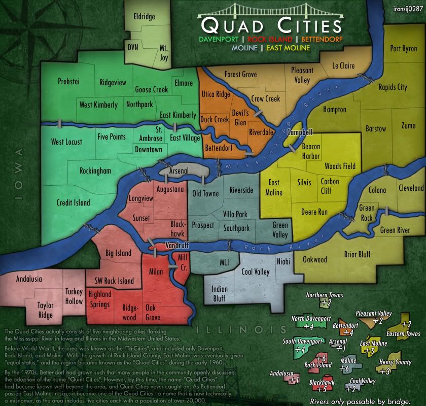
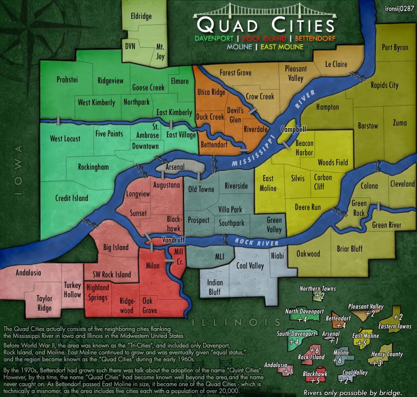
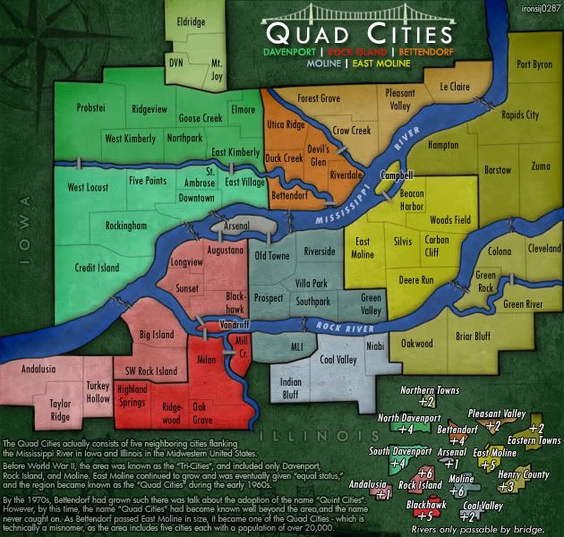
"The Quad Cities actually consists of five neighboring cities flanking the Mississippi River in Iowa and Illinois in the Midwestern United States.
Before WWII, the area was know as the 'Tri-Cities,' and as the cities and area grew in population, it became known as the 'Quad Cities.' Population continued to grow, however, and 'Quint Cities' was a proposed name to adjust to the developing cities. However, 'Quad Cities' had become known well beyond the area, thus leaving the curious case of the 5 member cities making up the 'Quad Cities."
Or something like that, to cut it down more.
--Andy
-
AndyDufresne
- Posts: 24919
- Joined: Fri Mar 03, 2006 8:22 pm
- Location: A Banana Palm in Zihuatanejo
Re: Quad Cities Map [16 Aug 2011] v7.02
![]() by Victor Sullivan on Wed Aug 17, 2011 4:23 pm
by Victor Sullivan on Wed Aug 17, 2011 4:23 pm
Meh, I don't think it's really necessary to cut it down, I like the blurb, and it fits (in theme and spacial-ly).
-Sully
-Sully
Beckytheblondie: "Don't give us the dispatch, give us a mustache ride."
Scaling back on my CC involvement...
Scaling back on my CC involvement...
-
Victor Sullivan
- Posts: 6010
- Joined: Mon Feb 08, 2010 8:17 pm
- Location: Columbus, OH
Re: Quad Cities Map [16 Aug 2011] v7.02
![]() by AndyDufresne on Thu Aug 18, 2011 4:03 pm
by AndyDufresne on Thu Aug 18, 2011 4:03 pm
Victor Sullivan wrote:Meh, I don't think it's really necessary to cut it down, I like the blurb, and it fits (in theme and spacial-ly).
-Sully
I like the blurb too---there is just so much information that makes it difficult to read at its size, and it seems like there is some extraneous information in it as well.
--Andy
-
AndyDufresne
- Posts: 24919
- Joined: Fri Mar 03, 2006 8:22 pm
- Location: A Banana Palm in Zihuatanejo
Re: Quad Cities Map [16 Aug 2011] v7.02
![]() by Victor Sullivan on Thu Aug 18, 2011 6:44 pm
by Victor Sullivan on Thu Aug 18, 2011 6:44 pm
AndyDufresne wrote:Victor Sullivan wrote:Meh, I don't think it's really necessary to cut it down, I like the blurb, and it fits (in theme and spacial-ly).
-Sully
I like the blurb too---there is just so much information that makes it difficult to read at its size, and it seems like there is some extraneous information in it as well.
--Andy
I suppose you have a point with the small version. Perhaps have a shorter blurb for the small? Or would that be too "un-uniform"? I am, at least, a fan of those maps that have sort of "Easter Eggs" when you upsize to the large. Like I think Celtic Nations has a poem on the large version.
-Sully
Beckytheblondie: "Don't give us the dispatch, give us a mustache ride."
Scaling back on my CC involvement...
Scaling back on my CC involvement...
-
Victor Sullivan
- Posts: 6010
- Joined: Mon Feb 08, 2010 8:17 pm
- Location: Columbus, OH
Re: Quad Cities Map [16 Aug 2011] v7.02
![]() by ender516 on Thu Aug 18, 2011 9:57 pm
by ender516 on Thu Aug 18, 2011 9:57 pm
Both Celtic Nations and England have a poem visible only on the large map.
-

ender516
- Posts: 4455
- Joined: Wed Dec 17, 2008 6:07 pm
- Location: Waterloo, Ontario


Re: Quad Cities Map [16 Aug 2011] v7.02
![]() by ironsij0287 on Thu Aug 18, 2011 11:46 pm
by ironsij0287 on Thu Aug 18, 2011 11:46 pm
So do I keep it on the large and nix it on the small?
-
ironsij0287
- Posts: 379
- Joined: Tue Nov 09, 2010 2:30 pm
- Location: Dubuque
Re: Quad Cities Map [16 Aug 2011] v7.02
![]() by DiM on Fri Aug 19, 2011 6:12 am
by DiM on Fri Aug 19, 2011 6:12 am
i say keep it on both. i can read it perfectly on the small maps and if somebody can't then he/she can simply switch to the large to read it. it's not like that's the most important text on the map and needs to be visible from across the room.
1. if you remove it from the small and leave it on the large then the small map remains with an ugly empty space there.
2. if you remove just a part of it from the small and leave the full text on the large then the people who only use small maps will never see the full story.
3. if you remove part of the text from both large and small then interesting info will be lost.
“In the beginning God said, the four-dimensional divergence of an antisymmetric, second rank tensor equals zero, and there was light, and it was good. And on the seventh day he rested.”- Michio Kaku
-

DiM
- Posts: 10415
- Joined: Wed Feb 14, 2007 6:20 pm
- Location: making maps for scooby snacks


Re: Quad Cities Map [16 Aug 2011] v7.02
![]() by ironsij0287 on Fri Aug 19, 2011 9:38 am
by ironsij0287 on Fri Aug 19, 2011 9:38 am
DiM wrote:i say keep it on both. i can read it perfectly on the small maps and if somebody can't then he/she can simply switch to the large to read it. it's not like that's the most important text on the map and needs to be visible from across the room.
1. if you remove it from the small and leave it on the large then the small map remains with an ugly empty space there.
2. if you remove just a part of it from the small and leave the full text on the large then the people who only use small maps will never see the full story.
3. if you remove part of the text from both large and small then interesting info will be lost.
Yeah, I agree with all of this.
-
ironsij0287
- Posts: 379
- Joined: Tue Nov 09, 2010 2:30 pm
- Location: Dubuque
Re: Quad Cities Map [16 Aug 2011] v7.02
![]() by Victor Sullivan on Fri Aug 19, 2011 6:10 pm
by Victor Sullivan on Fri Aug 19, 2011 6:10 pm
With point #2, that's precisely what I think is cool! I think you should go with 2.
-Sully
-Sully
Beckytheblondie: "Don't give us the dispatch, give us a mustache ride."
Scaling back on my CC involvement...
Scaling back on my CC involvement...
-
Victor Sullivan
- Posts: 6010
- Joined: Mon Feb 08, 2010 8:17 pm
- Location: Columbus, OH
Re: Quad Cities Map [16 Aug 2011] v7.02
![]() by ironsij0287 on Mon Aug 22, 2011 12:22 pm
by ironsij0287 on Mon Aug 22, 2011 12:22 pm
I'm fine with how the blurb is right now on the small map, and I think removing more text from it will degrade the explanation.
XML: download/file.php?id=221
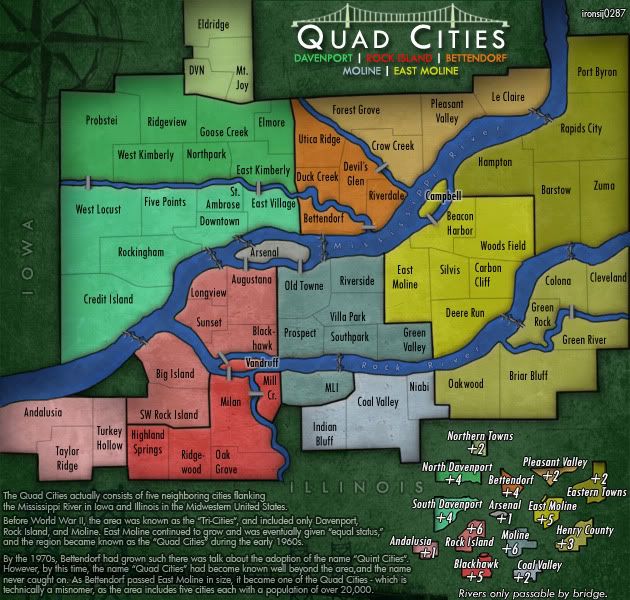
Small Map http://i11.photobucket.com/albums/a193/ ... 2small.jpg
Large Map http://i11.photobucket.com/albums/a193/ ... sk3_02.jpg
XML: download/file.php?id=221
Small Map http://i11.photobucket.com/albums/a193/ ... 2small.jpg
- Click image to enlarge.
Large Map http://i11.photobucket.com/albums/a193/ ... sk3_02.jpg
- Click image to enlarge.
-
ironsij0287
- Posts: 379
- Joined: Tue Nov 09, 2010 2:30 pm
- Location: Dubuque
Re: Quad Cities Map [16 Aug 2011] v7.02
![]() by thenobodies80 on Wed Aug 24, 2011 1:06 pm
by thenobodies80 on Wed Aug 24, 2011 1:06 pm
.....I must agree with the people who thinks that the text on the small version is really small 
-

thenobodies80
- Posts: 5400
- Joined: Wed Sep 05, 2007 4:30 am
- Location: Milan


Re: Quad Cities Map [16 Aug 2011] v7.02
![]() by ironsij0287 on Wed Aug 24, 2011 6:31 pm
by ironsij0287 on Wed Aug 24, 2011 6:31 pm
Increased opacity and font size of the text blurb. Does that make it a little more clear?
-
ironsij0287
- Posts: 379
- Joined: Tue Nov 09, 2010 2:30 pm
- Location: Dubuque
Re: Quad Cities Map [16 Aug 2011] v7.02
![]() by cairnswk on Wed Aug 24, 2011 6:50 pm
by cairnswk on Wed Aug 24, 2011 6:50 pm
ironsij0287...the story text on the small map is good for me now.
But there are three things that i beleve can be improved upon, and i know you've probably been over them with others...but IMHO it would help improve the map greatly
1. the river name texts needs to be slightly brighter/bigger so that is legiable, evne though it is superfluous to gameplay
2. the stort text on the large map needs increased size or opacity so that it is more legible...i say this because those who still cannot read the small map text will be able to read it on the large map
3. i do wish you would decrease or get rid of the inner shadow of the citys' outside border...i am sorry to say this but is simply makes the map look grubby.
Other than that it is well improved on where it was last time i commented some weeks ago.

* Pearl Harbour * Waterloo * Forbidden City * Jamaica * Pot Mosbi
-

cairnswk
- Posts: 11510
- Joined: Sat Feb 03, 2007 8:32 pm
- Location: Australia

Re: Quad Cities Map [16 Aug 2011] v7.02
![]() by ironsij0287 on Thu Aug 25, 2011 10:04 am
by ironsij0287 on Thu Aug 25, 2011 10:04 am
cairnswk wrote:ironsij0287...the story text on the small map is good for me now.
But there are three things that i beleve can be improved upon, and i know you've probably been over them with others...but IMHO it would help improve the map greatly
1. the river name texts needs to be slightly brighter/bigger so that is legiable, evne though it is superfluous to gameplay
2. the stort text on the large map needs increased size or opacity so that it is more legible...i say this because those who still cannot read the small map text will be able to read it on the large map
3. i do wish you would decrease or get rid of the inner shadow of the citys' outside border...i am sorry to say this but is simply makes the map look grubby.
Other than that it is well improved on where it was last time i commented some weeks ago.
1. I'll work on those. I've been wondering about them tooo.
2. easy fix, consider it done.
3. I decreased once already. I'll play around with it again and see how it looks.
-
ironsij0287
- Posts: 379
- Joined: Tue Nov 09, 2010 2:30 pm
- Location: Dubuque
Re: Quad Cities Map [16 Aug 2011] v7.02
![]() by ironsij0287 on Thu Aug 25, 2011 10:41 am
by ironsij0287 on Thu Aug 25, 2011 10:41 am
Updated map.
XML: download/file.php?id=221
Small Map http://i11.photobucket.com/albums/a193/ ... 1small.jpg
Large Map http://i11.photobucket.com/albums/a193/ ... 1large.jpg
Changes in v.7.3.1
XML: download/file.php?id=221
Small Map http://i11.photobucket.com/albums/a193/ ... 1small.jpg
- Click image to enlarge.
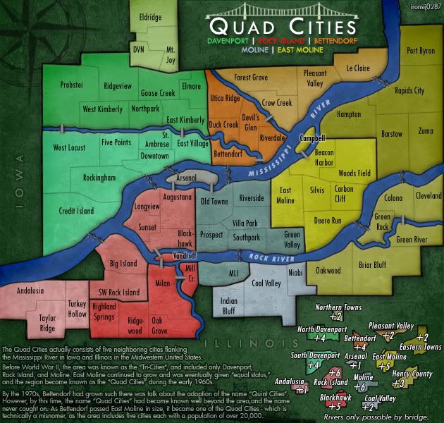
Large Map http://i11.photobucket.com/albums/a193/ ... 1large.jpg
- Click image to enlarge.
Changes in v.7.3.1
- - increased opacity and font size on Story Text in bottom left to make them more legible.
- - changed river labels to new font and style to make them more legible
- - Changed inner shadow around whole region, reducing opacity and switching from multiply to color burn, thus making it appear less "grubby" and dull.
-
ironsij0287
- Posts: 379
- Joined: Tue Nov 09, 2010 2:30 pm
- Location: Dubuque
Re: Quad Cities Map [25 Aug 2011] v7.03.1
![]() by hoschke118 on Mon Aug 29, 2011 4:05 am
by hoschke118 on Mon Aug 29, 2011 4:05 am
I'm not sure why, but I just read through almost this entire thread. I've got nothing to add at this stage. It looks great and I can't wait to play it. Also, I'm so glad you kept the gameplay simple.
-

hoschke118
- Posts: 33
- Joined: Wed Aug 27, 2008 2:21 am
Re: Quad Cities Map [25 Aug 2011] v7.03.1
![]() by cairnswk on Mon Aug 29, 2011 7:18 am
by cairnswk on Mon Aug 29, 2011 7:18 am
For me, ironsij8287, the maps look a whole lot better now.
* Pearl Harbour * Waterloo * Forbidden City * Jamaica * Pot Mosbi
-
cairnswk
- Posts: 11510
- Joined: Sat Feb 03, 2007 8:32 pm
- Location: Australia
Re: Quad Cities Map [25 Aug 2011] v7.03.1
![]() by pamoa on Mon Aug 29, 2011 7:23 am
by pamoa on Mon Aug 29, 2011 7:23 am
I must say you have now a good simple city map
as it says simple is not easy
one point you can improve is the Vandruff Island colour
as it is very narrow and you have emboss effect on it
it is hard to tell if it is part of Rock Island or Blackhawk
especially if you think their will be an army counter all over it
what you have to do is to make the red a little bit stronger
so it would be more certain it is part of Blackhawk
De gueules à la tour d'argent ouverte, crénelée de trois pièces, sommée d'un donjon ajouré, crénelé de deux pièces
Gules an open tower silver, crenellated three parts, topped by a apertured turret, crenellated two parts
Gules an open tower silver, crenellated three parts, topped by a apertured turret, crenellated two parts
-

pamoa
- Posts: 1242
- Joined: Sat Sep 01, 2007 3:18 am
- Location: Confederatio Helvetica


Re: Quad Cities Map [25 Aug 2011] v7.03.1
![]() by ironsij0287 on Mon Aug 29, 2011 10:54 am
by ironsij0287 on Mon Aug 29, 2011 10:54 am
Updated map.
XML: download/file.php?id=221
Small Map http://i11.photobucket.com/albums/a193/ ... 2small.jpg
Large Map http://i11.photobucket.com/albums/a193/ ... 2large.jpg
Changes in v.7.3.2
XML: download/file.php?id=221
Small Map http://i11.photobucket.com/albums/a193/ ... 2small.jpg
- Click image to enlarge.
Large Map http://i11.photobucket.com/albums/a193/ ... 2large.jpg
- Click image to enlarge.

Changes in v.7.3.2
- - darkened the red in Blackhawkto better emphasize that Vandruff Island is part of that region.
Last edited by ironsij0287 on Mon Aug 29, 2011 1:20 pm, edited 1 time in total.
-
ironsij0287
- Posts: 379
- Joined: Tue Nov 09, 2010 2:30 pm
- Location: Dubuque
Who is online
Users browsing this forum: No registered users
|
|||||||
| Conquer Club is not associated with RISK online in any way. Copyright © 2006-2024 by Big Wham LLC | |||||||