Conquer Club

Quad Cities Map [Quenched]

Care to peruse completed maps? Take a stroll through the Atlas.

Moderator: Cartographers

Forum rules
Please read the Community Guidelines before posting.

Re: Quad Cities Map

Postby DiM on Thu Jun 30, 2011 5:03 pm

MrBenn wrote: I know that things are being worked on behind-the scenes and further updates will be given in due course ;-)


very good. i'm really glad to hear that but unfortunately that doesn't change the fact that some people feel so outraged that i (and others) dared to demand changes.

when i like a map i tend to be a perfectionist and try to find every single mistake no matter how small it is. for example my post in golfe du st laurent. on the other hand some people become very lenient when they like a map and would willingly ignore various mistakes just to be able to play it sooner (for example the guy that responded to my post)
my point is, if you like something, then why not make the best of it? why settle for less? that's what tobinov is doing, that's what ironsij is doing...
i don't know, i was raised to be the best that i can possibly be and always try to better myself. maybe i'm wrong, maybe i'm taking this too serious, but if ironsij can improve this map then i there's no excuse for not doing it. sure it's easy to say that he's jumped through hoops, that he got his medals and waited for 8 months but would he be pleased with himself knowing he didn't do the best that he could possibly do? i wouldn't.
ā€œIn the beginning God said, the four-dimensional divergence of an antisymmetric, second rank tensor equals zero, and there was light, and it was good. And on the seventh day he rested.ā€- Michio Kaku
User avatar
Major DiM
 
Posts: 10415
Joined: Wed Feb 14, 2007 6:20 pm
Location: making maps for scooby snacks

Re: Quad Cities Map

Postby natty dread on Thu Jun 30, 2011 5:42 pm

Ironsij:

My first map was received in FF in a similar way. I had worked hard, received the graphics stamp, and when I got to FF there were some foundry then-regulars who told me the map sucked and I'd be better off scrapping it and starting over. Like now, heated words were said by both sides, but luckily, some people did give me some great advice, and some 10 versions later, the map was immensely better thanks to it. I learned a lot in the process, and looking back, I'm glad I was forced to make those changes and improve myself.

Back then, when I got to FF, I figured my map would be received well, I was certain that my map was awesome in quality, after all I had been working so hard and long for it (it was around version #50 at the time) and I was suprised when people told me otherwise. Looking back now, I think the map looks kinda crappy (although in my defense I was working with very limited resources back then, with inferior hardware & software) and if I could turn back time, I would work doubly longer on that map. Heck, I'd probably do the same for my 2nd map as well.

I get the first-time mapmaker's anxiety, wanting to see his first map in play as soon as possible, and I get that it feels like a stab in the back to get your map in FF and then be told that your work isn't good enough and you need to work on it more. But honestly, if you keep on working with maps, 2-3 maps from now you will look back and wish that you'd have spent a bit more time with that first map.

---
Dim:

You may be right to be disappointed with the state of the foundry (and if things are too awful here, I'm sure the guys at majorcommand would just love to have you making maps for them...) but you can't just blame the foundry people for the decline in quality - in fact, a lot of the old mapmakers, who should have been here at least to transfer that mapmaking knowledge they gathered over the years to the next generation, have simply given up on CC and the foundry, and as a result, the new generation of mapmakers has had to sort of feel their way blindly. A lot of the old foundry commentators have quit visiting the foundry, and without feedback, the situation is even worse - less people giving feedback means the foundry mods have less to go by when they try to judge if a map should be stamped or not.

The more knowledgeable people we have offering constructive criticism to maps, the better the quality of maps will be. I believe eventually the situation will rectify itself either way, as the current foundry population (me included) gets more experience under the belt... but other than that, if you don't know some magic trick that can get the old guys suddenly involved again, I don't know if there's much that can be done.
Image
User avatar
Sergeant 1st Class natty dread
 
Posts: 12877
Joined: Fri Feb 08, 2008 8:58 pm
Location: just plain fucked

Re: Quad Cities Map

Postby DiM on Thu Jun 30, 2011 6:05 pm

natty_dread wrote:Ironsij:

My first map was received in FF in a similar way. I had worked hard, received the graphics stamp, and when I got to FF there were some foundry then-regulars who told me the map sucked and I'd be better off scrapping it and starting over. Like now, heated words were said by both sides, but luckily, some people did give me some great advice, and some 10 versions later, the map was immensely better thanks to it. I learned a lot in the process, and looking back, I'm glad I was forced to make those changes and improve myself.

Back then, when I got to FF, I figured my map would be received well, I was certain that my map was awesome in quality, after all I had been working so hard and long for it (it was around version #50 at the time) and I was suprised when people told me otherwise. Looking back now, I think the map looks kinda crappy (although in my defense I was working with very limited resources back then, with inferior hardware & software) and if I could turn back time, I would work doubly longer on that map. Heck, I'd probably do the same for my 2nd map as well.

I get the first-time mapmaker's anxiety, wanting to see his first map in play as soon as possible, and I get that it feels like a stab in the back to get your map in FF and then be told that your work isn't good enough and you need to work on it more. But honestly, if you keep on working with maps, 2-3 maps from now you will look back and wish that you'd have spent a bit more time with that first map.


very well said.


natty_dread wrote:Dim:

You may be right to be disappointed with the state of the foundry (and if things are too awful here, I'm sure the guys at majorcommand would just love to have you making maps for them...) but you can't just blame the foundry people for the decline in quality - in fact, a lot of the old mapmakers, who should have been here at least to transfer that mapmaking knowledge they gathered over the years to the next generation, have simply given up on CC and the foundry, and as a result, the new generation of mapmakers has had to sort of feel their way blindly. A lot of the old foundry commentators have quit visiting the foundry, and without feedback, the situation is even worse - less people giving feedback means the foundry mods have less to go by when they try to judge if a map should be stamped or not.

The more knowledgeable people we have offering constructive criticism to maps, the better the quality of maps will be. I believe eventually the situation will rectify itself either way, as the current foundry population (me included) gets more experience under the belt... but other than that, if you don't know some magic trick that can get the old guys suddenly involved again, I don't know if there's much that can be done.


i came back for conquerclub, not for majorcommand or anything else. i simply came back to see what's going on and maybe make another map. i don't want to go to another site to make maps, heck, i don't even play the game anymore, as i said i simply came to see what happened to the foundry while i was gone.
i have always given a lot of feedback on almost all maps. the problem is some people aren't receiving my feedback the way they used to. i've always been a detail person but at this moment the foundry in general doesn't seem to care about the details anymore. i commented on one map about a barely visible mistake and i've been told that people don't play with microscopes. sadly that response adequately describes the current situation of the foundry. nobody looks closely at maps when analysing them. most people just take a look and if it has borders terits and a legend it's good enough. nobody seems to be bothered anymore by a pixelated border, a blurry icon or a misaligned shadow.

with or without the oldguys the foundry still has to move forward and better itself but that's impossible if people set lower and lower standards. and the first to stop those standards from getting lower are the mapmakers. if very few people come to your thread to comment that's no reason to slack around and make a poor map. set your own standard as high as possible. compare your map to the best maps available and try to surpass them. that's the only way for the foundry to move forward.
ā€œIn the beginning God said, the four-dimensional divergence of an antisymmetric, second rank tensor equals zero, and there was light, and it was good. And on the seventh day he rested.ā€- Michio Kaku
User avatar
Major DiM
 
Posts: 10415
Joined: Wed Feb 14, 2007 6:20 pm
Location: making maps for scooby snacks

Re: Quad Cities Map

Postby natty dread on Thu Jun 30, 2011 7:17 pm

DiM wrote:i came back for conquerclub, not for majorcommand or anything else. i simply came back to see what's going on and maybe make another map.


And we're happy to have you here.

DiM wrote:i have always given a lot of feedback on almost all maps. the problem is some people aren't receiving my feedback the way they used to. i've always been a detail person but at this moment the foundry in general doesn't seem to care about the details anymore.


Some mapmakers (most, I'd say) do. It's just, there aren't many people who comment on details. On the average CC goer's view, a map is fine as long as you can see what connects where and it plays ok.

It's not all bad, though. Most of the maps are good, some are awesome. I haven't seen many really bad maps quenched here. Usually, the foundry mods do a good job making sure all concerns about a map are addressed. But sometimes maps slip through the cracks and issues go unaddressed until someone points them out later on.

DiM wrote:i commented on one map about a barely visible mistake and i've been told that people don't play with microscopes.


I think whoever said that was someone who's not a foundry regular. As long as I've been here, it's always been like that - the non-regulars, who don't care about the details, are the ones who are always in a hurry to get a map to play, the ones who only visit the first or last forum occasionally, and comment along the lines of "cool map! when can I play it?"

DiM wrote:nobody seems to be bothered anymore by a pixelated border, a blurry icon or a misaligned shadow.


To be fair, there are some older maps that have some pretty egrecious mistakes as well. Look at WWII Europe and count the pixelated borders, blurry arrows etc. I guess it had an interesting gameplay for it's time... I don't see how else it could have been quenched.

Anyway, in my experience blurriness and pixelation is generally addressed pretty quickly in the foundry today - I think the problem we have today is more that we don't have many people with experience in graphic design who would be able to take a look at a map and instantly spot things you can improve by changing shading, colours, composition etc.

DiM wrote:with or without the oldguys the foundry still has to move forward and better itself but that's impossible if people set lower and lower standards. and the first to stop those standards from getting lower are the mapmakers. if very few people come to your thread to comment that's no reason to slack around and make a poor map. set your own standard as high as possible. compare your map to the best maps available and try to surpass them. that's the only way for the foundry to move forward.


I agree with this 100%.
Image
User avatar
Sergeant 1st Class natty dread
 
Posts: 12877
Joined: Fri Feb 08, 2008 8:58 pm
Location: just plain fucked

Re: Quad Cities Map

Postby ironsij0287 on Fri Jul 01, 2011 10:25 am

natty_dread wrote:Ironsij:

My first map was received in FF in a similar way. I had worked hard, received the graphics stamp, and when I got to FF there were some foundry then-regulars who told me the map sucked and I'd be better off scrapping it and starting over. Like now, heated words were said by both sides, but luckily, some people did give me some great advice, and some 10 versions later, the map was immensely better thanks to it. I learned a lot in the process, and looking back, I'm glad I was forced to make those changes and improve myself.

Back then, when I got to FF, I figured my map would be received well, I was certain that my map was awesome in quality, after all I had been working so hard and long for it (it was around version #50 at the time) and I was suprised when people told me otherwise. Looking back now, I think the map looks kinda crappy (although in my defense I was working with very limited resources back then, with inferior hardware & software) and if I could turn back time, I would work doubly longer on that map. Heck, I'd probably do the same for my 2nd map as well.

I get the first-time mapmaker's anxiety, wanting to see his first map in play as soon as possible, and I get that it feels like a stab in the back to get your map in FF and then be told that your work isn't good enough and you need to work on it more. But honestly, if you keep on working with maps, 2-3 maps from now you will look back and wish that you'd have spent a bit more time with that first map.


Thank you natty. You completely nailed it.

I opened up QC in Photoshop yesterday to work on some things but I got nowhere. I'm literally at a point where I don't know where to go with it. I know there are plenty of things mentioned to be worked on but as a whole I feel like a lot of the map needs to just be wiped out and redone.

Would it be best to have this moved back to graphics for now? Even if the map in it's current state could just use a handful of touch ups to be ready, I'm not sure in hindsight I'll be happy with it once it gets quenched without doing an overhaul on it.
User avatar
Sergeant 1st Class ironsij0287
 
Posts: 379
Joined: Tue Nov 09, 2010 2:30 pm
Location: Dubuque

Re: Quad Cities Map

Postby natty dread on Fri Jul 01, 2011 10:48 am

What I would do, is take the good elements you have in the map and preserve them - things like territories, territory labels, rivers, and just scrap the elements that need work - that way you don't have to do all the work again on tracing the boundaries, etc.

I'm not sure exactly how your image is constructed, but if it's done in a flexible manner (meaning that all the elements are in their own layers, for example) then it should be no problem just changing things like textures, colours, backgrounds, etc.

I'm sure people like DiM & cairnswk can give you lots more advice on rehauling the graphics, if that's what you choose to do - they have way more experience than me.
Image
User avatar
Sergeant 1st Class natty dread
 
Posts: 12877
Joined: Fri Feb 08, 2008 8:58 pm
Location: just plain fucked

Re: Quad Cities Map

Postby DiM on Fri Jul 01, 2011 10:54 am

natty_dread wrote:What I would do, is take the good elements you have in the map and preserve them - things like territories, territory labels, rivers, and just scrap the elements that need work - that way you don't have to do all the work again on tracing the boundaries, etc.


good advice.
ā€œIn the beginning God said, the four-dimensional divergence of an antisymmetric, second rank tensor equals zero, and there was light, and it was good. And on the seventh day he rested.ā€- Michio Kaku
User avatar
Major DiM
 
Posts: 10415
Joined: Wed Feb 14, 2007 6:20 pm
Location: making maps for scooby snacks

Re: Quad Cities Map

Postby ironsij0287 on Fri Jul 01, 2011 1:01 pm

All of the territories are originally done in ArcView. I have those files saved there and can export them into PS whenever.
User avatar
Sergeant 1st Class ironsij0287
 
Posts: 379
Joined: Tue Nov 09, 2010 2:30 pm
Location: Dubuque

Re: Quad Cities Map

Postby cairnswk on Fri Jul 01, 2011 2:36 pm

ironsij0287 wrote:All of the territories are originally done in ArcView. I have those files saved there and can export them into PS whenever.

So from this I take it you are using PS for the map overall?
Image
* Pearl Harbour * Waterloo * Forbidden City * Jamaica * Pot Mosbi
User avatar
Private cairnswk
 
Posts: 11510
Joined: Sat Feb 03, 2007 8:32 pm
Location: Australia

Re: Quad Cities Map

Postby pamoa on Fri Jul 01, 2011 2:44 pm

some zen master wrote:if you want to have something that will stand the forging process
you need a graphic theme
because map is graphic representation you should have a graphic idea
one of the thing you can use here is the bridge theme
go around the web go to your local library and find cool bridge images drawings plans...
put some time in gathering material and find how other people treated the theme
at least thousand of them around the world
you never are the first to do something
use what they did
it may seems a loss of time
but you will be able to answer any graphic issue very quickly after that
because of the background you created yourself
after that phase you will have plenty of idea on what to work on
and also a huge pleasure and willingness to work on it
specially because your gameplay is settled
and remember the goal is not the map itself but the fun you have to work on it
De gueules Ć  la tour d'argent ouverte, crĆ©nelĆ©e de trois piĆØces, sommĆ©e d'un donjon ajourĆ©, crĆ©nelĆ© de deux piĆØces
Gules an open tower silver, crenellated three parts, topped by a apertured turret, crenellated two parts
User avatar
Cadet pamoa
 
Posts: 1242
Joined: Sat Sep 01, 2007 3:18 am
Location: Confederatio Helvetica

Re: Quad Cities Map

Postby ironsij0287 on Fri Jul 01, 2011 3:28 pm

cairnswk wrote:
ironsij0287 wrote:All of the territories are originally done in ArcView. I have those files saved there and can export them into PS whenever.

So from this I take it you are using PS for the map overall?


Yes the map is in PS. ArcView is used mainly to create my base map.
User avatar
Sergeant 1st Class ironsij0287
 
Posts: 379
Joined: Tue Nov 09, 2010 2:30 pm
Location: Dubuque

Re: Quad Cities Map

Postby ironsij0287 on Sun Jul 03, 2011 10:01 am

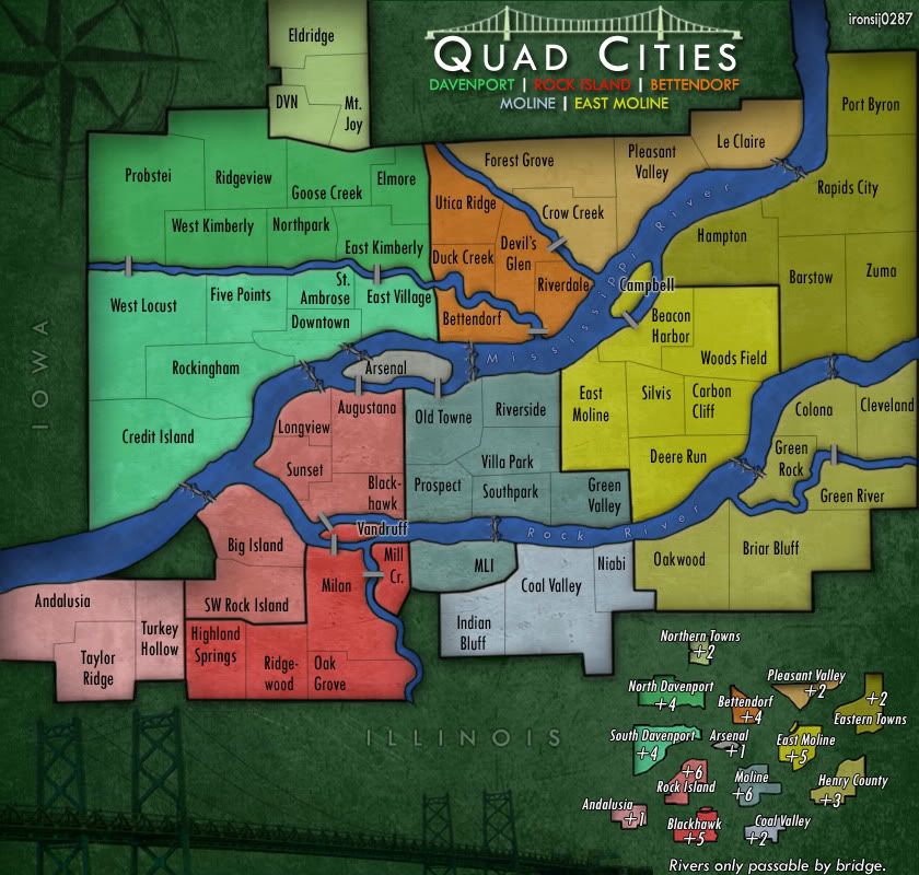
New version!

Click image to enlarge.
image


Big thanks to nobodies for this revamp. It looks amazing!
User avatar
Sergeant 1st Class ironsij0287
 
Posts: 379
Joined: Tue Nov 09, 2010 2:30 pm
Location: Dubuque

Re: Quad Cities Map

Postby DiM on Sun Jul 03, 2011 10:14 am

as i previously said in case of a good update i'll be the first to congratulate you, and here i am doing just that :)
the map looks much better. the rivers are nice the bridges are gorgeous and there's an overall nice crisp looking feeling to this.

right now i'm a little bit distracted by the very cluttered legend. it just looks like the text is too much for so very little graphic.
and the bridge in the title is blurry. sharpen it a bit.

edit// i just noticed the outer border is a bit uneven. in some places it's thinner for no apparent reason. for example in the western side of Probstei just north of the river.
ā€œIn the beginning God said, the four-dimensional divergence of an antisymmetric, second rank tensor equals zero, and there was light, and it was good. And on the seventh day he rested.ā€- Michio Kaku
User avatar
Major DiM
 
Posts: 10415
Joined: Wed Feb 14, 2007 6:20 pm
Location: making maps for scooby snacks

Re: Quad Cities Map

Postby zimmah on Sun Jul 03, 2011 11:39 am

wow this map look so much better then the original, nice job.

however, a few small things i noticed:

The bridge and the compass are a little dark on a dark background, maybe you can change it a little bit to make the more visible (at first i thought: "what's that huge black empty space doing at the bottom of the map?")

Font size of the legend is pretty high, especially the bonus numbers.

The river looks much more realistic then it did before, however maybe you could try to add some color to it to make it look more alive. like it's all blue now, and water (especially flowing water) has never really an equal spread color to it because the waves usually break the light and it reflects stuff, so try addng white stripes or something to make it actually look like flowing water. maybe someone else has tips on how to do that exactly. (t's no big deal but still if you can do it, it would be great)

the colors of rock island and andalusia look too much alike. altho it's not a very big problem because the legend is very clear, you stll might want to look at it.

some bridges look better then others, some are just lines, others actually look like bridges.


all in all it's quite good tho.
Click image to enlarge.
image
User avatar
Major zimmah
 
Posts: 1652
Joined: Fri Jun 01, 2007 12:43 pm
Location: VDLL

Re: Quad Cities Map

Postby ironsij0287 on Sun Jul 03, 2011 12:03 pm

The bridges vary by whether they're a major river crossing or minor crossing.

The colors between Rock Island and Andalusia are close. They contrasted a bit more in the old layout. I could play with that.

The legend I will tinker with as well and I'll look into the border thickness issue DiM mentioned.
User avatar
Sergeant 1st Class ironsij0287
 
Posts: 379
Joined: Tue Nov 09, 2010 2:30 pm
Location: Dubuque

Re: Quad Cities Map

Postby cairnswk on Sun Jul 03, 2011 3:34 pm

ironsij0287...i agree with DiM, congrats on this update. it is starting to look so much better than previous version.
there are still some furhter points howerver that need attending to:
1. i like river, it looks sunk into the land, although i am uncertain about the river border with Andalusia, it doesn't look like the same as the rest of the river.
2. the borders are much better, pixelation is gone
3. yes,the legend seems now cluttered...perhaps spread is out a little more if possible
4. the green area west of Big Island seems to have a large drop shadow hanging over those territories...is that meant to be like that?
5. there is also that drop shadow hanging over the territories around the edge of the map...i think it is making the map look quiet dark. perhaps loose that, as it i don't think it is needed as you have that external drop shadow aroudn the edges anyway.
well done...a big improvement. :)
Image
* Pearl Harbour * Waterloo * Forbidden City * Jamaica * Pot Mosbi
User avatar
Private cairnswk
 
Posts: 11510
Joined: Sat Feb 03, 2007 8:32 pm
Location: Australia

Re: Quad Cities Map

Postby natty dread on Sun Jul 03, 2011 3:54 pm

That is a huge improvement. Well done =D>
Image
User avatar
Sergeant 1st Class natty dread
 
Posts: 12877
Joined: Fri Feb 08, 2008 8:58 pm
Location: just plain fucked

Re: Quad Cities Map

Postby shakeycat on Sun Jul 03, 2011 9:56 pm

Big improvement! Good work.

It feels like there is a lot of dead space where your bridge and "Illinois" are at the bottom. Though I understand you probably have it this way so that the bonuses can appear in the same format as on the large-scale map, there is probably room to tighten it up a bit.

And while minor river crossings may not have a suspension bridge or any other fanciness in real life, it feels like there should be a little more than just a road. The little grey roads are awkward and stand out. If you're going for a "road" look, go full on and make it a little more realistic, like your bridges (which look great!) Otherwise, something like Charleston would work, where the little connections blend in colour-wise and feel quite organic.
Current Map Project: Tokyo
User avatar
Lieutenant shakeycat
 
Posts: 390
Joined: Sun Mar 11, 2007 5:13 am
Location: Vancouver

Re: Quad Cities Map

Postby AndyDufresne on Mon Jul 04, 2011 10:23 am

natty_dread wrote:That is a huge improvement. Well done =D>

These were my thoughts exactly.

Now that you've updated the graphics massive, the font looks a little sub-standard, at least, for the gameboard regions. The title, and the 'Iowa/Illinois' markers look great, and I could probably live with the legend font as well.

But great work. I'm looking forward to playing this map.


--Andy
User avatar
Corporal 1st Class AndyDufresne
 
Posts: 24919
Joined: Fri Mar 03, 2006 8:22 pm
Location: A Banana Palm in Zihuatanejo

Re: Quad Cities Map

Postby ironsij0287 on Mon Jul 04, 2011 2:06 pm

Thank you for all the nice comments but really the credit needs to go to nobodies. He's the one that worked his magic to greatly improve this map.
User avatar
Sergeant 1st Class ironsij0287
 
Posts: 379
Joined: Tue Nov 09, 2010 2:30 pm
Location: Dubuque

Re: Quad Cities Map

Postby zimmah on Mon Jul 04, 2011 5:20 pm

ironsij0287 wrote:Thank you for all the nice comments but really the credit needs to go to nobody. It's the magic that worked to greatly improve this map.


you're saying the map improved itself? :roll:
Click image to enlarge.
image
User avatar
Major zimmah
 
Posts: 1652
Joined: Fri Jun 01, 2007 12:43 pm
Location: VDLL

Re: Quad Cities Map

Postby Victor Sullivan on Tue Jul 05, 2011 3:06 am

nobodies, like the Foundry Deputy, dear. Nice work.

-Sully
User avatar
Corporal Victor Sullivan
 
Posts: 6010
Joined: Mon Feb 08, 2010 8:17 pm
Location: Columbus, OH

Re: Quad Cities Map

Postby ironsij0287 on Tue Jul 05, 2011 9:16 am

zimmah wrote:
ironsij0287 wrote:Thank you for all the nice comments but really the credit needs to go to nobody. It's the magic that worked to greatly improve this map.


you're saying the map improved itself? :roll:


Yes. The Immaculate Cartography.
User avatar
Sergeant 1st Class ironsij0287
 
Posts: 379
Joined: Tue Nov 09, 2010 2:30 pm
Location: Dubuque

Re: Quad Cities Map

Postby ironsij0287 on Tue Jul 05, 2011 12:02 pm

Click image to enlarge.
image
User avatar
Sergeant 1st Class ironsij0287
 
Posts: 379
Joined: Tue Nov 09, 2010 2:30 pm
Location: Dubuque

Re: Quad Cities Map

Postby zimmah on Tue Jul 05, 2011 8:48 pm

another tip, not about the map itself but about posting the updates.

When you post an updated map (or repost your map to the last page of the topic) please add the folowing information.

Map version (Quad cities v0.12 or something, name it whatever you want it, but i'd just number them v1 v2 v3 etc.)
What did you change since the last version, in this case i'd be something like:
  • Increased font size on territories
  • Decreased font size on minimap
  • etc.
Click image to enlarge.
image
User avatar
Major zimmah
 
Posts: 1652
Joined: Fri Jun 01, 2007 12:43 pm
Location: VDLL

PreviousNext

Return to The Atlas

Who is online

Users browsing this forum: No registered users