Conquer Club

Philippines Map revealed!! [Quenched]

Care to peruse completed maps? Take a stroll through the Atlas.

Moderator: Cartographers

Forum rules
Please read the Community Guidelines before posting.

Postby Marvaddin on Mon Jul 24, 2006 11:23 am

Thanks, Pedro... so I hope. :)

AK_iceman wrote:i think you should put the continent name first, then the bonus for holding it after that. it looks kinda wierd right now the way you have it.


And you appear to talk about this now, when all version had numbers then names?? But, I tried it, and I disliked, it seems more strange. I will mantain this legend since it probably is the better for the most people, unless I return to the old one with ovals (I personally like it more).
Image
User avatar
Major Marvaddin
 
Posts: 2545
Joined: Thu Feb 09, 2006 5:06 pm
Location: Belo Horizonte, Brazil

Postby fluffybunnykins on Mon Jul 24, 2006 12:22 pm

so, here's
Image
and
Image
comments?
this ok Marv?
Superman wears 'Fluffybunnykins' pyjamas
User avatar
Corporal 1st Class fluffybunnykins
 
Posts: 385
Joined: Tue May 02, 2006 6:43 am
Location: Liverpool, UK

Postby Risk_06 on Mon Jul 24, 2006 8:50 pm

...so I'm guessing that you're not going to change "Tagalog"?
Currently on vacation. Sorry.

Proud xiGAMES member!
http://xigames.net/forum
Click it! NOW!
User avatar
Corporal 1st Class Risk_06
 
Posts: 159
Joined: Wed Jan 18, 2006 8:33 pm
Location: BC, Canada.

Postby Marvaddin on Mon Jul 24, 2006 10:06 pm

Image
Here is the legend of the map I got almost all names. No, Im not going to change tagalog. I also know here is written Mindanio instead of Mindanao, but several maps had Mindanao, so I assumed its the correct form.

About the legend effect, fluffy, thanks a lot. But I dont know if I like it as it is. The effect in the light blue letters is much more visible, so its not ok to me... Maybe we can await more opinions, or maybe you can decrease a bit the effect over light blue colour, maybe gray, too.

What do you guys think about it??
Image
User avatar
Major Marvaddin
 
Posts: 2545
Joined: Thu Feb 09, 2006 5:06 pm
Location: Belo Horizonte, Brazil

Postby motts444 on Mon Jul 24, 2006 10:17 pm

Can't wait to play it
User avatar
Corporal motts444
 
Posts: 297
Joined: Wed May 03, 2006 6:58 pm
Location: Hell

Postby fluffybunnykins on Tue Jul 25, 2006 2:03 am

I'm away til sunday, so, depending in the feedback, I could edit it on Monday.
I managed to wind down all my games but one, a circus game that's dragging a bit... I think I might be about to do my first deadbeating :o(
[edit] auto-smilies... pah!
Superman wears 'Fluffybunnykins' pyjamas
User avatar
Corporal 1st Class fluffybunnykins
 
Posts: 385
Joined: Tue May 02, 2006 6:43 am
Location: Liverpool, UK

Postby Epeus on Wed Jul 26, 2006 11:24 am

Great looking map, but as a person that's color blind... I can't tell hardly any of the continents apart. I know I'm coming in waaay late... But in the future, don't stick colors so similar together. You said earlier what the colors are, so I assume the light blue, blue, pink, and gray are the 4 in the center and bottom right of the map. It just looks like a huge blob to me.
Private 1st Class Epeus
 
Posts: 1
Joined: Mon Jun 19, 2006 6:02 am

Postby Marvaddin on Wed Jul 26, 2006 1:26 pm

Is this a problem with your monitor? Because I would never say these colours are alike. Im much worried, in fact, about making things easily distinctive. Because of this I adopted these colours, because I thought this would be the simplest way to realize the continents properly. Sorry, but I couldnt do nothing, because I never knew what you are talking about. I can pm you a list of what countries belong to each continent, if you want.
Image
User avatar
Major Marvaddin
 
Posts: 2545
Joined: Thu Feb 09, 2006 5:06 pm
Location: Belo Horizonte, Brazil

Postby Marvaddin on Fri Aug 04, 2006 9:56 am

Andy, isnt time to this map be quenched? I finished already the xml days ago, the images too. I dont want wait more until fluffy changes the legend. Lets put it alive, then he can change it later if he wants.
Image
User avatar
Major Marvaddin
 
Posts: 2545
Joined: Thu Feb 09, 2006 5:06 pm
Location: Belo Horizonte, Brazil

Postby reverend_kyle on Fri Aug 04, 2006 11:00 am

I agree looks very good.
User avatar
Sergeant reverend_kyle
 
Posts: 9250
Joined: Tue Mar 21, 2006 4:08 pm
Location: 1000 post club

Postby Molacole on Fri Aug 04, 2006 12:32 pm

wow, this map looks like fun to play!

That legend needs a serious makeover though...
User avatar
Lieutenant Molacole
 
Posts: 552
Joined: Fri Jun 23, 2006 8:19 am
Location: W 2.0 map by ZIM

Postby reverend_kyle on Fri Aug 04, 2006 3:50 pm

Molacole wrote:wow, this map looks like fun to play!

That legend needs a serious makeover though...


NOT that again.. hes done the best he could.
User avatar
Sergeant reverend_kyle
 
Posts: 9250
Joined: Tue Mar 21, 2006 4:08 pm
Location: 1000 post club

Postby reaper on Fri Aug 04, 2006 4:36 pm

they should darken lines cause its hard to see the boarder lines
Private reaper
 
Posts: 9
Joined: Sun Jul 23, 2006 5:14 pm

Postby AndyDufresne on Fri Aug 04, 2006 5:18 pm

If you are finished with all the legend tweaking, post an XML image of both the large and small versions, so I can make sure that you've properly centered the army coordinates.

Also (this is a suggestion, not a command), I'd consider perhaps making your name slightly smaller or less conspicuous. Just so it doesn't stand out so much. Of course you don't have to make it so tiny, that it can't be read, but I believe the cartographer's name shouldn't be so prominent. It should just flow with the map, much like how a painter adds his name to a fine piece of artwork.


--Andy
User avatar
Corporal 1st Class AndyDufresne
 
Posts: 24919
Joined: Fri Mar 03, 2006 8:22 pm
Location: A Banana Palm in Zihuatanejo

Postby Fireside Poet on Fri Aug 04, 2006 6:26 pm

No pictures of Ferdinand Marcos in the corner? Corazon Aquino? ;)
Image
Click this logo for more information on joining!
User avatar
Major Fireside Poet
 
Posts: 2671
Joined: Mon Apr 24, 2006 1:49 pm

Postby Marvaddin on Fri Aug 04, 2006 6:35 pm

No, sadly no... :cry:
And I said, the single thing I can do for the legend is return the one with ovals, I liked it more too.

So, dont trust me, heh, Andy:
Image
Image

Well, some numbers can look a bit uncentered, but then when you reload and there is another number, the old position seems better. Lack could add a way we can choose a same number to all countries, so they would really be at same position. This way this was the better I could do.
Image
User avatar
Major Marvaddin
 
Posts: 2545
Joined: Thu Feb 09, 2006 5:06 pm
Location: Belo Horizonte, Brazil

Postby happysadfun on Fri Aug 04, 2006 7:13 pm

dumaran could be amalgamated into whatever the country is that's next to it, then you could put the circle in closer. and the dark blue islands could be a bit lighter. otherwise, i would definitely play it. but it could be more challenging without some of the bridges.
ImageChildren, this is what happens to hockey players, druggies, and Hillary Clinton.

Rope. Tree. Hillary. Some assembly required.
User avatar
Cadet happysadfun
 
Posts: 1251
Joined: Mon Jul 10, 2006 9:06 pm
Location: Haundin at DotSco, Being Sad that Mark Green Lost in Suburban Wisconsin

Postby happysadfun on Fri Aug 04, 2006 7:19 pm

Marvaddin wrote:Image
Here is the legend of the map I got almost all names. ... I also know here is written Mindanio instead of Mindanao, but several maps had Mindanao, so I assumed its the correct form...


Mindanio is a variant name, used primarily in oriental asia. mindanao is the europeanized form
ImageChildren, this is what happens to hockey players, druggies, and Hillary Clinton.

Rope. Tree. Hillary. Some assembly required.
User avatar
Cadet happysadfun
 
Posts: 1251
Joined: Mon Jul 10, 2006 9:06 pm
Location: Haundin at DotSco, Being Sad that Mark Green Lost in Suburban Wisconsin

Postby Marvaddin on Sat Aug 05, 2006 4:21 pm

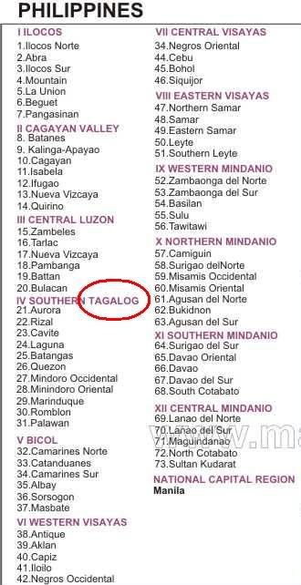
Thanks for the info, but the european form is fine to me.

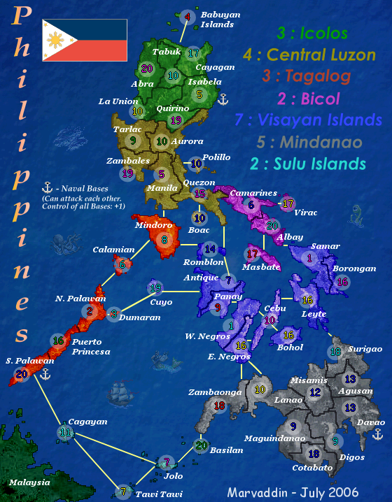
happysadfun wrote:dumaran could be amalgamated into whatever the country is that's next to it, then you could put the circle in closer. and the dark blue islands could be a bit lighter. otherwise, i would definitely play it. but it could be more challenging without some of the bridges.


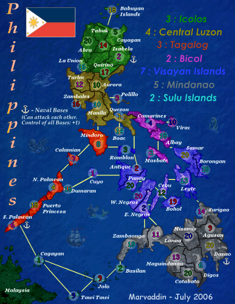
I will not merge Dumaran and N. Palawan. Dumaran is there to make the continent less linear, and also is completing the number of countries (48 ). Simply remove it as territory would create more problems than solve (in fact, I see no problem, since both countries are well individualized).

About the colour of the blue continent, I dont intend change it too. It looks fine to me. I was worried about make continents easily identified, so i dont want any proximity with the colour of the light blue continent. Why are you complaining? Is there something hard to see?

If you want to suggest some less connections, be more specific. Anyway, I want to say, at this stage I dont intend make any big alterations on the map. I really consider it done, both in graphics and playability. Of course some changes could be pleasant to some people, and not for others. So, Im working already at my next project, I only want this alive.

Andy, how about the images with numbers? Good enough?
Image
User avatar
Major Marvaddin
 
Posts: 2545
Joined: Thu Feb 09, 2006 5:06 pm
Location: Belo Horizonte, Brazil

Postby dussle on Sat Aug 05, 2006 4:27 pm

This map is really awsome, but there's one thing I'd change. It's unclear what the bottom Islands are, I had to check the continent list before i realized it was part of Tagalog or Mindanao! It would be easier to see if you moved the numbers over a bit, at least on the small map, the big map is easily readable.
User avatar
Sergeant dussle
 
Posts: 902
Joined: Fri Jun 09, 2006 4:00 pm
Location: Indiana, USA

Postby AndyDufresne on Sat Aug 05, 2006 6:21 pm

The army coordinates are acceptable. As for the post above, I think it is a bit unclear what the continent is at the bottom, the islands. Perhaps if you consider moving the circles slightly more into the ocean so we can actually see what country colors are.


--Andy
User avatar
Corporal 1st Class AndyDufresne
 
Posts: 24919
Joined: Fri Mar 03, 2006 8:22 pm
Location: A Banana Palm in Zihuatanejo

Postby gavin_sidhu on Sun Aug 06, 2006 6:22 am

Marvaddin all your maps (Brazil and this one) seem to be very jagged, is this because of the program you are using or something else you cant fix?
Highest Score: 1843 Ranking (Australians): 3
User avatar
Lieutenant gavin_sidhu
 
Posts: 1428
Joined: Mon May 22, 2006 6:16 am
Location: Brisbane, Australia

Postby kevinc on Sun Aug 06, 2006 6:45 am

You need to either left align or right align the legend. Having it centered like that is very difficult to read, and looks awkward.

I agree with gavin, you really need to learn to use another program with proper anti-aliasing. This looks like a great map, and it would be much better without the rough edges.

All the best with it - looking forward to it.
User avatar
Corporal kevinc
 
Posts: 182
Joined: Tue Mar 14, 2006 4:47 pm
Location: Dublin

Postby gavin_sidhu on Sun Aug 06, 2006 6:55 am

kevinc wrote:You need to either left align or right align the legend. Having it centered like that is very difficult to read, and looks awkward.

I agree with gavin, you really need to learn to use another program with proper anti-aliasing. This looks like a great map, and it would be much better without the rough edges.

All the best with it - looking forward to it.


I like the ledgend as is (centred and big)

KevinC, I use GIMP, nd was having the problem of jagged edges, i just made my borders thicker to fix it, how do u "anti-aliase"? is it possible with GIMP?
Highest Score: 1843 Ranking (Australians): 3
User avatar
Lieutenant gavin_sidhu
 
Posts: 1428
Joined: Mon May 22, 2006 6:16 am
Location: Brisbane, Australia

Postby kevinc on Sun Aug 06, 2006 7:57 am

gavin_sidhu wrote:I like the ledgend as is (centred and big)


People often say that, but it's proven to be wrong. Big is fine, but ,multi-line centered text is very hard for the eyes to read. It's not something you ever see in professional work.

gavin_sidhu wrote:KevinC, I use GIMP, nd was having the problem of jagged edges, i just made my borders thicker to fix it, how do u "anti-aliase"? is it possible with GIMP?


I don' tuse Gimp I'm afraid. It's not the best piece of software for creating maps. Inkscape, Fireworks, Xara, or Illustrator are much better suited to it. Gimp is good for photo montages, and image editing,. Vector applications like the ones mentioned are more suited to this work and make it all a lot less painful.
User avatar
Corporal kevinc
 
Posts: 182
Joined: Tue Mar 14, 2006 4:47 pm
Location: Dublin

PreviousNext

Return to The Atlas

Who is online

Users browsing this forum: No registered users