Page 5 of 9
Re: First Nations combined. Update pg. 6

Posted:
Sun Feb 06, 2011 12:37 amby The Bison King
Tisha wrote:The Bison King wrote:natty_dread wrote:IMO, since you have the ships on the map, you can just as well have the horse and the gun.
This is my sentiment exactly.
well, I photoshopped the gun out. we can do with the horse?
I even got rid of the horse reins in my most recent save.
Just put the gun back in. Or not. It's fine. The horse is fine too. The fact that this map is clearly a European explorers map of the New world tell's us that white man has been here, and horses have been introduced. You shouldn't need to change the picture.
Re: First Nations combined. Update pg. 6
Posted:
Sun Feb 06, 2011 3:52 amby MarshalNey
Tisha wrote:well, I photoshopped the gun out. we can do with the horse?
I even got rid of the horse reins in my most recent save.
That's fine. I'll leave this up to your perogrative and sense of the time frame you are wishing to depict.
Any other comments?
-- Marshal Ney
Re: First Nations combined. Update pg. 6
Posted:
Sun Feb 06, 2011 2:17 pmby Victor Sullivan
What was the verdict on the neutrals?
Re: First Nations combined. Update pg. 4
Posted:
Sun Feb 06, 2011 2:31 pmby Tisha
Victor Sullivan wrote:What was the verdict on the neutrals?
we are doing this:
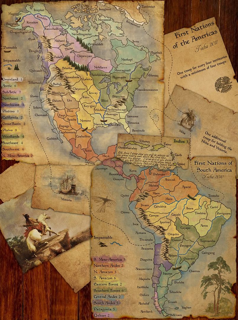
1 man for every four territories. zero neutrals.
natty_dread wrote:I wonder, why is the initial deployment problem never addressed by changing the troop reinforcements, especially on large maps like this?
When the map is this big, it would make sense to "scale up" the reinforcement specs as well.
For example, here we could specify that you'd get 1 troop for every 4 territories, with a minimum of 4. This way, 8 player games would be good with 15 starting territories.
7 playes would get 18 = 4 troops, can't drop below 4.
6 players would get 21 = need to take 2 to drop to 19.
5 players would get 25 = need to take 2 to drop to 23.
4 players would get 31 = need to take 4 to drop to 27.
3 players would get 42 = need to take 3 to drop to 39.
How does this sound?
Re: First Nations combined. Update pg. 6
Posted:
Sun Feb 06, 2011 2:53 pmby Victor Sullivan
Alright, cool. Just wanted to make sure. My next comment would be that the Indies should have a label following the format of the others. It looks strange having a different font and no color splotch behind it.
Re: First Nations combined. Update pg. 6
Posted:
Mon Feb 07, 2011 12:39 amby MarshalNey
Victor Sullivan wrote:Alright, cool. Just wanted to make sure. My next comment would be that the Indies should have a label following the format of the others. It looks strange having a different font and no color splotch behind it.
I agree, as it took me a second to identify the "Indies 3" as the bonus. At least, with a color splotch it would look more like a bonus.
However that is really not gameplay clarity anymore, as it wasn't confusing, just a little off. So on to graphics I say!

Congratulations Tisha, it looks to be a worthy map of the new Supersize breed, indeed.

-- Marshal Ney
Re: First Nations combined. Update pg. 6
Posted:
Mon Feb 07, 2011 1:40 amby rdsrds2120
Yayyyy. One step for Tisha...one big step for CC.
-rd
Re: First Nations combined. Update pg. 6
Posted:
Mon Feb 07, 2011 1:43 pmby Tisha
anything?
- Click image to enlarge.
Re: First Nations combined. Update pg. 6
Posted:
Mon Feb 07, 2011 1:52 pmby natty dread
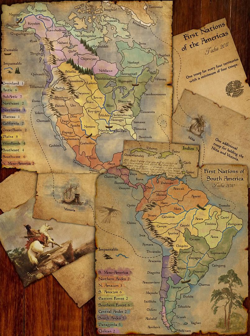
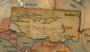
I'm not sure if my eyes are just deceiving me, but the land borders in the Indies inset look a bit thicker & sharper than the rest of the map... especially compared to N. Meso-America.
I'd also recommend moving the Chorotega label a bit to the right so that it won't need to be twisted - it looks nice and contributes to the page curl effect, but it makes the territory name kinda hard to read. Also, the Paya label could be moved down a bit, to separate it from the text in the Indies inset.
Re: First Nations combined. Update pg. 6
Posted:
Mon Feb 07, 2011 1:59 pmby Tisha
natty_dread wrote:I'm not sure if my eyes are just deceiving me, but the land borders in the Indies inset look a bit thicker & sharper than the rest of the map... especially compared to N. Meso-America.
I'd also recommend moving the Chorotega label a bit to the right so that it won't need to be twisted - it looks nice and contributes to the page curl effect, but it makes the territory name kinda hard to read. Also, the Paya label could be moved down a bit, to separate it from the text in the Indies inset.
their not thicker or sharper, maybe a bit darker of a color.
Re: First Nations combined. Update pg. 6
Posted:
Mon Feb 07, 2011 2:02 pmby natty dread
Tisha wrote:their not thicker or sharper, maybe a bit darker of a color.
Well, a darker colour can make a line look thicker

Re: First Nations Americas. Update pg. 8
Posted:
Mon Feb 07, 2011 5:22 pmby The Bison King
I don't like the writing underneath Cuba. I find it distracting, I suggest removing it.
Re: First Nations Americas. Update pg. 8
Posted:
Mon Feb 07, 2011 10:09 pmby isaiah40
The paper that has the Indies on it, can you fix it so that it looks like it is "under" the south america paper. Right now it looks like it is on top and underneath all at the same time.
Re: First Nations Americas. Update pg. 8
Posted:
Mon Feb 07, 2011 10:27 pmby Victor Sullivan
isaiah40 wrote:The paper that has the Indies on it, can you fix it so that it looks like it is "under" the south america paper. Right now it looks like it is on top and underneath all at the same time.
Wait, what? How? It's just ripped is all...
Re: First Nations combined. Update pg. 6
Posted:
Tue Feb 08, 2011 12:12 pmby Ace Rimmer
natty_dread wrote:I'd also recommend moving the Chorotega label a bit to the right so that it won't need to be twisted - it looks nice and contributes to the page curl effect, but it makes the territory name kinda hard to read. Also, the Paya label could be moved down a bit, to separate it from the text in the Indies inset.
agree
isaiah40 wrote:The paper that has the Indies on it, can you fix it so that it looks like it is "under" the south america paper. Right now it looks like it is on top and underneath all at the same time.
disagree
The Bison King wrote:I don't like the writing underneath Cuba. I find it distracting, I suggest removing it.
disagree
Re: First Nations Americas. Update pg. 8
Posted:
Tue Feb 08, 2011 12:35 pmby MrBenn
You should be able to make the papers look more like they're stacked by variegating the shadow slightly; the shadow should be slightly larger on the Northern map - something like this example... see how the shadow changes depending on which other 'layer' it's falling upon:

Re: First Nations Americas. Update pg. 8
Posted:
Tue Feb 08, 2011 5:48 pmby brandoncfi
Fantastic map can't wait to play
Re: First Nations Americas. Update pg. 8
Posted:
Tue Feb 08, 2011 11:28 pmby Tisha
-changed the Indies font, added more color behind it.
-lightened the letter on the Indies paper.. making it less bold
-lightened the borders on the Indies to make natty_dread shut up (:
-paper shadows like MrBenn
-moved the Nina Cariri route to the right a tiny bit.
-no gun or reins on the horse.
- Click image to enlarge.
Re: First Nations Americas. Update pg. 8
Posted:
Tue Feb 08, 2011 11:41 pmby Victor Sullivan
Fantastic. Just... fantastic... I love all edits, especially the lightening of that text on the Indies paper.
Re: First Nations Americas. Updated on Pg. 8
Posted:
Wed Feb 09, 2011 12:05 amby natty dread
Nice!
One small thing. Now that the North part doesn't have the title visible, I wonder if you should just remove it from the south part as well? I mean, some people might be confused seeing two titles on the map, but only one of them is the real title...

Re: First Nations Americas. Updated on Pg. 8
Posted:
Wed Feb 09, 2011 12:12 amby Victor Sullivan
natty_dread wrote:Nice!
One small thing. Now that the North part doesn't have the title visible, I wonder if you should just remove it from the south part as well? I mean, some people might be confused seeing two titles on the map, but only one of them is the real title...
Mm, yes, I agree.
Re: First Nations Americas. Updated on Pg. 8
Posted:
Wed Feb 09, 2011 8:19 pmby MrBenn
The Indies overlay looks heaps better now. I think my only concern is where all three papers meet at a single point. If you change the rip-line of the Indies overlay to be something like this, then the eye won;t be drawn to the point where all three maps meet
My only other niggle is that the vertical wooden planks in the background might look better if they were turned slightly off-vertical (but if you do that and it looks bad, I'll take your word for it).
Re: First Nations Americas. Updated on Pg. 8
Posted:
Fri Feb 11, 2011 9:13 amby Ace Rimmer
I like Benn's version of the Indies map better, but I like the boards as-is. There are so many things already tilted, I like having it look like it's laid out straight on a table.
Re: First Nations Americas. Updated on Pg. 8
Posted:
Fri Feb 11, 2011 11:00 amby VectorxMan
Now this would be an epic map to play on. Although with Coahuiltee split in 2 pieces by a river is an assault possible to/from Natchez?
Also with your +1 troop for every 4 regions does that override the +1 for every 3 regions or is it in addition to that bonus?
Re: First Nations Americas. Updated on Pg. 8
Posted:
Fri Feb 11, 2011 11:57 amby Ace Rimmer
VectorxMan wrote:Now this would be an epic map to play on. Although with Coahuiltee split in 2 pieces by a river is an assault possible to/from Natchez?
Yes, same as it is in the existing FNNA map.
VectorxMan wrote:Also with your +1 troop for every 4 regions does that override the +1 for every 3 regions or is it in addition to that bonus?
Instead of the +1 for every 3