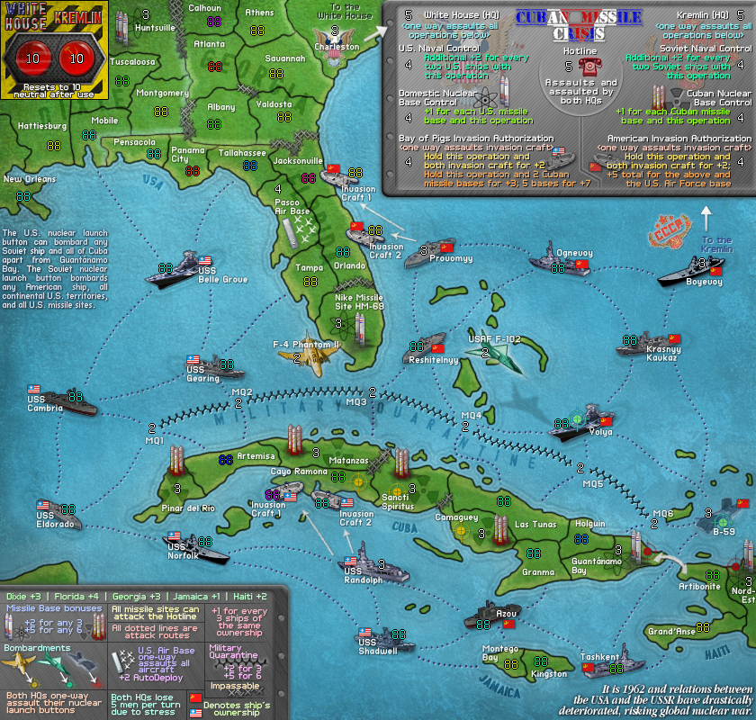
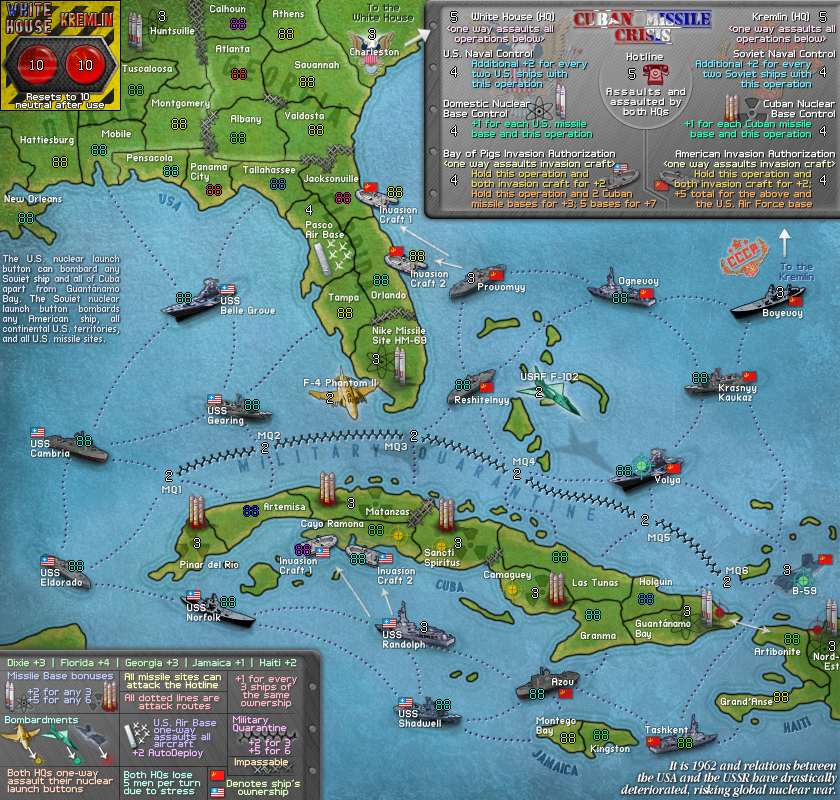
Cuban Missile Crisis [Quenched]
Moderator: Cartographers
Re: Cuban Missile Crisis [11 Aug 2011] (v34 page 4)
![]() by natty dread on Thu Aug 11, 2011 1:13 pm
by natty dread on Thu Aug 11, 2011 1:13 pm
What does the cyan target symbol mean?

-

 natty dread
- Posts: 12877
- Joined: Fri Feb 08, 2008 8:58 pm
- Location: just plain fucked


Re: Cuban Missile Crisis [11 Aug 2011] (v34 page 4)
![]() by Ace Rimmer on Thu Aug 11, 2011 1:21 pm
by Ace Rimmer on Thu Aug 11, 2011 1:21 pm
natty_dread wrote:What does the cyan target symbol mean?
Which one? On USAF F-102, it means it bombards the locations with cyan targets (see the legend). On Volya and B-59, it means they are bombarded by USAF F-102.
-

Ace Rimmer
- Posts: 1911
- Joined: Mon Dec 01, 2008 1:22 pm


Re: Cuban Missile Crisis [11 Aug 2011] (v34 page 4)
![]() by DiM on Thu Aug 11, 2011 1:41 pm
by DiM on Thu Aug 11, 2011 1:41 pm
the amount of detail on this map is insane. i love it. i have the feeling that it reminds me of something. perhaps a videogame... not sure.
onto nitpicking:
i think that the missiles and the ships should also cast a small shadow.
the title appears to be a bit blurry and has a slight curvature. everything else is so crisp and clearly defined.
also i'm not a big fan of the red colouring on the soviet ships. i know that it's done for gameplay reasons to make them easily identifiable, but i think the little flags should be enough. however this is just a personal taste and if you want to keep the colour i won't say anything.
anyway, i think you should work on the small map so that you can get more feedback and a badge.
“In the beginning God said, the four-dimensional divergence of an antisymmetric, second rank tensor equals zero, and there was light, and it was good. And on the seventh day he rested.”- Michio Kaku
-

DiM
- Posts: 10415
- Joined: Wed Feb 14, 2007 6:20 pm
- Location: making maps for scooby snacks


Re: Cuban Missile Crisis [11 Aug 2011] (v34 page 4)
![]() by natty dread on Thu Aug 11, 2011 1:42 pm
by natty dread on Thu Aug 11, 2011 1:42 pm
Ah, ok. I didn't notice it on the aircraft...
I say remove the symbols from the aircrafts.
I also recommend making the legend bigger, and using more visual elements instead of text.
I say remove the symbols from the aircrafts.
I also recommend making the legend bigger, and using more visual elements instead of text.
-
natty dread
- Posts: 12877
- Joined: Fri Feb 08, 2008 8:58 pm
- Location: just plain fucked
Re: Cuban Missile Crisis [11 Aug 2011] (v34 page 4)
![]() by Ace Rimmer on Thu Aug 11, 2011 1:46 pm
by Ace Rimmer on Thu Aug 11, 2011 1:46 pm
natty: I don't see where more visual elements would go into the legend. Have any more concrete suggestions to help me understand?
DiM: thanks for the feedback.
DiM: thanks for the feedback.
-
Ace Rimmer
- Posts: 1911
- Joined: Mon Dec 01, 2008 1:22 pm
Re: Cuban Missile Crisis [11 Aug 2011] (v34 page 4)
![]() by natty dread on Thu Aug 11, 2011 1:58 pm
by natty dread on Thu Aug 11, 2011 1:58 pm
Well, how about this: come up with a symbol for the HQ:s, then replace the "Both hq:s 0ne-way assault" etc. text with the HQ symbol & arrow to launch button symbol.
The Aircraft/sub bombardment text... replace with it icons of each aircraft & sub, with arrows going to their target symbols... and add the subtitle "Bombardments".
The Aircraft/sub bombardment text... replace with it icons of each aircraft & sub, with arrows going to their target symbols... and add the subtitle "Bombardments".
-
natty dread
- Posts: 12877
- Joined: Fri Feb 08, 2008 8:58 pm
- Location: just plain fucked
Re: Cuban Missile Crisis [11 Aug 2011] (v34 page 4)
![]() by Ace Rimmer on Wed Aug 17, 2011 7:34 am
by Ace Rimmer on Wed Aug 17, 2011 7:34 am
V36:
List of changes:
* "Cuban Missile Crisis" logo/title changed. The Cuban flag overlay is now vertical and the text is clearer/straight.
* Taken all of the red-colouring off the Soviet ships. Although it was useful to have as a quick indicator of a ship's ownership, all ships have flags denoting their ownership and the US ships are grouped in one area, and the Soviets in another, so it's not as if you could easily mistake them.
* Moved the mini-flags close to the region labels so to create a uniform pattern among all ships to quickly identify its ownership.
* Altered the bottom legend and created a "Bombardments" section as Natty suggested.
* Recreated all missile-base missiles, both US and Soviet ones.
* Added slight flag overlays on the nuclear launch buttons for graphical purposes.
* Moved the "It is 1962" text over where it is more suited.
To-Do [before creating large]:
* Create shadows for ships.
* Recreate the arrow connecting Cuba to Haiti.
- Click image to enlarge.
List of changes:
* "Cuban Missile Crisis" logo/title changed. The Cuban flag overlay is now vertical and the text is clearer/straight.
* Taken all of the red-colouring off the Soviet ships. Although it was useful to have as a quick indicator of a ship's ownership, all ships have flags denoting their ownership and the US ships are grouped in one area, and the Soviets in another, so it's not as if you could easily mistake them.
* Moved the mini-flags close to the region labels so to create a uniform pattern among all ships to quickly identify its ownership.
* Altered the bottom legend and created a "Bombardments" section as Natty suggested.
* Recreated all missile-base missiles, both US and Soviet ones.
* Added slight flag overlays on the nuclear launch buttons for graphical purposes.
* Moved the "It is 1962" text over where it is more suited.
To-Do [before creating large]:
* Create shadows for ships.
* Recreate the arrow connecting Cuba to Haiti.
-
Ace Rimmer
- Posts: 1911
- Joined: Mon Dec 01, 2008 1:22 pm
Re: Cuban Missile Crisis [17 Aug 2011] (v36 page 5)
![]() by lostatlimbo on Wed Aug 17, 2011 1:15 pm
by lostatlimbo on Wed Aug 17, 2011 1:15 pm
Just gets better and better. Can't wait to play this one!
-

lostatlimbo
- Posts: 1386
- Joined: Wed Mar 28, 2007 3:56 pm
- Location: Portland, OR


Re: Cuban Missile Crisis [17 Aug 2011] (v36 page 5)
![]() by Ace Rimmer on Wed Aug 17, 2011 2:44 pm
by Ace Rimmer on Wed Aug 17, 2011 2:44 pm
lostatlimbo wrote:Just gets better and better. Can't wait to play this one!
Thx mate
-
Ace Rimmer
- Posts: 1911
- Joined: Mon Dec 01, 2008 1:22 pm
Re: Cuban Missile Crisis [17 Aug 2011] (v36 page 5)
![]() by Nola_Lifer on Thu Aug 18, 2011 12:05 pm
by Nola_Lifer on Thu Aug 18, 2011 12:05 pm
The "one way assaults" text looks super blurry to me in the right hand legend. Also, is it possible to make some of the text slightly larger?

-
Nola_Lifer
- Posts: 819
- Joined: Mon Oct 13, 2008 4:46 pm
- Location: 雪山


Re: Cuban Missile Crisis [17 Aug 2011] (v36 page 5)
![]() by TaCktiX on Sat Aug 20, 2011 1:37 am
by TaCktiX on Sat Aug 20, 2011 1:37 am
It's actually both One Way Assaults texts. They have the same amount of blurriness, particularly around the word "assaults." Likewise, the left side white text has blur ("and all", "button" most prominently), and the bottom left legend's Jamaica has blur.
Also, why are the Cambria and Azou significantly blacker than any of the other ships? It seems odd.
Also, why are the Cambria and Azou significantly blacker than any of the other ships? It seems odd.
-

TaCktiX
- Posts: 2392
- Joined: Mon Dec 17, 2007 8:24 pm
- Location: Rapid City, SD


Re: Cuban Missile Crisis [17 Aug 2011] (v36 page 5)
![]() by Victor Sullivan on Sat Aug 20, 2011 1:38 am
by Victor Sullivan on Sat Aug 20, 2011 1:38 am
On the one hand, I like the Cuban flag in the title, but I think it makes it more difficult to read. This is quality work, Ace, keep it up!
-Sully
-Sully
Beckytheblondie: "Don't give us the dispatch, give us a mustache ride."
Scaling back on my CC involvement...
Scaling back on my CC involvement...
-

Victor Sullivan
- Posts: 6010
- Joined: Mon Feb 08, 2010 8:17 pm
- Location: Columbus, OH


Re: Cuban Missile Crisis [17 Aug 2011] (v36 page 5)
![]() by TaCktiX on Sat Aug 20, 2011 1:42 am
by TaCktiX on Sat Aug 20, 2011 1:42 am
Ninja-re-reply: I agree with Victor and forgot to say it originally. The flag makes the title almost impossible to read. Perhaps lighter tones of red, white, and blue?
-
TaCktiX
- Posts: 2392
- Joined: Mon Dec 17, 2007 8:24 pm
- Location: Rapid City, SD
Re: Cuban Missile Crisis [17 Aug 2011] (v36 page 5)
![]() by Nola_Lifer on Sat Aug 20, 2011 9:53 am
by Nola_Lifer on Sat Aug 20, 2011 9:53 am
Damn, I had no problems reading the title.
-
Nola_Lifer
- Posts: 819
- Joined: Mon Oct 13, 2008 4:46 pm
- Location: 雪山
Re: Cuban Missile Crisis [17 Aug 2011] (v36 page 5)
![]() by DiM on Sat Aug 20, 2011 11:58 am
by DiM on Sat Aug 20, 2011 11:58 am
i find the title very readable too.
“In the beginning God said, the four-dimensional divergence of an antisymmetric, second rank tensor equals zero, and there was light, and it was good. And on the seventh day he rested.”- Michio Kaku
-
DiM
- Posts: 10415
- Joined: Wed Feb 14, 2007 6:20 pm
- Location: making maps for scooby snacks
Re: Cuban Missile Crisis [17 Aug 2011] (v36 page 5)
![]() by Tisha on Sat Aug 20, 2011 12:16 pm
by Tisha on Sat Aug 20, 2011 12:16 pm
lighter tones of red would be pink. no.
maybe a stroke around the title letters in black.
maybe a stroke around the title letters in black.
-

Tisha
- Posts: 1065
- Joined: Sat Dec 23, 2006 12:41 am


Re: Cuban Missile Crisis [17 Aug 2011] (v36 page 5)
![]() by natty dread on Sat Aug 20, 2011 12:17 pm
by natty dread on Sat Aug 20, 2011 12:17 pm
The impassables that look like lots of small X:s... maybe you could change them to something more resembling barbed wire?
As for title, a black stroke would be fine.
As for title, a black stroke would be fine.
-
natty dread
- Posts: 12877
- Joined: Fri Feb 08, 2008 8:58 pm
- Location: just plain fucked
Re: Cuban Missile Crisis [17 Aug 2011] (v36 page 5)
![]() by DiM on Sat Aug 20, 2011 12:29 pm
by DiM on Sat Aug 20, 2011 12:29 pm
natty_dread wrote:The impassables that look like lots of small X:s... maybe you could change them to something more resembling barbed wire?
why should it look like barbed wire when it's not barbed wire?
those are hedgehogs. or at least i think that's what they're called.
here's an image:

“In the beginning God said, the four-dimensional divergence of an antisymmetric, second rank tensor equals zero, and there was light, and it was good. And on the seventh day he rested.”- Michio Kaku
-
DiM
- Posts: 10415
- Joined: Wed Feb 14, 2007 6:20 pm
- Location: making maps for scooby snacks
Re: Cuban Missile Crisis [17 Aug 2011] (v36 page 5)
![]() by Tisha on Sat Aug 20, 2011 12:32 pm
by Tisha on Sat Aug 20, 2011 12:32 pm
DiM wrote:natty_dread wrote:The impassables that look like lots of small X:s... maybe you could change them to something more resembling barbed wire?
why should it look like barbed wire when it's not barbed wire?
those are hedgehogs. or at least i think that's what they're called.
here's an image:
I like them how they are also.. I assumed the same as DiM.
-
Tisha
- Posts: 1065
- Joined: Sat Dec 23, 2006 12:41 am
Re: Cuban Missile Crisis [17 Aug 2011] (v36 page 5)
![]() by natty dread on Sat Aug 20, 2011 12:46 pm
by natty dread on Sat Aug 20, 2011 12:46 pm
Yeah, but they look like small X:s.
-
natty dread
- Posts: 12877
- Joined: Fri Feb 08, 2008 8:58 pm
- Location: just plain fucked
Re: Cuban Missile Crisis [17 Aug 2011] (v36 page 5)
![]() by MrBenn on Sun Aug 21, 2011 6:01 pm
by MrBenn on Sun Aug 21, 2011 6:01 pm
natty_dread wrote:Yeah, but they look like small X:s.
Which is exactly what they would look like from the air, no?

PB: 2661 | He's blue... If he were green he would die | No mod would be stupid enough to do that
-

MrBenn
- Posts: 6880
- Joined: Wed Nov 21, 2007 9:32 am
- Location: Off Duty


Re: Cuban Missile Crisis [17 Aug 2011] (v36 page 5)
![]() by natty dread on Tue Aug 23, 2011 2:12 am
by natty dread on Tue Aug 23, 2011 2:12 am
Maybe you could try making the dotted sea routes into straight dotted lines instead of bezier curves. Not sure if it'd work, but it might create a more appropriate feel for the map... you know, with the cold war theme and all, straight, hard lines would somehow seem to fit better than round, smooth curves...
I also have a suggestion for the colours. The current colour scheme has a sort of bright, sugary feel to it, again not very well conveying the feel of cold war. What I would do is make it a bit more dark and gritty, like this:
This is just a mock-up, but it shows how I would change the land and sea colour. Maybe the sea shouldn't be quite that dark, but in that direction... there's a better contrast between the land and sea there, and you can always add slight glows to the objects on the sea.
Note also the complementary colour contrast between the land and sea: land being more yellowish in hue, with sea being more blue. Yellow and blue are complementary colours, forming a good contrast with each other.
I also have a suggestion for the colours. The current colour scheme has a sort of bright, sugary feel to it, again not very well conveying the feel of cold war. What I would do is make it a bit more dark and gritty, like this:
- Click image to enlarge.

This is just a mock-up, but it shows how I would change the land and sea colour. Maybe the sea shouldn't be quite that dark, but in that direction... there's a better contrast between the land and sea there, and you can always add slight glows to the objects on the sea.
Note also the complementary colour contrast between the land and sea: land being more yellowish in hue, with sea being more blue. Yellow and blue are complementary colours, forming a good contrast with each other.
-
natty dread
- Posts: 12877
- Joined: Fri Feb 08, 2008 8:58 pm
- Location: just plain fucked
Re: Cuban Missile Crisis [17 Aug 2011] (v36 page 5)
![]() by Tisha on Tue Aug 23, 2011 11:31 pm
by Tisha on Tue Aug 23, 2011 11:31 pm
I like the shades that things were before.. for the area the map is in. Maybe bring down the saturation a tiny bit..
-
Tisha
- Posts: 1065
- Joined: Sat Dec 23, 2006 12:41 am
Re: Cuban Missile Crisis [17 Aug 2011] (v36 page 5)
![]() by Ace Rimmer on Wed Aug 31, 2011 12:33 pm
by Ace Rimmer on Wed Aug 31, 2011 12:33 pm
Version 39:
Changes:
- Changed color of land and sea
- Changed text color in top right
- Changed CMC logo
- Added shadows to ships
- Changed arrow between Arbonite and Guantanamo Bay
- Click image to enlarge.
Changes:
- Changed color of land and sea
- Changed text color in top right
- Changed CMC logo
- Added shadows to ships
- Changed arrow between Arbonite and Guantanamo Bay
-
Ace Rimmer
- Posts: 1911
- Joined: Mon Dec 01, 2008 1:22 pm
Re: Cuban Missile Crisis [31 Aug 2011] (v39 page 6)
![]() by gimil on Thu Sep 01, 2011 12:02 pm
by gimil on Thu Sep 01, 2011 12:02 pm
Hi ace,
I am not feeling the title. I think it is because the colours sort of cut up the typography. Although, if you use the same kind of effect on the title that has be used on boht the White House/Kremlin text at the top right then I think it may fit better. By doing this I think you will gain some graphical consistency as well as defining the outline of the letters in the title. Does this make sense?
Also the crosshairs you use across the map to identify jet/submarine targets arn't as immediately obviously as I think they should be. I think they need a little something to make them stand out from the map, like a stroke, or drop shadow.
This is looking very good though, keep it up!
gimil
What do you know about map making, bitch?
Top Score:2403
natty_dread wrote:I was wrong
Top Score:2403
-

gimil
- Posts: 8599
- Joined: Sat Mar 03, 2007 12:42 pm
- Location: United Kingdom (Scotland)


Who is online
Users browsing this forum: Fuchsia tude
|
|||||||
| Conquer Club is not associated with RISK online in any way. Copyright © 2006-2024 by Big Wham LLC | |||||||