Page 2 of 13

Re: Cuban Missile Crisis [7 July 2011] (v22 page 3, NEW POLL

PostPosted: Tue Jul 12, 2011 3:35 pm
by isaiah40
I like the original fonts you used. IMO they are cleaner and easier to read.

Re: Cuban Missile Crisis [7 July 2011] (v22 page 3, NEW POLL

PostPosted: Tue Jul 12, 2011 4:23 pm
by AndyDufresne
Florida Fonts if I have to choose from these I think.


--Andy

Re: Cuban Missile Crisis [7 July 2011] (v22 page 3, NEW POLL

PostPosted: Wed Jul 13, 2011 9:53 am
by koontz1973
Original font was fine but the Florida is the best of what you have now.

Re: Cuban Missile Crisis [7 July 2011] (v22 page 3, NEW POLL

PostPosted: Wed Jul 13, 2011 9:56 am
by Victor Sullivan
I really like Dixie, myself, though I'd say Georgia would be my second pick. Florida's lower-case a's just bother me for some reason.

-Sully

Re: Cuban Missile Crisis [7 July 2011] (v22 page 3, NEW POLL

PostPosted: Sun Jul 17, 2011 9:08 pm
by lostatlimbo
Wow! This map looks great. I usually stay away from maps with so many different attack routes & sequences, but this one seems worth it. Complex in a way that is put to good use and stylish graphics. Well done!

Personally, I like Cuba font the best, but I think Florida is a close second.

Re: Cuban Missile Crisis [7 July 2011] (v22 page 3, NEW POLL

PostPosted: Thu Jul 21, 2011 6:41 am
by MrBenn
Waiting for an update ;-)

Re: Cuban Missile Crisis [1 Aug 2011] (v25 page 4)

PostPosted: Mon Aug 01, 2011 8:15 am
by Ace Rimmer
Click image to enlarge.
image


Updates:
Coastal contours
Territory font change
Slight land colour alteration
Replacing the bald eagle image representing the US

BIG THANKS to MrBenn for looking at this and giving some suggestions.

Re: Cuban Missile Crisis [1 Aug 2011] (v25 page 4)

PostPosted: Mon Aug 01, 2011 10:00 am
by AndyDufresne
Looking at the legends, the top legend I think is organized pretty nicely---you've got corresponding items across from one another.

The bottom legend is a little more scattered. For instance, 'Denotes region's ownership' seems to mostly refer to ships, since they are the only regions I see with flags. It seems like it might make more sense to have '+1 for every 3 ships of same nationality' somewhere close to the other ship reference. I'd also maybe consider rewording to make it more consistent across the board, to something like 'Denotes ship alignment' and '+1 for every 3 ships of the same alignment'.

The regular bonus zone board ('Dixie +3, Florida +4') also feels kind of lost in the midst of all the other information. I understand that on a map like this, with a plethora of bonuses, that standard is less important tactically, but I feel like there might be a better placement for it than in the middle of the bottom legend.

The graphics of this map are beyond amazing though. :D


--Andy

Re: Cuban Missile Crisis [1 Aug 2011] (v25 page 4)

PostPosted: Wed Aug 03, 2011 7:34 am
by Ace Rimmer
I agree Andy, the legend has been an issue all along, and was waiting until it got to this point to address it. To that point... I hereby petition that this be the smaller version of the map and we supersize the larger version. I'm waiting for Joe (aka thenobodies80) to chime in with his thoughts :)

Re: Cuban Missile Crisis [1 Aug 2011] (v25 page 4)

PostPosted: Wed Aug 03, 2011 10:17 am
by isaiah40
Here are some ideas to move things around a bit before we approve supersize.

The top right area.
1. Move the text "To the White House" over to the left a bit along with the arrow.
2. Move the text "To the Kremlin" and the CCCP logo down under Boyevoy ship.
3. (Not in this area) Move the USS Belle Grove over to the right a bit.
4. Take the story out of the gameplay box and place it at an angle where the USS Belle Grove was.
5. Expand the gameplay box to the left and down.
This will free up some room to where you can expand the box and increase the font size to make it clearer and readable.

Lower left Gameplay instructions
For this area I think you can increase the height of the map by 40px to make room for this area.

Try these suggestions, and post the image and then we'll go from there, deal?

Re: Cuban Missile Crisis [1 Aug 2011] (v25 page 4)

PostPosted: Wed Aug 03, 2011 10:23 am
by Ace Rimmer
There is at least one more graphic update underway, don't worry ;) Joe and I agreed to start the supersize discussion.

Re: Cuban Missile Crisis [1 Aug 2011] (v25 page 4)

PostPosted: Thu Aug 04, 2011 1:54 pm
by natty dread
I agree, the map could use some supersize.

The graphics are looking good though.

Re: Cuban Missile Crisis [1 Aug 2011] (v25 page 4)

PostPosted: Sat Aug 06, 2011 11:35 am
by RedBaron0
I still think the flag icons can be ditched for red and white stars.

Re: Cuban Missile Crisis [1 Aug 2011] (v25 page 4)

PostPosted: Tue Aug 09, 2011 11:31 am
by thenobodies80
Just in case you're waiting for a clear/official answer: You can use your current map as small version.

I've looked at the map for a while and I have some suggestions for you (see also the spoiler)
  • Nuclear Launch: The exclamation mark looks smaller than the word "warning"
  • Top Right legend:
    • The paragraph "It is 1962..." is really hard to read
    • The word "Additional" on the soviet side overlaps the other text.
    • "+1 for each..." on the soviet side overlaps the hotline border.
  • Lower Big Legend: "Aircraft/B59 sub...." :-k 
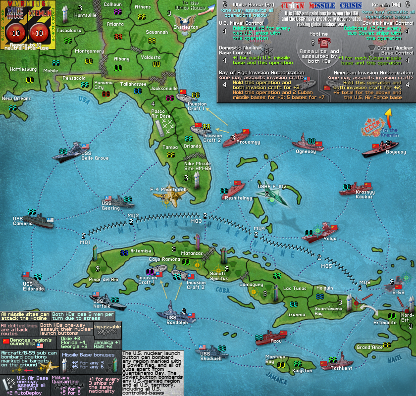
It took a while to find out B-59. The yellow targets are good, really visible and they have a reference in the legend. I saw them in a second, although I didn't noticed the target on the aircraft. The teal target was harder. The one on volya is displayed really well, but the one on B-59 is more dark and hidden, the same with the on ewhere the airplane. Finally the red targets, I didn't see them at all. specially the right one.
    Anyway, I suggest you to take more space to have that legend part clear, for all targets if possible.
  • Lower small legend (the white one) : It's possible to move a bit the text to have some space between the legend edge and the text?
  • Arrows....for my taste you have too many arrow types on the map, but it's just a personal preference. Anyway, can you have a clearer connections between B-59 and guantanamo. Also the arrow between Provomyy and Invasion Craft 1 could be refined a bit, to have it more close to the ship/army number.
  • Missiles. Right now you have 5 different type of missiles. On the legend you have just 2, this because you need just 2. So why to have 5 types on the map?
    In addition, your missile shape looks like a firework (or an arrow) more than a missile.
  • Finally the impassable between huntsville and Calhoun may have some care. Maybe it's just me, but It seems you have done that impassable with a bit less care than for the others.
show


Having said all those bad things, now let me say that imo this is a beautiful map, that kind of map I've not seen here for a while. ;)
Hope to play it soon.

Nobodies (Joe)

Re: Cuban Missile Crisis [1 Aug 2011] (v25 page 4)

PostPosted: Thu Aug 11, 2011 11:22 am
by Ace Rimmer
OK, finally have a graphic update that addresses most of the issues raised.

Click image to enlarge.
image


RedBaron: I am not ignoring you, I like the mini flags better. Maybe on the larger map they will look nicer because they will be clearer.

Updates:
completely new legend backgrounds, both top and bottom.
Improved the layout of both top and bottom legend.
Moved the summary out of the legend area and to the bottom.
Recreated the launch button areas.
Changed the U.S. bonus area glow colours.
Made the B-59 sub bigger on the map and explained more in the bottom legend.
Moved around the targets on the planes/ships as per request.
Changed up the U.S. bald eagle symbol on Charleston and the legend
Darkened the US nuke symbols
Lessened the grunge on Dixie

Todo:
Redo missiles
Finalize CMC logo

Feedback requested:
The planes currently have symbols on them that match their targets, while the sub does not. Should we remove the symbols from the planes to make the sub identical? I would prefer not to have two symbols on the sub, it would be too cluttered.

Re: Cuban Missile Crisis [11 Aug 2011] (v34 page 4)

PostPosted: Thu Aug 11, 2011 1:13 pm
by natty dread
What does the cyan target symbol mean?

Re: Cuban Missile Crisis [11 Aug 2011] (v34 page 4)

PostPosted: Thu Aug 11, 2011 1:21 pm
by Ace Rimmer
natty_dread wrote:What does the cyan target symbol mean?


Which one? On USAF F-102, it means it bombards the locations with cyan targets (see the legend). On Volya and B-59, it means they are bombarded by USAF F-102.

Re: Cuban Missile Crisis [11 Aug 2011] (v34 page 4)

PostPosted: Thu Aug 11, 2011 1:41 pm
by DiM
the amount of detail on this map is insane. i love it. i have the feeling that it reminds me of something. perhaps a videogame... not sure.

onto nitpicking:

i think that the missiles and the ships should also cast a small shadow.
the title appears to be a bit blurry and has a slight curvature. everything else is so crisp and clearly defined.
also i'm not a big fan of the red colouring on the soviet ships. i know that it's done for gameplay reasons to make them easily identifiable, but i think the little flags should be enough. however this is just a personal taste and if you want to keep the colour i won't say anything.

anyway, i think you should work on the small map so that you can get more feedback and a badge.

Re: Cuban Missile Crisis [11 Aug 2011] (v34 page 4)

PostPosted: Thu Aug 11, 2011 1:42 pm
by natty dread
Ah, ok. I didn't notice it on the aircraft...

I say remove the symbols from the aircrafts.

I also recommend making the legend bigger, and using more visual elements instead of text.

Re: Cuban Missile Crisis [11 Aug 2011] (v34 page 4)

PostPosted: Thu Aug 11, 2011 1:46 pm
by Ace Rimmer
natty: I don't see where more visual elements would go into the legend. Have any more concrete suggestions to help me understand?

DiM: thanks for the feedback.

Re: Cuban Missile Crisis [11 Aug 2011] (v34 page 4)

PostPosted: Thu Aug 11, 2011 1:58 pm
by natty dread
Well, how about this: come up with a symbol for the HQ:s, then replace the "Both hq:s 0ne-way assault" etc. text with the HQ symbol & arrow to launch button symbol.

The Aircraft/sub bombardment text... replace with it icons of each aircraft & sub, with arrows going to their target symbols... and add the subtitle "Bombardments".

Re: Cuban Missile Crisis [11 Aug 2011] (v34 page 4)

PostPosted: Wed Aug 17, 2011 7:34 am
by Ace Rimmer
V36:

Click image to enlarge.
image


List of changes:

* "Cuban Missile Crisis" logo/title changed. The Cuban flag overlay is now vertical and the text is clearer/straight.
* Taken all of the red-colouring off the Soviet ships. Although it was useful to have as a quick indicator of a ship's ownership, all ships have flags denoting their ownership and the US ships are grouped in one area, and the Soviets in another, so it's not as if you could easily mistake them.
* Moved the mini-flags close to the region labels so to create a uniform pattern among all ships to quickly identify its ownership.
* Altered the bottom legend and created a "Bombardments" section as Natty suggested.
* Recreated all missile-base missiles, both US and Soviet ones.
* Added slight flag overlays on the nuclear launch buttons for graphical purposes.
* Moved the "It is 1962" text over where it is more suited.


To-Do [before creating large]:

* Create shadows for ships.
* Recreate the arrow connecting Cuba to Haiti.

Re: Cuban Missile Crisis [17 Aug 2011] (v36 page 5)

PostPosted: Wed Aug 17, 2011 1:15 pm
by lostatlimbo
Just gets better and better. Can't wait to play this one!

Re: Cuban Missile Crisis [17 Aug 2011] (v36 page 5)

PostPosted: Wed Aug 17, 2011 2:44 pm
by Ace Rimmer
lostatlimbo wrote:Just gets better and better. Can't wait to play this one!


Thx mate :)

Re: Cuban Missile Crisis [17 Aug 2011] (v36 page 5)

PostPosted: Thu Aug 18, 2011 12:05 pm
by Nola_Lifer
The "one way assaults" text looks super blurry to me in the right hand legend. Also, is it possible to make some of the text slightly larger?