Age of Merchants - [Quenched]
Moderator: Cartographers
![]() by DiM on Tue Mar 13, 2007 8:12 pm
by DiM on Tue Mar 13, 2007 8:12 pm
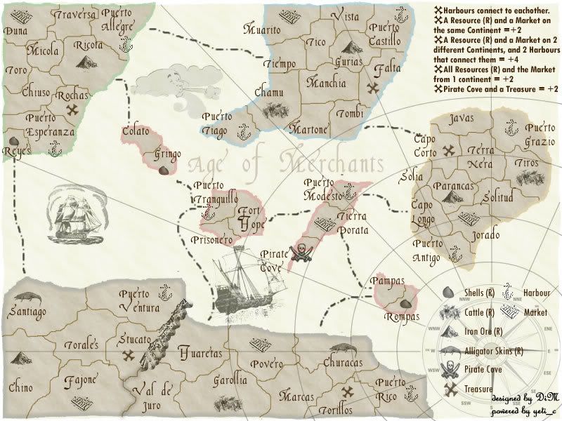
continents should be more clear now i adde some shades and fixed the borders that go out. i'll solve the circles in the next update.
“In the beginning God said, the four-dimensional divergence of an antisymmetric, second rank tensor equals zero, and there was light, and it was good. And on the seventh day he rested.”- Michio Kaku
-

 DiM
DiM
- Posts: 10415
- Joined: Wed Feb 14, 2007 6:20 pm
- Location: making maps for scooby snacks


![]() by DiM on Tue Mar 13, 2007 8:14 pm
by DiM on Tue Mar 13, 2007 8:14 pm
Enigma wrote:its looking better but still the wrong font. with the large letters and all the different symbols the map is way to busy.
i still personally think this concept would work better on a more colourful map. but i really like the idea- itll make for a very strategically interesting game!
all the playable maps are colourfull i tried a different approach.
“In the beginning God said, the four-dimensional divergence of an antisymmetric, second rank tensor equals zero, and there was light, and it was good. And on the seventh day he rested.”- Michio Kaku
-
DiM
- Posts: 10415
- Joined: Wed Feb 14, 2007 6:20 pm
- Location: making maps for scooby snacks

![]() by KEYOGI on Wed Mar 14, 2007 6:23 am
by KEYOGI on Wed Mar 14, 2007 6:23 am
You've got yourself another very cluttered map here. For starters, a lot of your territories leave no room at all for army numbers. I'm not a fan of this font either... it's nice that your trying some different fonts, but some of the characters are unclear. It's quite a bulky font, contributing to the cramped look of it at the moment.
Your legend in the top-right corner is very cramped, it's currently just a big jumble of text. The bottom-right one is much better.
I'd suggest making the compass and lines less obvious, they're quite distracting and again add to the clutter.
Your legend in the top-right corner is very cramped, it's currently just a big jumble of text. The bottom-right one is much better.
I'd suggest making the compass and lines less obvious, they're quite distracting and again add to the clutter.
-
KEYOGI
- Posts: 1632
- Joined: Tue Oct 10, 2006 6:09 am


![]() by DiM on Wed Mar 14, 2007 7:16 am
by DiM on Wed Mar 14, 2007 7:16 am
i already gotr read of all the extra stuff (grass rocks hills, etc)
if i ditch the compass lines and the compass and the ships and swithc to a simple font most of the feeling will be gone will it still shout: I'm and old merchant map of some forgotten region with pirates and old towns"
or will it whisper: i'm just a coloured thing with more blobs of darker colour on me. people say i'm a map but i don't belive them"
i won't remove any of the remaing graphics, i will make them less visible if the pose a problem but not remove them.
if i ditch the compass lines and the compass and the ships and swithc to a simple font most of the feeling will be gone
or will it whisper: i'm just a coloured thing with more blobs of darker colour on me. people say i'm a map but i don't belive them"
i won't remove any of the remaing graphics, i will make them less visible if the pose a problem but not remove them.
“In the beginning God said, the four-dimensional divergence of an antisymmetric, second rank tensor equals zero, and there was light, and it was good. And on the seventh day he rested.”- Michio Kaku
-
DiM
- Posts: 10415
- Joined: Wed Feb 14, 2007 6:20 pm
- Location: making maps for scooby snacks
![]() by Molacole on Wed Mar 14, 2007 8:07 am
by Molacole on Wed Mar 14, 2007 8:07 am
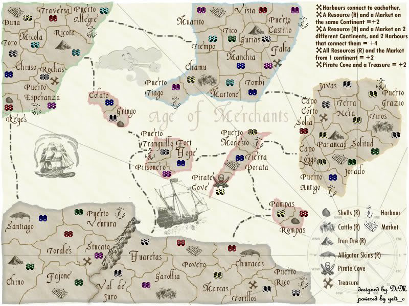
I liked it a lot more with the colors you had on it. It left no room for confusion of what is a resource or market and everything else was easy to recognize. The legend describes it good enough, but with colors you would only have to look at the map not go back and forth to double check which belongs to what.
It seems like the map is getting a little flat and stale with the lack of color. The colored outline helps though, but then you took it off. I think the font has once again become overwhelming with this new look because of that.
I like the new instructions symbol.
the cloud adds a nice touch.
definitely keep ships on this map.
I really like the current font you've got going there and I rather not see it be replaced, but it seems it might be causing some clutter problems.
-

Molacole
- Posts: 552
- Joined: Fri Jun 23, 2006 8:19 am
- Location: W 2.0 map by ZIM


![]() by DiM on Wed Mar 14, 2007 8:21 am
by DiM on Wed Mar 14, 2007 8:21 am
at the moment i'm putting the coords for the xml. i'll attend to all the suggestions when i'm done. keep the feedback going.
“In the beginning God said, the four-dimensional divergence of an antisymmetric, second rank tensor equals zero, and there was light, and it was good. And on the seventh day he rested.”- Michio Kaku
-
DiM
- Posts: 10415
- Joined: Wed Feb 14, 2007 6:20 pm
- Location: making maps for scooby snacks
![]() by DiM on Wed Mar 14, 2007 9:53 am
by DiM on Wed Mar 14, 2007 9:53 am
here is the map with numbers. i also took out the circles and made the lines less bold.
“In the beginning God said, the four-dimensional divergence of an antisymmetric, second rank tensor equals zero, and there was light, and it was good. And on the seventh day he rested.”- Michio Kaku
-
DiM
- Posts: 10415
- Joined: Wed Feb 14, 2007 6:20 pm
- Location: making maps for scooby snacks
![]() by Bad Speler on Wed Mar 14, 2007 9:58 am
by Bad Speler on Wed Mar 14, 2007 9:58 am
ive just noticed this, but isnt that cloud graphic a bit out of place? It looks like something out of a cartoon, its smiling at me.
Highest Score: 2532
Highest Position: 69 (a long time ago)
Highest Position: 69 (a long time ago)
-

Bad Speler
- Posts: 1027
- Joined: Fri Jun 02, 2006 8:16 pm
- Location: Ottawa


![]() by hulmey on Wed Mar 14, 2007 10:01 am
by hulmey on Wed Mar 14, 2007 10:01 am
i think this map is quite boring looking...How about putting on of those wooden boards on from your other thread???
[img]http://img801.imageshack.us/img801/9761/41922610151374166770386.jpg[/mg]
-

hulmey
- Posts: 3742
- Joined: Fri Nov 03, 2006 7:33 am
- Location: Las Vegas


![]() by DiM on Wed Mar 14, 2007 10:01 am
by DiM on Wed Mar 14, 2007 10:01 am
Bad Speler wrote:ive just noticed this, but isnt that cloud graphic a bit out of place? It looks like something out of a cartoon, its smiling at me.
it's not smiling it's blowing wind. and yes he has a face but that's how the maps were drawn back then.
“In the beginning God said, the four-dimensional divergence of an antisymmetric, second rank tensor equals zero, and there was light, and it was good. And on the seventh day he rested.”- Michio Kaku
-
DiM
- Posts: 10415
- Joined: Wed Feb 14, 2007 6:20 pm
- Location: making maps for scooby snacks


![]() by DiM on Wed Mar 14, 2007 10:11 am
by DiM on Wed Mar 14, 2007 10:11 am
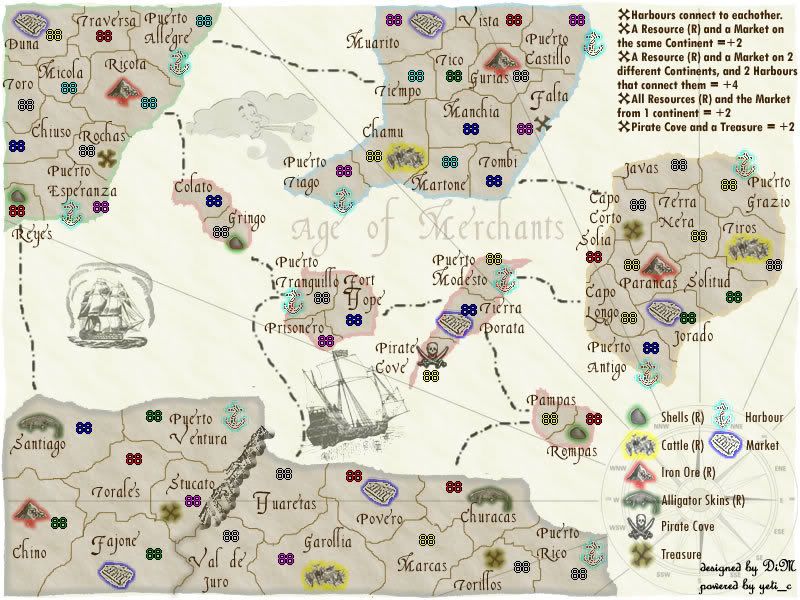
here is the version with outlined resources
“In the beginning God said, the four-dimensional divergence of an antisymmetric, second rank tensor equals zero, and there was light, and it was good. And on the seventh day he rested.”- Michio Kaku
-
DiM
- Posts: 10415
- Joined: Wed Feb 14, 2007 6:20 pm
- Location: making maps for scooby snacks
![]() by Enigma on Wed Mar 14, 2007 10:13 am
by Enigma on Wed Mar 14, 2007 10:13 am
DiM wrote:Enigma wrote:its looking better but still the wrong font. with the large letters and all the different symbols the map is way to busy.
i still personally think this concept would work better on a more colourful map. but i really like the idea- itll make for a very strategically interesting game!
all the playable maps are colourfull i tried a different approach.
k im with you there- it looks better with the coloured outlines. if keyogis not going to use them, you might as well
the things i think could be improved, pretty similar to what molacole said.:
-i really like the outline colour, this map really needs it to be able to differentiate between continents. it also adds interest, or depth as molacole said, without taking away from your clean map idea. the colours can be tweaked to blend better.
-i think make the compass, compass lines, and background images much lighter. look at the kanji symbol in oaktowns chinese checkers map-- its barely darker than the background of the map, but it is still legible. and it doesnt interfere with the game play.
-on a similar note add some yellow/brown to those same background images. it wil help them blend in a little better, and will lend a more aged look to the map.
-i love the font. but it is too much for the territory labels-- just simply makes the map too cluttered. keep it in the title though, thats where the art of the letters can be appreciated. try making the title just a little bit darker-- in the same tone as the rest of the background images, more brown.
-the legend needs to be very clear and uniform as this is a complicated map. try to make the icons clearer, both on the legend and the map itself- especially the Harbors and the Markets.
-why are there both harbors and ocean route lines? is this necessary? i dont think its a bad thing- just something to think about. if you keep the route lines then make sure it is very clear which territories they are leading to/from.
-are there continent bonuses at all? i dont see them listed on either part of the legend. there should be, i dont think these market bonuses should replace the continent bonuses, rather add to them.
after all, in a real war both political divides and supply lines are crucial. thats why i like this idea so much- it comes closer to mimicking real tactics.
-i love how you put different pirate treasures around the map. thats a great addition.
ok i think thats it for now lol. good luck
edit: you added a new map while i was writing this. i personally dont like the coloured icon outlines, i dont get the impression thats the look you were going for. clearer icons would generate the same result, or maybe a veeeerrrry lightly coloured tint to the entire icon, instead of a glowing outline.
Last edited by Enigma on Wed Mar 14, 2007 10:18 am, edited 1 time in total.
Do you need an excuse to have a war? I mean, who for? Can't you just say "You got lots of cash and land, but I've got a big sword, so divy up right now, chop chop."
Terry Pratchet
Terry Pratchet
-

Enigma
- Posts: 367
- Joined: Mon Jul 03, 2006 10:23 pm
- Location: Classified

![]() by DiM on Wed Mar 14, 2007 10:14 am
by DiM on Wed Mar 14, 2007 10:14 am
hulmey wrote:i think this map is quite boring looking...How about putting on of those wooden boards on from your other thread???
where??
“In the beginning God said, the four-dimensional divergence of an antisymmetric, second rank tensor equals zero, and there was light, and it was good. And on the seventh day he rested.”- Michio Kaku
-
DiM
- Posts: 10415
- Joined: Wed Feb 14, 2007 6:20 pm
- Location: making maps for scooby snacks
![]() by Bad Speler on Wed Mar 14, 2007 10:19 am
by Bad Speler on Wed Mar 14, 2007 10:19 am
ok, i dont know much about drawings from back then so ill have to trust you thats how they drew it. One more request though, is that boat on the right looks like it was crammed in there, try shrinking it a bit to give it some breathing room
Highest Score: 2532
Highest Position: 69 (a long time ago)
Highest Position: 69 (a long time ago)
-
Bad Speler
- Posts: 1027
- Joined: Fri Jun 02, 2006 8:16 pm
- Location: Ottawa
![]() by DiM on Wed Mar 14, 2007 10:28 am
by DiM on Wed Mar 14, 2007 10:28 am
Enigma wrote:k im with you there- it looks better with the coloured outlines. if keyogis not going to use them, you might as well
the things i think could be improved, pretty similar to what molacole said.:
-i really like the outline colour, this map really needs it to be able to differentiate between continents. it also adds interest, or depth as molacole said, without taking away from your clean map idea. the colours can be tweaked to blend better.
it can be done but i think the colours are already very soft. if i soften them even more won't people complain they can't see them? but if everybody agrees i can definitely soften them.
Enigma wrote:-i think make the compass, compass lines, and background images much lighter. look at the kanji symbol in oaktowns chinese checkers map-- its barely darker than the background of the map, but it is still legible. and it doesnt interfere with the game play.
will do.
Enigma wrote:-on a similar note add some yellow/brown to those same background images. it wil help them blend in a little better, and will lend a more aged look to the map.
will do.
Enigma wrote:-i love the font. but it is too much for the territory labels-- just simply makes the map too cluttered. keep it in the title though, thats where the art of the letters can be appreciated. try making the title just a little bit darker-- in the same tone as the rest of the background images, more brown.
i can make the title a bit darker (but just a bit)
also i need suggestions for the country fonts.
Enigma wrote:-the legend needs to be very clear and uniform as this is a complicated map. try to make the icons clearer, both on the legend and the map itself- especially the Harbors and the Markets.
what's not clear about them? they have very distinct icons and also different colours.
Enigma wrote:-why are there both harbors and ocean route lines? is this necessary? i dont think its a bad thing- just something to think about. if you keep the route lines then make sure it is very clear which territories they are leading to/from.
there are other routes because harbours can't provide enough movement options.
Enigma wrote:-are there continent bonuses at all? i dont see them listed on either part of the legend. there should be, i dont think these market bonuses should replace the continent bonuses, rather add to them.
after all, in a real war both political divides and supply lines are crucial. thats why i like this idea so much- it comes closer to mimicking real tactics.
continent bonuses could be added but there are 2 problems.
1. i really don't have enough space to add the additional legend (i could add it if i'm allowed to make the map 700*800 instead of 650*800) this would also solve the problem with the explanations box in the top right.
2. if i add bonuses for continents then i should lower the resources bonus or do something because the map will end up with double figures bonuses.
let's take the top left island. +2 for each resource taken to market. +2 for having all the resources on one continent. that's already a +6 bonus. if i add a continent bonus of another 6 then we're up to 12 armies.
Enigma wrote:-i love how you put different pirate treasures around the map. thats a great addition.
don't forget the pirate cove
Enigma wrote:ok i think thats it for now lol. good luck
thanks.
“In the beginning God said, the four-dimensional divergence of an antisymmetric, second rank tensor equals zero, and there was light, and it was good. And on the seventh day he rested.”- Michio Kaku
-
DiM
- Posts: 10415
- Joined: Wed Feb 14, 2007 6:20 pm
- Location: making maps for scooby snacks
![]() by DiM on Wed Mar 14, 2007 10:30 am
by DiM on Wed Mar 14, 2007 10:30 am
Bad Speler wrote:ok, i dont know much about drawings from back then so ill have to trust you thats how they drew it. One more request though, is that boat on the right looks like it was crammed in there, try shrinking it a bit to give it some breathing room
thanks for the trust
also i shrunk the boat.
how the heck can i add a new poll????
previous poll:
- Code: Select all
Do you like it??
Yes     68%     [ 26 ]
No     31%     [ 12 ]
Total Votes : 38
“In the beginning God said, the four-dimensional divergence of an antisymmetric, second rank tensor equals zero, and there was light, and it was good. And on the seventh day he rested.”- Michio Kaku
-
DiM
- Posts: 10415
- Joined: Wed Feb 14, 2007 6:20 pm
- Location: making maps for scooby snacks
![]() by Enigma on Wed Mar 14, 2007 11:26 am
by Enigma on Wed Mar 14, 2007 11:26 am
DiM wrote:Enigma wrote:-i really like the outline colour, this map really needs it to be able to differentiate between continents. it also adds interest, or depth as molacole said, without taking away from your clean map idea. the colours can be tweaked to blend better.
it can be done but i think the colours are already very soft. if i soften them even more won't people complain they can't see them? but if everybody agrees i can definitely soften them.
you dont necessarily ahve to make them lighter, there are other options. look at the map segment that someone posted in keyogis thread from the internet- the outline colours are pretty dark but they have the same yellowed look thats it the rest of the map, which makes them blend.
Dim wrote:Enigma wrote:-are there continent bonuses at all? i dont see them listed on either part of the legend. there should be, i dont think these market bonuses should replace the continent bonuses, rather add to them.
after all, in a real war both political divides and supply lines are crucial. thats why i like this idea so much- it comes closer to mimicking real tactics.
continent bonuses could be added but there are 2 problems.
1. i really don't have enough space to add the additional legend (i could add it if i'm allowed to make the map 700*800 instead of 650*800) this would also solve the problem with the explanations box in the top right.
2. if i add bonuses for continents then i should lower the resources bonus or do something because the map will end up with double figures bonuses.
let's take the top left island. +2 for each resource taken to market. +2 for having all the resources on one continent. that's already a +6 bonus. if i add a continent bonus of another 6 then we're up to 12 armies.
the continent bonuses dont necessarily have to be as big as usual.
Do you need an excuse to have a war? I mean, who for? Can't you just say "You got lots of cash and land, but I've got a big sword, so divy up right now, chop chop."
Terry Pratchet
Terry Pratchet
-
Enigma
- Posts: 367
- Joined: Mon Jul 03, 2006 10:23 pm
- Location: Classified
![]() by Bad Speler on Wed Mar 14, 2007 11:41 am
by Bad Speler on Wed Mar 14, 2007 11:41 am
I say no continent bonuses, the other bonuses are more then enough.
Highest Score: 2532
Highest Position: 69 (a long time ago)
Highest Position: 69 (a long time ago)
-
Bad Speler
- Posts: 1027
- Joined: Fri Jun 02, 2006 8:16 pm
- Location: Ottawa
![]() by DiM on Wed Mar 14, 2007 11:53 am
by DiM on Wed Mar 14, 2007 11:53 am
Enigma wrote:DiM wrote:Enigma wrote:-i really like the outline colour, this map really needs it to be able to differentiate between continents. it also adds interest, or depth as molacole said, without taking away from your clean map idea. the colours can be tweaked to blend better.
it can be done but i think the colours are already very soft. if i soften them even more won't people complain they can't see them? but if everybody agrees i can definitely soften them.
you dont necessarily ahve to make them lighter, there are other options. look at the map segment that someone posted in keyogis thread from the internet- the outline colours are pretty dark but they have the same yellowed look thats it the rest of the map, which makes them blend.
i understand what you mean. i'll try it.
Enigma wrote:Dim wrote:Enigma wrote:-are there continent bonuses at all? i dont see them listed on either part of the legend. there should be, i dont think these market bonuses should replace the continent bonuses, rather add to them.
after all, in a real war both political divides and supply lines are crucial. thats why i like this idea so much- it comes closer to mimicking real tactics.
continent bonuses could be added but there are 2 problems.
1. i really don't have enough space to add the additional legend (i could add it if i'm allowed to make the map 700*800 instead of 650*800) this would also solve the problem with the explanations box in the top right.
2. if i add bonuses for continents then i should lower the resources bonus or do something because the map will end up with double figures bonuses.
let's take the top left island. +2 for each resource taken to market. +2 for having all the resources on one continent. that's already a +6 bonus. if i add a continent bonus of another 6 then we're up to 12 armies.
the continent bonuses dont necessarily have to be as big as usual.
let's take top left island. it has 10 territories and 4 borders (2 of those borders are harbours which makes them very dangerous). for a continent such as this one +6 seems ok. but if we make it any lower then what's the point of bothering to take it? you'll lose more armies trying to hold it than the armies you receive as bonus.
anyway i put a poll to see if people want bonuses.
“In the beginning God said, the four-dimensional divergence of an antisymmetric, second rank tensor equals zero, and there was light, and it was good. And on the seventh day he rested.”- Michio Kaku
-
DiM
- Posts: 10415
- Joined: Wed Feb 14, 2007 6:20 pm
- Location: making maps for scooby snacks
Who is online
Users browsing this forum: Delf
|
|||||||
| Conquer Club is not associated with RISK online in any way. Copyright © 2006-2024 by Big Wham LLC | |||||||