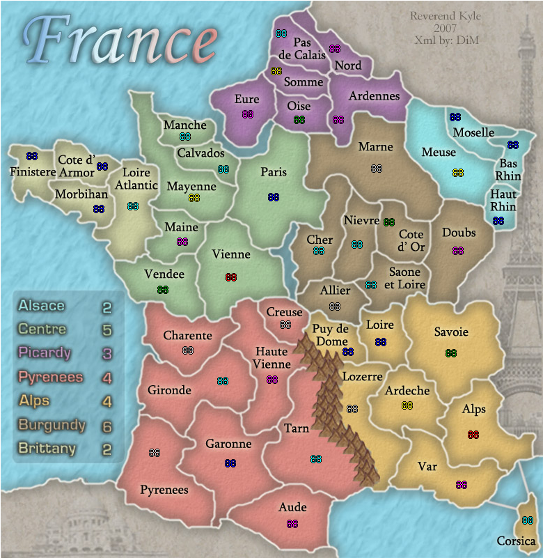
Conquer Club

France [Quenched]

Care to peruse completed maps? Take a stroll through the Atlas.

Moderator: Cartographers

Forum rules
Please read the Community Guidelines before posting.

Postby gimil on Fri Sep 21, 2007 10:17 am

Wisse wrote:
edbeard wrote:nope. frankly whenever I see these 2 maps I think they are unnecessarily large, but that's just personal taste.

legend corners look good to me. I'm not gonna Wisse it and zoom in because well if I can't tell from this view it probably doesn't matter


the legend corners aren't all the same rounded, but i think it looks good now so it doesn't matter that much ;)


well the rev broke it becasue i made them perfectly for him :wink:
What do you know about map making, bitch?

natty_dread wrote:I was wrong


Top Score:2403
User avatar
Corporal 1st Class gimil
 
Posts: 8599
Joined: Sat Mar 03, 2007 12:42 pm
Location: United Kingdom (Scotland)

Postby Wisse on Fri Sep 21, 2007 10:22 am

reverend_kyle wrote:does anyone else feel like my mall map is too small. I constantly keep checking the size because it feels way small.

it's more big than small ;)
Image Image
User avatar
Sergeant Wisse
 
Posts: 4448
Joined: Fri Oct 13, 2006 2:59 pm
Location: The netherlands, gelderland, epe

Postby AndyDufresne on Fri Sep 21, 2007 10:24 am

It's looking pretty good, kyle.

I quite like the EiffelTower on the right, but the image on the bottom looks like it is of bad resolution. I'm not entirely sure it is needed either, maybe it's just my eyes!


--Andy
User avatar
Corporal 1st Class AndyDufresne
 
Posts: 24919
Joined: Fri Mar 03, 2006 8:22 pm
Location: A Banana Palm in Zihuatanejo

Postby Wisse on Fri Sep 21, 2007 10:36 am

AndyDufresne wrote:It's looking pretty good, kyle.

I quite like the EiffelTower on the right, but the image on the bottom looks like it is of bad resolution. I'm not entirely sure it is needed either, maybe it's just my eyes!


--Andy

it isn't your eyes ;)
Image Image
User avatar
Sergeant Wisse
 
Posts: 4448
Joined: Fri Oct 13, 2006 2:59 pm
Location: The netherlands, gelderland, epe

Postby jako on Fri Sep 21, 2007 12:49 pm

Wisse wrote:
AndyDufresne wrote:It's looking pretty good, kyle.

I quite like the EiffelTower on the right, but the image on the bottom looks like it is of bad resolution. I'm not entirely sure it is needed either, maybe it's just my eyes!


--Andy

it isn't your eyes ;)


yup, that bottom pic is pretty blurry and i have pretty vision myself
Image

Time to retire this much loved sig of mine with a new clan.
User avatar
Lieutenant jako
 
Posts: 1022
Joined: Sun Jun 03, 2007 4:50 am
Location: A lost soul with no-one to stalk.

Postby reverend_kyle on Fri Sep 21, 2007 3:17 pm

gimil wrote:
Wisse wrote:
edbeard wrote:nope. frankly whenever I see these 2 maps I think they are unnecessarily large, but that's just personal taste.

legend corners look good to me. I'm not gonna Wisse it and zoom in because well if I can't tell from this view it probably doesn't matter


the legend corners aren't all the same rounded, but i think it looks good now so it doesn't matter that much ;)


well the rev broke it becasue i made them perfectly for him :wink:


No, they complained after yours so I had go through and re round i ;) but wisse says it doesn't matter and looks good so that's not a holding back issue.
DANCING MUSTARD FOR POOP IN '08!
User avatar
Sergeant reverend_kyle
 
Posts: 9250
Joined: Tue Mar 21, 2006 4:08 pm
Location: 1000 post club

Postby reverend_kyle on Fri Sep 21, 2007 3:18 pm

cairnswk wrote:reverend_kyle....hi
just doing some housekeeping...i assume your poll is ready to come down since i think it was started around page 23, and was only running for ten days.
Can you advise please. :)
if it is finished it will be removed.


get rid of it ;) thx
DANCING MUSTARD FOR POOP IN '08!
User avatar
Sergeant reverend_kyle
 
Posts: 9250
Joined: Tue Mar 21, 2006 4:08 pm
Location: 1000 post club

Postby reverend_kyle on Fri Sep 21, 2007 3:20 pm

jako wrote:
Wisse wrote:
AndyDufresne wrote:It's looking pretty good, kyle.

I quite like the EiffelTower on the right, but the image on the bottom looks like it is of bad resolution. I'm not entirely sure it is needed either, maybe it's just my eyes!


--Andy

it isn't your eyes ;)


yup, that bottom pic is pretty blurry and i have pretty vision myself


The blur is sort of on purpose, with the color and when I merged it under the text it made it look sort of blurry,but with it being an old building and all i thought it looked better so I left it.. if you think it looks bad i'll remove it but personally I like it.
DANCING MUSTARD FOR POOP IN '08!
User avatar
Sergeant reverend_kyle
 
Posts: 9250
Joined: Tue Mar 21, 2006 4:08 pm
Location: 1000 post club

Postby Coleman on Fri Sep 21, 2007 3:23 pm

Which Font options do you like the best?
  • Mother - 34% [ 10 ]
  • Corsica - 20% [ 6 ]
  • Alps - 27% [ 8 ]
  • Country - 17% [ 5 ]
Total Votes : 29
Warning: You may be reading a really old topic.
User avatar
Sergeant Coleman
 
Posts: 5402
Joined: Tue Jan 02, 2007 10:36 pm
Location: Midwest

Postby cairnswk on Fri Sep 21, 2007 7:41 pm

reverend_kyle....comments if i may....i like this "soft approach" to your map. it feels to me like it has feeling like the french are famous for.

1. I think the two images are almost fine...is it possible to darken the bottom left one to balance against the tower, either that or lighten the tower a fraction.

2. yes the maps do look overly large perhaps, but since they are within current guidelines, not an issue.

3. the only thing that i would ask you to think about is the ordering of the legend. i found it strange to have to chase over the map to find the regions and associate them with the colours. Perhaps you could reorder them to work left to right down the map like:

Picardy
Alsace
Brittany
Centre
Burgundy
Pyrennes
Alps

if this has been already re-worked in the legend then no issue, i just think it might work better for players visually.
Image
* Pearl Harbour * Waterloo * Forbidden City * Jamaica * Pot Mosbi
User avatar
Private cairnswk
 
Posts: 11510
Joined: Sat Feb 03, 2007 8:32 pm
Location: Australia

Postby reverend_kyle on Sat Sep 22, 2007 1:42 pm

Feedback has been alot faster since they hired the new guys.

I would like to congratulate conquer club for hiring people with nothing better to do than stay on the computer all day ;)

just kidding guys.
DANCING MUSTARD FOR POOP IN '08!
User avatar
Sergeant reverend_kyle
 
Posts: 9250
Joined: Tue Mar 21, 2006 4:08 pm
Location: 1000 post club

Postby AndyDufresne on Sat Sep 22, 2007 1:45 pm

;) We do our best to get some good help. ;)

Regarding the building, if you like it, I think it can stay. It doesn't necessarily detract from the map.


--Andy
User avatar
Corporal 1st Class AndyDufresne
 
Posts: 24919
Joined: Fri Mar 03, 2006 8:22 pm
Location: A Banana Palm in Zihuatanejo

Postby DiM on Sat Sep 22, 2007 3:52 pm

will test xml and post it tomorrow. i'm at work now.
“In the beginning God said, the four-dimensional divergence of an antisymmetric, second rank tensor equals zero, and there was light, and it was good. And on the seventh day he rested.”- Michio Kaku
User avatar
Major DiM
 
Posts: 10415
Joined: Wed Feb 14, 2007 6:20 pm
Location: making maps for scooby snacks

Postby DiM on Sun Sep 23, 2007 8:43 am

DiM wrote:will test xml and post it tomorrow. i'm at work now.


here is the xml http://www.sendspace.com/file/i63n8y

i have modified the names and the coordinates.

i have tested the small version and it looks good. but the large version somehow doesn't work.
when i load the large image it doesn't appear whole.
if somebody could verify that and upload a screenshot it would be great.
“In the beginning God said, the four-dimensional divergence of an antisymmetric, second rank tensor equals zero, and there was light, and it was good. And on the seventh day he rested.”- Michio Kaku
User avatar
Major DiM
 
Posts: 10415
Joined: Wed Feb 14, 2007 6:20 pm
Location: making maps for scooby snacks

Postby Wisse on Sun Sep 23, 2007 11:33 am

DiM wrote:
DiM wrote:will test xml and post it tomorrow. i'm at work now.


here is the xml http://www.sendspace.com/file/i63n8y

i have modified the names and the coordinates.

i have tested the small version and it looks good. but the large version somehow doesn't work.
when i load the large image it doesn't appear whole.
if somebody could verify that and upload a screenshot it would be great.

large:
Image
all the cordinates are off

small: (for others who want to see it)
Image
i think these are off:
Pas de Calais, a bit more to the right
Cote d' Armor, place the text lable 1 px to the left
Saone et Liore, a bit more to the right and a bit more southwards
Puy de Dome, a bit more to the right and maybe one pixel southwards
Lozerre, a bit more to the right
Corsica, 1px to the right
Haut Rhin, a bit more to the right and 1 px northwards
Moselle, 1px to the right
Bas Rihn, a bitmore to the right
Image Image
User avatar
Sergeant Wisse
 
Posts: 4448
Joined: Fri Oct 13, 2006 2:59 pm
Location: The netherlands, gelderland, epe

Postby DiM on Sun Sep 23, 2007 4:19 pm

Wisse wrote:large:
all the cordinates are off


that's exactly what i get in the tester. as you can see the coordinates seem to be off but i think that's because the map is not full it's somehow stretched and then cut. look at the large map you posted. you can't even see corsica on the map. that's the problem the map is not fully loaded in the tester. i'm sure the coordinates are ok but i can't verify it.
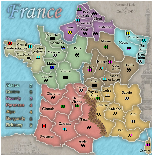
Wisse wrote:small:
i think these are off:
Pas de Calais, a bit more to the right


if i put it to the right then the 3 digit armies will go over the name

Cote d' Armor, place the text lable 1 px to the left


talk to rev kyle for that but if he moves it then it will be too close to finistere

Saone et Liore, a bit more to the right and a bit more southwards


if i put it to the right then the 3 digit armies will go over the name

Puy de Dome, a bit more to the right and maybe one pixel southwards


if i put it to the right then the 3 digit armies will go over the border

Lozerre, a bit more to the right


this will be done

Corsica, 1px to the right


if i put it to the right then the 3 digit armies will go off the map

Haut Rhin, a bit more to the right and 1 px northwards


if i put it to the right then the 3 digit armies will go over the border. but i will move it north 1px

Moselle, 1px to the right


if i put it to the right then the 3 digit armies will go over the border

Bas Rihn, a bitmore to the right


if i put it to the right then the 3 digit armies will go over the border.


i made all the coords with the triple digit armies in mind. yes they might look a bit off centered but i'd rather have them like that than overlaping names and borders.

and there are also others besides those you mentioned like calvados or ardennes but i have the same reason. the overlapping for 3 digit armies.
“In the beginning God said, the four-dimensional divergence of an antisymmetric, second rank tensor equals zero, and there was light, and it was good. And on the seventh day he rested.”- Michio Kaku
User avatar
Major DiM
 
Posts: 10415
Joined: Wed Feb 14, 2007 6:20 pm
Location: making maps for scooby snacks

Postby DiM on Sun Sep 23, 2007 4:22 pm

yeah i found out why the large version is wrong. i defined different width and height for the large in the xml. will correct it when i get home.
“In the beginning God said, the four-dimensional divergence of an antisymmetric, second rank tensor equals zero, and there was light, and it was good. And on the seventh day he rested.”- Michio Kaku
User avatar
Major DiM
 
Posts: 10415
Joined: Wed Feb 14, 2007 6:20 pm
Location: making maps for scooby snacks

Postby reverend_kyle on Mon Sep 24, 2007 12:32 am

cairnswk wrote:reverend_kyle....comments if i may....i like this "soft approach" to your map. it feels to me like it has feeling like the french are famous for.

1. I think the two images are almost fine...is it possible to darken the bottom left one to balance against the tower, either that or lighten the tower a fraction.

2. yes the maps do look overly large perhaps, but since they are within current guidelines, not an issue.

3. the only thing that i would ask you to think about is the ordering of the legend. i found it strange to have to chase over the map to find the regions and associate them with the colours. Perhaps you could reorder them to work left to right down the map like:

Picardy
Alsace
Brittany
Centre
Burgundy
Pyrennes
Alps

if this has been already re-worked in the legend then no issue, i just think it might work better for players visually.


I will darken the building but I don't want to reorder the legend. Is that fine? I know you just said think about it, and I think the cost would outweigh the benefit.
DANCING MUSTARD FOR POOP IN '08!
User avatar
Sergeant reverend_kyle
 
Posts: 9250
Joined: Tue Mar 21, 2006 4:08 pm
Location: 1000 post club

Postby edbeard on Mon Sep 24, 2007 12:53 am

well could you make it so the continent title in the legend and the bonus number are on the same bottom level. Seems really weird to me that they are lined up properly


And, since you're doing that, you might as well order them properly as well.

I know it's tedious work, but it makes the outcome better. This might be obvious, but it's quite easy to do if you make long boxes for each separate level so that the continent and bonus are lined up. And, separate inbetween boxes to make sure spacing is done correctly is helpful as well.
User avatar
Lieutenant edbeard
 
Posts: 2501
Joined: Thu Mar 29, 2007 12:41 am

Postby reverend_kyle on Mon Sep 24, 2007 1:09 am

did you mean aren't lined up properly?
DANCING MUSTARD FOR POOP IN '08!
User avatar
Sergeant reverend_kyle
 
Posts: 9250
Joined: Tue Mar 21, 2006 4:08 pm
Location: 1000 post club

Postby edbeard on Mon Sep 24, 2007 2:55 am

all that stuff I wrote hardly made sense after reading it again. haha. yes. please line them up properly!
User avatar
Lieutenant edbeard
 
Posts: 2501
Joined: Thu Mar 29, 2007 12:41 am

Postby reverend_kyle on Mon Sep 24, 2007 3:02 am

ok this will give me some much needed practice with editing smart objects anyways.
DANCING MUSTARD FOR POOP IN '08!
User avatar
Sergeant reverend_kyle
 
Posts: 9250
Joined: Tue Mar 21, 2006 4:08 pm
Location: 1000 post club

Postby cairnswk on Mon Sep 24, 2007 4:04 am

reverend_kyle wrote:ok this will give me some much needed practice with editing smart objects anyways.


reverend...i like that "style of positiveness"...good on you. Thanks. :) and to edbeard also.
Image
* Pearl Harbour * Waterloo * Forbidden City * Jamaica * Pot Mosbi
User avatar
Private cairnswk
 
Posts: 11510
Joined: Sat Feb 03, 2007 8:32 pm
Location: Australia

Postby Wisse on Mon Sep 24, 2007 5:57 am

ok dim i did think it was strange why you all did it much to the left but well if it is for that reason it seems good to me,
Image Image
User avatar
Sergeant Wisse
 
Posts: 4448
Joined: Fri Oct 13, 2006 2:59 pm
Location: The netherlands, gelderland, epe

Postby DiM on Mon Sep 24, 2007 5:58 am

i have corrected all the coordinates for small and large and i have moved them around to make them as centered as possible but at the same time thinking of the triple digit armies. so some may seem off center but they are like that to accommodate the triple digits.

large test
Image

small test
Image

xml
http://www.sendspace.com/file/vrsnxf

small image:
http://i15.tinypic.com/4mwgr6f.jpg
Image

large image:
http://i17.tinypic.com/67cxbus.jpg
Image
“In the beginning God said, the four-dimensional divergence of an antisymmetric, second rank tensor equals zero, and there was light, and it was good. And on the seventh day he rested.”- Michio Kaku
User avatar
Major DiM
 
Posts: 10415
Joined: Wed Feb 14, 2007 6:20 pm
Location: making maps for scooby snacks

PreviousNext

Return to The Atlas

Who is online

Users browsing this forum: No registered users