Hi natty,
This has a much more 'British' feel to it now. A few graphical points while you wait on getting this moved by those that run the drafting room.
The British flag contrasts with the Big Ben watermark. I would suggest making the flag similar in tone and transparency to big ben for graphical consistency. You know what I mean?
Also the bonus legends could probably be moved to the bottom right corner to utalise the dead space in that area, also the legends could probably be colour coded with the map for ease of reference (and so they look prettier).
Finally I ain't digging the Font choice for the title. With the semi-British theme you have going on I think a hand writing font would fit the theme much better, perhaps 'Monotype Corsiva'. Let me know what you think.
Nice work,
gimil
Classic cities: London [19.2.12] p27
Moderator: Cartographers
Re: London [6.9.11]
![]() by gimil on Tue Sep 06, 2011 7:03 am
by gimil on Tue Sep 06, 2011 7:03 am
What do you know about map making, bitch?
Top Score:2403
natty_dread wrote:I was wrong
Top Score:2403
-

 gimil
gimil
- Posts: 8599
- Joined: Sat Mar 03, 2007 12:42 pm
- Location: United Kingdom (Scotland)


Re: London [6.9.11]
![]() by gimil on Tue Sep 06, 2011 7:10 am
by gimil on Tue Sep 06, 2011 7:10 am
p.s. if you are up for downloading font this look like a winner for your map.
http://www.dafont.com/mk-british-writing.font
http://www.dafont.com/mk-british-writing.font
What do you know about map making, bitch?
Top Score:2403
natty_dread wrote:I was wrong
Top Score:2403
-
gimil
- Posts: 8599
- Joined: Sat Mar 03, 2007 12:42 pm
- Location: United Kingdom (Scotland)

-

MoB Deadly
- Posts: 2381
- Joined: Sun Jan 11, 2009 2:07 am


Re: London [6.9.11]
![]() by isaiah40 on Tue Sep 06, 2011 8:20 am
by isaiah40 on Tue Sep 06, 2011 8:20 am
[MOVED]
New update, moved again!! Can you please update the OP with all of the maps relative information please.
New update, moved again!! Can you please update the OP with all of the maps relative information please.
-
isaiah40
- Posts: 3990
- Joined: Mon Aug 27, 2007 7:14 pm


Re: London [6.9.11]
![]() by koontz1973 on Tue Sep 06, 2011 8:36 am
by koontz1973 on Tue Sep 06, 2011 8:36 am
natty_dread, nice to see you bring this one back to life. I really like the new colour scheme, getting away from the green was a great idea but South east and North Central look very similar.
North Central, can you rename it just North. Central is not used.
Why Big Ben for the background, I have no problem with it but a lot of people will just ask, so I might as well be first.
Gimil said it, but the title font looks really bad (like something a dog with a bad tummy would do).
North Central, can you rename it just North. Central is not used.
Why Big Ben for the background, I have no problem with it but a lot of people will just ask, so I might as well be first.
Gimil said it, but the title font looks really bad (like something a dog with a bad tummy would do).

-

koontz1973
- Posts: 6960
- Joined: Thu Jan 01, 2009 10:57 am


Re: London [6.9.11]
![]() by Seamus76 on Tue Sep 06, 2011 8:40 am
by Seamus76 on Tue Sep 06, 2011 8:40 am
Very nice work natty, as usual.
I agree with Koontz, the SE and N do look similar, especially Haringey and Camden. They look very much like the SE, and event different than Barnet and Enfield.
I agree with Koontz, the SE and N do look similar, especially Haringey and Camden. They look very much like the SE, and event different than Barnet and Enfield.


-

Seamus76
- Posts: 1574
- Joined: Fri Feb 25, 2011 5:41 pm
- Location: Atlanta, GA


Re: London [6.9.11]
![]() by gimil on Tue Sep 06, 2011 8:41 am
by gimil on Tue Sep 06, 2011 8:41 am
koontz1973 wrote:Why Big Ben for the background, I have no problem with it but a lot of people will just ask, so I might as well be first.
Big Ben, is London's most prominent and well known landmark.
What do you know about map making, bitch?
Top Score:2403
natty_dread wrote:I was wrong
Top Score:2403
-
gimil
- Posts: 8599
- Joined: Sat Mar 03, 2007 12:42 pm
- Location: United Kingdom (Scotland)
Re: London [6.9.11]
![]() by koontz1973 on Tue Sep 06, 2011 8:45 am
by koontz1973 on Tue Sep 06, 2011 8:45 am
gimil wrote:koontz1973 wrote:Why Big Ben for the background, I have no problem with it but a lot of people will just ask, so I might as well be first.
Big Ben, is London's most prominent and well known landmark.
That is debatable.
But as I said, it is natty's choice but like all maps with these landmarks on, people will say why that one.
-
koontz1973
- Posts: 6960
- Joined: Thu Jan 01, 2009 10:57 am
Re: London [6.9.11]
![]() by gimil on Tue Sep 06, 2011 8:52 am
by gimil on Tue Sep 06, 2011 8:52 am
koontz1973 wrote:gimil wrote:koontz1973 wrote:Why Big Ben for the background, I have no problem with it but a lot of people will just ask, so I might as well be first.
Big Ben, is London's most prominent and well known landmark.
That is debatable.
But as I said, it is natty's choice but like all maps with these landmarks on, people will say why that one.
How is that debatable?
What do you know about map making, bitch?
Top Score:2403
natty_dread wrote:I was wrong
Top Score:2403
-
gimil
- Posts: 8599
- Joined: Sat Mar 03, 2007 12:42 pm
- Location: United Kingdom (Scotland)
Re: London [6.9.11]
![]() by koontz1973 on Tue Sep 06, 2011 9:01 am
by koontz1973 on Tue Sep 06, 2011 9:01 am
Simple, when I think of London, I think of many many things, Big Ben is only one of them, but I am not the right person to ask as I am to close to my home city. As an exercise, I will ask my kids at school tomorrow and see what they come up with.
-
koontz1973
- Posts: 6960
- Joined: Thu Jan 01, 2009 10:57 am
Re: London [6.9.11]
![]() by Herbas on Tue Sep 06, 2011 9:48 am
by Herbas on Tue Sep 06, 2011 9:48 am
Maybe it's just me, but I prefer when bonuses are listed in a mini-map with numbers instead of a text list.
Just like this one:
With so many maps nowadays it's more and more difficult to remember how one or another region is called.
Just like this one:
- Click image to enlarge.
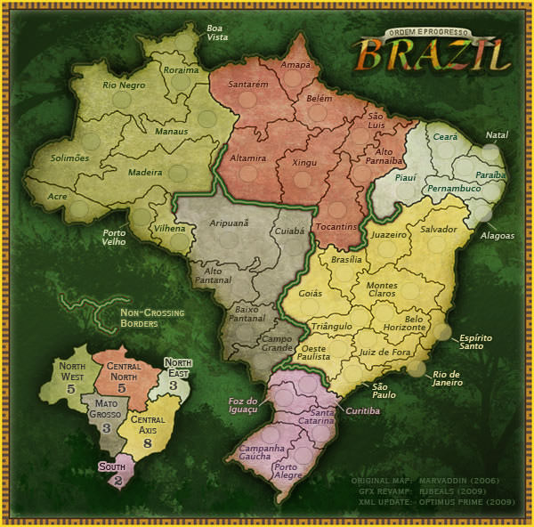
With so many maps nowadays it's more and more difficult to remember how one or another region is called.
-

Herbas
- Posts: 101
- Joined: Mon Jan 26, 2009 5:52 pm
- Location: Top Score: 2647


Re: London [6.9.11]
![]() by gimil on Tue Sep 06, 2011 10:01 am
by gimil on Tue Sep 06, 2011 10:01 am
Herbas wrote:Maybe it's just me, but I prefer when bonuses are listed in a mini-map with numbers instead of a text list.
That could work also, natty.
What do you know about map making, bitch?
Top Score:2403
natty_dread wrote:I was wrong
Top Score:2403
-
gimil
- Posts: 8599
- Joined: Sat Mar 03, 2007 12:42 pm
- Location: United Kingdom (Scotland)
Re: London [6.9.11]
![]() by Pedronicus on Tue Sep 06, 2011 10:48 am
by Pedronicus on Tue Sep 06, 2011 10:48 am
If you want a proper London font - get the London Underground font
http://www.fonts101.com/fonts/view/Unca ... ondon.aspx
If anyone suggests anything different, get them to pm me and i'll gladly tell them to f*ck off all day long.
http://www.fonts101.com/fonts/view/Unca ... ondon.aspx
If anyone suggests anything different, get them to pm me and i'll gladly tell them to f*ck off all day long.

-
Pedronicus
- Posts: 2080
- Joined: Tue Jan 24, 2006 2:42 pm
- Location: Busy not shitting you....


Re: London [6.9.11]
![]() by ViperOverLord on Tue Sep 06, 2011 10:51 am
by ViperOverLord on Tue Sep 06, 2011 10:51 am
The map's okay for gaming purposes. I don't think it really capture's any of the city's personality though.
-

ViperOverLord
- Posts: 2472
- Joined: Sun Apr 19, 2009 3:19 pm
- Location: California


Re: London [6.9.11]
![]() by Pedronicus on Tue Sep 06, 2011 10:55 am
by Pedronicus on Tue Sep 06, 2011 10:55 am
Oh, and while I'm here.
Rename
North Central - north
North East - East
this is how they are know in London
Rename
North Central - north
North East - East
this is how they are know in London
-
Pedronicus
- Posts: 2080
- Joined: Tue Jan 24, 2006 2:42 pm
- Location: Busy not shitting you....
Re: London [6.9.11]
![]() by natty dread on Tue Sep 06, 2011 10:59 am
by natty dread on Tue Sep 06, 2011 10:59 am
Wow, lots of feedback. Thanks guys. It's nice that so many people are interested in this map.
So, I tweaked the bonus colours for now. I think they should now be distinct enough.
So, let's see... what else?
- title font: I think it fits the map, but I'm not opposed to experimenting with other fonts. Not monotype corsiva though, that's an awful and overused font. I'd rather give pedro's suggestion a shot.
- big ben: it stays. I don't see any reason to remove it.
- renaming "north central" to "north"... hm, why not. Less text on the map, yeah. Same with northeast -> east, why not.
- minimap for bonuses: maybe... I'll see if I can make one that fits the map.
So, I tweaked the bonus colours for now. I think they should now be distinct enough.
- Click image to enlarge.

So, let's see... what else?
- title font: I think it fits the map, but I'm not opposed to experimenting with other fonts. Not monotype corsiva though, that's an awful and overused font. I'd rather give pedro's suggestion a shot.
- big ben: it stays. I don't see any reason to remove it.
- renaming "north central" to "north"... hm, why not. Less text on the map, yeah. Same with northeast -> east, why not.
- minimap for bonuses: maybe... I'll see if I can make one that fits the map.

-

natty dread
- Posts: 12877
- Joined: Fri Feb 08, 2008 8:58 pm
- Location: just plain fucked


Re: London [6.9.11]
![]() by natty dread on Tue Sep 06, 2011 12:59 pm
by natty dread on Tue Sep 06, 2011 12:59 pm
How's this title?
Or this alternate:
- Click image to enlarge.

Or this alternate:
- Click image to enlarge.

-
natty dread
- Posts: 12877
- Joined: Fri Feb 08, 2008 8:58 pm
- Location: just plain fucked
Re: London [6.9.11]
![]() by aad0906 on Tue Sep 06, 2011 1:05 pm
by aad0906 on Tue Sep 06, 2011 1:05 pm
Menton should be Merton.
Sulton should be Sutton.
Sulton should be Sutton.
-

aad0906
- Posts: 555
- Joined: Mon Nov 22, 2010 8:15 pm
- Location: New Jersey, USA


Re: London [6.9.11]
![]() by sannemanrobinson on Tue Sep 06, 2011 1:09 pm
by sannemanrobinson on Tue Sep 06, 2011 1:09 pm
The first title is too prominent and is not really an improvement. Smaller, more basic and more depth could work.
The second one has a kind of modern look. Something more exciting is to assemble the letters from landmarks. Like the O's could be an abstract London Eye.
The second one has a kind of modern look. Something more exciting is to assemble the letters from landmarks. Like the O's could be an abstract London Eye.
-
sannemanrobinson
- Posts: 255
- Joined: Mon Dec 20, 2010 6:35 am


Re: London [6.9.11]
![]() by gimil on Tue Sep 06, 2011 2:38 pm
by gimil on Tue Sep 06, 2011 2:38 pm
Pedronicus wrote:If you want a proper London font - get the London Underground font
http://www.fonts101.com/fonts/view/Unca ... ondon.aspx
If anyone suggests anything different, get them to pm me and i'll gladly tell them to f*ck off all day long.
I think your wrong...the handwriting font I suggest would work much better for the overall theme of this map. In my opinion.
What do you know about map making, bitch?
Top Score:2403
natty_dread wrote:I was wrong
Top Score:2403
-
gimil
- Posts: 8599
- Joined: Sat Mar 03, 2007 12:42 pm
- Location: United Kingdom (Scotland)
Re: London [6.9.11]
![]() by koontz1973 on Tue Sep 06, 2011 2:54 pm
by koontz1973 on Tue Sep 06, 2011 2:54 pm
As you are looking at the title, may I suggest something like this...

Not sure on the actual font but from a daily newspaper. Should look rather striking at the top.
If you do go with a hand writing font, england looks quite nice or shit happens is also good.
Not sure on the actual font but from a daily newspaper. Should look rather striking at the top.
If you do go with a hand writing font, england looks quite nice or shit happens is also good.
-
koontz1973
- Posts: 6960
- Joined: Thu Jan 01, 2009 10:57 am
Re: London [6.9.11]
![]() by Victor Sullivan on Tue Sep 06, 2011 2:59 pm
by Victor Sullivan on Tue Sep 06, 2011 2:59 pm
gimil wrote:Pedronicus wrote:If you want a proper London font - get the London Underground font
http://www.fonts101.com/fonts/view/Unca ... ondon.aspx
If anyone suggests anything different, get them to pm me and i'll gladly tell them to f*ck off all day long.
I think your wrong...the handwriting font I suggest would work much better for the overall theme of this map. In my opinion.
Yeah, I agree, with Big Ben and the whole color scheme, I'm not sure a modern font like you have above works well.
On a side note:
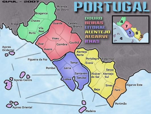
Herbas wrote:Maybe it's just me, but I prefer when bonuses are listed in a mini-map with numbers instead of a text list.
Just like this one:
- Click image to enlarge.
Or Portugal***
-Sully
Beckytheblondie: "Don't give us the dispatch, give us a mustache ride."
Scaling back on my CC involvement...
Scaling back on my CC involvement...
-

Victor Sullivan
- Posts: 6010
- Joined: Mon Feb 08, 2010 8:17 pm
- Location: Columbus, OH


Re: London [6.9.11]
![]() by gimil on Tue Sep 06, 2011 3:22 pm
by gimil on Tue Sep 06, 2011 3:22 pm
What do you know about map making, bitch?
Top Score:2403
natty_dread wrote:I was wrong
Top Score:2403
-
gimil
- Posts: 8599
- Joined: Sat Mar 03, 2007 12:42 pm
- Location: United Kingdom (Scotland)
Re: London [6.9.11]
![]() by Pedronicus on Tue Sep 06, 2011 4:19 pm
by Pedronicus on Tue Sep 06, 2011 4:19 pm
gimil wrote:Pedronicus wrote:If you want a proper London font - get the London Underground font
http://www.fonts101.com/fonts/view/Unca ... ondon.aspx
If anyone suggests anything different, get them to pm me and i'll gladly tell them to f*ck off all day long.
I think your wrong...the handwriting font I suggest would work much better for the overall theme of this map. In my opinion.
I'm a London graffiti artist, I know what font is 'London'
-
Pedronicus
- Posts: 2080
- Joined: Tue Jan 24, 2006 2:42 pm
- Location: Busy not shitting you....
Re: London [6.9.11]
![]() by Pedronicus on Tue Sep 06, 2011 4:29 pm
by Pedronicus on Tue Sep 06, 2011 4:29 pm
Street name signs around London are cool, but they change from borough to borough.


whereas the London underground font is the same from one side of the city to the other. It is THE London wide font that doesn't change.
whereas the London underground font is the same from one side of the city to the other. It is THE London wide font that doesn't change.
-
Pedronicus
- Posts: 2080
- Joined: Tue Jan 24, 2006 2:42 pm
- Location: Busy not shitting you....
Who is online
Users browsing this forum: No registered users
|
|||||||
| Conquer Club is not associated with RISK online in any way. Copyright © 2006-2024 by Big Wham LLC | |||||||