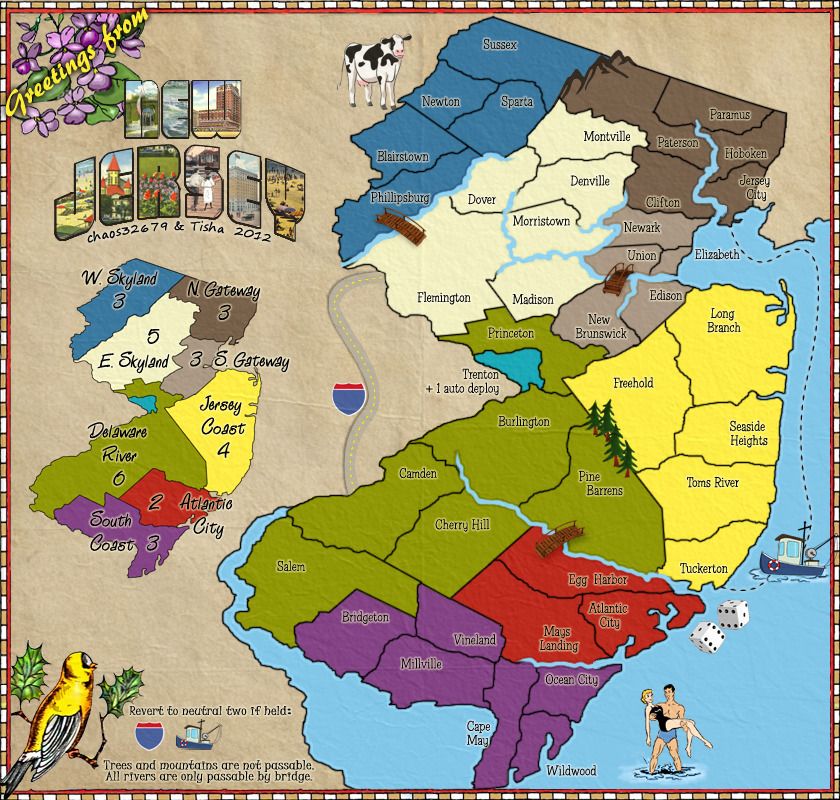
Re: New Jersey [UPDATE 06.10.2012, p15, XML Fixes]
DiM wrote:2. as andy said, the mountains don't fit with the style of the map or the style of the other icons.
How do they not fit? They look pretty cartoonish to me. Maybe the colors don't work? idk, maybe if you had a suggestion we could make a change, or try it and see, because i don't see anything not fitting the theme of the map so i'm not even sure what to try here...
DiM wrote:5. the river in the upper right corner continues far outside the playing area but the river in philipsburg ends abruptly.
The upper right extends because it separates two states (NJ/NY), the one in P-Burg just goes into PA, no reason for it to keep going. Extending one OR shortening the other wouldn't really do much IMO. Plus, the upper right is empty, so the extension there works i think...
DiM wrote:6. the title while being awesome in itself (gotta love those old postcards), doesn't really fit with the map at all. first, everything is flat but the title is 3D, second, everything on the map has a cartoony hand drawing feel while the title has sharp straight letters with actual photos in it. wavy flat hand drawn cartoons and sharp crisp 3d photorealism in the same image...
Going to have to disagree with you on this all the way around. The 3D fits (examples: (http://www.wildpostcards.com/wp-content/slng93/2008/09/greetings-from-atlantic-city-nj.jpg OR http://rlv.zcache.com/greetings_from_new_jersey_postcard-p239770204088223232envli_400.jpg). Secondly, the letters are filled with 'drawings', they are not filled with actual photos, a quick glance could show you that. they may look more sharp/detailed because they are smaller, but they are drawings, not photos.


