Page 6 of 14
Re: Patch Wars [10.Dec.11] - V7 - p1&8

Posted:
Wed Dec 14, 2011 11:01 amby DiM
that settles it. tweaked shadows on all the buttons.
anything else?
i'll get started on the small map.
Re: Patch Wars [10.Dec.11] - V7 - p1&8
Posted:
Wed Dec 14, 2011 11:05 amby isaiah40
Nope, I don't have anything at the moment.
Re: Patch Wars [10.Dec.11] - V7 - p1&8
Posted:
Wed Dec 14, 2011 11:21 amby DiM
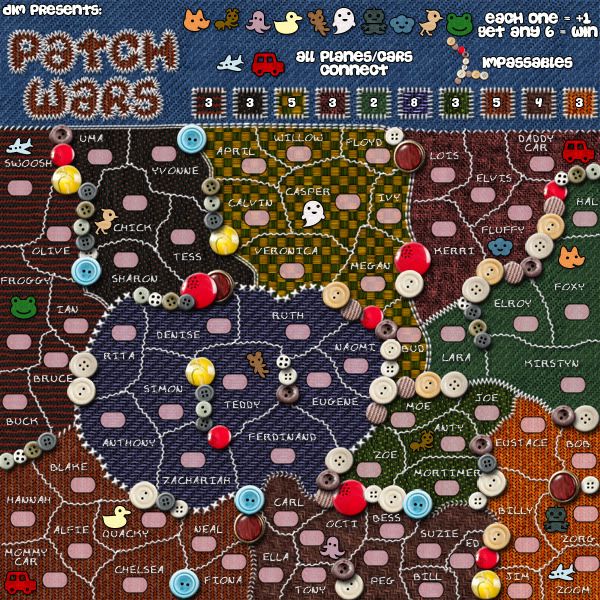
V8:*tweaked shadows for buttons
*moved some names around
Large:- Click image to enlarge.
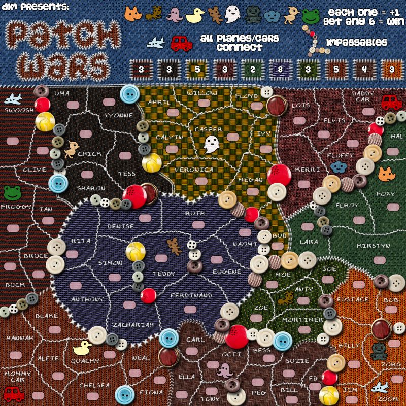
- Click image to enlarge.
Re: Patch Wars [10.Dec.11] - V7 - p1&8
Posted:
Wed Dec 14, 2011 5:48 pmby zimmah
DiM wrote:V8:*tweaked shadows for buttons
*moved some names around
Large:- Click image to enlarge.
- Click image to enlarge.
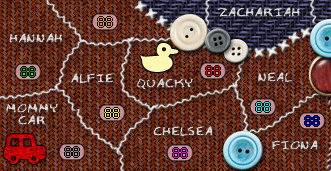
did you make the border between carl and ferdinant diferent on purpose?
Re: Patch Wars [14.Dec.11] - V8 - p1&9
Posted:
Wed Dec 14, 2011 6:20 pmby DiM
i explained this a while back. each patch has it's own outer border, then the patches are put one on top of the other like they're laid down on a bed or a flat surface. the border between carl and ferdinand is the outer border for the octi patch which sits above the teddy patch.
i can make all outer borders the same but i like the flavour of having all sorts of stitch types and different colours and different materials.
Re: Patch Wars [14.Dec.11] - V8 - p1&9
Posted:
Wed Dec 14, 2011 11:10 pmby Victor Sullivan
Hm, I kinda preferred the Teddy border over the Octi one, but I suppose it's not that big of a deal.
-Sully
Re: Patch Wars [14.Dec.11] - V8 - p1&9
Posted:
Fri Dec 16, 2011 1:09 amby lostatlimbo
This looks a lot better with the buttons laid out in a more random fashion.
Have to admit this is growing on me.
Just out of curiosity - why red for the troop boxes? Seems like something neutral would look a little better.
Re: Patch Wars [14.Dec.11] - V8 - p1&9
Posted:
Fri Dec 16, 2011 10:21 amby DiM
it's pink, not red. my girl loves pink. actually i think every little girl loves pink. it's probably genetic.
Re: Patch Wars [14.Dec.11] - V8 - p1&9
Posted:
Fri Dec 16, 2011 10:25 amby natty dread
DiM wrote:actually i think every little girl loves pink. it's probably genetic.
Actually, it's just social conditioning. The whole pink=girl/blue=boy thing only started around the beginning of 20th century. Before that it was actually reversed, with pink considered the more masculine colour, and blue more feminine.
Re: Patch Wars [14.Dec.11] - V8 - p1&9
Posted:
Fri Dec 16, 2011 10:59 amby DiM
natty_dread wrote:DiM wrote:actually i think every little girl loves pink. it's probably genetic.
Actually, it's just social conditioning. The whole pink=girl/blue=boy thing only started around the beginning of 20th century. Before that it was actually reversed, with pink considered the more masculine colour, and blue more feminine.

i was obviously joking

Re: Patch Wars [14.Dec.11] - V8 - p1&9
Posted:
Fri Dec 16, 2011 11:22 amby natty dread
I thought you enjoyed my random factoids

Re: Patch Wars [14.Dec.11] - V8 - p1&9
Posted:
Fri Dec 16, 2011 1:24 pmby AndyDufresne
Back to the map development, I don't think I have anything more to add at this stage. I'm pretty satisfied.
Nice work, DiM.
--Andy
Re: Patch Wars [14.Dec.11] - V8 - p1&9
Posted:
Fri Dec 16, 2011 5:37 pmby zimmah
natty_dread wrote:DiM wrote:actually i think every little girl loves pink. it's probably genetic.
Actually, it's just social conditioning. The whole pink=girl/blue=boy thing only started around the beginning of 20th century. Before that it was actually reversed, with pink considered the more masculine colour, and blue more feminine.
true, and besides, i love pink too.but it's horrible on forums, too bright.
Re: Patch Wars [14.Dec.11] - V8 - p1&9
Posted:
Fri Dec 16, 2011 5:40 pmby zimmah
btw, did you check if all possible army colors are visible on that pink army numbers? it'll be a pity if it doesn't.
Re: Patch Wars [14.Dec.11] - V8 - p1&9
Posted:
Fri Dec 16, 2011 5:50 pmby DiM
Re: Patch Wars [14.Dec.11] - V8 - p1&9
Posted:
Fri Dec 16, 2011 10:27 pmby ender516
Those look fine. I expect the neutrals will show equally well.
Re: Patch Wars [14.Dec.11] - V8 - p1&9
Posted:
Sat Dec 17, 2011 2:16 pmby koontz1973
Dim, as always, great work. I just have 2 suggestions as final touches.
The icons (quacky, octi, planes, cars etc) you have, I assume they are part of the quilt, if so, should they not of been stitched on. Right now, they look thrown on. Just a simple cross stitch.
And as a final little touch to add that all important realism to this, can we have a loose thread or two.
Re: Patch Wars [14.Dec.11] - V8 - p1&9
Posted:
Sat Dec 17, 2011 3:10 pmby natty dread
koontz1973 wrote:a lose thread or two.
Loose.
Re: Patch Wars [14.Dec.11] - V8 - p1&9
Posted:
Sat Dec 17, 2011 8:13 pmby ender516
koontz1973 wrote:Dim, as always, great work. I just have 2 suggestions as final touches.
The icons (quacky, octi, planes, cars etc) you have, I assume they are part of the quilt, if so, should they not of been stitched on. Right now, they look thrown on. Just a simple cross stitch.
And as a final little touch to add that all important realism to this, can we have a loose thread or two.
I think the intention was that they
were toys that were thrown on the bed. However, they do look like they are just cut-out pieces of felt. I don't know if trying to make them look more like 3-D toys would be a good idea or not.
Re: Patch Wars [14.Dec.11] - V8 - p1&9
Posted:
Sat Dec 17, 2011 11:59 pmby koontz1973
ender516 wrote:koontz1973 wrote:Dim, as always, great work. I just have 2 suggestions as final touches.
The icons (quacky, octi, planes, cars etc) you have, I assume they are part of the quilt, if so, should they not of been stitched on. Right now, they look thrown on. Just a simple cross stitch.
And as a final little touch to add that all important realism to this, can we have a loose thread or two.
I think the intention was that they
were toys that were thrown on the bed. However, they do look like they are just cut-out pieces of felt. I don't know if trying to make them look more like 3-D toys would be a good idea or not.
If they are felt/cloth, then my original idea stands, if they are supposed to be proper toys, having them look like toys would be good. For the sake of clarity and keeping the overall look the same, having them as felt seems to be better.
Re: Patch Wars [14.Dec.11] - V8 - p1&9
Posted:
Sun Dec 18, 2011 4:09 pmby ender516
koontz1973 wrote:ender516 wrote:koontz1973 wrote:Dim, as always, great work. I just have 2 suggestions as final touches.
The icons (quacky, octi, planes, cars etc) you have, I assume they are part of the quilt, if so, should they not of been stitched on. Right now, they look thrown on. Just a simple cross stitch.
And as a final little touch to add that all important realism to this, can we have a loose thread or two.
I think the intention was that they
were toys that were thrown on the bed. However, they do look like they are just cut-out pieces of felt. I don't know if trying to make them look more like 3-D toys would be a good idea or not.
If they are felt/cloth, then my original idea stands, if they are supposed to be proper toys, having them look like toys would be good. For the sake of clarity and keeping the overall look the same, having them as felt seems to be better.
My kids used to play with felt cutouts, which were supposed to be put on a feltboard, and could be moved around. Of course, they did not always stay on the feltboard, and might appear on a quilt. If they really need to be stitched on, I would use a blanket stitch, which would form a nice outline. I think a cross stitch might be too fussy.
Re: Patch Wars [14.Dec.11] - V8 - p1&9
Posted:
Sun Dec 18, 2011 4:24 pmby DiM
i actually envisioned the little toys as coloured paper cut-outs not felt or quilt.
i can make them look like they're stitched on the quilt but it won't look good because they're so small and have tiny details.
Re: Patch Wars [14.Dec.11] - V8 - p1&9
Posted:
Sun Dec 18, 2011 9:04 pmby cairnswk
lostatlimbo wrote:...Seems like something neutral would look a little better.
Dim, I'm looking at this as i haven't visited for a while...
2 things that strike me about the colours...
I agree with lostalimbo about neutral probably being better for the army boxes, and
the regions around casper...their pattern is out of place with everything else and sticks out like a sore thumb. Any chance you could keep one of the colours (probably dark green) and find a similar pattern to what is going on in the rest of the continents ?
Re: Patch Wars [14.Dec.11] - V8 - p1&9
Posted:
Thu Dec 22, 2011 7:34 pmby DiM
cairnswk wrote:I agree with lostalimbo about neutral probably being better for the army boxes, and
what do you mean neutral? currently they're a very light pink which as you can see above shows all the colours perfectly.
do you want the army boxes to be white? i can do that but wouldn't it be too bland?
cairnswk wrote:the regions around casper...their pattern is out of place with everything else and sticks out like a sore thumb. Any chance you could keep one of the colours (probably dark green) and find a similar pattern to what is going on in the rest of the continents ?
why is it out of place? each piece of quilt is an actual texture of material and just like the others have zig-zag patterns, dot patterns or line patterns, this one has a square pattern.
Re: Patch Wars [14.Dec.11] - V8 - p1&9
Posted:
Thu Dec 22, 2011 8:16 pmby cairnswk
DiM wrote:cairnswk wrote:I agree with lostalimbo about neutral probably being better for the army boxes, and
what do you mean neutral? currently they're a very light pink which as you can see above shows all the colours perfectly.
do you want the army boxes to be white? i can do that but wouldn't it be too bland?
I think pink it the wrong colour for the overall design....and as such i fiddled.
The colours that work really well as parts of the overall design are light blue R201 G241 B243
and black. White/grey stands out too much although is probably better for seeing the army numbers.
Black works really well with the army numbers. However, my opinion as always!
cairnswk wrote:the regions around casper...their pattern is out of place with everything else and sticks out like a sore thumb. Any chance you could keep one of the colours (probably dark green) and find a similar pattern to what is going on in the rest of the continents ?
why is it out of place? each piece of quilt is an actual texture of material and just like the others have zig-zag patterns, dot patterns or line patterns, this one has a square pattern.
it is a two coloured checkered pattern and because the check squares are larger than other stitches stands out much more than all the others patterns. It is not a similar sewing pattern to the other areas.
I also think you need to separate the AUNTY and FOXY continents - two greens beside each other.