But I do agree that bonuses need to be adjusted:
N. America worth more
Antartica worth more
Also, I see there is one name to 2 countries in N. America
Extreme Global Warming [Quenched]
Moderator: Cartographers


-

 wrightfan123
- Posts: 601
- Joined: Sat Jan 06, 2007 2:58 pm
- Location: Looking over every baseball team's schedule to try to determine who will win the World Series.


![]() by wrightfan123 on Sun Mar 25, 2007 4:40 pm
by wrightfan123 on Sun Mar 25, 2007 4:40 pm
RobinJ wrote:But I do agree that bonuses need to be adjusted:
N. America worth more
Antartica worth more
Also, I see there is one name to 2 countries in N. America
Yea, Wade, you have Prairies spanning two countries; is it supposed to be like that?
-
wrightfan123
- Posts: 601
- Joined: Sat Jan 06, 2007 2:58 pm
- Location: Looking over every baseball team's schedule to try to determine who will win the World Series.

![]() by DiM on Sun Mar 25, 2007 6:49 pm
by DiM on Sun Mar 25, 2007 6:49 pm
i really don't understand why most of europe is under water (including some mountains) but some small islands are still there 
at the moment i don't like this map because it is highly innacurate. some high areas are underwater and other low ones still exist.
and second, i don't like the map because it has the same playability as classic map or world 2.1
PS: i really hate the red band across the map.
at the moment i don't like this map because it is highly innacurate. some high areas are underwater and other low ones still exist.
and second, i don't like the map because it has the same playability as classic map or world 2.1
PS: i really hate the red band across the map.
“In the beginning God said, the four-dimensional divergence of an antisymmetric, second rank tensor equals zero, and there was light, and it was good. And on the seventh day he rested.”- Michio Kaku
-

DiM
- Posts: 10415
- Joined: Wed Feb 14, 2007 6:20 pm
- Location: making maps for scooby snacks


![]() by pepperonibread on Sun Mar 25, 2007 7:33 pm
by pepperonibread on Sun Mar 25, 2007 7:33 pm
ok, i based this map on an elevation map and put all the green (lowest elevation) under water. and antarctica is a land mass, not like the polar ice caps of the north. the ice would melt off it, but the land would still be there

-

pepperonibread
- Posts: 954
- Joined: Sun Jan 28, 2007 4:33 pm
- Location: The Former Confederacy


![]() by PimpCaneYoAss on Sun Mar 25, 2007 8:54 pm
by PimpCaneYoAss on Sun Mar 25, 2007 8:54 pm
Heres an example of a map of the future...
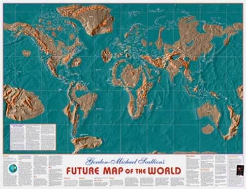
Maybe take some advice from that. Maybe it can help. Otherwise i love the map. great idea was thinking about it myself.
and to respond to DiM's comment, it has to deal with areas closet to the ice caps as well.
Maybe take some advice from that. Maybe it can help. Otherwise i love the map. great idea was thinking about it myself.
and to respond to DiM's comment, it has to deal with areas closet to the ice caps as well.
-

PimpCaneYoAss
- Posts: 185
- Joined: Fri Feb 16, 2007 3:04 pm
- Location: Connecticut

![]() by casper on Sun Mar 25, 2007 8:58 pm
by casper on Sun Mar 25, 2007 8:58 pm
Great idea. Looks like you did some research. I came across this site. http://merkel.zoneo.net/Topo/Applet Anyone who's interested in what the world's land masses will look like at different sea levels should check it out. You can type in any rise (or drop) in sea level. Try around 300 m and pepperonibread's map is dead on.
Africa is going to be quite difficult to hold I imagine since it's split in two by the red zone. And the southern half of Africa is too isolated imo.
Africa is going to be quite difficult to hold I imagine since it's split in two by the red zone. And the southern half of Africa is too isolated imo.
-

casper
- Posts: 416
- Joined: Wed Feb 01, 2006 6:36 pm
- Location: Chicago


![]() by joystickgenie on Sun Mar 25, 2007 10:53 pm
by joystickgenie on Sun Mar 25, 2007 10:53 pm
PimpCaneYoAss wrote:Heres an example of a map of the future...
Maybe take some advice from that. Maybe it can help. Otherwise i love the map. great idea was thinking about it myself.
and to respond to DiM's comment, it has to deal with areas closet to the ice caps as well.
I don't know. that map doesn't make that much sense either. why is Florida still above water? why is there that new continent in the pacific. what is this based on?

Shinobi Nations
Comments are greatly appreciated.
-

joystickgenie
- Posts: 62
- Joined: Fri Feb 09, 2007 9:25 pm
![]() by 1st chair flute on Mon Mar 26, 2007 8:13 am
by 1st chair flute on Mon Mar 26, 2007 8:13 am
sounds like a great map wade but the uninhabbitable zone should be less of a pop out thing. and bonouses need to be adjusted but looks really great. and in response to the comments about global warming, its just for the fun of it were not sayingf its true it is just a general idea
Blue
who needs a good signature when you look like i do
who needs a good signature when you look like i do
-
1st chair flute
- Posts: 138
- Joined: Tue Jan 16, 2007 5:31 pm
- Location: Aiur
![]() by Crowley on Mon Mar 26, 2007 8:21 am
by Crowley on Mon Mar 26, 2007 8:21 am
casper wrote:Great idea. Looks like you did some research. I came across this site. http://merkel.zoneo.net/Topo/Applet Anyone who's interested in what the world's land masses will look like at different sea levels should check it out.
Looks like South Africa will be pretty safe! WHOOHOO!
All you guys are welcome at my house...
.jpg)
-

Crowley
- Posts: 166
- Joined: Sun Feb 18, 2007 5:53 pm
- Location: Gauteng, South Africa


![]() by pepperonibread on Mon Mar 26, 2007 3:19 pm
by pepperonibread on Mon Mar 26, 2007 3:19 pm

ok, heres the map that i based my map on
in photoshop, i eliminated all of the lowest elevations of green, and got my landmasses from that
since this is a satellite picture and antarctica is covered in ice, it pretty much looks like a huge plateau, but im not sure if when all the ice melts off some of antarctica's lower elevations would flood. antarctica could just be a plateau without the ice. again, im not sure.
and about the uninhabitable zone (red band), when i changed the image from a photoshop doc to a jpeg, some of the colors got a little weird, but ill fix that soon
-
pepperonibread
- Posts: 954
- Joined: Sun Jan 28, 2007 4:33 pm
- Location: The Former Confederacy
![]() by coconut4paws on Mon Mar 26, 2007 6:41 pm
by coconut4paws on Mon Mar 26, 2007 6:41 pm
You should not erase the water covered land, but fade or blur it out. It would show the global warming effect more and it would just plain be cool. The thermal image would look cooler as a base, and show more of the global warming aspect. You could just use black lines as dividers and throw in some cool science/math blurbs...  Have fun with it!
You're obsessed with CC when...
codyjd wrote:When you're listening to a history lecture and think, "wow, Hitler had really good dice."
-

coconut4paws
- Posts: 301
- Joined: Tue Mar 06, 2007 7:19 pm
- Location: Im, Hungary
![]() by dominationnation on Mon Mar 26, 2007 8:18 pm
by dominationnation on Mon Mar 26, 2007 8:18 pm
I think that you should make the red band only in certain areas in the equater and make it uncrossalbe. Along with that It doesn't look much different from classic or world2.1 do something to shake it up 
-
dominationnation
- Posts: 4234
- Joined: Sat Jan 13, 2007 10:20 am
![]() by KEYOGI on Mon Mar 26, 2007 8:26 pm
by KEYOGI on Mon Mar 26, 2007 8:26 pm
I agree with those that have said this doesn't offer much over Classic or World 2.0. I'm just not sure we need another map of the world.
Personally I'd find it much more interesting if it was focused on a particular area that was heavily affected. Just as an example, say it was based in Europe... I'd like to see some more islands and perhaps even go as far as having marshes or swamps as impassables along with some desert areas?
Personally I'd find it much more interesting if it was focused on a particular area that was heavily affected. Just as an example, say it was based in Europe... I'd like to see some more islands and perhaps even go as far as having marshes or swamps as impassables along with some desert areas?
-
KEYOGI
- Posts: 1632
- Joined: Tue Oct 10, 2006 6:09 am


![]() by pepperonibread on Tue Mar 27, 2007 6:42 am
by pepperonibread on Tue Mar 27, 2007 6:42 am
coconut4paws wrote:You should not erase the water covered land, but fade or blur it out. It would show the global warming effect more and it would just plain be cool. The thermal image would look cooler as a base, and show more of the global warming aspect. You could just use black lines as dividers and throw in some cool science/math blurbs...
yeah, that would look really cool
thanks
-
pepperonibread
- Posts: 954
- Joined: Sun Jan 28, 2007 4:33 pm
- Location: The Former Confederacy
![]() by GreecePwns on Tue Mar 27, 2007 4:29 pm
by GreecePwns on Tue Mar 27, 2007 4:29 pm
I think the uninhabitable zone color should be toned down a bit. It's almost impossible to see the territories behind it.
Chariot of Fire wrote:As for GreecePwns.....yeah, what? A massive debt. Get a job you slacker.
Viceroy wrote:[The Biblical creation story] was written in a time when there was no way to confirm this fact and is in fact a statement of the facts.
-

GreecePwns
- Posts: 2656
- Joined: Tue Feb 20, 2007 7:19 pm
- Location: Lawn Guy Lint


![]() by pepperonibread on Tue Mar 27, 2007 4:38 pm
by pepperonibread on Tue Mar 27, 2007 4:38 pm
GreecePwns wrote:I think the uninhabitable zone color should be toned down a bit. It's almost impossible to see the territories behind it.
ok, i guess i need to clarify this in the map key
the uninhabitable zone is an impassable border except for along the ocean routes that go through it, so, theres no territories in the uninhabitable zone
-
pepperonibread
- Posts: 954
- Joined: Sun Jan 28, 2007 4:33 pm
- Location: The Former Confederacy
![]() by coconut4paws on Tue Mar 27, 2007 5:31 pm
by coconut4paws on Tue Mar 27, 2007 5:31 pm
pepperonibread wrote:coconut4paws wrote:You should not erase the water covered land, but fade or blur it out. It would show the global warming effect more and it would just plain be cool. The thermal image would look cooler as a base, and show more of the global warming aspect. You could just use black lines as dividers and throw in some cool science/math blurbs...
yeah, that would look really cool
thanks
Thanx wade, By the way this is Lori...so yeah...I had a smart moment.
You're obsessed with CC when...
codyjd wrote:When you're listening to a history lecture and think, "wow, Hitler had really good dice."
-
coconut4paws
- Posts: 301
- Joined: Tue Mar 06, 2007 7:19 pm
- Location: Im, Hungary
Who is online
Users browsing this forum: No registered users
|
|||||||
| Conquer Club is not associated with RISK online in any way. Copyright © 2006-2024 by Big Wham LLC | |||||||