Re: 4 Star Meats [11 November 2012] v21 pg 30
OK not sure how I'll get clean versions of those numbers into photoshop, but I'll work it out. The one's I'm using on the large map are the same size as yours. Can I use mine if I change their color?
Conquer Club, a free online multiplayer variation of a popular world domination board game.
https://www.conquerclub.com/forum/
https://www.conquerclub.com/forum/viewtopic.php?f=358&t=156204
I did them all except for removing the frame on the chalkboards because I tried it and didn't like it.


Flapcake wrote:Dana, I realy like what you have done with the colours, they are sharp and much more dense now... Good work...
This is maby not a question for you, so lets ask the mods, how close to beta are we here ?


 In this view you are looking at the INSIDE of the left part of the frame. They all need to be from the same point of view.
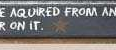 The star, and actually all the stars are way too hard to see. I only see 2 stars on the map itself, if there are more I can't find them (this is especially true on the color blind version). Get a good contrasting color, maybe a bright color?
isaiah40 wrote:3. In the color blind test there is a problem between Plate and Flank. They are a little too close together. I suggest swapping the Left Leg and Flank colors.
isaiah40 wrote:2. The title font doesn't seem to fit with the rest of the map.
isaiah40 wrote:6. The special offer. You have it split in two places. Suggested wording "Special offer can attack and be attacked by items on offer. Special Offer area reverts back to 3." You can then remove the text on the bottom left. Short, and too the point.
isaiah40 wrote:4. The chalk lines are good, I would suggest making them look like they are "HAND" drawn on. Right now they are too straight.
isaiah40 wrote:5.
dana1971 wrote:Thanks again for the feedback, I know it is all good stuff and makes the map better, even if it's a bit hard to hear sometimes.
dana1971 wrote:isaiah40 wrote:2. The title font doesn't seem to fit with the rest of the map.
2. The logo however being a different style is intentional and goes back about 20 pages or so. The debate was for a while that the map needed a theme. And the theme / setting is a poster hanging in a butcher shop wall. Keeping that in mind the Logo on the poster was created by a different person than the one who wrote on the chalk board.
dana1971 wrote:isaiah40 wrote:6. The special offer. You have it split in two places. Suggested wording "Special offer can attack and be attacked by items on offer. Special Offer area reverts back to 3." You can then remove the text on the bottom left. Short, and too the point.
6. The same debate relates to the special offer text. To fit into the theme, I had to avoid words like attack. Because it was argued that you can't attack on a cow map. It's more like you are trying to buy, or own the whole cow, hence words like acquire. Also think writing out the regions on offer makes it more clear than only having them written in the special offer sticker.
dana1971 wrote:isaiah40 wrote:5.
5. I can play around with the color of the stars, keeping in mind the color will look a little different depending what color background they are on. However I don't think the stars are hard to find. I would think if someone could notice small details on the chalkboard boarder they could easily see all the stars.
dana1971 wrote:At the end of the day I want this map to get published, so I'm happy to make most of these changes if it helps me get the elusive graphics sticker. But it can be time consuming to uploaded spot the difference variations on this map over and over again, so is it possible to get a definitive list from the people in charge of approving a graphics sticker before I post another update.
What do you think, koontz1973? You seem to be the one in charge. Can you approve a list of final changes?
isaiah40 wrote:While it is true that you have to have a theme, the problem here is you have more of a old west font for the title, while the rest says 50's/60's style. So you have a font from the late 1800's to the early 1900's, and the rest of the map is between 1950 through the mid 1960's. See the problem?
isaiah40 wrote:Remember that you have been working on this map so you know where the stars are. I could only find 2 of the stars, but when I looked closer, I found one other one. Please bear this in mind because players don't necessarily look closely at a map, and they WILL miss things. It is your job to make sure that the stars can be easily found. I noticed the differences on the chalk boards without really looking, the stars blend into the map too much.