Page 20 of 27
Re: 4 Star Meats [18 November 2012] v22pg 31

Posted:
Mon Nov 26, 2012 4:45 pmby greenoaks
AndyDufresne wrote:Since the font is easily readable, I'm going to defer the choice (assuming any future fonts are also readable) to the mapmaker. It seems like this sort of thing likely can be left up to their aesthetic choice.
--Andy
what about the typos ?
Re: 4 Star Meats [18 November 2012] v22pg 31
Posted:
Mon Nov 26, 2012 4:50 pmby AndyDufresne
greenoaks wrote:AndyDufresne wrote:Since the font is easily readable, I'm going to defer the choice (assuming any future fonts are also readable) to the mapmaker. It seems like this sort of thing likely can be left up to their aesthetic choice.
--Andy
what about the typos ?
If the typos are a part of the theme (a la someone writing a chalkboard), and they don't impact the readability, I'd be fine with it, but I wouldn't recommend it, since you'll just have people coming into map topic after it has been taken out of beta to say they found a typo, etc.
--Andy
Re: 4 Star Meats [18 November 2012] v22pg 31
Posted:
Mon Nov 26, 2012 6:35 pmby dana1971
Ok I think I know how to move forward now.. You can expect an update in the next few days when I get some time. I will certainly fix any typos.
Best wishes,
Dana
PS thanks for the input.
Re: 4 Star Meats [18 November 2012] v22pg 31
Posted:
Mon Nov 26, 2012 9:32 pmby greenoaks
i didn't have a problem locating the stars but i'm not colour blind so i don't know if they would have any difficulty.
Re: 4 Star Meats [18 November 2012] v22pg 31
Posted:
Wed Nov 28, 2012 11:23 amby The Bison King
I think this looks ready for a stamp
Re: 4 Star Meats [18 November 2012] v22pg 31
Posted:
Sun Dec 02, 2012 2:27 amby isaiah40
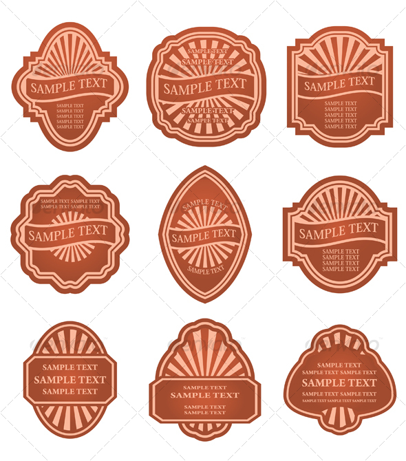
I think a more retro special offer image can be use like this. Obviously the colors can be changed to reflect the rest of the map.
Re: 4 Star Meats [18 November 2012] v22pg 31
Posted:
Sun Dec 02, 2012 4:17 amby jonofperu
I don't see a problem with the stars either. 4 immediately visible. Unless it's a colorblind issue or something...
I'm not convinced there is problem with the font. Old west fonts are often combined with something generic aren't they?
great work Dana!
Re: 4 Star Meats [18 November 2012] v22pg 31
Posted:
Sun Dec 02, 2012 7:49 amby ManBungalow
isaiah40 wrote:I think a more retro special offer image can be use like this. Obviously the colors can be changed to reflect the rest of the map.
Nice, but I don't think it looks right.
Re: 4 Star Meats [18 November 2012] v22pg 31
Posted:
Sun Dec 02, 2012 8:57 amby anamainiacks
ManBungalow wrote:isaiah40 wrote:I think a more retro special offer image can be use like this. Obviously the colors can be changed to reflect the rest of the map.
Nice, but I don't think it looks right.
Ditto. It doesn't really fit in...
Re: 4 Star Meats [18 November 2012] v22pg 31
Posted:
Sun Dec 02, 2012 10:05 amby koontz1973
anamainiacks wrote:ManBungalow wrote:isaiah40 wrote:I think a more retro special offer image can be use like this. Obviously the colors can be changed to reflect the rest of the map.
Nice, but I don't think it looks right.
Ditto. It doesn't really fit in...
Have to agree and disagree with isaiah. It is not right (and he did say this) but it is far better than the current one. A special offer sticker should look like a sticker and not part of the poster. And that I think is the main problem with the current one, it looks like it is part of the poster that has been hanging for a while (blood spots, old looking and tatty in places). Do offers last that long? No, so an offer should look noticeable better (current one does not). Give it a slight angle and you might have a winner.
I could go for one like isaiah posted but maybe not that one.

Either way, the current one does not fit the map.
Re: 4 Star Meats [18 November 2012] v22pg 31
Posted:
Sun Dec 02, 2012 12:13 pmby isaiah40
koontz1973 wrote:anamainiacks wrote:ManBungalow wrote:isaiah40 wrote:I think a more retro special offer image can be use like this. Obviously the colors can be changed to reflect the rest of the map.
Nice, but I don't think it looks right.
Ditto. It doesn't really fit in...
Have to agree and disagree with isaiah. It is not right (and he did say this) but it is far better than the current one. A special offer sticker should look like a sticker and not part of the poster. And that I think is the main problem with the current one, it looks like it is part of the poster that has been hanging for a while (blood spots, old looking and tatty in places). Do offers last that long? No, so an offer should look noticeable better (current one does not). Give it a slight angle and you might have a winner.
I could go for one like isaiah posted but maybe not that one.
Either way, the current one does not fit the map.
This is just an idea, I have a few other retro "stickers" in psd format, so maybe one could work. I chose this one because the 3 special offers could be larger so they can be read easier while eliminating the text making the map cleaner. Like I said I have others available in PSD format so the colors can be changed to fit with the theme better. I just may post some of what I have to see what dana and others think.
Re: 4 Star Meats [18 November 2012] v22pg 31
Posted:
Sun Dec 02, 2012 1:14 pmby jonofperu
I don't really have a problem with Dana's last version of the sticker, but maybe something like this would work with the vintage theme?
- Click image to enlarge.
Not sure if it's old enough though.
Any maybe the wording should be "Daily Special" with "Valid one turn only - resets to 3 neutral" underneath?
Or maybe "Sale - today only".Could also do something like:
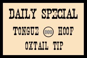
Valid one turn only - resets to 3 neutral.
Used this font:
http://www.fontspace.com/disturbed-type/nashvilleOr even put it on a chalkboard? But it seems there are too many chalkboards... if fact maybe the upper left chalkboard content could be written on the sign like the other comments on the bottom?
I suppose the amounts wouldn't be quite right, but it would look cool if the prices were in cents: 5¢ (it would probably have to be in the range of 50¢?)
Re: 4 Star Meats [18 November 2012] v22pg 31
Posted:
Sun Dec 02, 2012 2:02 pmby isaiah40
Or something like this, colors go with the theme a little more.
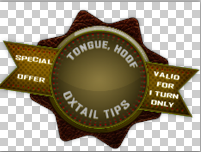
The checked background is actually transparent. So just ignore that. So it would look like this on the map:
- Click image to enlarge.
Re: 4 Star Meats [18 November 2012] v22pg 31
Posted:
Sun Dec 02, 2012 3:26 pmby generalhead
isaiah40 wrote:Or something like this, colors go with the theme a little more.
The checked background is actually transparent. So just ignore that. So it would look like this on the map:
I +1 this one. This one does go with the theme of the map. Did you mean for it to be crooked though or is that just how you posted it?
I wonder if it would look better straight?
Re: 4 Star Meats [18 November 2012] v22pg 31
Posted:
Sun Dec 02, 2012 5:15 pmby isaiah40
generalhead wrote:isaiah40 wrote:Or something like this, colors go with the theme a little more.
The checked background is actually transparent. So just ignore that. So it would look like this on the map:
I +1 this one. This one does go with the theme of the map. Did you mean for it to be crooked though or is that just how you posted it?
I wonder if it would look better straight?
Yes I meant for it to be that way. If Dana likes it then he can place it on anyway he wants.
Re: 4 Star Meats [18 November 2012] v22pg 31
Posted:
Mon Dec 03, 2012 2:52 pmby AndyDufresne
I like them all, so I whatever is chosen sounds good to me!
--Andy
Re: 4 Star Meats [18 November 2012] v22pg 31
Posted:
Mon Dec 03, 2012 6:58 pmby dana1971
isaiah40 wrote:Or something like this, colors go with the theme a little more.
I like this sticker, but the color is wrong, I can fix that no problem.
Thanks for finding it.
Best Wishes,
Dana
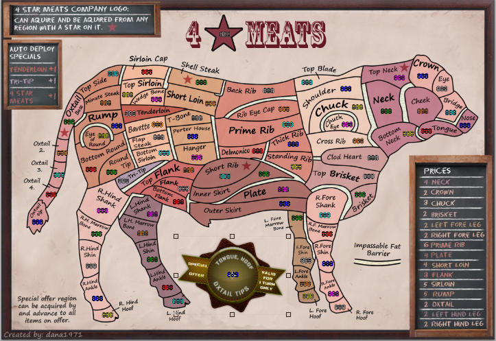
Re: 4 Star Meats [09 December 2012] v23pg 33
Posted:
Sun Dec 09, 2012 6:33 pmby dana1971
OK all,
I've reworked the chalk boards, the colors, the text, and the special offer sticker.
I will fall off my chair in surprise if I get a graphics sticker as I'm sure I must have misspelled something, or used the wrong color for a region, or maybe have to much description, maybe not enough.
I'm liking it, but let me know what you eagle eye viewers out there think.
Best wishes,
Dana
- Click image to enlarge.

- Click image to enlarge.

- Click image to enlarge.

Re: 4 Star Meats [09 December 2012] v23pg 33
Posted:
Sun Dec 09, 2012 7:33 pmby ironmanbravo
looks great Dana1971...I am ready to play
Re: 4 Star Meats [09 December 2012] v23pg 33
Posted:
Sun Dec 09, 2012 9:33 pmby generalhead
ironmanbravo wrote:looks great Dana1971...I am ready to play
+1
Re: 4 Star Meats [09 December 2012] v23pg 33
Posted:
Sun Dec 09, 2012 9:44 pmby Funkyterrance
Make the stars from a branding iron and I'm ready to play it.

Seriously though, the red/brown/pink contrasts are a little hard to see. Make it a nice black star with the inside empty like a brand and problem solved.
Re: 4 Star Meats [09 December 2012] v23pg 33
Posted:
Sun Dec 09, 2012 9:52 pmby anamainiacks
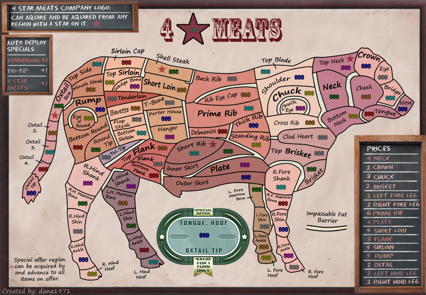
"reverts back to 3 after one full round." - The 'r' at the start of the sentence should be capitalised.
On the sticker itself, "Oxtail Tips" should be singular form, "Oxtail Tip". You MIGHT want to change "Hoof" to "Hooves", since there are 4 of them, but I think this one's understood.
Looking good, hope it gets the stamp! (:
Re: 4 Star Meats [09 December 2012] v23pg 33
Posted:
Sun Dec 09, 2012 10:29 pmby koontz1973
dana, can you see if you can get the sticker to have a slight peeling effect on one of the corners, as if it is coming of. Do not forget the shadow that would create though.
apart from that, the sticker looks much better.
Re: 4 Star Meats [09 December 2012] v23pg 33
Posted:
Tue Dec 11, 2012 6:55 pmby dana1971
Should I wait to hear from isaiah40 before I make these changes to see if he has anything to add?
Best wishes,
Dana
Re: 4 Star Meats [09 December 2012] v23pg 33
Posted:
Tue Dec 11, 2012 8:02 pmby greenoaks
anamainiacks wrote:"reverts back to 3 after one full round." - The 'r' at the start of the sentence should be capitalised.
On the sticker itself, "Oxtail Tips" should be singular form, "Oxtail Tip". You MIGHT want to change "Hoof" to "Hooves", since there are 4 of them, but I think this one's understood.
Looking good, hope it gets the stamp! (:
i would leave it as Hoof as then all three are singular
Oxtail Tip, Hoof, Tongue