Açores are 3 groups of islands
- Grupo Ocidental (Occidental Group)
- - Corvo
- - Flores
- Grupo Central (Central Group)
- - Faial
- - Graciosa
- - Pico
- - São Jorge
- - Terceira
- Grupo Oriental (Eastern Group)
- - Santa Maria
- - São Miguel
Portugal [Quenched]
Moderator: Cartographers

![]() by Molacole on Wed Apr 18, 2007 5:21 am
by Molacole on Wed Apr 18, 2007 5:21 am
I think there's 9 islands and if you made each of them a territory you could kick the troops up to 6 each in a 6 player game and also open up the option for medeira and acores as indipendant bonus worth 1 each or something.
I'm not a big fan of the thick bonus borders either. Think you could change the grey to a color or symbol or something to represent spain? Not a biggy just another option to spice things up a bit.
Another option you have is to add sporting and benfica clubs to the map and figure out some type of bonus for those also. Maybe even just make it an extra attack route to balance things out easier. It would be like the 2 soccer clubs battling each other and might get a littlte more attention to your map from soccer players.
If you need any info on the soccer clubs and where they're home towns are located I'll let you know if you decide to use it.
-

 Molacole
- Posts: 552
- Joined: Fri Jun 23, 2006 8:19 am
- Location: W 2.0 map by ZIM


![]() by Samus on Wed Apr 18, 2007 10:43 pm
by Samus on Wed Apr 18, 2007 10:43 pm
The formula is calculated from this:
( (Number of territories * 1.5) + (Number of border territories * 4) + (Number of neighboring territories * 0.5) + (Number of neighboring regions * 1) ) / 6 - 1
It's nothing official that you are required to follow or anything like that, but it tends to be fairly accurate.
I think I have figured out what the problem is with the water, it's the point of view. It looks like I'm looking out at the open water and this map is being hung down in my face. The graphic itself is great, but I think you need to make it appear more as a top-down point of view somehow.
-

Samus
- Posts: 372
- Joined: Mon Jan 01, 2007 12:33 pm
![]() by DiM on Tue Apr 24, 2007 4:03 pm
by DiM on Tue Apr 24, 2007 4:03 pm
*i like the sea texture. i think it fits ok. maybe tone it down just a tad more.
*make the dots in the dotted lines a bit smaller
*also try to do something about the rivers with black borders. they look odd because only one side has a thick black border.
PS: note for self "battlefield"
*make the dots in the dotted lines a bit smaller
*also try to do something about the rivers with black borders. they look odd because only one side has a thick black border.
PS: note for self "battlefield"
“In the beginning God said, the four-dimensional divergence of an antisymmetric, second rank tensor equals zero, and there was light, and it was good. And on the seventh day he rested.”- Michio Kaku
-

DiM
- Posts: 10415
- Joined: Wed Feb 14, 2007 6:20 pm
- Location: making maps for scooby snacks


![]() by gimil on Sat Apr 28, 2007 5:53 pm
by gimil on Sat Apr 28, 2007 5:53 pm

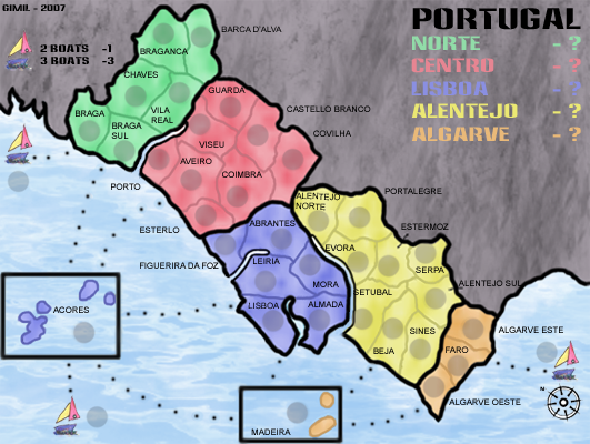
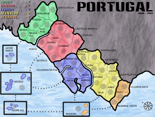
ive boosted the territories to 37. ive took out the ledgens backgound and im not sure what its going to be now. The reason for the boats is i pritty much arsed up my layers organisation in photoshop and found spliting the islands impossible
-

gimil
- Posts: 8599
- Joined: Sat Mar 03, 2007 12:42 pm
- Location: United Kingdom (Scotland)


![]() by edbeard on Sat Apr 28, 2007 6:05 pm
by edbeard on Sat Apr 28, 2007 6:05 pm
I'd say you have to have a number like 36 or 42 or something divisible by 3,4,5,6 preferable at least 2 of those.
also, I know you said you messed up the layers, but I think splitting yellow up into a couple places would be a very good idea.
edit: also the way the boat legend is setup, it looks like you put negative bonus on the boats. And, the legend is better to have in one area, not split up
also, I know you said you messed up the layers, but I think splitting yellow up into a couple places would be a very good idea.
edit: also the way the boat legend is setup, it looks like you put negative bonus on the boats. And, the legend is better to have in one area, not split up
-

edbeard
- Posts: 2501
- Joined: Thu Mar 29, 2007 12:41 am


![]() by Ruben Cassar on Sat Apr 28, 2007 7:44 pm
by Ruben Cassar on Sat Apr 28, 2007 7:44 pm
To be honest I don't like the boat idea at all. You need 36 territories, the number you have used (37) makes no sense at all. To get 36 territories all you have to do is split Azores (which btw you have wrongly spelt as Acores I think) and Madeira in two territories or else add some other islands. You can use this map to help you add two islands and get to 36 territories. Perhaps add Porto Santo near Madeira and split Azores in two?


-

Ruben Cassar
- Posts: 2160
- Joined: Thu Nov 16, 2006 6:04 am
- Location: Civitas Invicta, Melita, Evropa


![]() by ParadiceCity9 on Sat Apr 28, 2007 7:59 pm
by ParadiceCity9 on Sat Apr 28, 2007 7:59 pm
edit: also the way the boat legend is setup, it looks like you put negative bonus on the boats. And, the legend is better to have in one area, not split up[/quote]
i thought that too
i thought that too
-
ParadiceCity9
- Posts: 4239
- Joined: Thu Feb 15, 2007 4:10 pm


![]() by gimil on Fri May 04, 2007 4:31 pm
by gimil on Fri May 04, 2007 4:31 pm
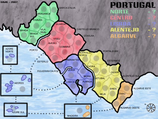
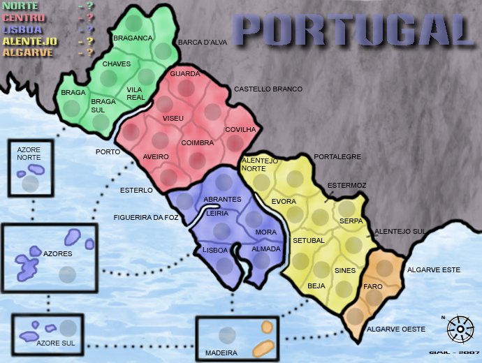
guys this sliting up the islands is impossible because ive ruined my layer system. i wanna come to a compromise.
1. ill take out the boats.
2. the 2 extra territoys will be joint above and below azores. despit them not being geographically correct.
and then i want to declare the map complete. you guys have been pushin for high standards and my maps graphics are of a much higher standard than most of teh maps here.
so what do u all say?
-
gimil
- Posts: 8599
- Joined: Sat Mar 03, 2007 12:42 pm
- Location: United Kingdom (Scotland)
![]() by Ruben Cassar on Fri May 04, 2007 6:11 pm
by Ruben Cassar on Fri May 04, 2007 6:11 pm
gimil wrote:guys this sliting up the islands is impossible because ive ruined my layer system. i wanna come to a compromise.
1. ill take out the boats.
2. the 2 extra territoys will be joint above and below azores. despit them not being geographically correct.
and then i want to declare the map complete. you guys have been pushin for high standards and my maps graphics are of a much higher standard than most of teh maps here.
so what do u all say?
I say that it's not that easy to get a map quenched and that you cannot declare that it is complete and expect the foundry to quench it just because you say so.
I like how the map is shaping up though, however I think you should work on a way to split the islands as I mentioned in my earlier post. Good luck!
-
Ruben Cassar
- Posts: 2160
- Joined: Thu Nov 16, 2006 6:04 am
- Location: Civitas Invicta, Melita, Evropa
![]() by AndyDufresne on Fri May 04, 2007 8:12 pm
by AndyDufresne on Fri May 04, 2007 8:12 pm
I'm just stopping by quick, but I must say that I do like the visuals you having going on in this map. They are quite original and unique, at least to my eye. I think in time this could become a nice little map! Hopefully I'll be able to check in again and give the map a little more of a look over.
--Andy
--Andy
-

AndyDufresne
- Posts: 24919
- Joined: Fri Mar 03, 2006 8:22 pm
- Location: A Banana Palm in Zihuatanejo


![]() by KEYOGI on Wed May 09, 2007 2:59 am
by KEYOGI on Wed May 09, 2007 2:59 am
Territory names could probably use some effect like a stroke or glow to make them stand out against the borders. For example Setubal. You might be able to avoid it by simply moving some names around though, Setubal for one. Chaves could be moved down and across, Evora up and across, perhaps switch the army shadow and the text in Abrantes.
The continent labels in the legend could definately do with a shadow or dark stroke around the edges to give them contrast from the background.
It's not necessary, but I think it would be nice if you could liven up the map a little. Add some imagery to the dead territory like in the Mongol Empire map or something else to try and just liven up the map a bit. It feels a bit washed out and drab at the moment.
-
KEYOGI
- Posts: 1632
- Joined: Tue Oct 10, 2006 6:09 am


![]() by edbeard on Fri May 11, 2007 1:09 pm
by edbeard on Fri May 11, 2007 1:09 pm
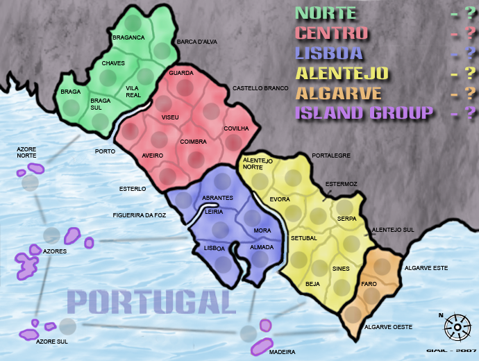
I still don't like the yellow continent. 9 countries total with only 4 as borders. this means 5 of them are not. I'd like it more if there was a couple smaller nations.
Maybe make all the islands one continent. Add a couple to orange from yellow or something.
Maybe make all the islands one continent. Add a couple to orange from yellow or something.
-
edbeard
- Posts: 2501
- Joined: Thu Mar 29, 2007 12:41 am
![]() by DiM on Fri May 11, 2007 2:57 pm
by DiM on Fri May 11, 2007 2:57 pm
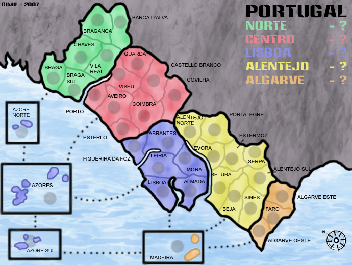
*you have a huge blank space under the title so move the legend there.
*alentejo norte touches the border. move the text a bit lower.
*i don't like how the islands have those big black squares
*i would really like all the islands to form one continent. this also sorts the problem of the boxes. just make the islands a different colour and form a new continent. and if you make them into a new continent please remove the connections to aveiro and to lisboa
*the text is a bit wobbly in some areas. like lisboa, the S seems to bit a bit lower than the rest of the letters.
“In the beginning God said, the four-dimensional divergence of an antisymmetric, second rank tensor equals zero, and there was light, and it was good. And on the seventh day he rested.”- Michio Kaku
-
DiM
- Posts: 10415
- Joined: Wed Feb 14, 2007 6:20 pm
- Location: making maps for scooby snacks


![]() by DiM on Wed May 16, 2007 5:50 pm
by DiM on Wed May 16, 2007 5:50 pm
i don't think you need that bridge
“In the beginning God said, the four-dimensional divergence of an antisymmetric, second rank tensor equals zero, and there was light, and it was good. And on the seventh day he rested.”- Michio Kaku
-
DiM
- Posts: 10415
- Joined: Wed Feb 14, 2007 6:20 pm
- Location: making maps for scooby snacks
![]() by KEYOGI on Thu May 17, 2007 3:31 am
by KEYOGI on Thu May 17, 2007 3:31 am
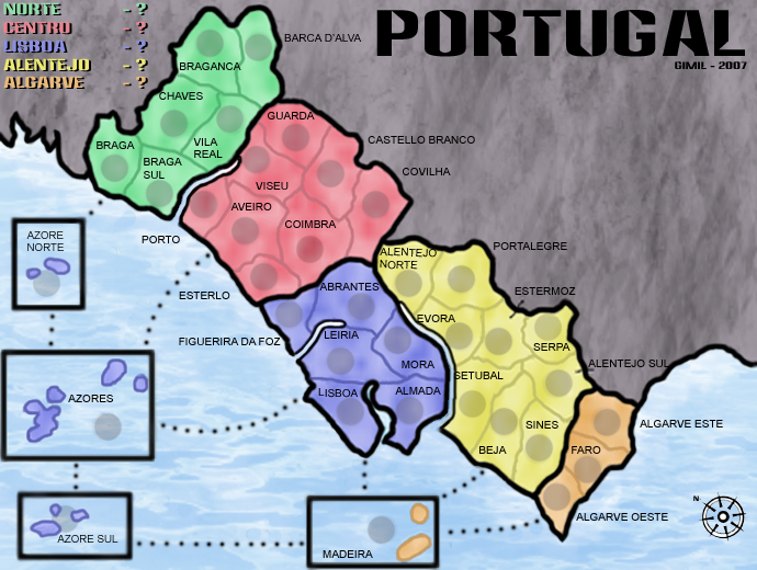
Nice update gimil. I think the title was better in the top-right corner above the key though. I'm also a little unsure on the territory lables, particularly the ones that are next to territories rather than in them. Perhaps use the lines to show which territory the label belongs to and along the coast it wont hurt to move Esterlo and Figuerira Da Foz a bit closer to their respective territories.
Alentejo Norte text is a bit wobbly, same in Lisboa. The font overall seems to be a bit poor in quality. I'm not sure what program you are using, but perhaps try altering the sharpness of the font. I don't have access to Photoshop at the moment so I'm not sure what it's called in the menu, but in that program you can choose from sharp, soft, none, etc.
Alentejo Norte text is a bit wobbly, same in Lisboa. The font overall seems to be a bit poor in quality. I'm not sure what program you are using, but perhaps try altering the sharpness of the font. I don't have access to Photoshop at the moment so I'm not sure what it's called in the menu, but in that program you can choose from sharp, soft, none, etc.
-
KEYOGI
- Posts: 1632
- Joined: Tue Oct 10, 2006 6:09 am
Who is online
Users browsing this forum: No registered users
|
|||||||
| Conquer Club is not associated with RISK online in any way. Copyright © 2006-2024 by Big Wham LLC | |||||||