Page 10 of 25

Re: Labyrinth [23/8] Page 16. Food Pg16 Choose one.

PostPosted: Fri Aug 24, 2012 12:00 pm
by IcePack
I don't mind the icon, but I'd feel weird calling it a plate / food.
As for other possibilities, what about the old goblet (large size) w a bunch purple grapes?
I'll look at the larger icons again a bit later and see if anything grabs me

Re: Labyrinth [23/8] Page 16. Food Pg16 Choose one.

PostPosted: Fri Aug 24, 2012 12:17 pm
by koontz1973
nolefan5311 wrote:That looks good, though it could possibly be seen as a shield or something like that...

I see what you mean. Well, if you do not try something, you never know.
IcePack wrote:I don't mind the icon, but I'd feel weird calling it a plate / food.
As for other possibilities, what about the old goblet (large size) w a bunch purple grapes?
I'll look at the larger icons again a bit later and see if anything grabs me

I like the idea of a large goblet and will see if I can get grapes/olives around it.

Will get the plate finished and do the goblet design as Icepack said, then let you choose which one.

Re: Labyrinth [23/8] Page 16. Food Pg16 Choose one.

PostPosted: Sat Aug 25, 2012 12:52 am
by koontz1973
Lots more food. All over the board you wil see slight differences and icons that are with others.
Ones I like the most but do not let this influence you. ;)
    N3
    N7
    J3

Click image to enlarge.
image

Re: Labyrinth [23/8] Page 16 New Food Pg17 Choose one.

PostPosted: Mon Aug 27, 2012 7:39 pm
by x-raider
I like H7 and O12.
You don't want too much detail on a map like this.
By the way, are you sure you like the alphabet the way it is? Going up, not down?

Re: Labyrinth [23/8] Page 16 New Food Pg17 Choose one.

PostPosted: Mon Aug 27, 2012 11:11 pm
by isaiah40
x-raider wrote:I like H7 and O12.

O12??? I can't seem to find O12!! Did you mean by chance D12?

Personally I like N7 as well.

Re: Labyrinth [23/8] Page 16 New Food Pg17 Choose one.

PostPosted: Tue Aug 28, 2012 7:55 am
by nolefan5311
N7 does look good...but won't some of these cause issues with the 888's?

Have you thought about maybe like, a yellow olive wreath around the box? Or something like that? It might clash with the Ring of Fire, but you could maybe change the ring of fire to actual flames coming up from the bottom of the box or something...

Re: Labyrinth [23/8] Page 16 New Food Pg17 Choose one.

PostPosted: Tue Aug 28, 2012 8:34 am
by koontz1973
Nope, all are good for the army numbers. When I decide on which one and it now looks like N7 is a winner, I can and will tweak it a tad to make sure it fits, centred and it does not muck up the 88s.

Re: Labyrinth [23/8] Page 16 New Food Pg17 Choose one.

PostPosted: Wed Aug 29, 2012 12:15 pm
by koontz1973
Food in place now. Thats the last of the icons set in place. Legend is next. Will make some mock ups and post later in the week.
Click image to enlarge.
image

Re: Labyrinth [30/8] Page 17

PostPosted: Thu Aug 30, 2012 9:21 am
by koontz1973
Legend looks good now. If no one objects this week, will get on and do the small one next week.
Click image to enlarge.
image

Re: Labyrinth [30/8] Page 17

PostPosted: Thu Sep 06, 2012 1:53 am
by koontz1973
Well, no complaints on the legend so here is the small and all of the other types of maps in the spoiler.
Large.
Click image to enlarge.
image

Small.
Click image to enlarge.
image

show: all other types

Re: Labyrinth [6/9] Page 17 Small and all others.

PostPosted: Thu Sep 13, 2012 11:51 pm
by koontz1973
Fixed the double rock problem I just noticed and cleaned up the image.
Click image to enlarge.
image

Click image to enlarge.
image

Re: Labyrinth [14/9] Page 1/17

PostPosted: Fri Sep 21, 2012 9:27 pm
by RedBaron0
In an effort to generate some conversion here's what I have to say, I know I can be more than quiet at times, but listen: It's a nice looking map, but but overall it just isn't all that good. A couple years ago it probably woulda passed through, but not now. Honestly I'm reminded of early 1980's video games from this, the whole of the map just seems to have that grainy pixelly quality. Also I don't get a good sense of the maze at all, it just has blobby sections of impassibles that are supposed to be rock. The labyrinth I've almost always seen has nice smooth walls, and impossibly huge. While I understand the limitations here, I just am not feeling any of that here, just a bad video game look. Sorry koontz.

Re: Labyrinth [14/9] Page 1/17

PostPosted: Sat Sep 22, 2012 12:28 am
by koontz1973
RB0, I know you are quiet and without any comments from you, it is hard for me to steer a map in a direction that you would like.
It's a nice looking map, but but overall it just isn't all that good.

Contradicting yourself in a sentence is not always a good way.
Honestly I'm reminded of early 1980's video games from this

I am glad. This was the look that was went for.
the whole of the map just seems to have that grainy pixelly quality.

grainy yes, trying to draw grass at the scale, you will always get that look, as for pixelly, I doubt that it has pixelation?
Also I don't get a good sense of the maze at all, it just has blobby sections of impassibles that are supposed to be rock. The labyrinth I've almost always seen has nice smooth walls, and impossibly huge. The labyrinth I've almost always seen has nice smooth walls, and impossibly huge. While I understand the limitations here, I just am not feeling any of that here, just a bad video game look.

Those blobby sections (I take it you mean the small ones) where put in so the movement part of the legend could be taken out. As for the walls, as you say, I am limited for the size and if I had to redo the whole map over again, then I might of taken it in a different way, but that would mean know a complete rethink of all game play. So by doing what you ask, are you really telling me that I need to bin this one after so many months, and go all the way back to the drafting board?

I just am not feeling any of that here, just a bad video game look. Sorry koontz.

Not a problem. But this is what frustrates me the most. Natty did it a lot I it really pissed me off no end. What you have posted is all opinion and there is nothing specific. You say the walls are not how you would like them, but you do not say how you would like them? I understand about the height thing but that comes from the games aspect of the map. How can the Greeks watch if the walls are a 100 feet tall.

About the walls though, did you want to see them smoother or something different?

Re: Labyrinth [14/9] Page 1/17

PostPosted: Sat Sep 22, 2012 9:05 pm
by RedBaron0
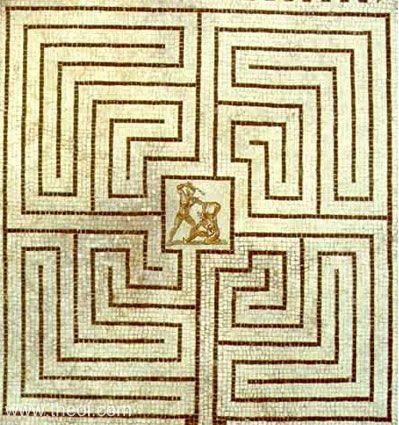
I do think smoother would be better, I just don't know how you'd get a better visual for the maze itself. I'm not saying to go back to the drawing board for it, not at all. Something like this:

Image

incorporated into your design I think would do wonders. Often the maze is depicted as being round, but this is square and so it the map. The impassible rock could be more like blocks than amorphous rock. Those would be true impassibles, while passible, thin walls would be the borders between the territory blocks. Giving us the image of the maze... the Labyrinth.

koontz1973 wrote:RB0, I know you are quiet and without any comments from you, it is hard for me to steer a map in a direction that you would like.

RedBaron0 wrote:It's a nice looking map, but but overall it just isn't all that good.


The point... of my statement is that a nice map is not a map that meets with the standards of the Foundry. It is my opinion, yes, but no one else is saying anything, refute me, please, I welcome the discussion...

The 80's type video game look, great then, you hit it pretty well. I hadn't notice any other mention of it before though... at least not in the terminology I put it in, if I missed something then I'm sorry.

Re: Labyrinth [14/9] Page 1/17

PostPosted: Sun Sep 23, 2012 12:01 am
by koontz1973
No, the style was never brought up. As for smother walls, that I can do. Will get it done this weekend for you. That is a nice maze, shame when I started this one I did not know the things I do now, or it could of turned out more like that, but if you feel the map is not labs enough, I can always revert to a previous title (Greek Games).

I know the overall look is very same y in that I have identical icons, spacing between territs, etc etc. But that all comes from game play and making use of the space I have.

RB0, give me a list of of your top things you do not like, and what you would like to see. More than happy to get it done.

Is this the reason you came here. Game 11328673 My selective bombing. :lol:

Re: Labyrinth [14/9] Page 1/17

PostPosted: Sun Sep 23, 2012 10:54 am
by RedBaron0
Labs is fine, better than Greek Games for sure. (Greek Games would give me more of feeling of the Olympics...)

Basically what'd I'd like to see is the black territory borders covered over in spots. Put "walls" there, make a maze of it. These walls won't have an bearing on gameplay, save for a block on the 4 corners, and if you go with something square, best to put on as a diamond. Those blocks would easily blend into the "walls" as a post between slabs, and still be needed on each corner.

It's really the only thing bothering me that this labyrinth really doesn't depict any sort of maze.

Nooooo, I got only a few maps to deal with gfx wise, figured I'd just stir the pot. ;) Is the only reason YOU selectively targeted me, is because I said something here? :P

Re: Labyrinth [14/9] Page 1/17

PostPosted: Sun Sep 23, 2012 11:40 am
by ManBungalow
The Greek characters spelling out 'LABYRINTH' are just...wrong.

Re: Labyrinth [14/9] Page 1/17

PostPosted: Sun Sep 23, 2012 12:03 pm
by koontz1973
Will make the big slabs of rock smoother and the small blobby ones elongated. As for changing it to diamonds, you do realize that is a complete redraw and gameplay do over. I hope you where suggesting this for a sequal map and not this one? And no, I only bombed you as you seemed to of started putting troops there to attack me.

Labs title font can change MB. Can I ask what is wrong with it?

Re: Labyrinth [14/9] Page 1/17

PostPosted: Sun Sep 23, 2012 1:31 pm
by ManBungalow
koontz1973 wrote:Labs title font can change MB. Can I ask what is wrong with it?


The Greek characters in the title don't mean anything like that.

In my opinion, you can spell 'labyrinth' using our usual Roman alphabet or you can use the Greek form (wikipedia tells me that it's 'λαβύρινθος' ) - not both.

Re: Labyrinth [14/9] Page 1/17

PostPosted: Sun Sep 23, 2012 4:45 pm
by tkr4lf
I don't see that there is anything wrong with it. It's a stylistic thing. It's like when people use Cyrillic to spell things out in English when there is a Russian/Soviet theme.

Yeah, the letters don't actually mean that, but pretty much everybody is going to know what's going on with it. Even Greek people will see that it spells out Labyrinth in English. I think it's fine the way it is.

Re: Labyrinth [14/9] Page 1/17

PostPosted: Mon Sep 24, 2012 1:00 am
by koontz1973
MB, if the title goes into the Greek alphabet, no one will be able to read it. It would become nonsense. As for moving it into the Roman alphabet, it again is wrong as it is not a Roman map. So both of your choices are bad for those reasons. The title has to be able to be read and the font used is called something Greek which is why it was used. This is going to turn into the cairnswk / Oneyed argument in the Moscow thread over that title. It stays as is unless you point me towards a better font to use then.
Labs is fine, better than Greek Games for sure. (Greek Games would give me more of feeling of the Olympics...)

That was one of the reasons it got changed from Greek Games of Death (too long) to Greek Games (Olympic year) to Labs.

Re: Labyrinth [14/9] Page 1/17

PostPosted: Fri Sep 28, 2012 11:13 am
by koontz1973
RB0, here is a quick mock up of the walls made smother and larger. I can see what you mean by making it more of a maze but it feels wrong to me. If this is the way it has to be done, then I will get them done nice. Sorry it took so long to do the mock up.

Click image to enlarge.
image

Re: Labyrinth [14/9] Wall mock up page 18

PostPosted: Wed Oct 03, 2012 4:28 pm
by RedBaron0
It definitely doesn't look good.... I was kinda expecting something regular with defined edges, like blocks. The best example I can think, especially in the realm of mid 80's type video games is the wall block in the original Legend of Zelda, in fact a lot of the Labyrinth levels there have the same kind of feel as you do here.

Image

I wouldn't say it has to totally replicate this of course, but a similar style block, kinda crumbly would work quite nicely.

Re: Labyrinth [14/9] Wall mock up page 18

PostPosted: Wed Oct 03, 2012 11:58 pm
by koontz1973
Here's your blocks RB0. I do not like them but I will defer to your judgement.
Click image to enlarge.
image

Re: Labyrinth [14/9] Wall mock up page 18

PostPosted: Thu Oct 04, 2012 12:02 am
by nolefan5311
It definitely looks more "pillar like" from the top. Cleaner and more maze like, imo. What about the stone areas around the edge of the map?

Also, I think the color for Medusa's Gaze is a little out of place.