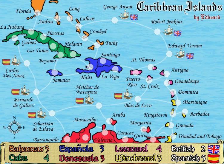
A couple of little things seem a bit out of place.
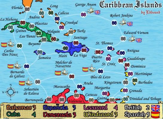
The white outline/glow to the text in the title seems perhaps a little fuzzy or low quality to me. You've got nice clean lines and colours everywhere else on the map, so this stands out a little. Maybe see if you can clean this up with a stronger or more consisten outline/glow?
I really like the new ships, I think they're quite fitting with the rest of the map. However, they seems to be floating over the water rather than sitting in it. Perhaps some shadow or wave effects around them would help, I'm not really sure.
Good work though edbeard, you've got yourself a nice map.
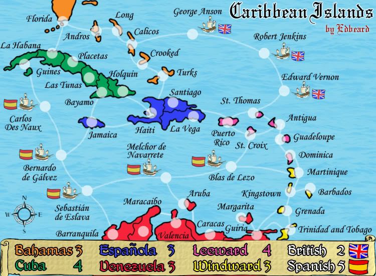
