Page 1 of 15

Re: Three Kingdoms of China - v1.1 [2013-01-01] p1

PostPosted: Tue Jan 01, 2013 1:28 pm
by koontz1973
nicarus wrote:how about placing invading armies into the neighboring counties with supply lines leading back to the capital. if supply line is held, you get an auto deploy on your armies that can attack up to two terits away?

You cannot get an auto deploy like this, but a normal bonus would work. But the idea of having some sort of bombardments sound nice. How about capitals can bombard each other?

Re: Three Kingdoms of China - v1.1 [2013-01-01] p1

PostPosted: Tue Jan 01, 2013 11:07 pm
by Seamus76
koontz1973 wrote:OK seamus, I am going to be brutal here, so please do not take anything personal.
Man if you think that's brutal you should meet my wife. :lol:

koontz1973 wrote:Map background is great, not much can be done on that apart from touch ups. Territ lines do seem a little hard in places.

Thanks. The tert lines are all the same color for each kingdom, but because the bonus colors behind them change they look "harder" depending on the background. Apart from making them all black or super dark, which I don't want to do, I think they look good the way they are. If during graphics there is strong push back, which I doubt, I will look at it again.

koontz1973 wrote:Might be an idea to swap the colours out. Colours are going to be a problem. You will need to change them.
show: CB tests

I'm not sure why I would need to change them so you'll need to explain that for me. I have looked at those cb images and worked with them for weeks now, and as far as I can tell everything is clearly distinguishable from everything else, plus there are mini maps which are clear as well.

koontz1973 wrote:Mountains, do not work on this map. Go and look at similar maps with bright colours. You will see they all have inverted v shapes with a single colour in them. Either that or a top down view of them will work.

Yes I know, they don't work for me either so I'm redoing them, and they are looking pretty good actually.

koontz1973 wrote:Next to Jiaozhi, you have a red symbol that is very faded, what is this?

Just a faded bonsai tree. You no likey?

koontz1973 wrote:Game play. Look at this from natty dread to see what I meant about adding some trade routes and other towns onto the map. Only holding 3 cities where you may deploy next to them is going to be bad for the game play boys. They will get you to change this for a winning condition. I suggest at least one capital for each bonus zone. Have trade routes between them with the winning condition of holding 4 complete trade routes. Bring a bonus onto each one and players will go for them.

The capital bonus wont be a winning condition, I was just throwing things against the wall to see what sticks. I'll leave it open to discussion, but a +3 for 3, or a +4 for 3 would work just fine for me. I would also keep one of them open as a starting position to help keep them in play.

Yes, I'm very familiar with that map, and would have loved for natty to have finished it. I also know what you meant about trade routes, but I'm extremely resistant to bring those aspects into this map, and at this time don't really plan to add them. Just because they could be, doesn't mean they should be. I want this to be simple, gameplay and estheticly. Adding them not only clutters up the map, but also takes away other limited space needed to explain the trade routes, and everything else. I want to keep the explaining, and the need for explaining down to an absolute minimum.

I hope that makes sense, as I'm not trying to be stubborn just looking to add a map that is simple and straightforward.

Re: Three Kingdoms of China - v1.1 [2013-01-01] p1

PostPosted: Wed Jan 02, 2013 1:43 am
by koontz1973
I'm not sure why I would need to change them so you'll need to explain that for me. I have looked at those cb images and worked with them for weeks now, and as far as I can tell everything is clearly distinguishable from everything else, plus there are mini maps which are clear as well.

The colours are not intuitive enough. With the 3 separate mini maps, players are going to be looking all over the place for bonuses. Top two CB tests show all of the bottom in brown. These tests are for the average CB person so someone with a heavier CB problem, may not see the regions when they change. The bottom one has the same effect but for bottom left and top. It will need to be made clearer on the changes. Try a heavier black line between the three.
Man if you think that's brutal you should meet my wife. :lol:

If she has read 50 shades of grey, then yes please. ;)
Just a faded bonsai tree. You no likey?

Make it look like one and I will like.

Trade route, I understand the need to keep it simple, I keep trying to make them myself, but I end up getting bored and adding extras in. So no trade routes (yet) but add in other capitals. One for each bonus zone. Forget about the bombards (for now). That gives you 8 capitals.

Re: Three Kingdoms of China - v1.1 [2013-01-01] p1

PostPosted: Wed Jan 02, 2013 11:49 am
by Seamus76
koontz1973 wrote:
I'm not sure why I would need to change them so you'll need to explain that for me. I have looked at those cb images and worked with them for weeks now, and as far as I can tell everything is clearly distinguishable from everything else, plus there are mini maps which are clear as well.

The colours are not intuitive enough. With the 3 separate mini maps, players are going to be looking all over the place for bonuses. Top two CB tests show all of the bottom in brown. These tests are for the average CB person so someone with a heavier CB problem, may not see the regions when they change. The bottom one has the same effect but for bottom left and top. It will need to be made clearer on the changes. Try a heavier black line between the three.

I would strongly disagree unless nolefan or some other color blind folks say otherwise. Maybe it's my monitor, or just that I've been looking at the images for a while, but even the brown areas in the first two CB test images are different to me. They are all distinct to me on the map, and the mini-maps. I can certainly darken the lines between them, but even those are clear to me.

I also strongly disagree regarding the intuitiveness of the map and the colors. Looking at all of the maps on the site this is one of the more simple, and clearly laid out maps as they come. I really don't see any players having to "look all over the place" to understand that the top two terts are Bei Ping and receive a +1 bonus. Compared to Third Crusade, All Your Base, and many others this is pretty intuitive I would say. And if players have to look at the map for a minute to understand the gameplay and what they are doing, then good, all great players do that anyway, and besides it won't take long to figure it out.

koontz1973 wrote:
Man if you think that's brutal you should meet my wife. :lol:

If she has read 50 shades of grey, then yes please. ;)
Just a faded bonsai tree. You no likey?

Make it look like one and I will like.

Ha, ha. With twin toddlers and a 4 year old who has time to read? We'll wait for the DVD. :lol: I'll try to bring it out, but if it's too distracting I'll prob just drop it. We'll see.

koontz1973 wrote:Trade route, I understand the need to keep it simple, I keep trying to make them myself, but I end up getting bored and adding extras in. So no trade routes (yet) but add in other capitals. One for each bonus zone. Forget about the bombards (for now). That gives you 8 capitals.

I can't just add in other capitals. There were only three, if anything we'd be adding city icons, or something, but even that I'm hesitant to do. I'll keep playing the same card, there are lots of maps with no additional bonuses, so I understand it can be done, but that doesn't mean it should or that without them the map wouldn't be appealing to the widest possible spectrum of players from beginners to experts.


Can we at least agree to Draft Stamp this one so we can get some more eyes on it? That's for the feedback as always my friend.

Re: Three Kingdoms of China - v1.1 [2013-01-01] p1

PostPosted: Wed Jan 02, 2013 11:57 am
by koontz1973
Seamus, they are different in the CB tests, and they are easy to see the individual bonuses, but with the same overall colours (brown or grey) they become the same. You do not need to change the colours completely, but make the green a different colour so it does not become the same as the other two in the tests.

Re: Three Kingdoms of China - v1.1 [2013-01-01] p1

PostPosted: Wed Jan 02, 2013 12:14 pm
by Seamus76
Sorry, I forgot to add more before posting that last reply, please take a look again regarding the Capitals.

by koontz1973 on Wed Jan 02, 2013 12:57 pm
Seamus, they are different in the CB tests, and they are easy to see the individual bonuses, but with the same overall colours (brown or grey) they become the same. You do not need to change the colours completely, but make the green a different colour so it does not become the same as the other two in the tests.


I have to ask though, if you say and to quote your above statement, "they are different in the CB tests, and they are easy to see the individual bonuses", then why do I need to change anything if they are different? I understand they all turn brown, but they are clearly different shades, and thus each area is clearly different from the one next to it. If the colors become a big issue as we progress, especially for the CB community I can certainly update them pretty easily. I'd still like to push for a Draft Stamp so we can move this up and get a few more eyes on it.

Re: Three Kingdoms of China - v1.1 [2013-01-01] p1

PostPosted: Wed Jan 02, 2013 12:46 pm
by koontz1973
OK, if you are a player with CB problems and you see a map with lots of brown or grey. Each brown or grey may be different (for the tests, yes they are, but these tests are an average) but the overall brown or grey may make someone look for a bonus zone in the wrong place. Remember, the map must be intuitive just by looking at it. But I do not have a problem with the colours. It is just my personal opinion to try and make life easier for some of the players. Keep it the same as is, but just keep it on your radar incase for later though.

As for adding the other cities, ask yourself this, what makes this map worth making? What is different from all the other maps we have. This map was originally started when we had less than 100 maps. Their is really nothing new to this map regarding gameplay or graphics. I do understand the reason for wanting to keep it simple, I really do, but at the same time, I can see a need for something different. As a player, why play this?

Do adding more cities to this map make much difference? The answer is not much in anyway, but it makes enough difference as right now we only have San Marino with that type of GP. Even that does not have a winning condition on it so again this map is different.

A different icon for the cities, a line of text and another bonus to add into the xml. That does not make for a map that is going to be overly complicated to make. Give me a good reason not to add more cities onto the map and I will drop my idea.

Re: Three Kingdoms of China - v1.1 [2013-01-01] p1

PostPosted: Wed Jan 02, 2013 1:00 pm
by Seamus76
koontz1973 wrote:OK, if you are a player with CB problems and you see a map with lots of brown or grey. Each brown or grey may be different (for the tests, yes they are, but these tests are an average) but the overall brown or grey may make someone look for a bonus zone in the wrong place. Remember, the map must be intuitive just by looking at it. But I do not have a problem with the colours. It is just my personal opinion to try and make life easier for some of the players. Keep it the same as is, but just keep it on your radar incase for later though.

I will certainly do that. Thanks again for the feedback.

koontz1973 wrote:As for adding the other cities, ask yourself this, what makes this map worth making? What is different from all the other maps we have. This map was originally started when we had less than 100 maps. Their is really nothing new to this map regarding gameplay or graphics. I do understand the reason for wanting to keep it simple, I really do, but at the same time, I can see a need for something different. As a player, why play this?

Do adding more cities to this map make much difference? The answer is not much in anyway, but it makes enough difference as right now we only have San Marino with that type of GP. Even that does not have a winning condition on it so again this map is different.

A different icon for the cities, a line of text and another bonus to add into the xml. That does not make for a map that is going to be overly complicated to make. Give me a good reason not to add more cities onto the map and I will drop my idea.

I completely see your point, and this is what the foundry is supposed to work out, so thanks. I didn't think about a map being too simple, and the time period in which it was started. I do think there is still a place for basic maps that offer nothing more than a change of pace for the eyes. However, I do want the map to be different, and yet simple, so I agree adding cities will be a great thing.

To that point, what would be your thoughts on a Capital Bonus and a City Bonus? Right now I have the Capital bonus changed to +4 for 3, with one of them open as a starting position.

Re: Three Kingdoms of China - v1.1 [2013-01-01] p1

PostPosted: Wed Jan 02, 2013 1:04 pm
by koontz1973
I would say to have all capitals start neutral. The +4 for 3 is OK. You have 8 bonuses so 8 cities. Word it like this - Every two cities +1. Give each city out as a starting position with 3 neutrals on them. Make the cities have at least 2 adjoining territs and I can not see a problem.

Re: Three Kingdoms of China - v1.1 [2013-01-01] p1

PostPosted: Wed Jan 02, 2013 1:09 pm
by Seamus76
koontz1973 wrote:I would say to have all capitals start neutral. The +4 for 3 is OK. You have 8 bonuses so 8 cities. Word it like this - Every two cities +1. Give each city out as a starting position with 3 neutrals on them. Make the cities have at least 2 adjoining territs and I can not see a problem.

Thanks, I'll be working on it. Did you mean to say give each city as a "starting position", and then with 3 neutrals?

Re: Three Kingdoms of China - v1.1 [2013-01-01] p1

PostPosted: Wed Jan 02, 2013 1:10 pm
by koontz1973
Yep, only give one city out as a starting position. If you make each city a neutral, any not given out will start neutral, stopping all bonuses.

Re: Three Kingdoms of China - v1.1 [2013-01-01] p1

PostPosted: Wed Jan 02, 2013 1:22 pm
by Seamus76
koontz1973 wrote:Yep, only give one city out as a starting position. If you make each city a neutral, any not given out will start neutral, stopping all bonuses.

Ok, just to make sure I follow. So one of the 8 cities will be open to a player as a randomly given out tert. The other 7 will start 3 neutral. Is that correct? Then the next question, am I selecting which 1 of the 8 will be give out to a player, or does how does that work? I'm not sure how to show the starting neutrals, or how to list it in the first post. Thanks.

Re: Three Kingdoms of China - v1.1 [2013-01-01] p1

PostPosted: Wed Jan 02, 2013 1:39 pm
by koontz1973
8 cities, 2 player game.
Each player gets one city each, the other 6 start neutral.
8 cities, 5 player game.
Each player gets one, 3 start neutral.

What you programme into the xml is positions. This is a very easy part of the code to do. Here is the same exact code from my Madrid map. You just need to change the names. Then with the territories, just start them as a neutral. Any that are given out will start, those that are not, will start neutral. You cannot choose which one the players get, they will be handed out randomly. So player one will not get position one and player 4 may get position 6.
show: madrid positions

Re: Three Kingdoms of China - v2.0 [2013-01-02] p2

PostPosted: Wed Jan 02, 2013 11:10 pm
by Seamus76
CURRENT UPDATE INFO - 2013-01-02:
- Adjusted the size of the title to fit better.
- Brought out the Bonsai tree in the bottom left a little bit more.
- Redid all of the mountains by hand. (Insert patting self on back here :lol: )

The main thing is that I added 8 cities to be part of the new City Bonus of +1 for every 2. Each player will start with 1 city. I also plan to move the City from Liang North to Liang, so that it has two borders.

CURRENT MAP VERSION:

v2.0 - Large (840x800)
Click image to enlarge.
image

Re: Three Kingdoms of China - v2.0 [2013-01-02] p2

PostPosted: Thu Jan 03, 2013 12:30 am
by koontz1973
Seamus, Last thing from me before I pass you over to the game play boys, that bonsai tree, make it look like a tree. Brown trunk, green leaves.

Mountains do fit better. Cities look good, that one you mentioned, yes to the move. Well placed as well.

Re: Three Kingdoms of China - v2.1 [2013-01-03] p2

PostPosted: Thu Jan 03, 2013 11:54 am
by Seamus76
CURRENT UPDATE INFO - 2013-01-03:
- Moved the City icon from Liang North to Liang.

What else? Let's keep this one moving.

Postby koontz1973 on Thu Jan 03, 2013 1:30 am
Seamus, Last thing from me before I pass you over to the game play boys, that bonsai tree, make it look like a tree. Brown trunk, green leaves.

As for the bonsai tree, it's supposed to be a faded red silhouette, red being the Chinese color for good luck. I also did try using an actual looking tree, but it didn't look right with the rest of the look and feel of the map. Surely this shouldn't hold up the progress of the map, right. O:)

CURRENT MAP VERSION:

v2.1 - Large (840x800)
Click image to enlarge.
image

Re: Three Kingdoms of China - v2.1 [2013-01-03] p3

PostPosted: Thu Jan 03, 2013 9:47 pm
by Seamus76
To quote my favorite band of all time, Pink Floyd...Is there anybody out there?

Re: Three Kingdoms of China - v2.1 [2013-01-03] p3

PostPosted: Thu Jan 03, 2013 9:58 pm
by generalhead
How is the color blindness going to work with the colors being so close?
Can you just have inspired by Gimil, do you have to have inspired by and special thanks?
Can you try a black outline with a lowered opacity on the bonus names because they are pretty hard to read. ex. Kingdom of Shu
The mountain pass at tian shui might need opened up a little bit.
For the capitals do you think an auto deploy would be better?
Awesome map buddy.

Re: Three Kingdoms of China - v2.1 [2013-01-03] p3

PostPosted: Thu Jan 03, 2013 10:09 pm
by RjBeals
I think the original mountians were better. These are cheap.

Everything looks very washed out to me. A little contrast may help the "pop" of the map.

I've never liked the broad curved borders - they look rushed, like it took about 2 minutes to draw some curves and stroke them. You may like them, it's personal preference, I just think a map looks better with some more jagged areas.

good colors overall - maybe add a bit more texture / grunge to the background

(edit) I understand this is in draft room still - I prefer to comment on gfx rather than gameplay.

Re: Three Kingdoms of China - v2.1 [2013-01-03] p3

PostPosted: Thu Jan 03, 2013 10:48 pm
by Seamus76
Sorry for this long ass quote/reply.
generalhead wrote:How is the color blindness going to work with the colors being so close?

I'd like to hear more from some CB players to find out how they are seeing it. To me they are different shades, plus there are mini-maps which show the differences more clearly. At the moment the colors are what they are.

generalhead wrote:Can you just have inspired by Gimil, do you have to have inspired by and special thanks?

I suppose. There was some space I needed to use up, and I wanted to make sure to give him some extra props.

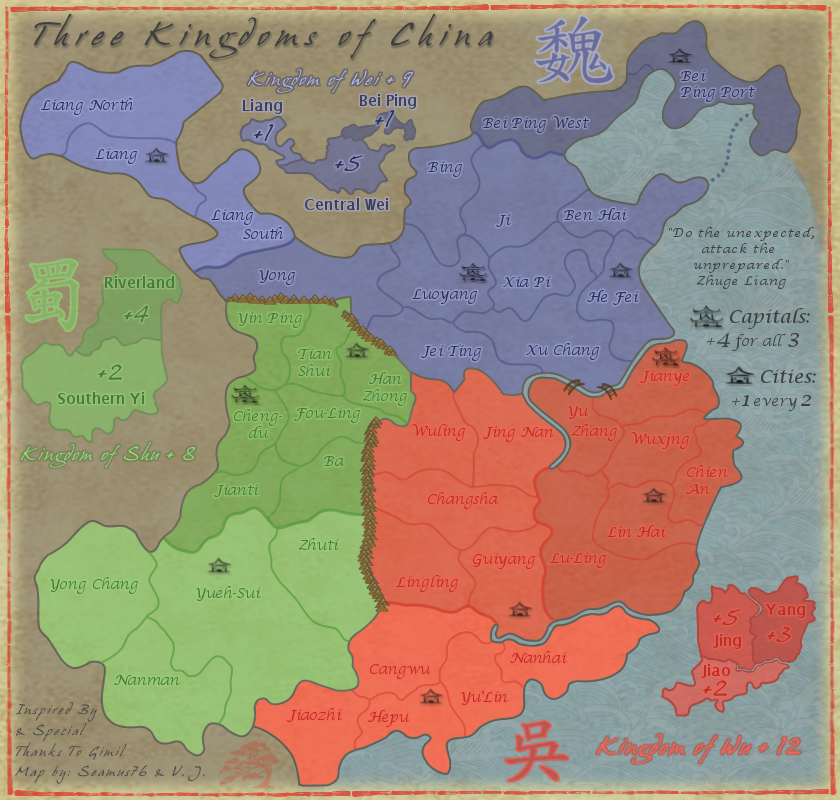
generalhead wrote:Can you try a black outline with a lowered opacity on the bonus names because they are pretty hard to read.

Do you mean the names on the mini-maps?

generalhead wrote:The mountain pass at tian shui might need opened up a little bit.

You think it's too small or something? I'm not sure players will have a problem quickly recognizing it's a one way.

generalhead wrote:For the capitals do you think an auto deploy would be better?

With the added City bonus I think that might be a good idea to have them a little different. Anyone else have a thought on that, and if it should be a straight +1 or maybe a +2 auto-deploy?

generalhead wrote:Awesome map buddy.

Thanks very much, now get back to working on your map gh! :lol:

RjBeals wrote:Thu Jan 03, 2013 11:09 pm
I think the original mountians were better. These are cheap.

I'm not sure how many other people liked the first mountains, but I do think these fit a little better with the look and feel. I'm really not that good with graphics and they were my first attempt at hand drawn mountains, or should I say stroked with hand drawn paths and then colored by hand. The first were part of a brush pack I edited and colored. What do you think I can do with the current ones to help make them look a little better? Or how would one make hand drawn mountains better?

RjBeals wrote:Everything looks very washed out to me. A little contrast may help the "pop" of the map.

I actually toned down the opacity quite a bit to give it that old washed out faded look. If you were to add some pop to it, what would your thoughts be?

RjBeals wrote:I've never liked the broad curved borders - they look rushed, like it took about 2 minutes to draw some curves and stroke them. You may like them, it's personal preference, I just think a map looks better with some more jagged areas.

Yeah, I like that look and feel too, not sure I'll go back on this one and redo the lines though. They may look rushed, but from your experience you know they are not, there are over 200 path points that had to be adjusted for the entire Kingdom of Wei border alone to get them to be so smooth.

RjBeals wrote:good colors overall - maybe add a bit more texture / grunge to the background

Thanks. Your maps are certainly great examples of awesome backgrounds and map texture. Any pro-tips? ;)

RjBeals wrote:(edit) I understand this is in draft room still - I prefer to comment on gfx rather than gameplay.

Rj, thank you so much for taking the time to comment. Whether it's gfx or gameplay your opinion is extremely valuable, and I appreciate it.

Re: Three Kingdoms of China - v2.1 [2013-01-03] p3

PostPosted: Fri Jan 04, 2013 3:12 pm
by RjBeals
Here's a quick comparison. Bolder colors. I just threw this together, maybe it will help.

Image

Re: Three Kingdoms of China - v2.1 [2013-01-03] p3

PostPosted: Fri Jan 04, 2013 10:20 pm
by Seamus76
RjBeals wrote:Here's a quick comparison. Bolder colors. I just threw this together, maybe it will help.

Image

Just threw it together huh? :lol: I wish I could throw it together like that. But seriously, very nice, especially the background and tert border texture, and the mountains. Are those part of a brush pack? How did you do their shading and coloring? I know you are asking for "bolder colors", but I'd love to know your techniques and apply them to my colors to see how it looks. The other reason I'm hesitant to change is the Red I'm using is Vermillion, which is the traditional red pigment for Chinese art. Every other red on the map is built off of this one color so I would like to exhaust some other options first.

Re: Three Kingdoms of China - v2.1 [2013-01-03] p3

PostPosted: Sat Jan 05, 2013 2:04 am
by koontz1973
RJBeals does not use brush packs. Now if you can copy what RJ did for the rest of the map, it would look stunning. A little dark for the complete map but that would be an easy thing.

Re: Three Kingdoms of China - v2.1 [2013-01-03] p3

PostPosted: Sat Jan 05, 2013 11:35 am
by RjBeals
I'll send you the psd (assuming you are using photoshop) when I log into the laptop later. Drew a mountain with 1px round black brush. Then duplicated the layer few times and created the range. Then erased the parts of the mountains in the background. Then colored in with tan. I used a 10% opacity black brush to trace over the borders to give the shadow look. Nothing neat just a few strokes, and some overlapping to give a deeper shadow. I did use a subtle pattern to overlay the entire piece for texture. I used a very very subtle 1px dropshadow set to 90 degrees, no blur, and changed color to white to give the borders a little extra pop.

Re: Three Kingdoms of China - v2.1 [2013-01-03] p3

PostPosted: Sat Jan 05, 2013 4:32 pm
by Seamus76
RjBeals wrote:I'll send you the psd (assuming you are using photoshop) when I log into the laptop later. Drew a mountain with 1px round black brush. Then duplicated the layer few times and created the range. Then erased the parts of the mountains in the background. Then colored in with tan. I used a 10% opacity black brush to trace over the borders to give the shadow look. Nothing neat just a few strokes, and some overlapping to give a deeper shadow. I did use a subtle pattern to overlay the entire piece for texture. I used a very very subtle 1px dropshadow set to 90 degrees, no blur, and changed color to white to give the borders a little extra pop.


Certainly send along, that would be great. I'll give it a try myself as well.
I used a 10% opacity black brush to trace over the borders to give the shadow look. Nothing neat just a few strokes, and some overlapping to give a deeper shadow.
It looks like you also traced all of the borders themselves with black, correct?

I used a very very subtle 1px dropshadow set to 90 degrees, no blur, and changed color to white to give the borders a little extra pop.

What did you use the dropshadow on? The bottom black tert name? And you say you did white? I see the tert name in white which does pop nicely.

Sorry to be a pain. Teach a man to fish...right. O:)