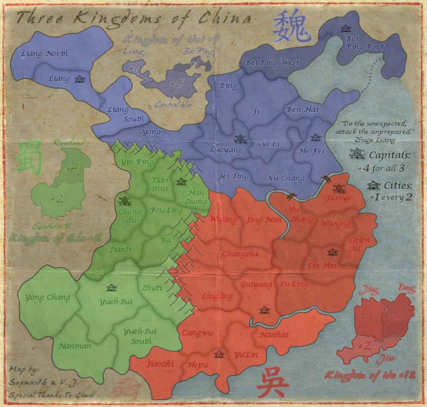
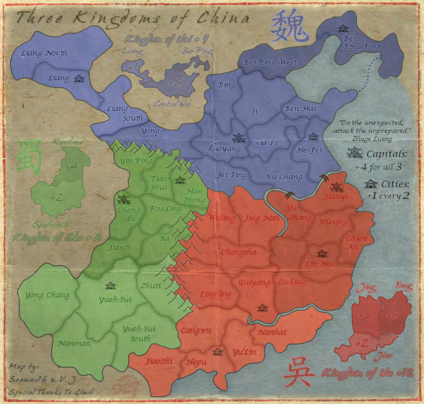
- Made a lot changes, including all of the below from isaiah40, and Koontz, I also made those bonus lines darker, they should work for you.
isaiah40 wrote:1. The bonus amounts on the mini-map for Wu, especially on Yang is very hard to read. Maybe increase the outer glow a tad bit to make it stand out more. The same on Jing. Done
2. The bonus amount on Bei Ping is also hard to read, move it beside Bei Ping. I don't want to move it out, but I did bring out the outer glow more, which makes it easier to read.
3. The Chinese character for Shu is hard to see as well, it needs to be darkened a bit.Done
4. Kingdom of Wu text is hard to tell exactly what it is. It looks like the "g" is an "s".
5. Kindom of Shu text is hard to read due to the light color you have. My suggestion is to use the same dark color you have for the bonus amounts.
6. I think that you will also need to adjust the kerning of the text for each "the Kingdom of ..." as the letters are very close together which also makes them hard to read. I can read them fine because I've been following the map, but first time players probably will have a hard time reading them.Numbers 4-6 should be good as well. I brought them all out more, and increased the kerning on all of the "Kingdoms" test from 2-4, so double. Also, used a separate layer for the "+" values so I could bring them closer to the text, rather than being effected so much by the kerning.
CURRENT MAP VERSION
v6.2 - Large (840x800)
- Click image to enlarge.