Re: Three Kingdoms of China - v2.2 [2013-01-08] p3
Posted: Tue Jan 08, 2013 1:56 pm
by benga
Jiao-Jing can it have a bit more contrast, bonus structure seems good.
Also this might come after when game play will be discussed, but seems to me that bottom cities are closer together then upper.
Re: Three Kingdoms of China - v2.2 [2013-01-08] p3
Posted: Tue Jan 08, 2013 2:34 pm
by Seamus76
cairnswk wrote:Seamus, from Tian Shui to Yong through those mountains...is that a one-way arrow? If so, it needs to be better defined? If not the border squareness needs changing os it doesn't look like a one-way arrow. On the mountains...maybe a little shadow base left side...nice work btw...nothing wrong with those imo...but then i don't exactly do the best mountains all the time. the bridges...are they meant to be floorless?
Thanks for the feedback.
Yeah, it's a one-way arrow, I was looking at it after posting the update and realized it needs some work as well. Thanks on the mountains. I'll add the shadow, good idea. And I was looking at the bridges as well. There meant to be kind of walking bridges, but I'll fill in some of the empty spots with other boards to make it look more structurally sound, etc.
by benga on Tue Jan 08, 2013 2:56 pm Jiao-Jing can it have a bit more contrast, bonus structure seems good.
Also this might come after when game play will be discussed, but seems to me that bottom cities are closer together then upper.
I can try tweaking it a little, but I have pretty much tried to keep them all as it, which does have enough contrast to tell them apart, etc. Thanks for the feedback benga.
Re: Three Kingdoms of China - v2.2 [2013-01-08] p3
Posted: Tue Jan 08, 2013 11:45 pm
by Seamus76
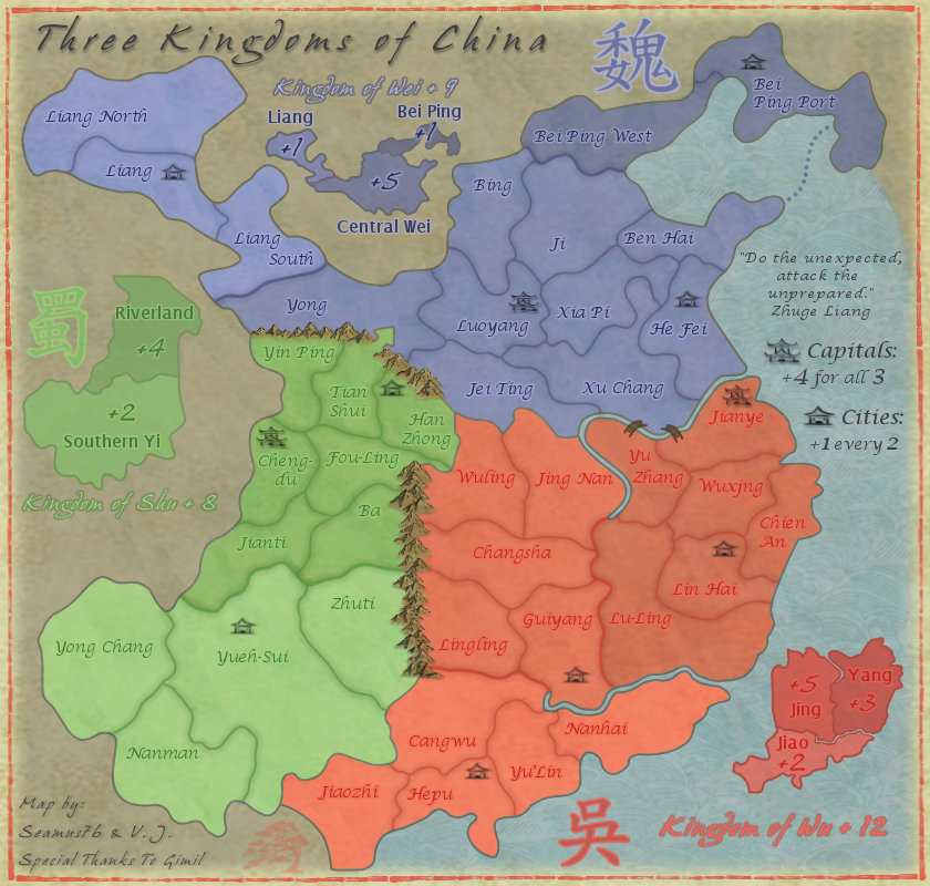
CURRENT UPDATE INFO - 2013-01-09: - Added some more color to the bridges to fill them in, but they are meant to be oriental style walking bridges, so I didn't want to completely fill them in. - Re-did the one-way arrow from Tian Shui to Yong. Should be pretty clear now, but if not let me know.
- Need to add a little shadow to the mountains, as per cairns' suggestion.
Let's get some stamps on this bad boy.
CURRENT MAP VERSION:
v2.3 - Large (840x800)
Click image to enlarge.
Re: Three Kingdoms of China - v2.3 [2013-01-09] p4
Posted: Wed Jan 09, 2013 8:20 pm
by generalhead
Mountains look good. I agree with benga about the Jiao and jing contrats. It is a little too close. did you try the contrast, brightness color option? That is all I see for now, great map.
Re: Three Kingdoms of China - v2.3 [2013-01-09] p4
Posted: Wed Jan 09, 2013 8:37 pm
by Seamus76
generalhead wrote:Mountains look good. I agree with benga about the Jiao and jing contrats. It is a little too close. did you try the contrast, brightness color option? That is all I see for now, great map.
Ok, I think I see what you're talking about and will make Jiao a little lighter.
You would say the mini-map has good contrast though, correct? I believe it does.
Re: Three Kingdoms of China - v2.3 [2013-01-09] p4
Posted: Thu Jan 10, 2013 12:44 am
by koontz1973
Seamus, a few things for you.
kingdom of Shu mini map is out of scale to the others. Out of all the mini maps Wei is the best. Copy that over to the other two and you have a winner. One way arrow from Tian Shui to Yong, whilst clear, it will need a simple text put on the map to explain it to all the players that do not get it. Is their a historical reason for this one way attack or is it something Gimil made up? Try to give the text some flavour like the Army from Tain Shui holds the mountain pass stopping all attacks from Yong. Why the change in font for the bonus regions in the mini map? The title font for each mini map works, give the regions the same effect so they do not jump of the page. Lastly, try to distress your map a tad. It is looking , make it look .
Re: Three Kingdoms of China - v2.3 [2013-01-09] p4
Posted: Thu Jan 10, 2013 12:55 pm
by Seamus76
koontz1973 wrote:Seamus, a few things for you.
kingdom of Shu mini map is out of scale to the others. Out of all the mini maps Wei is the best. Copy that over to the other two and you have a winner. One way arrow from Tian Shui to Yong, whilst clear, it will need a simple text put on the map to explain it to all the players that do not get it. Is their a historical reason for this one way attack or is it something Gimil made up? Try to give the text some flavour like the Army from Tain Shui holds the mountain pass stopping all attacks from Yong. Why the change in font for the bonus regions in the mini map? The title font for each mini map works, give the regions the same effect so they do not jump of the page. Lastly, try to distress your map a tad. It is looking , make it look .
The mini-map scale should not be a problem. Also for the next update I have adjusted the contrast of the Jiao bonus color which should put that issue to bed once and for all.
I'll add some text to the left of Yin Ping about the one way arrow. Something along your lines, "Tain Shui holds the only mountain pass." Should work, yes? Also, from what I've read, and translated to the map by gimil, "the reason for the one way is to represent the historical failed attempts of the south invading the north". It also adds more gameplay strategy to holding Central Wei.
I like the change in font, would making the font smaller help?
What distress suggestions were you thinking? It has a nice texture now, which I'm not sure "more" will equal more.
Re: Three Kingdoms of China - v2.3 [2013-01-09] p4
Posted: Thu Jan 10, 2013 1:10 pm
by koontz1973
Not sure if making the font smaller will help, it is just that is jumps of the map now. Make it smaller, lower the opacity or my best bet would be to make each bit of text the same colour as region it goes to. Getting the names of the mini map itself will allow you to do this. Have a play around and see what looks good to you.
As for distressing it, and this is my point, it looks too bloody nice. A few things for you to try out would be to put a roll effect on it (as if it had been unrolled), a crease in it (either one or two as if it had been folded up, 2 would be best). Last idea for now would be to put a subtle paper effect on it. Spent some time looking and Chinese paper (old ones) seem to have a very rough texture to it. This one is good to use.
You see what I mean. The paper has all of these rough bits to it and this alone will give you that look.
Re: Three Kingdoms of China - v2.3 [2013-01-09] p4
Posted: Thu Jan 10, 2013 2:11 pm
by Seamus76
koontz1973 wrote:Not sure if making the font smaller will help, it is just that is jumps of the map now. Make it smaller, lower the opacity or my best bet would be to make each bit of text the same colour as region it goes to. Getting the names of the mini map itself will allow you to do this. Have a play around and see what looks good to you.
As for distressing it, and this is my point, it looks too bloody nice. A few things for you to try out would be to put a roll effect on it (as if it had been unrolled), a crease in it (either one or two as if it had been folded up, 2 would be best). Last idea for now would be to put a subtle paper effect on it. Spent some time looking and Chinese paper (old ones) seem to have a very rough texture to it. This one is good to use.
You see what I mean. The paper has all of these rough bits to it and this alone will give you that look.
Ok, I'll see what I can do, but I don't want to do too much as I'm a big fan of the current look and feel, and in case there are other changes as the map moves up. I mean it's still in the drafting room, and as far as I can see the gameplay is solid, and the only comments for weeks have been graphics related. Thoughts on a move or two up?
Re: Three Kingdoms of China - v2.3 [2013-01-09] p4
Posted: Thu Jan 10, 2013 5:02 pm
by cairnswk
Seamus, i don't doubt your commitment to making this map, and yes, i too think it is time is was rolled out of Drafts into the foundry. i wonder what reasons it is being held up for? Wouldn't hurt to know!
Re: Three Kingdoms of China - v2.3 [2013-01-09] p4
Posted: Thu Jan 10, 2013 11:41 pm
by Seamus76
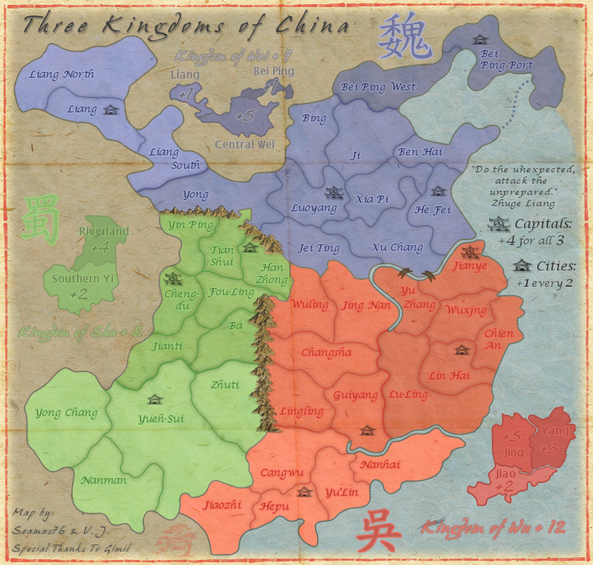
CURRENT UPDATE INFO - 2013-01-11: - Scaled down the Shu mini-map. - Lowered the opacity of some of the mini-map bonus names. I think they pop less, and all blend in better. - Added in a different paper background along the lines of what Koontz suggested, and added creases to grunge it up and make it a little more . Koontz, is this more along the lines of what you were thinking?
As for the one-way arrow, I'm not sure adding text for that is going to work, spacially that is. I tried moving the mini-map around to see where and how it would fit, and it was really rather awkward and detached.
CURRENT MAP VERSION:
v3.0 - Large (840x800)
Click image to enlarge.
Re: Three Kingdoms of China - v3.0 [2013-01-11] p4
Posted: Thu Jan 10, 2013 11:55 pm
by koontz1973
Much better Seamus, well done, it has that feel to it now.
I still say to make the 3 legends the same in all aspects. Look at the blue mini map and copy that for the others. You lowered the title opacity (Kingdom of Shu etc), bring this back out.
Re: Three Kingdoms of China - v3.0 [2013-01-11] p4
Posted: Fri Jan 11, 2013 12:11 am
by Seamus76
koontz1973 wrote:Much better Seamus, well done, it has that feel to it now.
I still say to make the 3 legends the same in all aspects. Look at the blue mini map and copy that for the others. You lowered the title opacity (Kingdom of Shu etc), bring this back out.
Thanks for the suggestions.
When you say make them the same in all aspects as the blue mini-map, you mean to pull the bonus names out and just have the bonus values inside? Blue is like that simply because the areas are so small it looked better outside. If that's what you mean it can certainly be done. As for adding any one-way attack arrow text, moving the green bonus names out will cut down even more on any potential space for that.
Also, I actually didn't lower the opacity of the "Kingdom of Shu" mini-map title, it does seem lighter though which I can only attribute to the new background, which is a little lighter than before and doesn't bring out the darker colors as it did before.
Re: Three Kingdoms of China - v3.0 [2013-01-11] p4
Posted: Fri Jan 11, 2013 12:18 am
by koontz1973
Correct, it is the blue one to copy. Numbers on the map, names of it. All the titles, all seem lighter, try to bring them out a tad more so the stand out better than the bonus names but not more than the mini map itself.
Leave the text of if you want. I was trying to get some historical feel to it but if you do not want it then fine.
Re: Three Kingdoms of China - v3.0 [2013-01-11] p4
Posted: Fri Jan 11, 2013 7:35 am
by generalhead
The contrast For the kingdom of Wu is good on the mini map I think the bigger mini maps do show better The lines on the map look awkward to me
Re: Three Kingdoms of China - v3.0 [2013-01-11] p4
Posted: Fri Jan 11, 2013 9:41 am
by RjBeals
generalhead wrote:The lines on the map look awkward to me
Me too - because of the map graphics, the crease lines don't really give the illusion of paper folded map. They just look distracting. But I like the texture itself.
Re: Three Kingdoms of China - v3.0 [2013-01-11] p4
Posted: Fri Jan 11, 2013 11:47 am
by Seamus76
I'm about to post another update, moving the mini-map text out, should I ditch the lines and just leave the texture, or is there something I can do to make the lines work and look better?
Re: Three Kingdoms of China - v3.0 [2013-01-11] p4
Posted: Fri Jan 11, 2013 11:52 am
by koontz1973
Lines you can leave for later. Lets see this update.
Re: Three Kingdoms of China - v3.0 [2013-01-11] p4
Posted: Fri Jan 11, 2013 12:02 pm
by Seamus76
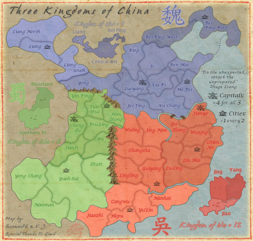
CURRENT UPDATE INFO - 2013-01-11: - Moved the red and green mini-map labels outside of the map. - Brought out the names more. - For now just lowered the opacity of the line.
CURRENT MAP VERSION: v3.1 - Large (840x800)
Click image to enlarge.
Re: Three Kingdoms of China - v3.1 [2013-01-11] p5
Posted: Fri Jan 11, 2013 12:20 pm
by koontz1973
Seamus, here is your sticky. Stamping in two days as normal. But before I stamp this, I am going to ask if you want it stamped with the new rules now in place?
With the folds, they will need a lot more work done on them but you can do that as you go though game play and graphics. The lines that I think RJ is talking about and I do kind of agree with him is this, you territ lines and land/sea border are just too curvy. rough them up a bit. Not jagged but I can see every single point you have made. Look at Tian Shui - Han Zhong border. That is a nice line. Get the rest like this. It will mean a complete re do I am afraid but you have time.
Re: Three Kingdoms of China - v3.1 [2013-01-11] p5
Posted: Fri Jan 11, 2013 12:32 pm
by Seamus76
koontz1973 wrote:Seamus, here is your sticky. Stamping in two days as normal. But before I stamp this, I am going to ask if you want it stamped with the new rules now in place?
With the folds, they will need a lot more work done on them but you can do that as you go though game play and graphics. The lines that I think RJ is talking about and I do kind of agree with him is this, you territ lines and land/sea border are just too curvy. rough them up a bit. Not jagged but I can see every single point you have made. Look at Tian Shui - Han Zhong border. That is a nice line. Get the rest like this. It will mean a complete re do I am afraid but you have time.
Thank you sir, and yes please stamp this.
RJ is specifically talking about the creases though, but if you're not a fan of the other lines I can have a deeper look. At first glance the territ lines look good to me, there is good consistency with curves and jaggs. The sea/land border is pretty smooth, which I can jag up a bit.
by RjBeals » Fri Jan 11, 2013 10:41 am ...because of the map graphics, the crease lines don't really give the illusion of paper folded map. They just look distracting. But I like the texture itself.
Re: Three Kingdoms of China - v3.1 [2013-01-11] p5
Posted: Fri Jan 11, 2013 12:37 pm
by koontz1973
The creases will need more work, but as I said you have a lot of time to play around now with them. So as you do not bugger up your image, make a copy of it and play around till you find something that work. As yes, the territ lines are way to smooth. Give them a natural feel to them if you know what I mean.
Re: Three Kingdoms of China - v3.1 [2013-01-11] p5
Posted: Fri Jan 11, 2013 12:55 pm
by The Bison King
Looking awesome! Why is this still in the drafting room?
Re: Three Kingdoms of China - v3.1 [2013-01-11] p5
Posted: Fri Jan 11, 2013 5:30 pm
by generalhead
The Bison King wrote:Looking awesome! Why is this still in the drafting room?
It got stamped, you have to read back two and three posts.
Re: Three Kingdoms of China - v3.1 [2013-01-11] p5
Posted: Sat Jan 12, 2013 1:19 pm
by koontz1973
Seamus, just posted this in GH Easter Island thread and it might help you to. With the mountains, try to change the colour of the smaller ones. Then place some in front of the larger mountains to add depth to them. Where you have the range going between red/green, add a few more going into red. Not as impassables but again to add depth to the range. Apart from that, the only other thing I can think of is adding some shadow to them.