Conquer Club

[Official] Circus Maximus REVAMP [Quenched]

Care to peruse completed maps? Take a stroll through the Atlas.

Moderator: Cartographers

Forum rules
Please read the Community Guidelines before posting.

Postby DiM on Thu May 31, 2007 4:07 am

WidowMakers wrote:Here are the changes.

*changed the north entrance arches to be the same size.
*crowd is more colored (not just red)
*Fixed the Diocletian name and moved the coordinates slightly for Flavius


you still need to move the tower to the right. mahe it on top of the central arch.

also you need the caligula gate


one more thing in the emperor's stand there seems to be a large crowd. normally there are only a few people there.
ā€œIn the beginning God said, the four-dimensional divergence of an antisymmetric, second rank tensor equals zero, and there was light, and it was good. And on the seventh day he rested.ā€- Michio Kaku
User avatar
Major DiM
 
Posts: 10415
Joined: Wed Feb 14, 2007 6:20 pm
Location: making maps for scooby snacks

Postby gimil on Thu May 31, 2007 4:10 am

fisherman5 wrote:i'm seeing blotches of colors in the crowd its kinda annoying but live able i guess


There suppose to represent supports colors i think
User avatar
Corporal 1st Class gimil
 
Posts: 8599
Joined: Sat Mar 03, 2007 12:42 pm
Location: United Kingdom (Scotland)

Postby WidowMakers on Thu May 31, 2007 4:54 am

gimil wrote:
fisherman5 wrote:i'm seeing blotches of colors in the crowd its kinda annoying but live able i guess


There suppose to represent supports colors i think
Yes. They represent the different player colors. Initially there was too much red. I got the crowd from a picture of a stadium. People on the forum did not like the idea of the crowd being that red. I have added the different colors to represent teh different players in the game.

DiM wrote:you still need to move the tower to the right. mahe it on top of the central arch.

also you need the caligula gate


one more thing in the emperor's stand there seems to be a large crowd. normally there are only a few people there.
Ok Dim. 1) I will see what I can do about moving the tower over the arch. 2) I am not going to have a caligula gate. There is not a lot of that portion showing and I really don't think it is necessary. 3) The emperors stand is ok IMHO. Some pictures show it really big. Remember I basically took the original circus maximus and cut out 75% of the length. Things are pretty close. If you still feel that it is a problem we can have a poll after my next update when I move the north west tower over the arch.
Image
Major WidowMakers
 
Posts: 2774
Joined: Mon Nov 20, 2006 9:25 am
Location: Detroit, MI

Postby DiM on Thu May 31, 2007 5:07 am

WidowMakers wrote:Ok Dim. 1) I will see what I can do about moving the tower over the arch. 2) I am not going to have a caligula gate. There is not a lot of that portion showing and I really don't think it is necessary. 3) The emperors stand is ok IMHO. Some pictures show it really big. Remember I basically took the original circus maximus and cut out 75% of the length. Things are pretty close. If you still feel that it is a problem we can have a poll after my next update when I move the north west tower over the arch.


1. thanks.
2. i'm not talking about the size of the emperor's stand but about the people inside it. you have lots of people in there when there should only be few.
ā€œIn the beginning God said, the four-dimensional divergence of an antisymmetric, second rank tensor equals zero, and there was light, and it was good. And on the seventh day he rested.ā€- Michio Kaku
User avatar
Major DiM
 
Posts: 10415
Joined: Wed Feb 14, 2007 6:20 pm
Location: making maps for scooby snacks

Postby The Random One on Thu May 31, 2007 6:14 am

WidowMakers wrote:Yes. They represent the different player colors. Initially there was too much red. I got the crowd from a picture of a stadium. People on the forum did not like the idea of the crowd being that red. I have added the different colors to represent teh different players in the game.


I can see why people complained about the red, but I doubt that in Ancient Rome people actually dressed in the colors of their favourite competitors *Imagines seven togaless drunken romans with FLAVIVS painted on their bellies* Unless I'm really wrong, the most common colors in their outfits were white, red and violet, so a crowd of Romans would really look more red than anything else. Oh, well - do as you (and the foundry) feel is best.
User avatar
Cadet The Random One
 
Posts: 111
Joined: Mon Apr 09, 2007 6:58 am

Postby KEYOGI on Thu May 31, 2007 7:50 am

I agree with The Random One, the predominantly red crowd was fine.
Sergeant 1st Class KEYOGI
 
Posts: 1632
Joined: Tue Oct 10, 2006 6:09 am

Postby Sparqs on Thu May 31, 2007 5:00 pm

Wow, your artwork is amazing, WidowMakers - it really adds to the gameplay experience.

My one critique of this version of the Circus Maximus map is that the center aisle looks a bit too shiny and clean. Maybe adding some dirt or other texture would soften it up.
User avatar
Sergeant Sparqs
 
Posts: 173
Joined: Tue May 29, 2007 5:52 am

Postby KEYOGI on Thu May 31, 2007 7:41 pm

WidowMakers wrote:Well here is the next update. I have made several changes and there is now a poll to help determine some things.
*DiM suggested that I lower the number of people in the emperor's Throne area and add a throne. Done. I think it makes that portion look much better..

I will post the final version after the poll with armies both large and small. The four maps below have not changed the XML from the previous posts.

Here are the picture that correspond to the poll.
1) Multi colored crowd / remove northwest tower
Image
2) Multi colored crowd / keep northwest tower
Image
3) Mostly red colored crowd / remove northwest tower
Image
4) Mostly red colored crowd / keep northwest tower
Image

LET THE VOTING BEGIN
Sergeant 1st Class KEYOGI
 
Posts: 1632
Joined: Tue Oct 10, 2006 6:09 am

Postby DiM on Thu May 31, 2007 7:48 pm

clearly number 4. red crowds are more realistic. and the tower just fits nicely.
ā€œIn the beginning God said, the four-dimensional divergence of an antisymmetric, second rank tensor equals zero, and there was light, and it was good. And on the seventh day he rested.ā€- Michio Kaku
User avatar
Major DiM
 
Posts: 10415
Joined: Wed Feb 14, 2007 6:20 pm
Location: making maps for scooby snacks

Postby KEYOGI on Thu May 31, 2007 8:06 pm

Hmm... I still prefer the previous version below:

Image

While I understand moving the tower, it looks odd sitting where it is. I think it's because of the slanted look on the right side of it.
Sergeant 1st Class KEYOGI
 
Posts: 1632
Joined: Tue Oct 10, 2006 6:09 am

Postby hulmey on Fri Jun 01, 2007 3:53 am

i think the King's box should be more in the middle
[img]http://img801.imageshack.us/img801/9761/41922610151374166770386.jpg[/mg]
User avatar
Lieutenant hulmey
 
Posts: 3742
Joined: Fri Nov 03, 2006 7:33 am
Location: Las Vegas

Postby edbeard on Fri Jun 01, 2007 4:07 am

I think #3 is the "best" currently, but I'm not sold on any of the northwest corner options to be honest. I'm not sure what it is exactly, but when I look at that portion of the map the tower seems out of place. That being said, when I look at it without the tower, it doesn't look quite right either. Although, it's not a big deal.
User avatar
Lieutenant edbeard
 
Posts: 2501
Joined: Thu Mar 29, 2007 12:41 am

Postby anamainiacks on Fri Jun 01, 2007 9:51 am

t.e.c wrote:
anamainiacks wrote:But for the territory names, I always tend to take 'Inside Lane' as the lane inside the other two, so can it be changed? I can't think of any other replacement word though...

but inside lane IS the lane inside the other two..


Inside the other two as in in between the other two... which would be center lane.


And WM, maybe you could make the peak of the landing below the Northwest block, instead of having it a bit off, as it currently is.

The pink flag at the right also seems rather stiff :S
User avatar
Colonel anamainiacks
 
Posts: 1778
Joined: Sat Mar 03, 2007 9:21 am

Postby The1exile on Fri Jun 01, 2007 10:46 am

I agee with Keyogi about the tower location.
Image
User avatar
Lieutenant The1exile
 
Posts: 7140
Joined: Tue Aug 15, 2006 7:01 pm
Location: Devastation

Postby ericwdhs on Fri Jun 01, 2007 11:44 am

The curve of the stadium and lanes in the bottom right looks wrong. Use a circle transformed for perspective to align them correctly. (I assume you're using Photoshop.) Other than that, it looks excellent.
Sergeant ericwdhs
 
Posts: 118
Joined: Thu May 03, 2007 6:12 pm

Postby AndyDufresne on Fri Jun 01, 2007 1:56 pm

anamainiacks wrote:
t.e.c wrote:
anamainiacks wrote:But for the territory names, I always tend to take 'Inside Lane' as the lane inside the other two, so can it be changed? I can't think of any other replacement word though...

but inside lane IS the lane inside the other two..


Inside the other two as in in between the other two... which would be center lane.


And WM, maybe you could make the peak of the landing below the Northwest block, instead of having it a bit off, as it currently is.

The pink flag at the right also seems rather stiff :S


Regarding this issue, I've never found it as one, but would perhaps renaming 'inside' to 'inner' and 'outside' to 'outer' make it clearer?


--Andy
User avatar
Corporal 1st Class AndyDufresne
 
Posts: 24919
Joined: Fri Mar 03, 2006 8:22 pm
Location: A Banana Palm in Zihuatanejo

Postby sully800 on Fri Jun 01, 2007 3:21 pm

AndyDufresne wrote:Regarding this issue, I've never found it as one, but would perhaps renaming 'inside' to 'inner' and 'outside' to 'outer' make it clearer?


--Andy


Great suggestion.

KEYOGI wrote:While I understand moving the tower, it looks odd sitting where it is. I think it's because of the slanted look on the right side of it.


I agree, bit the reason it looks wrong is once again because everything should be symmetric. The arches should be the same size, and they are now. The tower should be in the center and it is now. But the rampart should also be straight....no slanting or bending. I think it will look better and be more historically accurate if that is changed which is double the goodness. Also thats the way it is in the pictures, and it would have been easier to draw that way from the get go :wink:
User avatar
Major sully800
 
Posts: 4978
Joined: Wed Jun 14, 2006 5:45 pm
Location: Bethlehem, Pennsylvania

Postby WidowMakers on Fri Jun 01, 2007 4:13 pm

*I changed the XML to inner and outer. Plus I replaced all of teh u with v. SO the names on the map are the same in the XML

*As far as the tower goes, I used a picture to make the map that had a slanted wall. I like the placement of the original tower. And since the tower is winning in the polls, here are two new pictures with the original tower and the colored crowds.

*Plus the lane lines in the lower right corner now have better perspective to the circle shape of the track.

XML
http://www.mediamax.com/dzlqps/Hosted/C ... imus_4.xml

Image

Image
Image
Major WidowMakers
 
Posts: 2774
Joined: Mon Nov 20, 2006 9:25 am
Location: Detroit, MI

Postby fisherman5 on Fri Jun 01, 2007 4:19 pm

the only problem i have with the tower is that it looks like it is hovering and that its sticking over the edge of the wall
Image
User avatar
Cadet fisherman5
 
Posts: 48
Joined: Fri Jan 12, 2007 9:33 pm

Postby Coleman on Fri Jun 01, 2007 4:47 pm

fisherman5 wrote:the only problem i have with the tower is that it looks like it is hovering and that its sticking over the edge of the wall

I agree with this one, a couple pixels towards the inside from where it is now would be great.
Warning: You may be reading a really old topic.
User avatar
Sergeant Coleman
 
Posts: 5402
Joined: Tue Jan 02, 2007 10:36 pm
Location: Midwest

Postby WidowMakers on Fri Jun 01, 2007 9:18 pm

Image
Major WidowMakers
 
Posts: 2774
Joined: Mon Nov 20, 2006 9:25 am
Location: Detroit, MI

Postby sully800 on Fri Jun 01, 2007 9:54 pm

Ummm, the tower in your poll options is centered. Then you said people were in favor of keeping the tower so you moved it back to the off center position? They are in favor of keeping the tower, but centered or not hasnt been voted upon. I 100% support a completely symmetrical entrance because that is one of the main foundations of roman architecture. They would never approve a plan with an off center tower like that.

There are three pictures of a similar stadium posted in this thread. All are symmetrical designs including the one you posted and said you used for the design. So why make the tower off center and the walls uneven?
User avatar
Major sully800
 
Posts: 4978
Joined: Wed Jun 14, 2006 5:45 pm
Location: Bethlehem, Pennsylvania

Postby Wisse on Sat Jun 02, 2007 2:10 am

ok i had to made an explanition to what i said earlyer:

Image
look to the red bricks
if you look to the one to the south and the north you notice a difference, the little gray stroke* is with it at the south one and not at the north, ok thats your perspective, but then look to the east one, there is even space between the red brick and the gray stroke
and than if you look at caligvla and ballista (still the wall) you see a huge difference in not more than a few pixels distance from eachoter
i hope you do understand what i say now :)


* the road where the people can walk
Image Image
User avatar
Sergeant Wisse
 
Posts: 4448
Joined: Fri Oct 13, 2006 2:59 pm
Location: The netherlands, gelderland, epe

Postby WidowMakers on Sat Jun 02, 2007 8:11 am

sully800 wrote:Ummm, the tower in your poll options is centered. Then you said people were in favor of keeping the tower so you moved it back to the off center position? They are in favor of keeping the tower, but centered or not hasnt been voted upon. I 100% support a completely symmetrical entrance because that is one of the main foundations of roman architecture. They would never approve a plan with an off center tower like that.
You are correct, the poll has two options with and without a tower. and the tower is centered. But several people have said that they liked the previous version (the new one I posted). That is why I posted it.

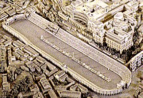
sully800 wrote:There are three pictures of a similar stadium posted in this thread. All are symmetrical designs including the one you posted and said you used for the design. So why make the tower off center and the walls uneven?
Well here is a picture that has a centered tower but is not symmetrical. One of the walls is angled.
Image
If it is that big of a problem, I will have another poll and see what everyone wants.

Wisse wrote:ok i had to made an explanition to what i said earlyer:
Image
look to the red bricks
if you look to the one to the south and the north you notice a difference, the little gray stroke* is with it at the south one and not at the north, ok thats your perspective, but then look to the east one, there is even space between the red brick and the gray stroke
and than if you look at caligvla and ballista (still the wall) you see a huge difference in not more than a few pixels distance from eachoter
i hope you do understand what i say now :)
* the road where the people can walk
I do see what you are saying but I have to say that there is nothing wrong with the map from this perspective. The seating is ramped towards the center of the track. It the camera was directly over the center of the track you would be correct, all of the red blocks should be the same. However, since the camera is to the south east, the wall closest to the camera is going to appear shorter. For that last time. I built this stadium in MAYA, a 3D program. I then positioned a camera in space and took a picture. Aside from the placement of the different objects in the model, the model is correctly show as it would be from this point of view.
Image
Major WidowMakers
 
Posts: 2774
Joined: Mon Nov 20, 2006 9:25 am
Location: Detroit, MI

Postby KEYOGI on Sat Jun 02, 2007 8:54 am

Which combination looks the best? (please look on page 6 for the images)

1) Multi colored crowd / remove northwest tower
5% [ 2 ]
2) Multi colored crowd / keep northwest tower
32% [ 13 ]
3) Mostly red colored crowd / remove northwest tower
20% [ 8 ]
4) Mostly red colored crowd / keep northwest tower
42% [ 17 ]

Total Votes : 40
Sergeant 1st Class KEYOGI
 
Posts: 1632
Joined: Tue Oct 10, 2006 6:09 am

PreviousNext

Return to The Atlas

Who is online

Users browsing this forum: No registered users