Conquer Club

[Official] Circus Maximus REVAMP [Quenched]

Care to peruse completed maps? Take a stroll through the Atlas.

Moderator: Cartographers

Forum rules
Please read the Community Guidelines before posting.

Postby sully800 on Sat Jun 02, 2007 2:58 pm

WidowMakers wrote:
sully800 wrote:There are three pictures of a similar stadium posted in this thread. All are symmetrical designs including the one you posted and said you used for the design. So why make the tower off center and the walls uneven?
Well here is a picture that has a centered tower but is not symmetrical. One of the walls is angled.
Image
If it is that big of a problem, I will have another poll and see what everyone wants.


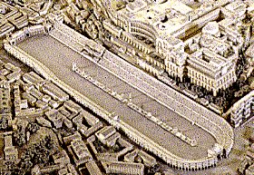
Actually, I think both walls are angled. It's just hard to tell from the perspective. Here are some other pictures of circus maximus that show a symmetrical front with two angled walls:

Image

Image
User avatar
Major sully800
 
Posts: 4978
Joined: Wed Jun 14, 2006 5:45 pm
Location: Bethlehem, Pennsylvania

Postby icemonkey on Sat Jun 02, 2007 3:08 pm

you are all making way too big a deal with this tower. Where it is with the angled wall and the boxes next to it so it doesn't look like its floating are good. No one really knows what the circus maximus really looked liked. If you want to be historically accurate then I think the stone should be whiter rather than the grey it is.

And I think the problem with the colored crowd is that its so blotchy, theres little sections of one color and little sections of all another color. I think what would look better is a crowd that is more random in that there are no sections of a certain color. I dunno how hard this would be to pull off tho.
Corporal icemonkey
 
Posts: 11
Joined: Tue May 01, 2007 8:22 pm

Postby reverend_kyle on Sat Jun 02, 2007 3:56 pm

the original artist was rock solid wasn't it? I think he signed it petrvus blah blah as a joke right?
DANCING MUSTARD FOR POOP IN '08!
User avatar
Sergeant reverend_kyle
 
Posts: 9250
Joined: Tue Mar 21, 2006 4:08 pm
Location: 1000 post club

Postby Molacole on Sun Jun 03, 2007 2:06 am

This won't help you keep things to scale...

I'd like to see the space left over from the armies (88) used for increasing the size of your chariots! Maybe around the size of the statues in the middle or if you go bigger then make the middle statue bigger also.

Bigger "royal family" in the VIP box! Maybe add some drapes to the insides of the pilars to help "glorify" it some or something like that


also a grassy noll with a sniper! thanks
User avatar
Lieutenant Molacole
 
Posts: 552
Joined: Fri Jun 23, 2006 8:19 am
Location: W 2.0 map by ZIM

Postby WidowMakers on Sun Jun 03, 2007 6:17 am

Molacole wrote:This won't help you keep things to scale...

I'd like to see the space left over from the armies (88) used for increasing the size of your chariots! Maybe around the size of the statues in the middle or if you go bigger then make the middle statue bigger also.

Bigger "royal family" in the VIP box! Maybe add some drapes to the insides of the pilars to help "glorify" it some or something like that


also a grassy noll with a sniper! thanks
I understand that several people want to make the chariots bigger. I however want to keep the map as close to scale as possible. Players still understand the chariots are racing. There is a big picture of a chariot in the top left. As I make the chariots bigger the feel for the size of the stadium is lost. I really don't want to change them.

As for the drapes. I like that idea. I will see what I can do.

And there already is a sniper. You just cant see him because he is camouflaged so well. LOOK OUT RACERS!
Image
Major WidowMakers
 
Posts: 2774
Joined: Mon Nov 20, 2006 9:25 am
Location: Detroit, MI

Postby Keredrex on Sun Jun 03, 2007 9:37 am

WidowMakers wrote:I understand that several people want to make the chariots bigger. I however want to keep the map as close to scale as possible. Players still understand the chariots are racing. There is a big picture of a chariot in the top left. As I make the chariots bigger the feel for the size of the stadium is lost. I really don't want to change them.


I agree the scale is fine... however i feel that the colors of the green and the light blue chariots look the same to me.... its not a big deal but if you can darken the green a little.
as for the Tower.. It is fine why does the outer wall have to SYMMETRICAL... I think it looks great... Maybe adorn it with I statue on top ...
User avatar
Sergeant 1st Class Keredrex
 
Posts: 400
Joined: Sun Jan 14, 2007 1:41 am
Location: New York

Postby sam_levi_11 on Sun Jun 03, 2007 12:58 pm

get rid of the tower- it looks wrong and like its above the stadium completley
User avatar
Sergeant 1st Class sam_levi_11
 
Posts: 2872
Joined: Mon Dec 11, 2006 2:48 pm

Postby yeti_c on Sun Jun 03, 2007 1:50 pm

I voted for rebuild the far wall... But I would like to see an angle on it - but it should be mimiced on both sides.

C.
Image
Highest score : 2297
User avatar
Lieutenant yeti_c
 
Posts: 9624
Joined: Thu Jan 04, 2007 9:02 am

Postby sully800 on Sun Jun 03, 2007 2:18 pm

Keredrex wrote:I agree the scale is fine... however i feel that the colors of the green and the light blue chariots look the same to me.... its not a big deal but if you can darken the green a little.
as for the Tower.. It is fine why does the outer wall have to SYMMETRICAL... I think it looks great... Maybe adorn it with I statue on top ...


The outer wall should be symmetrical, because that is the way the Romans created their architectural pieces, and circus maximus would be no exception.

Here are some quotes from briefly looking through some papers on Roman architecture:

"In Roman architecture, strictly observed axial symmetry gives rise to spaces that are monumental and static, that is, generally embodying a sense of equilibrium rather than expressing a sense of dynamic movement."

"Thus we see that in this arc of architectural history, the dominant symmetry evolved from a generalized axial symmetry in the Roman age, to bilateral symmetry in the Paleo-Christian, Romanesque and Gothic ages, to rotational and reflectional symmetry in the Renaissance. "

http://www.mi.sanu.ac.yu/vismath/kim/index.html
User avatar
Major sully800
 
Posts: 4978
Joined: Wed Jun 14, 2006 5:45 pm
Location: Bethlehem, Pennsylvania

Postby Molacole on Mon Jun 04, 2007 11:52 am

WidowMakers wrote:And there already is a sniper. You just cant see him because he is camouflaged so well. LOOK OUT RACERS!


:lol:
User avatar
Lieutenant Molacole
 
Posts: 552
Joined: Fri Jun 23, 2006 8:19 am
Location: W 2.0 map by ZIM

Postby WidowMakers on Tue Jun 05, 2007 4:16 pm

The current poll shows the tower can stay so here are the changes I have made
*lightened the stone to make it more colored like the pictures (whiter)
*Added royal curtains in the emperors area.
*added C and M with golden horse under emperors area.

Image
Image
the XML is the same
http://www.mediamax.com/dzlqps/Hosted/C ... imus_4.xml
Image
Major WidowMakers
 
Posts: 2774
Joined: Mon Nov 20, 2006 9:25 am
Location: Detroit, MI

Postby Keredrex on Tue Jun 05, 2007 6:26 pm

sully800 wrote:The outer wall should be symmetrical, because that is the way the Romans created their architectural pieces, and circus maximus would be no exception.

Here are some quotes from briefly looking through some papers on Roman architecture:

"In Roman architecture, strictly observed axial symmetry gives rise to spaces that are monumental and static, that is, generally embodying a sense of equilibrium rather than expressing a sense of dynamic movement."

"Thus we see that in this arc of architectural history, the dominant symmetry evolved from a generalized axial symmetry in the Roman age, to bilateral symmetry in the Paleo-Christian, Romanesque and Gothic ages, to rotational and reflectional symmetry in the Renaissance. "

http://www.mi.sanu.ac.yu/vismath/kim/index.html


I know this.. I have studied art/anncient history ... but this is a CC Map based on an idea... stylized by widowmakers... so he can make it how he pleases and the polls back him up...
User avatar
Sergeant 1st Class Keredrex
 
Posts: 400
Joined: Sun Jan 14, 2007 1:41 am
Location: New York

Postby sully800 on Tue Jun 05, 2007 8:35 pm

Keredrex wrote:I know this.. I have studied art/anncient history ... but this is a CC Map based on an idea... stylized by widowmakers... so he can make it how he pleases and the polls back him up...


Well I for one am in favor of cars instead of chariots. They would be much more practical in a race.

EDIT: I would at least like to see a version with the gate in its proper position and THEN have the poll between the two choices.
User avatar
Major sully800
 
Posts: 4978
Joined: Wed Jun 14, 2006 5:45 pm
Location: Bethlehem, Pennsylvania

Postby hulmey on Wed Jun 06, 2007 1:09 am

what gate? I would like the King's box in the middle!! Can that be done widow ?
[img]http://img801.imageshack.us/img801/9761/41922610151374166770386.jpg[/mg]
User avatar
Lieutenant hulmey
 
Posts: 3742
Joined: Fri Nov 03, 2006 7:33 am
Location: Las Vegas

Postby Teya on Wed Jun 06, 2007 1:44 am

I dont understand why this map is being picked apart so much. It is a visual masterpiece, but its still not good enough for some people. But then you have maps out there that have been forged and quenched with many problems, such as bad bonuses and font that is impossible to read. Or even a map drawn with crayon. Seriously, whats with the double standards people????
User avatar
Sergeant 1st Class Teya
 
Posts: 411
Joined: Tue Oct 17, 2006 5:25 am

Postby yeti_c on Wed Jun 06, 2007 2:44 am

Teya wrote:I dont understand why this map is being picked apart so much. It is a visual masterpiece, but its still not good enough for some people. But then you have maps out there that have been forged and quenched with many problems, such as bad bonuses and font that is impossible to read. Or even a map drawn with crayon. Seriously, whats with the double standards people????


That map isn't actually drawn with crayons...

C.
Image
Highest score : 2297
User avatar
Lieutenant yeti_c
 
Posts: 9624
Joined: Thu Jan 04, 2007 9:02 am

Postby hulmey on Wed Jun 06, 2007 2:48 am

if its going to be re-vamped its best its done as best possible so as not too re-vamp it again a couple of months down the line :wink:
[img]http://img801.imageshack.us/img801/9761/41922610151374166770386.jpg[/mg]
User avatar
Lieutenant hulmey
 
Posts: 3742
Joined: Fri Nov 03, 2006 7:33 am
Location: Las Vegas

Postby reverend_kyle on Wed Jun 06, 2007 4:05 am

She added rock solid to the original artist. I'm happy

quench.
DANCING MUSTARD FOR POOP IN '08!
User avatar
Sergeant reverend_kyle
 
Posts: 9250
Joined: Tue Mar 21, 2006 4:08 pm
Location: 1000 post club

Postby Teya on Wed Jun 06, 2007 4:06 am

yeti_c wrote:
Teya wrote:I dont understand why this map is being picked apart so much. It is a visual masterpiece, but its still not good enough for some people. But then you have maps out there that have been forged and quenched with many problems, such as bad bonuses and font that is impossible to read. Or even a map drawn with crayon. Seriously, whats with the double standards people????


That map isn't actually drawn with crayons...

C.


Its meant to look like crayons and that is my point.

And, hulmey, yes it should be done as best as possible but I dont see why people are nitpicking this when other maps with alot worse graphics are getting through the foundry with no problems. You cant lower your standards for some maps then raise them for others.

Im with reverend_kyle quench!
User avatar
Sergeant 1st Class Teya
 
Posts: 411
Joined: Tue Oct 17, 2006 5:25 am

Postby reverend_kyle on Wed Jun 06, 2007 4:10 am

whats this crayon map you speak of?
DANCING MUSTARD FOR POOP IN '08!
User avatar
Sergeant reverend_kyle
 
Posts: 9250
Joined: Tue Mar 21, 2006 4:08 pm
Location: 1000 post club

Postby hulmey on Wed Jun 06, 2007 4:32 am

i think there are standards for all maps...U got 3 D maps like this or u have the geography maps.....but i think all in all standards are the same for every1.

The one 2 things i think widow could improve are the lines needed to be curved properly on the racecourse and the king's box should be in the middle as it would do in real life....
[img]http://img801.imageshack.us/img801/9761/41922610151374166770386.jpg[/mg]
User avatar
Lieutenant hulmey
 
Posts: 3742
Joined: Fri Nov 03, 2006 7:33 am
Location: Las Vegas

Postby WidowMakers on Wed Jun 06, 2007 4:46 am

reverend_kyle wrote:She added rock solid to the original artist. I'm happy

quench.
SHE???


hulmey wrote:The one 2 things i think widow could improve are the lines needed to be curved properly on the racecourse and the king's box should be in the middle as it would do in real life....
As far as the lines go, I do not want them to be perfect. This is dirt track after all. and as far as the kings box goes. It is not on center in any of the other pictures we have posted. Plus many times it has been said before, we don't really know what it looked like.
Image
Major WidowMakers
 
Posts: 2774
Joined: Mon Nov 20, 2006 9:25 am
Location: Detroit, MI

Postby yeti_c on Wed Jun 06, 2007 5:01 am

I agree - leave the bumpy lines and leave the emperors box...

I still think the far wall could be tweaked... how long would it take for you to tweak it to be as everyone suggests?

If it's ages then I say don't bother - if you can knock it up in under an hour - can we have a preview and a poll?

C.
Image
Highest score : 2297
User avatar
Lieutenant yeti_c
 
Posts: 9624
Joined: Thu Jan 04, 2007 9:02 am

Postby hulmey on Wed Jun 06, 2007 5:08 am

whats all this with polls and if you ever watched the film the Gladiator the bloody box is in the middle...

I acyuall worked on the film the Gladiator which was filmed entirely in Malta. And anyways gods and empreors were also centred in the middle
[img]http://img801.imageshack.us/img801/9761/41922610151374166770386.jpg[/mg]
User avatar
Lieutenant hulmey
 
Posts: 3742
Joined: Fri Nov 03, 2006 7:33 am
Location: Las Vegas

Postby WidowMakers on Wed Jun 06, 2007 5:37 am

yeti_c wrote:I agree - leave the bumpy lines and leave the emperors box...

I still think the far wall could be tweaked... how long would it take for you to tweak it to be as everyone suggests?

If it's ages then I say don't bother - if you can knock it up in under an hour - can we have a preview and a poll?

C.
I would need to rebuild the 3D by deleting the old and trying to patch it back together. Then place that back into photoshop and try to merge it with the rest. I would say 4-5 hours to get it done. I don't know how much of the entire map I will need to remake since I have many layers and overlays that build off of the base image from 3D. Believe me, if it was going to be easy, I would have done it already. :D
Image
Major WidowMakers
 
Posts: 2774
Joined: Mon Nov 20, 2006 9:25 am
Location: Detroit, MI

PreviousNext

Return to The Atlas

Who is online

Users browsing this forum: No registered users

cron