Conquer Club

[Official] Circus Maximus REVAMP [Quenched]

Care to peruse completed maps? Take a stroll through the Atlas.

Moderator: Cartographers

Forum rules
Please read the Community Guidelines before posting.

Postby AK_iceman on Thu May 24, 2007 9:02 pm

DiM wrote:i actually liked how the terits were shaped like arrows in the old map. could we have the same aspect in the new one?

Yeah, that made it easier to tell that you could attack diagonally. With all the straight edges, it looks like you can only attack in front of you, and side-to-side.
User avatar
Sergeant 1st Class AK_iceman
 
Posts: 5704
Joined: Wed May 10, 2006 10:39 pm

Postby ParadiceCity9 on Thu May 24, 2007 9:44 pm

GosoxJ wrote:Are you aware that you have a V in the word bonuses?


have you ever seen anything written in greek or latin...u's looked like v's
Corporal 1st Class ParadiceCity9
 
Posts: 4239
Joined: Thu Feb 15, 2007 4:10 pm

Postby WidowMakers on Thu May 24, 2007 9:47 pm

Lanceyboyuk wrote:i believe that is on purpose lol. Great first draft. If you can try and make the stadium a bit more 3D in the bottom section i think it would help. darker to lighter shading maybe but im no map making buff lol.
I can't make it more 3D. It was made with a 3D program. Believe me I tilted it every way. This perspective give the largest area for teh actual map play area, while allowing everyone to see arean (Circus Maximus) as much as possible.

Coleman wrote:This is awesome. Still some issues though. I think you need to display the names in a similar fashion to the original map, I can't visualize the overlapping names working right now.
Other then that quench~! =D>
I will try that. I felt that this was a better feel but we shall see.
Coleman wrote:
pancakemix wrote:Some of the lines are a little wobbly between areas. Ex.:Honorius=>Imprerius borders.

I think that was intentional, judging from the slope in the dirt there. I don't mind it.
More on that, I think a perfectly flat chariot ring isn't realistic, I guess it's up to the community on if we care about that or not.
I will make a straight and wobbly track rings. Once they are up I will have Keyogi start a poll.
unriggable wrote:Its good but not enough of the picture is the map. You need to make it bigger. Otherwise its incredible.
I wanted to try and capture the actual feeling of the giant stadium and the atmosphere behind the circus maximus arena. The map is still playable and easy to read. The original map has a larger area but you really don't get a good feel of what circus maximus really is.

AK_iceman wrote:
DiM wrote:i actually liked how the terits were shaped like arrows in the old map. could we have the same aspect in the new one?

Yeah, that made it easier to tell that you could attack diagonally. With all the straight edges, it looks like you can only attack in front of you, and side-to-side.
I was actually thinking of this yesterday. I will update those for both the wobbly and straight track pictures.

Oh and should the original artist sig read: rocksolid or what my map currently has (from the original map on site)?
Here are the army pictures
Image
Image
Image
Major WidowMakers
 
Posts: 2774
Joined: Mon Nov 20, 2006 9:25 am
Location: Detroit, MI

Postby Coleman on Thu May 24, 2007 10:00 pm

I like how you have the army numbers near the edge they attack from, but I'm sure somebody won't. :(

EDIT: Also a big fan of the wobbly lines. Why do I always hit submit too early and edit almost every post I make?
Warning: You may be reading a really old topic.
User avatar
Sergeant Coleman
 
Posts: 5402
Joined: Tue Jan 02, 2007 10:36 pm
Location: Midwest

Postby DiM on Thu May 24, 2007 10:32 pm

i just realized a big problem the arena gate is not simetrical.

aslo flags and banners should be added in the center
“In the beginning God said, the four-dimensional divergence of an antisymmetric, second rank tensor equals zero, and there was light, and it was good. And on the seventh day he rested.”- Michio Kaku
User avatar
Major DiM
 
Posts: 10415
Joined: Wed Feb 14, 2007 6:20 pm
Location: making maps for scooby snacks

Postby RjBeals on Thu May 24, 2007 10:35 pm

DiM wrote:i just realized a big problem the arena gate is not simetrical.
Big Problem? The gate looks fine to me.
Image
User avatar
Private RjBeals
 
Posts: 2506
Joined: Mon Nov 20, 2006 5:17 pm
Location: South Carolina, USA

Postby KEYOGI on Thu May 24, 2007 11:58 pm

I see no problem with the gate, but the idea about the arrow shaped territories is spot on.
Sergeant 1st Class KEYOGI
 
Posts: 1632
Joined: Tue Oct 10, 2006 6:09 am

Postby Wisse on Fri May 25, 2007 12:42 am

i don't like the people and the horse riders i hope you can make them better
Image Image
User avatar
Sergeant Wisse
 
Posts: 4448
Joined: Fri Oct 13, 2006 2:59 pm
Location: The netherlands, gelderland, epe

Postby KEYOGI on Fri May 25, 2007 1:50 am

Which people Wisse? The one's on the chariots or in the crowd? Looks like WidowMakers has gone for the army number colours on the chariot racers.
Sergeant 1st Class KEYOGI
 
Posts: 1632
Joined: Tue Oct 10, 2006 6:09 am

Like It

Postby Keredrex on Fri May 25, 2007 3:38 am

Awesome I wanted a similar design..... Glad to see you had the same vision.

I was wondering if you can Lighten the ground of the actual territories ....sort of what happens when the horses and chariots race around again and again.. it would show a small difference from the outside ground color.. and maybe some flags or statues in the center island & gate area...Otherwise Its Great
User avatar
Sergeant 1st Class Keredrex
 
Posts: 400
Joined: Sun Jan 14, 2007 1:41 am
Location: New York

Postby yeti_c on Fri May 25, 2007 3:55 am

Coleman wrote:This is awesome. Still some issues though. I think you need to display the names in a similar fashion to the original map, I can't visualize the overlapping names working right now.

Other then that quench~! =D>


Hoardings?

On the far side there could be hoardings with the names on?

And on the near side there could be hoardings down the middle?

What about the ends?

Honorius caould have a hoarding round the end of the track...

Caligula could have it on the bit of wall that you can see... and a mimiced version that you can't read on the other side for balance?

(Obviously you would need to make the walls bigger etc)

C.
Image
Highest score : 2297
User avatar
Lieutenant yeti_c
 
Posts: 9624
Joined: Thu Jan 04, 2007 9:02 am

Postby yeti_c on Fri May 25, 2007 3:58 am

DiM wrote:i just realized a big problem the arena gate is not simetrical.

aslo flags and banners should be added in the center


I think DiM may have a point - I don't think the Isomeric perspective is quite right with that slope up the lower wall shouldn't go diagonal it should go straight?

Did I explain that correctly... if not I can knock up an image to explain?

C.

PS I love the idea BTW WM... it's ace.
Image
Highest score : 2297
User avatar
Lieutenant yeti_c
 
Posts: 9624
Joined: Thu Jan 04, 2007 9:02 am

Postby WidowMakers on Fri May 25, 2007 5:04 am

DiM wrote:i just realized a big problem the arena gate is not simetrical.

aslo flags and banners should be added in the center
Well the arena is not symmetrical. I took a series of pictures of circus maximus that I found on the web and adapted them to this map This is a pretty close idea of what it looked like. Only it was much longer.

As for the flag and banners, do you mean in the center of the track? Along the long gray center piece right? I will see what i can do. The reason I did not add any was that they would hide visibility of the track.

Wisse wrote:i don't like the people and the horse riders i hope you can make them better
by better i assume you mean easier to see. Well there is not much more I can do. You see the crowd is an ACTUAL crowd from a football or baseball game I found on the web. It is just copied and scaled. So it IS a crowd. The chariots and horses are 3d renderings, in perspective and place in the 3D track. This is what my version of Circus maximus would look like from a blimp. I can really make any changes to the chariots that would make them look more real. They are so small.
Image
Major WidowMakers
 
Posts: 2774
Joined: Mon Nov 20, 2006 9:25 am
Location: Detroit, MI

Postby WidowMakers on Fri May 25, 2007 5:13 am

yeti_c wrote:
DiM wrote:i just realized a big problem the arena gate is not simetrical.

aslo flags and banners should be added in the center


I think DiM may have a point - I don't think the Isomeric perspective is quite right with that slope up the lower wall shouldn't go diagonal it should go straight?

Did I explain that correctly... if not I can knock up an image to explain?

C.

PS I love the idea BTW WM... it's ace.
Once again. I did model the entire map in MAYA (a 3d program) all of the ground, stadium, boxes,barrels, and chariots are setup to the proper perspective to each other.
Image
Major WidowMakers
 
Posts: 2774
Joined: Mon Nov 20, 2006 9:25 am
Location: Detroit, MI

Postby Molacole on Fri May 25, 2007 5:27 am

it looks good, but the main thing making this map a turn off for me is the angle it's pitched at. I think a lesser angle would look a lot better. Closer to horizontal side is what I was thinking
User avatar
Lieutenant Molacole
 
Posts: 552
Joined: Fri Jun 23, 2006 8:19 am
Location: W 2.0 map by ZIM

Postby WidowMakers on Fri May 25, 2007 5:33 am

Molacole wrote:it looks good, but the main thing making this map a turn off for me is the angle it's pitched at. I think a lesser angle would look a lot better. Closer to horizontal side is what I was thinking
I rendered it this way to show as much of the stadium as I could. I want players to know what they are looking at. The first time i saw the current map I knew what it was (chariot racing) but I had no real idea of where or what the stadium was like. I did try to go more horizontal but both ends of were cut off. I do not just want to make a prettier version of the current map in top view either.
Image
Major WidowMakers
 
Posts: 2774
Joined: Mon Nov 20, 2006 9:25 am
Location: Detroit, MI

Postby yeti_c on Fri May 25, 2007 6:06 am

WidowMakers wrote:Once again. I did model the entire map in MAYA (a 3d program) all of the ground, stadium, boxes,barrels, and chariots are setup to the proper perspective to each other.


Ah I see it now...

What I thought was a slope up the wall is actually still flar... My mistake...

From this angle it looks like it could've been a slope - not a problem with the angle - that's the problem with Isometrics...

There is no line to indicate a slope though so I get it now...

One smal thing then... the fence on the back of the Arches is lower on the diagonal bit than on the straight bit... Could you tweak it up so it matches... - it's especially noticeable where the diagonal and straight bit meet.

C.
Image
Highest score : 2297
User avatar
Lieutenant yeti_c
 
Posts: 9624
Joined: Thu Jan 04, 2007 9:02 am

Postby Molacole on Fri May 25, 2007 7:41 am

Well if you're going to persue it I'll try and help out the best I can because I like the current map a lot for assassin games!

for a stadium feel think you could throw in some type of VIP box area where the king would be?

A close up or maybe more defined\visable chariots would look better too imo, but doubt it could be done with the amount of space you have to work with.

Could you make your center piece more like the center pieces in these 2 pictures?

Image

Image
User avatar
Lieutenant Molacole
 
Posts: 552
Joined: Fri Jun 23, 2006 8:19 am
Location: W 2.0 map by ZIM

Postby DiM on Fri May 25, 2007 9:11 am

WidowMakers wrote:
DiM wrote:i just realized a big problem the arena gate is not simetrical.

aslo flags and banners should be added in the center
Well the arena is not symmetrical. I took a series of pictures of circus maximus that I found on the web and adapted them to this map This is a pretty close idea of what it looked like. Only it was much longer.

As for the flag and banners, do you mean in the center of the track? Along the long gray center piece right? I will see what i can do. The reason I did not add any was that they would hide visibility of the track.

Wisse wrote:i don't like the people and the horse riders i hope you can make them better
by better i assume you mean easier to see. Well there is not much more I can do. You see the crowd is an ACTUAL crowd from a football or baseball game I found on the web. It is just copied and scaled. So it IS a crowd. The chariots and horses are 3d renderings, in perspective and place in the 3D track. This is what my version of Circus maximus would look like from a blimp. I can really make any changes to the chariots that would make them look more real. They are so small.


if you look at the bottom image put by molacole you'll see the gates are symmetrical. on top of the gate you have 2 lateral towers and a center one. the center one is really in the center at equal distance from the lateral ones. in your map the center tower is a bit towards the left tower. and this looks strange.

yes i mean the center gray piece.


also i agree with wisse about the chariots. you could make them larger even if it's not realistic. let's just say that since they are the main actors they deserve an artistic resize to emphasize their importance.
“In the beginning God said, the four-dimensional divergence of an antisymmetric, second rank tensor equals zero, and there was light, and it was good. And on the seventh day he rested.”- Michio Kaku
User avatar
Major DiM
 
Posts: 10415
Joined: Wed Feb 14, 2007 6:20 pm
Location: making maps for scooby snacks

Postby Wisse on Fri May 25, 2007 10:39 am

WidowMakers wrote:
DiM wrote:i just realized a big problem the arena gate is not simetrical.

aslo flags and banners should be added in the center
Well the arena is not symmetrical. I took a series of pictures of circus maximus that I found on the web and adapted them to this map This is a pretty close idea of what it looked like. Only it was much longer.

As for the flag and banners, do you mean in the center of the track? Along the long gray center piece right? I will see what i can do. The reason I did not add any was that they would hide visibility of the track.

Wisse wrote:i don't like the people and the horse riders i hope you can make them better
by better i assume you mean easier to see. Well there is not much more I can do. You see the crowd is an ACTUAL crowd from a football or baseball game I found on the web. It is just copied and scaled. So it IS a crowd. The chariots and horses are 3d renderings, in perspective and place in the 3D track. This is what my version of Circus maximus would look like from a blimp. I can really make any changes to the chariots that would make them look more real. They are so small.


ok for the chariots change them and make them bigger
but for the crowd, you see its all red and they have to much space between them for this stadion
Image Image
User avatar
Sergeant Wisse
 
Posts: 4448
Joined: Fri Oct 13, 2006 2:59 pm
Location: The netherlands, gelderland, epe

Postby Guiscard on Fri May 25, 2007 10:41 am

Looks very nice... But I would agree about adding in the arrows present in the original version to dictate the direction.
qwert wrote:Can i ask you something?What is porpose for you to open these Political topic in ConquerClub? Why you mix politic with Risk? Why you not open topic like HOT AND SEXY,or something like that.
User avatar
Private 1st Class Guiscard
 
Posts: 4103
Joined: Fri Dec 08, 2006 7:27 pm
Location: In the bar... With my head on the bar

Postby spinwizard on Fri May 25, 2007 10:47 am

chariots r too bright
User avatar
Private 1st Class spinwizard
 
Posts: 5016
Joined: Sun Dec 10, 2006 9:52 am

Postby icemonkey on Fri May 25, 2007 11:59 am

Heres some more detail about the center part of the track from Wikipedia, in case you didn't look it up already.

The track could hold twelve chariots, and the two sides of the track were separated by a raised median termed the spina. The spina was set slightly diagonally. Statues of various gods were set up on the spina, and Augustus erected an Egyptian obelisk on it as well. At either end of the spina was a turning post, the meta, around which chariots made dangerous turns at speed. On top of the spina, there were rotatable metal dolphins that were turned down to mark laps around the course.

So I think you should add at least some of that to the center, an obelisk would be cool I think.

Also I agree with the aforementioned: Add a special area for the emperor theres one in the second picture from molacole

Chariots are too bright and too small

But looks like a great start!
Corporal icemonkey
 
Posts: 11
Joined: Tue May 01, 2007 8:22 pm

Postby WidowMakers on Fri May 25, 2007 12:45 pm

DiM wrote:if you look at the bottom image put by molacole you'll see the gates are symmetrical. on top of the gate you have 2 lateral towers and a center one. the center one is really in the center at equal distance from the lateral ones. in your map the center tower is a bit towards the left tower. and this looks strange.
There are many different pictures or renderings of it on the web. I used a different one.

Image

I used different aspects of several images and my own touch. Plus the actual Length to Width of the circus and the map is no where near the same. I have had to make adjustments.
Image
Major WidowMakers
 
Posts: 2774
Joined: Mon Nov 20, 2006 9:25 am
Location: Detroit, MI

Postby WidowMakers on Fri May 25, 2007 1:12 pm

OK here is a quick update.
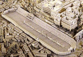
*I added stuff in the middle. I only had about 20 minutes so it is real quick. I just wanted to get a feeling of what it would look like and if it would mess up any army circle placement. I think it looks good.
*I added the emperor portion of the grand stands.
*lightened the track portion
*changed the names back to the original layout style (much better)
*added arrows to point the direction of each lane.

Things I do not want to update.
*I really don't want to make the chariots bigger. I want the map to have a HUGE feel to it. Making the chariots bigger just makes the crowd look bad. I want to keep it to scale as much as possible.
*I don't want to lower the brightness of the chariots because they are the 6 colors of the armies in a 6 player game.

Things I am planning on updating
*add banner under the emperor's seating area (the gray is just to dull right now)
* work on the texture and color of the spires and statues in the middle.

Large
Image
Image
Small
Image
Image

XML
http://www.mediamax.com/dzlqps/Hosted/C ... imus_3.xml
Image
Major WidowMakers
 
Posts: 2774
Joined: Mon Nov 20, 2006 9:25 am
Location: Detroit, MI

Next

Return to The Atlas

Who is online

Users browsing this forum: No registered users