Conquer Club
Conquer Club, a free online multiplayer variation of a popular world domination board game.
https://www.conquerclub.com/forum/
South America [Quenched]
https://www.conquerclub.com/forum/viewtopic.php?f=358&t=21778
Page 1 of 13

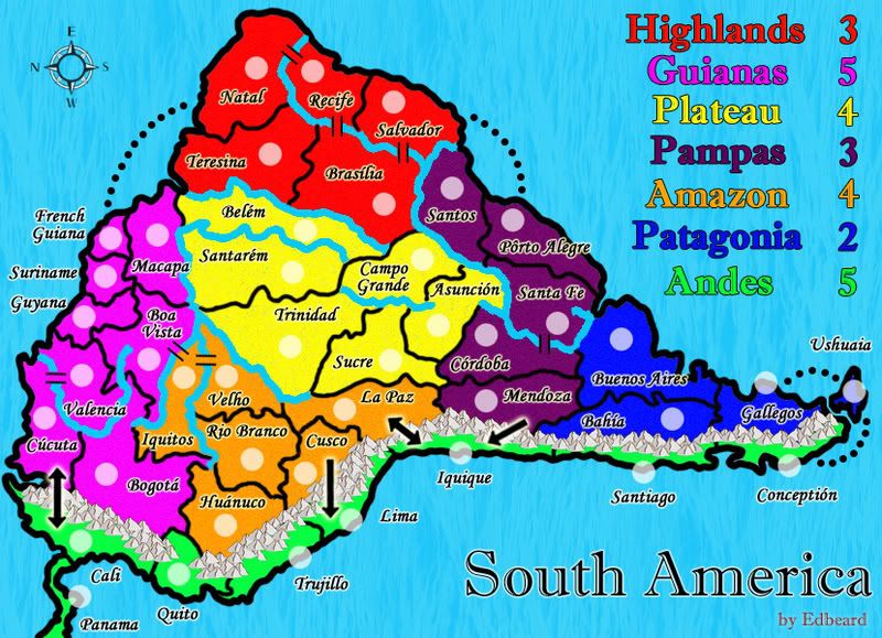
just from my first look I woul have to say it looks pretty good. I want it changed so that north is facing up but that is just cause I cant tell that its south america this way. The river is a little fuzzy. You might want to make the mountain passes a little more realistic. You could try something like what cainswick did. the river passes are ok though. Some of the army circles look a little off from the territory. Othe than those small points this map looks great for a first draft 
this map will never make it with south america on its side. you will get endless complaints.
mibi wrote:this map will never make it with south america on its side. you will get endless complaints.
well, we both know that because of the height restrictions, it's not possible to have South America in that direction. Unless, I want to make this a tiny tiny map, and that would be horrible.
So, I will take on all complainers and carry on despite!
try moving the map at more of an angle like my portugalmap. it will probably still not look right but i think it will be better sitting at about a 55 degree angle than how its sitting jsut now
edbeard wrote:mibi wrote:this map will never make it with south america on its side. you will get endless complaints.
well, we both know that because of the height restrictions, it's not possible to have South America in that direction. Unless, I want to make this a tiny tiny map, and that would be horrible.
So, I will take on all complainers and carry on despite!
My proof against the existance of god:
You have to wander why did god if he was omniscient did not design south america on it side, for this very reason?
gimil wrote:try moving the map at more of an angle like my portugalmap. it will probably still not look right but i think it will be better sitting at about a 55 degree angle than how its sitting jsut now
no offense to your map, but I'm not a fan of that style.
Because of your suggestion, I did try it to see how it looked, and I was not swayed. It's not a matter of just not liking it. It's a strong dislike. And, I'm not going to present something that I don't like of course.
at least rotate it a bit back (it can still have those formats you have now but it does look more like s.america) and i don't mean 45° but more like 10°
edbeard....i don't like the map on its side, can you rotate it?
Also i can also understand what you're tryting to achieve, but is there a river that runs all the way from Recife down to the Rio del la Plata? I think you'll find these are two separate river system that have their sources in the highlands behind Rio....apart from that...good start!
Also i can also understand what you're tryting to achieve, but is there a river that runs all the way from Recife down to the Rio del la Plata? I think you'll find these are two separate river system that have their sources in the highlands behind Rio....apart from that...good start!
It's taller than the "recommended" height, but it's shorter than World 2.1

to do:
1. change style of rivers.
to cairns, it doesn't connect, no, but it comes close and I could have it end so that becomes the connection between Salvador and Brasilia but I like this better. ill take away the connection and see how it looks.
2. increase pink and/or green bonus
3. have a blending border on the bridge between Iquitos and Boa Vista
4. steal more of cairnswk's ideas (so far I have mountain passes and line bridges, soon I'll have a blended border over a bridge)
5. sharpen compass. white borders around text.
6. move Ushuaia's circle so that the blue shows beneath
It is looking better already. I mush perfer the angle this way. After looking at it carfully I noticed a strange texture in the lighter colored areas. It looks quite strange if you really looks at it.
it looks good, but i think you should chang your colors. they are too bright
edbeard...good on you!
i don't know about the forum, but i have not probs with the height if it is shorter than world 2.1, but that is up to the forum.
It looks much better already....really pleased.
i don't know about the forum, but i have not probs with the height if it is shorter than world 2.1, but that is up to the forum.
It looks much better already....really pleased.
I have an opinion on this
Map design aside I don't like the overly bright colors of this map I like the purple near the south but... well tone it down. Other than that I'd have to say I'd get confused if it were small and I couldn't read the text so I think turning it on it's side would be a great idea to save space. 
Re: I have an opinion on this
Solus wrote:Map design aside I don't like the overly bright colors of this map I like the purple near the south but... well tone it down. Other than that I'd have to say I'd get confused if it were small and I couldn't read the text so I think turning it on it's side would be a great idea to save space.
Get a new avatar! That's twice now I've looked and thought you were AK Iceman. Other than that, I agree with everything you have said about the map.
Re: I have an opinion on this
RobinJ wrote:Solus wrote:Map design aside I don't like the overly bright colors of this map I like the purple near the south but... well tone it down. Other than that I'd have to say I'd get confused if it were small and I couldn't read the text so I think turning it on it's side would be a great idea to save space.
Get a new avatar! That's twice now I've looked and thought you were AK Iceman. Other than that, I agree with everything you have said about the map.
My bad... How's this one I just sorta like the other one didn't realize I had it on the same site as someone else.
Re: I have an opinion on this
Solus wrote:RobinJ wrote:Solus wrote:Map design aside I don't like the overly bright colors of this map I like the purple near the south but... well tone it down. Other than that I'd have to say I'd get confused if it were small and I couldn't read the text so I think turning it on it's side would be a great idea to save space.
Get a new avatar! That's twice now I've looked and thought you were AK Iceman. Other than that, I agree with everything you have said about the map.
My bad... How's this one I just sorta like the other one didn't realize I had it on the same site as someone else.
Brilliant!
Re: I have an opinion on this
RobinJ wrote:Solus wrote:RobinJ wrote:Solus wrote:Map design aside I don't like the overly bright colors of this map I like the purple near the south but... well tone it down. Other than that I'd have to say I'd get confused if it were small and I couldn't read the text so I think turning it on it's side would be a great idea to save space.
Get a new avatar! That's twice now I've looked and thought you were AK Iceman. Other than that, I agree with everything you have said about the map.
My bad... How's this one I just sorta like the other one didn't realize I had it on the same site as someone else.
Brilliant!
Why thank you! :3
hey you two, please keep this thread on topic.

changed the river style and added the gap cairnswk talked about. made a few other changes but I don't what they were
changed the river style and added the gap cairnswk talked about. made a few other changes but I don't what they were
Hey Ed did you see the other SA thread?
did you notice it had no posts since January until some joker decided to bump it?
nice to see all this great feedback
nice to see all this great feedback
Just a note: with the placement of "Boa Vista" and the river, it almost looks like that one small section of it is a completely different country. Not a major issue, just a visual one.
EDIT: Nvm. It's gone with that update up a few posts. My bad.
EDIT: Nvm. It's gone with that update up a few posts. My bad.
Hey Edbeard, can I steal your mountains and rivers textures/images for New World. I'll probably replace them with my own later, but for placeholders until I get less lazy?
EDIT: Also, I like the map as it is now.
EDIT: Also, I like the map as it is now.
yea go for it coleman
edbeard wrote:yea go for it coleman
Thanks a ton. I'm anxious to see what the more critical members of the foundry have to say when they notice this. Hopefully they ask for things you can do.