Midkemdil [Quenched]
Moderator: Cartographers
Really important
![]() by shadowdude on Mon Jul 23, 2007 3:43 pm
by shadowdude on Mon Jul 23, 2007 3:43 pm
gnome i posted the proper countrys and continents to your msn inbox please have a look the graphics are bad but the info is right
-
 shadowdude
- Posts: 60
- Joined: Wed Jul 18, 2007 12:40 pm
![]() by shadowdude on Mon Jul 23, 2007 3:53 pm
by shadowdude on Mon Jul 23, 2007 3:53 pm
edocsil wrote:the mountains r ok for now its the territories that r ugly
also the feather might have to go. If all your artwork is origonal then there are no copywrite problems.
id say go check out Fiest's books from a library and basethe countrys off it
That seems to be the second biggest problem. Just get a better texture and ppl wount complain to much
yer try the map i made 4 u its in youre inbox and change the feather to a rapier or something i'm bad with graphich but i bet you could do it
Last edited by shadowdude on Mon Jul 23, 2007 4:01 pm, edited 1 time in total.
-
shadowdude
- Posts: 60
- Joined: Wed Jul 18, 2007 12:40 pm


![]() by shadowdude on Tue Jul 24, 2007 2:31 am
by shadowdude on Tue Jul 24, 2007 2:31 am
Gnome wrote:Don't you like the new idea about the cities instead of the countrys with borders...I think it's way better like this...
yer them messages are from ages ago and i've decided it looks real good
-
shadowdude
- Posts: 60
- Joined: Wed Jul 18, 2007 12:40 pm
![]() by Gnome on Wed Jul 25, 2007 10:53 am
by Gnome on Wed Jul 25, 2007 10:53 am
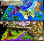
Version 3.3 
updates:
-Added trees/woods
-Legend is updated
-map title is added
-Citys are now connected through paths
-Sea ways are indicated with a white arrow (suggestions are still welcome...)
-Queg is made neutral and gives a bonus when owned (also starts neutral)
-The 'continents' are divided with regarding to the book thx to Shadowdude
*(I did some minor changes like the beach that belong to the western
kingdom but that would make it to large)
**(also added ironpass and hadriella to the 'Hedraldar empire' becous it was to small)
-canged the feather into a dagger...

-The bonuses can still be discussed, it is just in beta stage
-All Remarks and suggestions are still welcome!
updates:
-Added trees/woods
-Legend is updated
-map title is added
-Citys are now connected through paths
-Sea ways are indicated with a white arrow (suggestions are still welcome...)
-Queg is made neutral and gives a bonus when owned (also starts neutral)
-The 'continents' are divided with regarding to the book thx to Shadowdude
*(I did some minor changes like the beach that belong to the western
kingdom but that would make it to large)
**(also added ironpass and hadriella to the 'Hedraldar empire' becous it was to small)
-canged the feather into a dagger...
-The bonuses can still be discussed, it is just in beta stage
-All Remarks and suggestions are still welcome!
-

Gnome
- Posts: 388
- Joined: Wed Jul 18, 2007 4:15 am
- Location: Belgium


![]() by Gnome on Thu Jul 26, 2007 7:43 am
by Gnome on Thu Jul 26, 2007 7:43 am
Version 3.4
Details:
-Bonusses are changed
-made a little sized map
-adjust some army circles
-wrote xml file
-Queg is neutral at every start with 6 armys
test files:
Big

Small

Xml file
http://h1.ripway.com/Gnomepy/midkemia.xml
any remarks?
Details:
-Bonusses are changed
-made a little sized map
-adjust some army circles
-wrote xml file
-Queg is neutral at every start with 6 armys
test files:
Big
Small
Xml file
http://h1.ripway.com/Gnomepy/midkemia.xml
any remarks?
-
Gnome
- Posts: 388
- Joined: Wed Jul 18, 2007 4:15 am
- Location: Belgium
![]() by BelJoDoe on Thu Jul 26, 2007 8:56 am
by BelJoDoe on Thu Jul 26, 2007 8:56 am
It's very nice, good job.
If possible though, I think you might want to consider dropping a little internal glow on the Middle Kingdom's legend tag... I had to stick my head pretty close to my screen in order to read it and its bonus.
If possible though, I think you might want to consider dropping a little internal glow on the Middle Kingdom's legend tag... I had to stick my head pretty close to my screen in order to read it and its bonus.
-
BelJoDoe
- Posts: 76
- Joined: Sat Oct 21, 2006 6:09 pm
- Location: UK
![]() by Gnome on Thu Jul 26, 2007 11:23 am
by Gnome on Thu Jul 26, 2007 11:23 am
ok I took care of the Legend, I made the blue a little lighter and I made the numbers 1 font size bigger.
In the little map I removed the shadow so it's all readable.
I'm leaving on holiday till 28th of august so post all comments in this topic and I'll adjust my map when I come back. If you think it's good like it is you can move it to the Final forge
all links below:
Big Map
Big map with armies
Small map
Small map with armies
Xml file
-
Gnome
- Posts: 388
- Joined: Wed Jul 18, 2007 4:15 am
- Location: Belgium
![]() by n8freeman on Thu Jul 26, 2007 12:47 pm
by n8freeman on Thu Jul 26, 2007 12:47 pm
the continent bonus still need a little work
they are vry hard to read
they are vry hard to read
luns101 wrote:I would like the power to understand women. But we all know that is impossible...so it will have to remain a wish.

-
n8freeman
- Posts: 702
- Joined: Sat Feb 03, 2007 6:25 pm
- Location: wouldn't u like to know, STALKER!
![]() by shadowdude on Sat Jul 28, 2007 3:05 pm
by shadowdude on Sat Jul 28, 2007 3:05 pm
Final Forge time
____________________________
Kelewan the sequel to gnome's midkemia
____________________________
Kelewan the sequel to gnome's midkemia
-
shadowdude
- Posts: 60
- Joined: Wed Jul 18, 2007 12:40 pm
![]() by Evil Pope on Sat Jul 28, 2007 4:07 pm
by Evil Pope on Sat Jul 28, 2007 4:07 pm
Font on the small map is really difficult to read.
Also, I can see distinguishing paths slightly difficult on the small map. Not sure if that should be addressed or not, it may not be a big problem, but I did need to get my face relatively close to the screen to do it..
The map looks great, kinda busy, but great.
I think compared to the rest of the map, however, the sand and the water seems a bit...boring/dull/simple.
Of course, changing it may really make it too busy, which might not be best. But I don't think it'd be a bad thing to try and see how it turns out.
-

Evil Pope
- Posts: 275
- Joined: Fri Jan 13, 2006 8:39 pm


![]() by KEYOGI on Sun Jul 29, 2007 1:27 am
by KEYOGI on Sun Jul 29, 2007 1:27 am
I don't have the time or energy for a long detailed post, so I'll make this brief and to the point.
- The map is very texture heavy, consider reducing the impact of the textures and/or trying different variations of other textures.
- The font on both the map and legend is barely legible in most places, impossible to read in others. Experiement with different fonts and maybe boldness. Also consider reducing the glow around the territory labels or use some colours not so bright and hard on the eye.
- Consider some other options for your attack routes. They're barely visible in most places.
- Is everything on the map your own work? The snake coin or whatever that is and the knife stand out in quality above everything else in the map.
- Have you sought copyright permission from the publisher or author of the books?
-
KEYOGI
- Posts: 1632
- Joined: Tue Oct 10, 2006 6:09 am


![]() by Gnome on Mon Aug 13, 2007 4:26 am
by Gnome on Mon Aug 13, 2007 4:26 am
KEYOGI wrote:I don't have the time or energy for a long detailed post, so I'll make this brief and to the point.
- The map is very texture heavy, consider reducing the impact of the textures and/or trying different variations of other textures.
I'll try my best to make it less heavy but I don't have time right now to do big changes, that's for after my holliday- The font on both the map and legend is barely legible in most places, impossible to read in others. Experiement with different fonts and maybe boldness. Also consider reducing the glow around the territory labels or use some colours not so bright and hard on the eye.
I'll try out some new fonts...But if I reduce the glow around the territorys it will be even more impossible to read...- Consider some other options for your attack routes. They're barely visible in most places.
Ya, Working on that- Is everything on the map your own work? The snake coin or whatever that is and the knife stand out in quality above everything else in the map.
The knife is my own work and the coin is not entirely my but there is no copyright issue in this case- Have you sought copyright permission from the publisher or author of the books?
Well my English is not that good but maybe some1 can help me with an e-mail so I can send it to ask permission...
-
Gnome
- Posts: 388
- Joined: Wed Jul 18, 2007 4:15 am
- Location: Belgium


![]() by Gnome on Mon Aug 13, 2007 10:13 am
by Gnome on Mon Aug 13, 2007 10:13 am
Minor update
-Roads are made brighter so you can see them better
(I'm not planning on making black lines or something,
I made it like this so it's like you are playing in the map and not on top of it.
And in the big map it's realy easy to see them, I can even lay back in my chair and still see them...)
-Legend is changed in the small version.
Small map:

Big map is not changed, only roads are made same colour as in the small map
-Roads are made brighter so you can see them better
(I'm not planning on making black lines or something,
I made it like this so it's like you are playing in the map and not on top of it.
And in the big map it's realy easy to see them, I can even lay back in my chair and still see them...)
-Legend is changed in the small version.
Small map:
Big map is not changed, only roads are made same colour as in the small map
-
Gnome
- Posts: 388
- Joined: Wed Jul 18, 2007 4:15 am
- Location: Belgium
![]() by shadowdude on Thu Aug 16, 2007 4:42 am
by shadowdude on Thu Aug 16, 2007 4:42 am
ill be playing this if it get s to final forfged and gets quenched
-
shadowdude
- Posts: 60
- Joined: Wed Jul 18, 2007 12:40 pm
![]() by shadowdude on Tue Aug 21, 2007 2:18 am
by shadowdude on Tue Aug 21, 2007 2:18 am
Gnome i am sorry i made a little translation error it is edheldar instead of but hedraldar but i no u probably wanna keep it as it is. Your choice

-
shadowdude
- Posts: 60
- Joined: Wed Jul 18, 2007 12:40 pm
![]() by Gnome on Sun Aug 26, 2007 11:55 am
by Gnome on Sun Aug 26, 2007 11:55 am
shadowdude wrote:Gnome i am sorry i made a little translation error it is edheldar instead of but hedraldar but i no u probably wanna keep it as it is. Your choice
No it's no problem i'll change it, I'm back from holliday so I can work on the map again
I'll also start a new project soon, I think I'm going for another fantasy map...
-
Gnome
- Posts: 388
- Joined: Wed Jul 18, 2007 4:15 am
- Location: Belgium
![]() by Gnome on Tue Aug 28, 2007 5:07 am
by Gnome on Tue Aug 28, 2007 5:07 am
Version 4.2
-Changed Hedraldar into Edheldar
-Roads are made a little more easyer to see and I adjusted some of them
-Replaced some names to make the attack roads more visible
-The outer glow of some names are adjusted to make them easyer to read
Big Map:

Small Map:

-Changed Hedraldar into Edheldar
-Roads are made a little more easyer to see and I adjusted some of them
-Replaced some names to make the attack roads more visible
-The outer glow of some names are adjusted to make them easyer to read
Big Map:
Small Map:

-
Gnome
- Posts: 388
- Joined: Wed Jul 18, 2007 4:15 am
- Location: Belgium
![]() by cairnswk on Tue Aug 28, 2007 11:36 am
by cairnswk on Tue Aug 28, 2007 11:36 am
Hi gnome....i am liking what i see in your graphics, with the exception of:
*Eastern Kingdom and Middle Kingdom text in the legend, they are very fuzzy and not as clear as the others
* some of the terr names under the blue, red and pink are not as legible as the other.
Apart from that...keep up the excellent work...very nice map.
*Eastern Kingdom and Middle Kingdom text in the legend, they are very fuzzy and not as clear as the others
* some of the terr names under the blue, red and pink are not as legible as the other.
Apart from that...keep up the excellent work...very nice map.

* Pearl Harbour * Waterloo * Forbidden City * Jamaica * Pot Mosbi
-

cairnswk
- Posts: 11510
- Joined: Sat Feb 03, 2007 8:32 pm
- Location: Australia


Who is online
Users browsing this forum: No registered users
|
|||||||
| Conquer Club is not associated with RISK online in any way. Copyright © 2006-2024 by Big Wham LLC | |||||||