Page 2 of 15

Posted:
Sun Aug 05, 2007 5:10 amby hulmey
you could make the men in faided military gear ( so it didnt stand out too much)..some clutching helmets etc....
As well allied military gear , also include the japense who suffered greatly as well!!!

Posted:
Sun Aug 05, 2007 6:04 amby cairnswk
hulmey wrote:you could make the men in faided military gear ( so it didnt stand out too much)..some clutching helmets etc....
As well allied military gear , also include the japense who suffered greatly as well!!!
Mmmm, ok i get where you're coming from.
Um, i had thought of that, but decided against it.
I thought it would be too "not politically correct" or too in ones face.
I wanted to make the body shapes into rocks in the river rather then dead corpses. I'd feel uncomfortable if i made a map that deliberately placed en emphasis on fighting over clear dead bodies in military uniforms.
Do u get my dirft.
If this becomes an issue, then I do have an alternative map in mind that is more based on the railway itself.
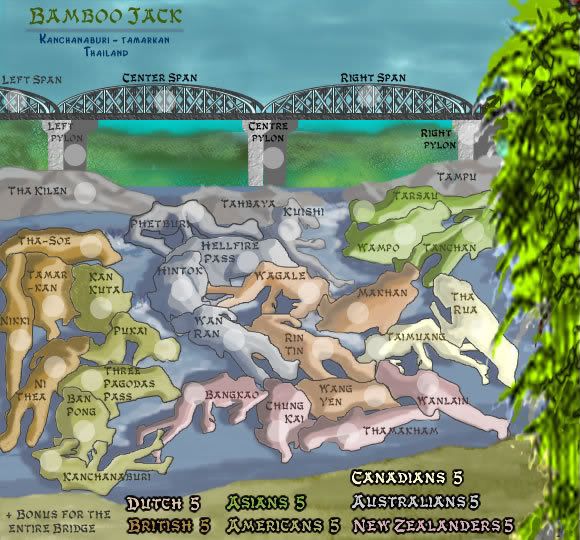
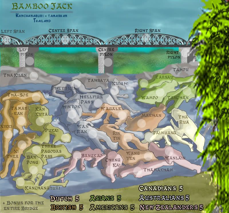
V2 Update

Posted:
Tue Aug 07, 2007 6:26 amby cairnswk
Well, I don't know if this is an improvement or not.
the effect trying to be achieved is broad-brush niaive artwork on the rocks and river. The river needs more treatment.
But for now, this is version 2 with new font more in the oriental style.
Bonuses are a long way off yet.
V2 Update


Posted:
Tue Aug 07, 2007 10:00 amby unriggable
I think you need to finish a map before you start others.

Posted:
Tue Aug 07, 2007 10:32 amby jasnostj
Are you people seriously discussing corpses to play on???
Even to a mass murderer like me that sounds sick.

Posted:
Tue Aug 07, 2007 11:18 amby AndyDufresne
Cairnswk, I usually like your ideas, but this one doesn't do anything for me. I think there are better projects you can start up than this.
--Andy

Posted:
Tue Aug 07, 2007 11:55 amby cairnswk
AndyDufresne wrote:Cairnswk, I usually like your ideas, but this one doesn't do anything for me. I think there are better projects you can start up than this.
--Andy
Thanks Andy.

I dont think the idea of Bridge on the River Kwai is the problem, it's the reminder that what everyone is doing here is actually waging war on each other, and that my idea of reminding people about what war produces i.e. dead bodies is too close to home.
Even I just looked at the artwork i produced ( after a big sleep) and I must say it is a tad real. Still I like the fact that I have achieved this objective.
So rather than destroy a good subject matter, I will rework the map to something that everyone won't be reminded about and they can continue attacking each other.
Bamboo Jack Plan B coming up soon.


Posted:
Tue Aug 07, 2007 11:59 amby cairnswk
unriggable wrote:I think you need to finish a map before you start others.
Even when such maps that are started don't produce any comments and people don't bother to go there to comment? I have one map up for comment and nobody has been there to discuss anything on it for over a week now. So why can't i start another map?
unriggable, i could produce several map ideas in the time that it takes this forum to quench one.
and please don't tell me when i should or shouldn't post a map.


Posted:
Tue Aug 07, 2007 12:01 pmby cairnswk
jasnostj wrote:Are you people seriously discussing corpses to play on???
Even to a mass murderer like me that sounds sick.
Yes it is sick, isn't it? jasnostj. People don't like reminders about what war produces.


Posted:
Tue Aug 07, 2007 12:03 pmby hulmey
What do you mean it doesnt do anything for you? Elaborate ?
I think its a great ma pand very different to what we have on CC...Its also a close to home remainder about war and the graphics are very nice...Prefer this much more than the sydney map..

Posted:
Tue Aug 07, 2007 12:11 pmby cairnswk
hulmey wrote:What do you mean it doesnt do anything for you? Elaborate ?
I think its a great ma pand very different to what we have on CC...Its also a close to home remainder about war and the graphics are very nice...Prefer this much more than the sydney map..
Hulmey, thanks for your "realist" support.

As to the difference between this and Sydney, yes it's very clear, but both are very different styles of artwork.
The bridge will still be there in the alternate version that I produce.

Posted:
Tue Aug 07, 2007 3:45 pmby hulmey
ok and the trees to the rgiht , i hope. As this gives it a 3D look


Posted:
Wed Aug 08, 2007 7:10 pmby pepperonibread
I know this map isn't emphasizing the blood and the death of war, but I still don't see any appeal in conquering neither rocks in a river nor dead bodies.

Posted:
Thu Aug 09, 2007 5:05 amby cairnswk
pepperonibread wrote:I know this map isn't emphasizing the blood and the death of war, but I still don't see any appeal in conquering neither rocks in a river nor dead bodies.
thanks pepperonibread

feedback is very helpful, particilarly logical expressions like your own.
Appreciation.
Preview V3

Posted:
Sun Aug 19, 2007 5:38 pmby cairnswk
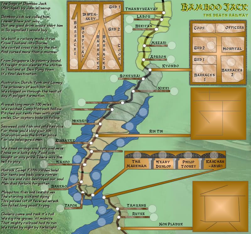
Well, after much thought and re-design, I have started creating the map below as the new version of Bamboo Jack.
Please, don't go bezerk with comments yet, this is only in its infancy, but it will give you an idea where it is heading, and yes it is still alive.
I will continue to update this image as this new image progresses towards something more substantial. When it is finished to a reasonable stage, I will post a completed version V4.
Current V3


Posted:
Sun Aug 19, 2007 10:10 pmby hulmey
your map is too big!!! Havent you been reading the map guidelines you naughty boy


Posted:
Sun Aug 19, 2007 11:57 pmby edbeard
maybe you are joking but this map is 800x745
guidelines
A large (up to 800px wide), Height must not be any greater than 800px on large maps

Posted:
Mon Aug 20, 2007 12:05 amby cairnswk
hulmey wrote:your map is too big!!! Havent you been reading the map guidelines you naughty boy

Oh dear hulmey....everyone is having size issues...they must all feel inadequate!

keyogi wrote:Any map in development must stick to the following map size criteria:
You must design two versions of the map:
A small (up to 600px wide), and
A large (up to 800px wide).
Height is flexible, but it is recommended that you do not exceed:
350px on small maps, and
600px on large maps.
Height must not be any greater than:
600px on small maps, and
800px on large maps.
My map hulmey is 800 x 745.
I beleive that falls with the guidelines
FOR A LARGE MAP


Posted:
Mon Aug 20, 2007 12:06 amby cairnswk
edbeard wrote:maybe you are joking but this map is 800x745
guidelines
A large (up to 800px wide), Height must not be any greater than 800px on large maps
Thanks edbeard....
the small version will be 630 x 587....this is what i am currently working on.


Posted:
Mon Aug 20, 2007 12:09 amby hulmey
this is all getting very strange *rubs his head* World 2.1 and this one look the same size on my monitor.
What on earth is going on *rubs head some more*

Posted:
Mon Aug 20, 2007 12:49 amby cairnswk
V3 Large Still in Progress

V4 Large and Small

Posted:
Mon Aug 20, 2007 12:46 pmby cairnswk
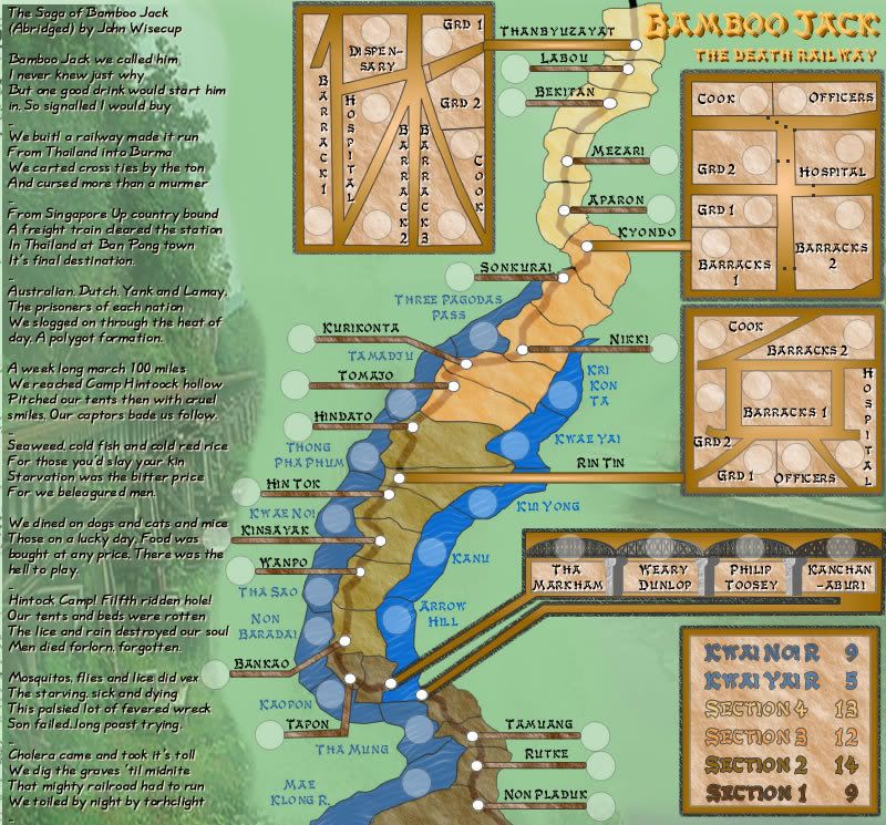
OK Here is the worked version 4.
Legend - only has number of terts in it yet.
Camp maps - created from the Japanese Kanji characters meaning rest, king and soldier in that order from top to bottom
It is very lineal, i'll agree, but i guess that what comes with the railwaym however the rivers each side of most of the line do assist for some diversion.
There will be bonuses for the bridge etc, just javen't worked it wll out yet.
But this is the general idea.
Oh and yes, still a little messy in places design-wise, but those are time issues.
V4 Small
 V4 Large


Posted:
Tue Aug 21, 2007 3:29 amby cairnswk
OK...voting seems to be indicating to me that this is still not appealing. Any expansion on why this doesn't appeal?

Posted:
Tue Aug 21, 2007 11:55 amby jako
sorry cairns, ive always been a fan of ur maps, but this one just doesnt appeal to me visually or gameplay-wise. the terrs look really weird, and the overall shape of it, and in the middle where its liek the bottleneck effect really disturbs me.
honesty and no offense but this would fall in with my list of maps i wouldnt play.
ps my reasons for y i dislike it are a bit shaky, but i cant quiet explain y.

Posted:
Tue Aug 21, 2007 12:36 pmby Coleman
I like it so far myself. The problems for me are the routes in the, bleh don't even know what they are called. Boxes that represent something bases? on the map.
Bleh without knowing what they are it's hard to say, the stuff with Cook's and officers and whatever in them don't have very clear routes with the exception of Kyondo.
I also have trouble reading the story. The font you used is too hard on my eyes.
