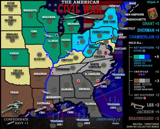
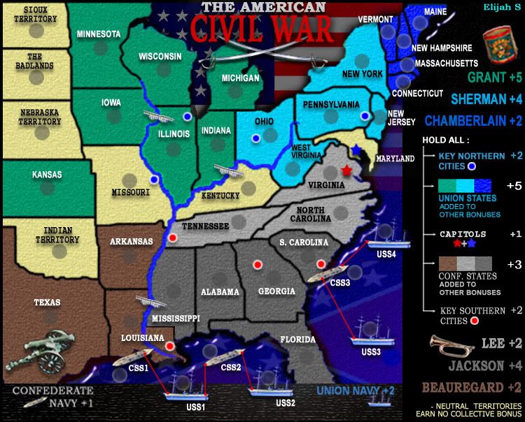
Elijah...OK...your map is coming along nicely.
Some more fixes if you would...
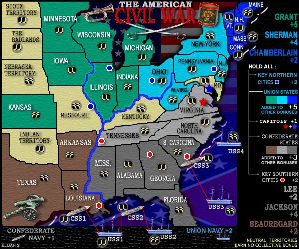
1. the borders around Tennessee and Kentucky are the ones that really need attending to...too jaggered, but still looking for that gaussian blur or similar.
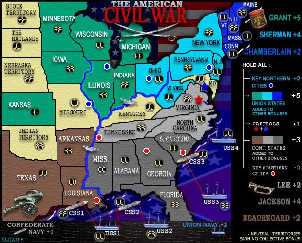
2. a couple of the fonts in the legend appear different sizes i.e. key northern cities and key southern cities, but please check that all of them are the same each side of the legend if that's what u want.
3. Your army circles need centering where possible in the middle of the territory or as close to that as you can get it.
4. Can you investigate a way of speling out Missouri in full please, and look at some of the different sizes of text for each tert, more consistency between them sizewise would be preferred where it is possible.
5. If possible, reduce the size of the "Civil War" in the title to give a little more space between those two first lines.
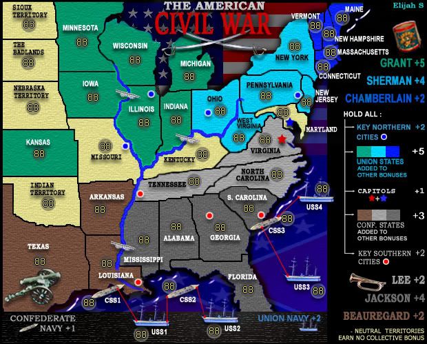
6. a challenge for you...i'd prefer to see the names of those north eastern states Vermont etc spelled out in full also if possible. While I as an aussie know your states to some degree, other players from other countries might not have the same level of knowledge and this might stop them from playing the map. maybe the top of the legend will need to move down so that those names can be fit in.

7. is there a link between alabama or florida to the css2...i think that is awkward gameplay to have a string of 4 terts off the coast like that as it gives a huge advantage to forting louisianna. think about that one.
8. there is a bit of pixelation happening on the city circles.
Elijah, don't be discouraged by the number of issues that i have targeted here...my object is to make you aware of what people sometimes look for, and these fixes could make your map look so much better.
Good work so far.!