Conquer Club

American Civil War [Quenched]

Care to peruse completed maps? Take a stroll through the Atlas.

Moderator: Cartographers

Forum rules
Please read the Community Guidelines before posting.

Postby Elijah S on Wed Oct 03, 2007 2:06 am

7th Revision
Image

Notable changes:
-Pixelation has been addressed
-Rivers have been changed to follow actual geographical path
-Bridges repositioned and one added
-All states have been spelled out and fonts made uniform
-Legend realligned and fonts resized accordingly
-City circles made smaller and less pixelated
-Army circles placed more center in their territory
Sergeant 1st Class Elijah S
 
Posts: 672
Joined: Wed May 09, 2007 6:24 pm

Postby Lupo on Wed Oct 03, 2007 3:43 am

It's the first time I look at this map.

I have some advices to give you:

- You made fonts uniform and that's good, but, at least for me, font in 6th Revision was easier to read (for the size, I mean); so, I would suggest to increase a little bit font size.

- In Lousiana I would invert territory name and army circle position, in order-Army circles placed more center in their territory in order to not cover Missisipi river.
"Nature is a temple in which living pillars
Sometimes emit confused words;
Man crosses it through forests of symbols
That observe him with familiar glances."
User avatar
Sergeant 1st Class Lupo
 
Posts: 180
Joined: Fri Sep 15, 2006 1:33 pm

Postby cairnswk on Wed Oct 03, 2007 3:58 am

My Version

Image
Image
* Pearl Harbour * Waterloo * Forbidden City * Jamaica * Pot Mosbi
User avatar
Private cairnswk
 
Posts: 11510
Joined: Sat Feb 03, 2007 8:32 pm
Location: Australia

Postby cairnswk on Wed Oct 03, 2007 4:08 am

OK...Elijah S....here's the go in the map above.

1. i have gone over your borders with a 2px pen totally black with .5 gaussiuan blur....this is what i was hoping you can achieve....please forgive some areas of smudging...but you will see that it certainly straightens those borders out and removes that jaggered look.

2. some of the left side states need their text centered in alignment

3. some armies could move more towards where i have the red circles.

4. there is a difference in the spacing in the legend where i have marked....you appear to have used two different fonts for the topp and bottom remarks.

5. the northern states maine to connecticut don't appear to have the same texture applied as the other states.

6. the title looks fab, as do the other things that you fixed in the 7th revision....great work!

This is really improving and you are going to be so proud, as will CC....excellent work...keep it up!
Image
* Pearl Harbour * Waterloo * Forbidden City * Jamaica * Pot Mosbi
User avatar
Private cairnswk
 
Posts: 11510
Joined: Sat Feb 03, 2007 8:32 pm
Location: Australia

Postby Elijah S on Wed Oct 03, 2007 7:30 pm

8th Revision
Image

Notable changes:
-Pixelation addressed... again. This time the borders have been made larger using vector lines and a slight gaussian blur.
-Some army circles have been repositioned.
-Legend spacing is more consistent.
-A texture has been added to the blue states.
-An slight overall texture has been added to all states.
-Yellow territory titles have been centered.
Sergeant 1st Class Elijah S
 
Posts: 672
Joined: Wed May 09, 2007 6:24 pm

Postby cairnswk on Thu Oct 04, 2007 3:18 am

Elijah S wrote:8th Revision


Elijah....this is looking so much better; what do you think, are you happy with this?

OK, the next step to be working towards (if there are no further objections to anything from the Foundry, assuming you will attend to or justify those issues) is the large map.

You are required to complete a large version (I wouldn't go anything wider than 800px) of this map. You may be able to simply use the re-size function to increase the size of elements on the map the large version.
The only thing you will have to re-work if you upsize this way is the size of the army shadows themsleves.

It is recommended that the army shadow circle be 24 px dia. this is unfortunately a tedious piece of the mapmaking process, however WidowMakers has completed a tutorial in Map Making Tools for the Army Circles, check there.

You need to show both maps together, with the army circle numbers on both versions.

See how you go!
Image
* Pearl Harbour * Waterloo * Forbidden City * Jamaica * Pot Mosbi
User avatar
Private cairnswk
 
Posts: 11510
Joined: Sat Feb 03, 2007 8:32 pm
Location: Australia

Postby Elijah S on Thu Oct 04, 2007 12:53 pm

I'm pleased with the progress and think this map's about's ready for final forge.

Since the height's a pretty good size, I may not go quite to 800px wide for the large map, but I'll try a few sizes before posting it.

The army circles, while yes, tedious work, should pose no problem.

Thanks for all the assistance... let's get this thing into production! I'm anxious to start kicking ass playing it!


cairnswk wrote:
Elijah S wrote:8th Revision


Elijah....this is looking so much better; what do you think, are you happy with this?

OK, the next step to be working towards (if there are no further objections to anything from the Foundry, assuming you will attend to or justify those issues) is the large map.

You are required to complete a large version (I wouldn't go anything wider than 800px) of this map. You may be able to simply use the re-size function to increase the size of elements on the map the large version.
The only thing you will have to re-work if you upsize this way is the size of the army shadows themsleves.

It is recommended that the army shadow circle be 24 px dia. this is unfortunately a tedious piece of the mapmaking process, however WidowMakers has completed a tutorial in Map Making Tools for the Army Circles, check there.

You need to show both maps together, with the army circle numbers on both versions.

See how you go!
Sergeant 1st Class Elijah S
 
Posts: 672
Joined: Wed May 09, 2007 6:24 pm

Postby cairnswk on Thu Oct 04, 2007 3:17 pm

Elijah S wrote:I'm pleased with the progress and think this map's about's ready for final forge.


Not so Elijah S, this is still some way off Final Forge.

And when it gets to Final Forge, are you ready to and or have you got someone doing the xml for you. All those coordinates don't just magically appear.

Since the height's a pretty good size, I may not go quite to 800px wide for the large map, but I'll try a few sizes before posting it.

The army circles, while yes, tedious work, should pose no problem.

Thanks for all the assistance... let's get this thing into production! I'm anxious to start kicking ass playing it!


Don't be anxious, but work methodically and take each step slowly.
I can understand you want to start using the map, but I don't think it will be ready for play for a short while yet. :wink: You could prove me wrong though.
Image
* Pearl Harbour * Waterloo * Forbidden City * Jamaica * Pot Mosbi
User avatar
Private cairnswk
 
Posts: 11510
Joined: Sat Feb 03, 2007 8:32 pm
Location: Australia

Postby Elijah S on Fri Oct 05, 2007 9:13 am

"And when it gets to Final Forge, are you ready to and or have you got someone doing the xml for you. All those coordinates don't just magically appear."

lol... I enjoyed this. Ah, the supportive, yet somewhat biting and condescending tone.

Having written a considerable amount of web-script, including java and html, I don't think the xml should pose any particular problem for me.
-I've not only read Lack's Tutorial, but also printed out a sample of the script format.

The coordinates (army circles) are still subject to being moved, so I won't begin the xml until they are fixed.

The maps, small and large, are below.

The small map: 620px wide x 499px high.
Image
The large map: 750px wide x 604px high.
Image
Sergeant 1st Class Elijah S
 
Posts: 672
Joined: Wed May 09, 2007 6:24 pm

Postby Elijah S on Fri Oct 05, 2007 9:15 am

***I just noticed I'm missing Maryland's army circle in the lg. map... I'll fix that with the next update.
Sergeant 1st Class Elijah S
 
Posts: 672
Joined: Wed May 09, 2007 6:24 pm

Postby Coleman on Fri Oct 05, 2007 12:54 pm

While you do that, some of the army circles are looking a little bit too bunched up with their territory names.

Wisconsin, Sioux Territory, and The Badlands to name a few, easy solution is to just move the army circles down a few pixels.

Speaking of Sioux territory... Sioux is an incorrect name white people gave to the Lakota. Regardless it still appears on a lot of maps and what not so if you don't care I won't bother to try and force you to change it to Lakota Territory. :wink:
Warning: You may be reading a really old topic.
User avatar
Sergeant Coleman
 
Posts: 5402
Joined: Tue Jan 02, 2007 10:36 pm
Location: Midwest

Postby Elijah S on Fri Oct 05, 2007 1:38 pm

Not to stray too far off topic here, but that's an interesting observation Coleman... although the name would more aptly be "Dakota" rather than Lakota...
The link below leads to a brief, but enlightening bit of Sioux history.
http://www.sonofthesouth.net/union-gene ... ndians.htm


Coleman wrote:While you do that, some of the army circles are looking a little bit too bunched up with their territory names.

Wisconsin, Sioux Territory, and The Badlands to name a few, easy solution is to just move the army circles down a few pixels.

Speaking of Sioux territory... Sioux is an incorrect name white people gave to the Lakota. Regardless it still appears on a lot of maps and what not so if you don't care I won't bother to try and force you to change it to Lakota Territory. :wink:
Sergeant 1st Class Elijah S
 
Posts: 672
Joined: Wed May 09, 2007 6:24 pm

Postby Coleman on Fri Oct 05, 2007 2:29 pm

I'm just going by what the natives call themselves. Dakota may not be right either but I don't have time to research. I do know for certain people that claim themselves to be Lakota are annoyed by being referred to as Sioux. It's possible Dakota and Lakota are two tribes that somehow fell into the same classification. But if you get really deep into it the Lakota aren't all necessarily one tribe either.

But you're right this is off topic. :lol:

Hopefully you can get the army circles a bit more away from the text so they don't look as clustered.
Warning: You may be reading a really old topic.
User avatar
Sergeant Coleman
 
Posts: 5402
Joined: Tue Jan 02, 2007 10:36 pm
Location: Midwest

Postby Evil Pope on Fri Oct 05, 2007 4:06 pm

Hmm.. I think that the textures may be a little too.. strong, might be a good word. Do you think softening it up a bit might make it a little easier on the eyes. A bit smoother, but not perfectly smooth?
And something about the bridges doesn't feel right.. they're nice bridges, but I feel that you could edit them a bit. The shadows of the bridges make them look like they're above the land, not connecting the two sides. If you understand what I mean, I don't think i'm being clear enough.
User avatar
Sergeant Evil Pope
 
Posts: 275
Joined: Fri Jan 13, 2006 8:39 pm

Postby cairnswk on Fri Oct 05, 2007 5:08 pm

Elijah S wrote:"And when it gets to Final Forge, are you ready to and or have you got someone doing the xml for you. All those coordinates don't just magically appear."

lol... I enjoyed this. Ah, the supportive, yet somewhat biting and condescending tone.

Having written a considerable amount of web-script, including java and html, I don't think the xml should pose any particular problem for me.
-I've not only read Lack's Tutorial, but also printed out a sample of the script format.


Elijah S. I am sorry if you think this is condescending and biting. It is simply my way of asking questions, and for all we know, you might not have the skills to do the xml..i don't know that you had already done webscript etc....And i thought it was rather resumptuous of you to announce that the map was ready for final forge...back on oct 4 post...you don't get to make those decisions.

Please don't cut off your nose despite your face, when people are only trying to help you get your map done. :)
Image
* Pearl Harbour * Waterloo * Forbidden City * Jamaica * Pot Mosbi
User avatar
Private cairnswk
 
Posts: 11510
Joined: Sat Feb 03, 2007 8:32 pm
Location: Australia

Postby Unit_2 on Fri Oct 05, 2007 6:02 pm

i don't think this map is a good look, it looks old(like the old brazil map) and not a new map, l think that you need to give it some better grafics/text.
User avatar
Corporal 1st Class Unit_2
 
Posts: 1834
Joined: Sun Jan 14, 2007 12:59 pm
Location: Pennsylvania, U.S.A, North America, Earth, Milky Way, Universe.

Postby Elijah S on Fri Oct 05, 2007 6:20 pm

Coleman- I've done a little research and it appears that the area in question was considered Dakota Territory in many of the maps from that era.
I've adjusted several of the army circles and will post that in the next revision...

Pope- I've had the same thought about the texture being a bit hard; Unfortunately, with photoshop, texture affects aren't easily reversed. So what I may wind up having to do is pull a layer from a previous version (one with a lesser or no texture), drop it in the newest version and rework it altogether...

Cairnswk- Your input in this project has, and continues to be invaluable to me and greatly appreciated.
When I mentioned moving this into final forge it was largely in response to your own, very positive, comments about the progress of the map.
But the assumption that I'd spend what has been a considerable amount of time on this, and yet think that the xml would "magically appear" just kind of rubbed me the wrong way.
I do, of course, realize that I don't make the decisions on when it gets moved to the next phase, but please don't mistake my enthusiasm for the project for being anything other than that.
We've had a reasonably respectful exchange of dialog and it would be truly regretful if that dialog were to become anything less than productive.

Again, Thanks to everyone for their opinions and constructive advice.
-Elijah
Sergeant 1st Class Elijah S
 
Posts: 672
Joined: Wed May 09, 2007 6:24 pm

Postby oaktown on Fri Oct 05, 2007 8:31 pm

Unit_2 wrote:i don't think this map is a good look, it looks old(like the old brazil map) and not a new map, l think that you need to give it some better grafics/text.

That's a bit harsh, but I also have a general bone to pick with the look. When it comes to a historical map, I like to see the overall look to capture the era somehow. There is much about this map that does, but the colors seem too crisp and vivid. The texture you've been playing with helps a lot.
Image
User avatar
Captain oaktown
 
Posts: 4451
Joined: Sun Dec 03, 2006 9:24 pm
Location: majorcommand

Postby cairnswk on Fri Oct 05, 2007 9:55 pm

Elijah S wrote:Cairnswk- Your input in this project has, and continues to be invaluable to me and greatly appreciated.
When I mentioned moving this into final forge it was largely in response to your own, very positive, comments about the progress of the map.
But the assumption that I'd spend what has been a considerable amount of time on this, and yet think that the xml would "magically appear" just kind of rubbed me the wrong way.
I do, of course, realize that I don't make the decisions on when it gets moved to the next phase, but please don't mistake my enthusiasm for the project for being anything other than that.
We've had a reasonably respectful exchange of dialog and it would be truly regretful if that dialog were to become anything less than productive.


Elijah...i appreciate your enthusiasm very much. However, it is part of my duties to ensure and assist mapmakers to try to achieve the best possible outcome for their maps and maintain the high standards that have been achieved in line with past productions. :)

In this respect I am always happy to assist wherever i can....and as for us having anything but respectful dialogue...that would be sheer folly on my part as a moderator if i were to allow it to disintergrate :)
Image
* Pearl Harbour * Waterloo * Forbidden City * Jamaica * Pot Mosbi
User avatar
Private cairnswk
 
Posts: 11510
Joined: Sat Feb 03, 2007 8:32 pm
Location: Australia

Postby AndyDufresne on Sun Oct 07, 2007 12:06 am

Well lets see what we've got here...!


Regarding the Visuals:

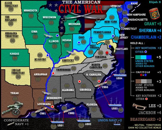
I like the simplicity of this map, visual wise, though I think it still needs some work. The recently Quenched map of Portugal was a very 'simple' map to the eye, but the way it presented its simplicity felt a little more polished than this current map.

Regarding the textures, as someone mentioned...they feel a little odd. I'm not sure the 'painted wall' texture really fits this map. What other textures could you experiment with?

I'd maybe nudge some the names so they aren't so close to the army circles (I.E. Neb. on small, Badlands on small). Also you are going to have some troubles with New Hampshire and Mass.'s coordinates (3 digits) perhaps overlapping the name, which is something we'd like to avoid. Also look out for Vermont's 3 digit coordinates overlapping N.H.'s. Watch New Jersey's overlap of name also.

I like the use of both flags as a background, but the where the 'flag ocean ends' when it meets the legend, the map looks almost unfinished in this aspect. I'm not sure how you would alleviate this, but the sudden change from the flag ocean to the legend is something to look at.

The river right now feels drawn on, and very un-river-like. And like another user mentioned, the bridge image doesn't quiet mesh with the map.

I see you also use a number of decorative images around the map, but for the most part I'm not a fan of these. They seem to take up space, without adding much to the map. I'd maybe be in favor of removing the canon, bugle, and whatever is above Grant's name. The swords in the name seem alright, though I'd maybe consider moving them behind the title and making them bigger.

Regarding the ships in the water...the current images don't fit with the map. They feel too much like a real life image, which doesn't quite fit this theme. I'd consider alternate images. I also dislike the 'little legend' at te bottom of the map, and how the ships are on it. Also eventually the red connecting lines should be spruced up, as they glaringly stand out and look crude.

The legend feels a little chaotic, especially with the overlap of territory names into it. I'd almost consider looking into cutting off a few pixels on the left side of the map, (as you have some territory space that isn't really needed), to create more space for a seperate legend.

=====

As for Game play....

The capitals aren't a part of the 'Key Cities' bonus, are they?

I like the bonus tiers you have, with the division leaders each having a bonus, along with the collective having a bonus. I also like the inclusion of the key cities bonus, though the north may be at a slight disadvantage as to where they are located. The capitals are similar to Anhk-Morpork in Discworld, and will he contested and a nice early foothold. Side note, capitAls

The rest of the game play looks pretty standard, but good. The bonuses seem alright, but I'll look closer at those maybe later. :)

Good work, keep it up.


--Andy
User avatar
Corporal 1st Class AndyDufresne
 
Posts: 24919
Joined: Fri Mar 03, 2006 8:22 pm
Location: A Banana Palm in Zihuatanejo

Postby Elijah S on Mon Oct 08, 2007 2:58 pm

Okay... my delayed reply is due to the fact that Andy placed a heaping stack of requests on my plate.

A few of the easier fixes have aleady been worked on, but the more time consuming things will be done gradually, if at all.

The icons still seem to add to the feel for some, and detract for others. So, this may have to go up to a vote at some point.
I think they give the board something... except for the drum which, when placed in the working file never seems to maintain its sharpness. So I'll probably 86 it.
The bugle and canon though... I like.

As for the river seeming "drawn on" and the ships seeming "too realistic"...
I don't see that this river is much different from others (i.e.- germany); and the ships... again, I'd like input from others on whether or not they need to be different. -The ones I've used are from the war itself and that should probably be considered.
I'm sure that, should a consensus show that others feel the same as Andy, I can draw new ones or find some appropriate clipart.

I've tacked on another 20px to the Legend and re-re-re-realigned it.
I'll work on making it more consistent as for the font sizes, but again, would like additional input.

I'm also playing with different textures... thusfar, the ones which are most appealing to me is an eye candy "weave" or photoshop "canvas"... I'll put the two in the next revision.

Gameplay issues will be addressed at a later stage, as I think that the graphic presentation should be fine-tuned first.
Sergeant 1st Class Elijah S
 
Posts: 672
Joined: Wed May 09, 2007 6:24 pm

Postby Coleman on Mon Oct 08, 2007 3:01 pm

Elijah S wrote:The icons still seem to add to the feel for some, and detract for others. So, this may have to go up to a vote at some point.
You might benefit from trying something akin to the arrows qwert uses to show river crossings in Eastern Front. Not trying to say the bridges don't work, just giving you another idea since a couple posters have mentioned problems with them.
Warning: You may be reading a really old topic.
User avatar
Sergeant Coleman
 
Posts: 5402
Joined: Tue Jan 02, 2007 10:36 pm
Location: Midwest

Hi, It's Me

Postby Suzy1 on Mon Oct 08, 2007 11:24 pm

Elijah, the fact that you continually receive posts from different moderators giving their input on what they each think needs to be done differently to your map has to at some point become frustrating. Just when you make a change to please 1 of them and get a thumbs-up, another tells you to go to the other extreme. I am sure that with all this artistic and graphic talent in 1 place together, that there are going to be differences of opinion. As moderators, I personally think that they should all look at what they think needs to be done, then collectively make a post that they can all appreciate. I still love the map. I really do hope that all of your hard work isn't for nothing. I have so much respect for you that you take all of this constructively and continue to try to find a happy medium for everyone. Good luck to you :wink:
Corporal 1st Class Suzy1
 
Posts: 269
Joined: Sat May 12, 2007 3:25 am

Postby Elijah S on Tue Oct 09, 2007 2:33 pm

Suzy, as always, you've been very supportive in this endeavor and I appreciate your comments.

I've been perhaps a little overanxious to get this map finished, and can see some things that can be improved but, yes, it's frustrating to change things per new input. -Especially things which require a considerable amount of time.
But you know me... I trudge on and try to maintain a degree of optimism.
Sergeant 1st Class Elijah S
 
Posts: 672
Joined: Wed May 09, 2007 6:24 pm

new texture

Postby Elijah S on Wed Oct 10, 2007 12:57 am

I've been looking for a texture that would give this map a more antiquated feel and I think this does it...

I also put a faint portrait of Lincoln in there... I think it adds something to the map.

Comments welcome...

Image
Last edited by Elijah S on Wed Oct 10, 2007 1:43 am, edited 1 time in total.
Sergeant 1st Class Elijah S
 
Posts: 672
Joined: Wed May 09, 2007 6:24 pm

PreviousNext

Return to The Atlas

Who is online

Users browsing this forum: No registered users

cron