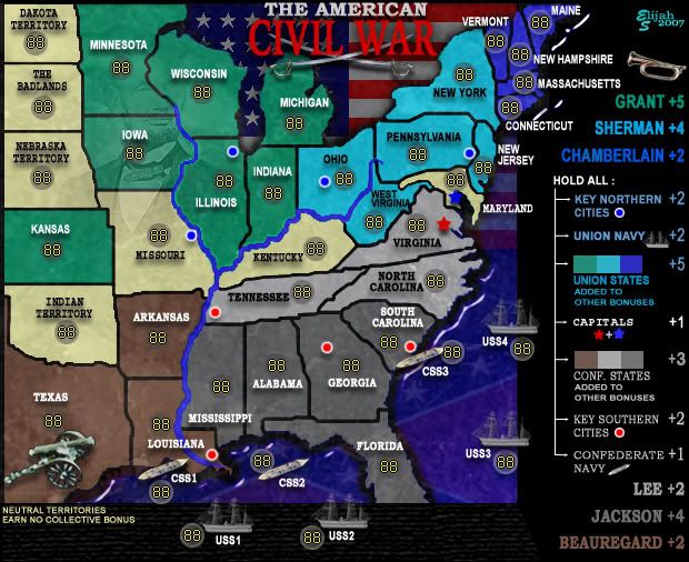
i don't think this map is a good look, it looks old(like the old brazil map) and not a new map, l think that you need to give it some better grafics/text.
Coleman- I've done a little research and it appears that the area in question was considered Dakota Territory in many of the maps from that era.
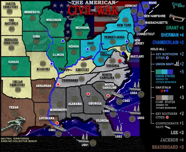
I've adjusted several of the army circles and will post that in the next revision...
Pope- I've had the same thought about the texture being a bit hard; Unfortunately, with photoshop, texture affects aren't easily reversed. So what I may wind up having to do is pull a layer from a previous version (one with a lesser or no texture), drop it in the newest version and rework it altogether...
Cairnswk- Your input in this project has, and continues to be invaluable to me and greatly appreciated.
When I mentioned moving this into final forge it was largely in response to your own, very positive, comments about the progress of the map.
But the assumption that I'd spend what has been a considerable amount of time on this, and yet think that the xml would "magically appear" just kind of rubbed me the wrong way.
I do, of course, realize that I don't make the decisions on when it gets moved to the next phase, but please don't mistake my enthusiasm for the project for being anything other than that.
We've had a reasonably respectful exchange of dialog and it would be truly regretful if that dialog were to become anything less than productive.
Again, Thanks to everyone for their opinions and constructive advice.
-Elijah